The New Identity of the Municipality of Filothei-Psychiko
Logo – Source of Inspiration & Visual Signature
Vibrant Diversity
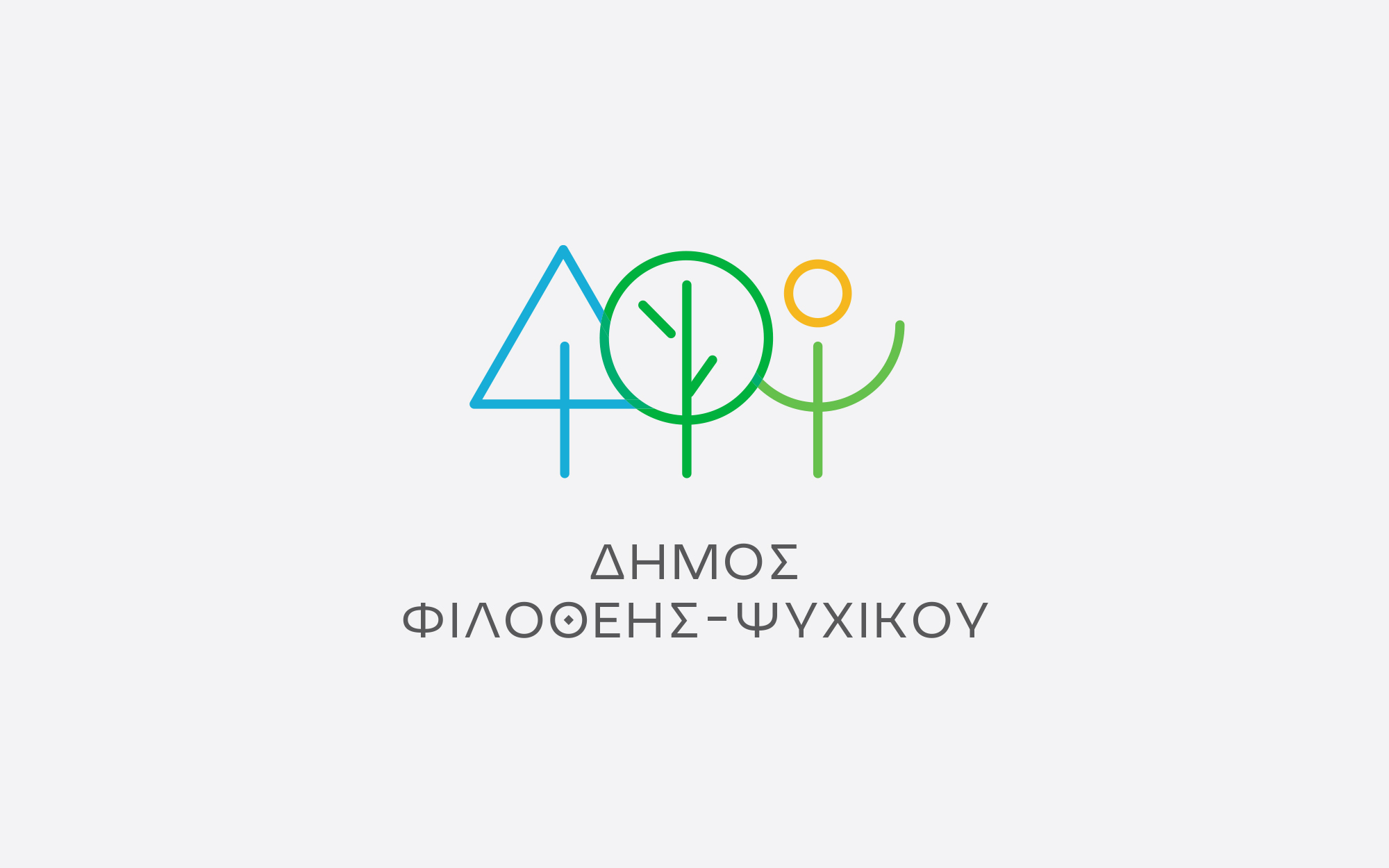
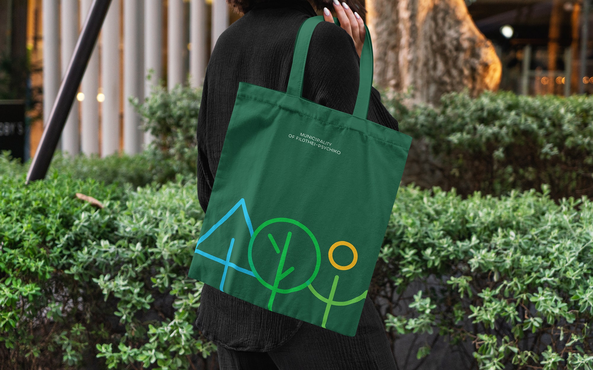
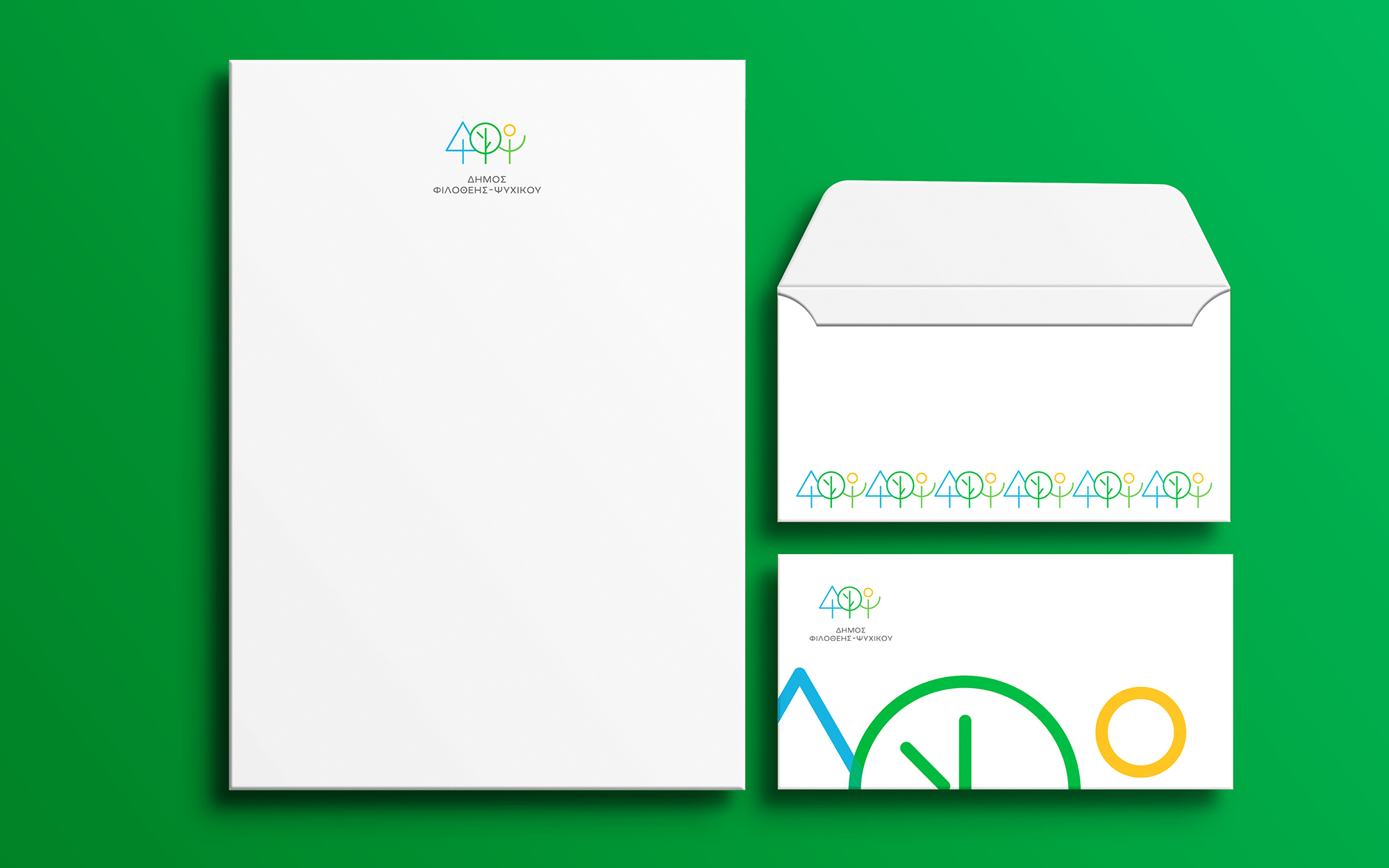
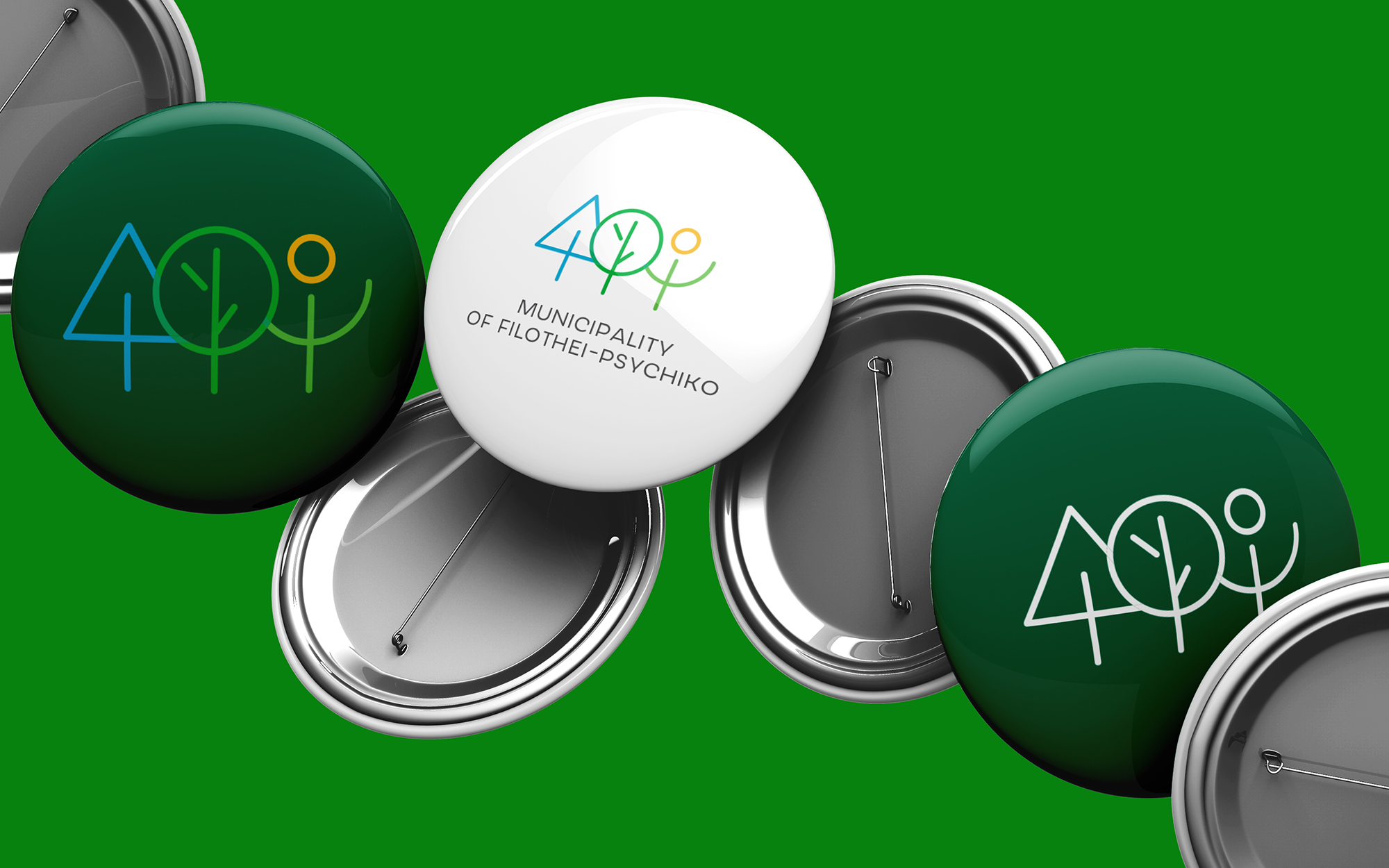
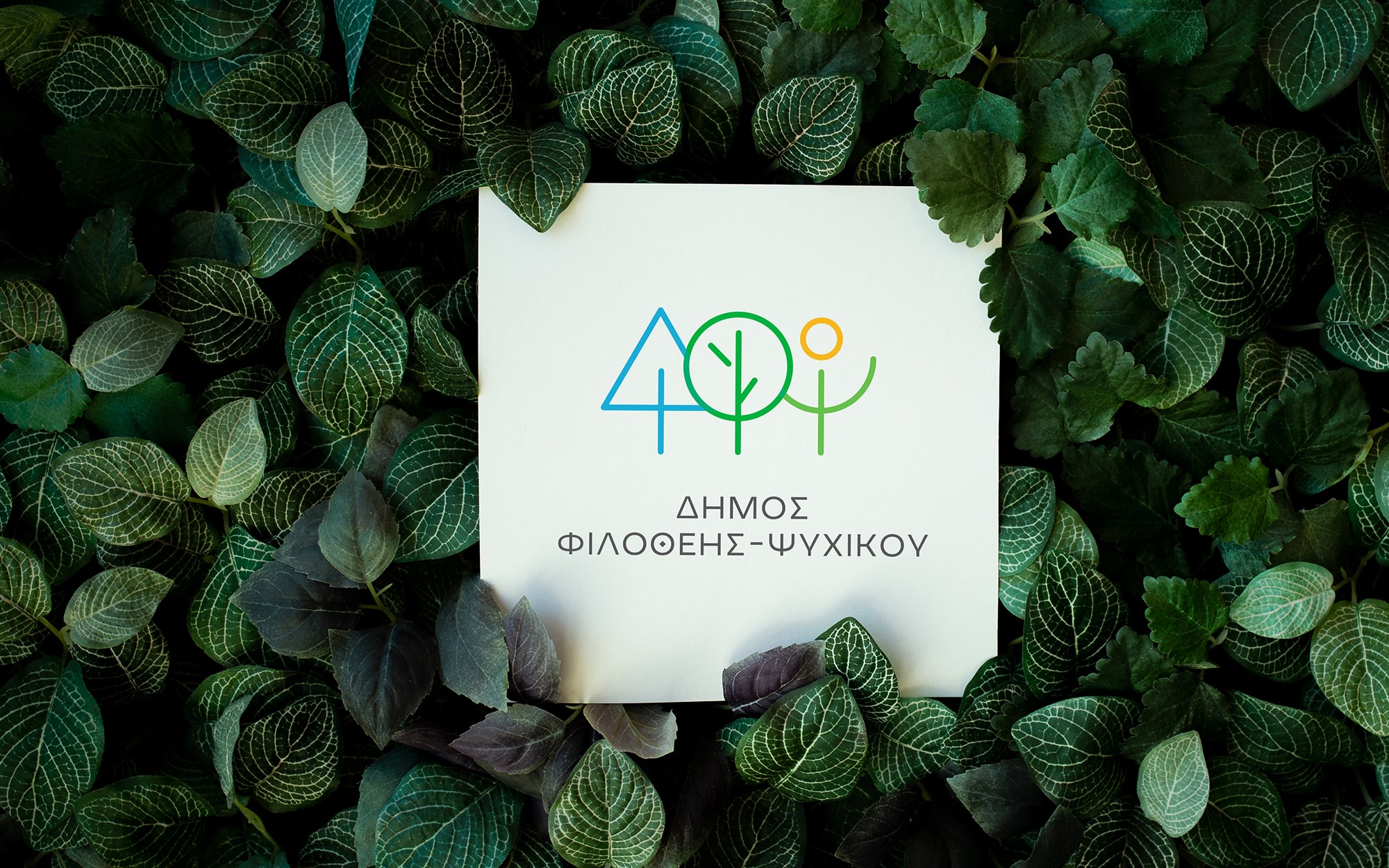
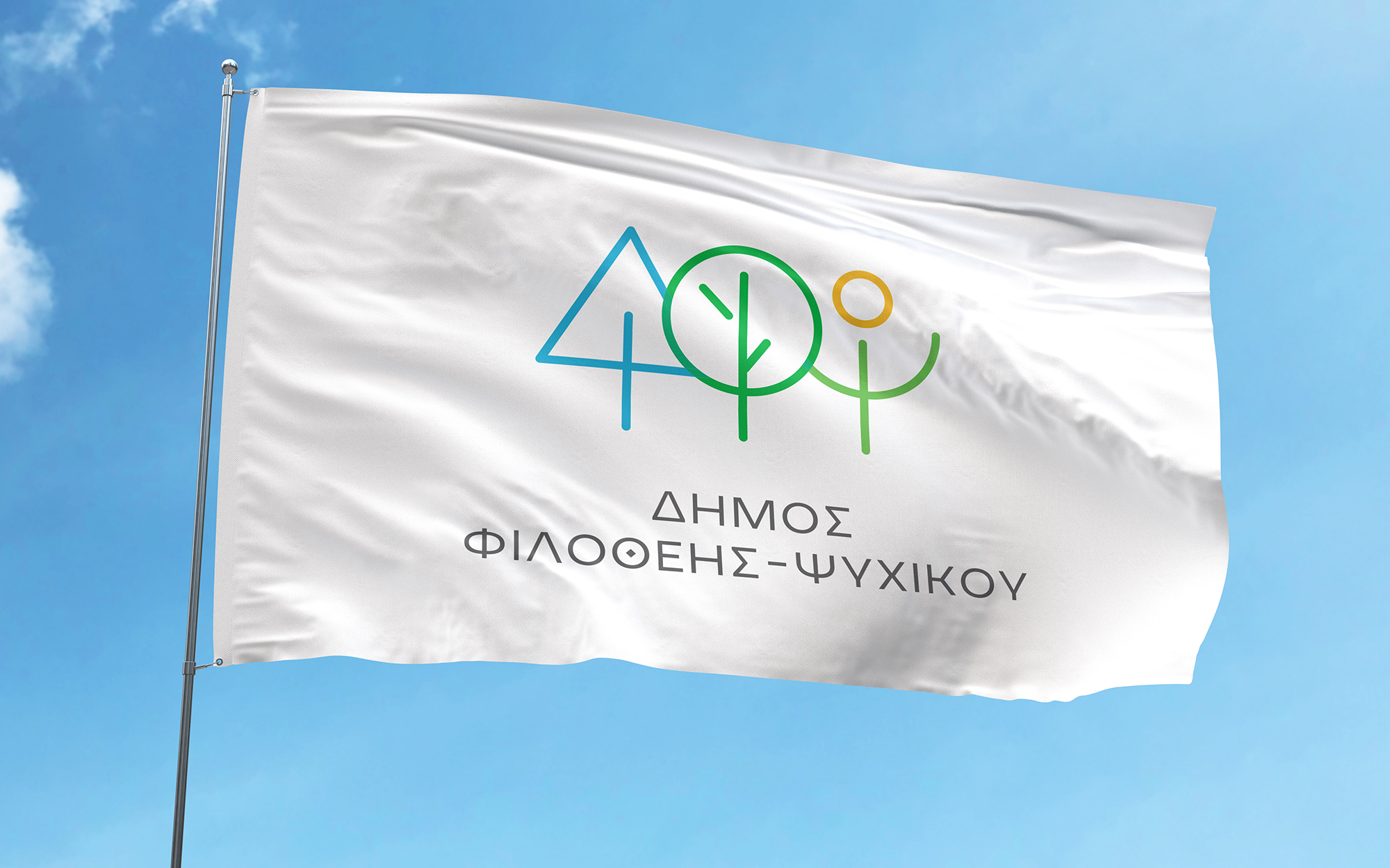
A logo with a colorful palette that highlights the diversity of the municipality’s three districts.
The color scheme is inspired by the natural environment: light blue reflects the sky and water—as well as the municipality’s prestige—green represents local vegetation, and yellow symbolizes sunlight, expressing optimism and joy for the residents who live here.
At the same time, the different colors visually represent the uniqueness of each municipal community, while the shared design language preserves a strong sense of unity.
The vibrant character of this logo conveys a feeling of dynamism and openness, portraying a modern municipality that welcomes new ideas and forward-thinking initiatives.
The subtle branch-like details inside the green circle enrich the visual narrative without overcomplicating the overall design.
This multicolored approach allows for versatility in future applications that require vividness and strong presence—such as cultural events, awareness campaigns, and communication targeting younger audiences.
Creative Rationale
The logo symbol is based on the initials ΔΦΨ (in greek), which are abstractly interpreted to form a minimal landscape that reflects nature and the environment, capturing the municipality’s identity as a green, refined, and culturally vibrant area.
The abstract forms of the letters create a strong and timeless symbol, easily recognizable and adaptable across different uses and platforms.
Font: Atypical Τext by George Triantafyllakos, atypical.gr
Copy: Konstatinos Kontinos
