The Charisma of Compassion
Brief
To create the brand name and logo for a company that provides healthcare services for the elderly.
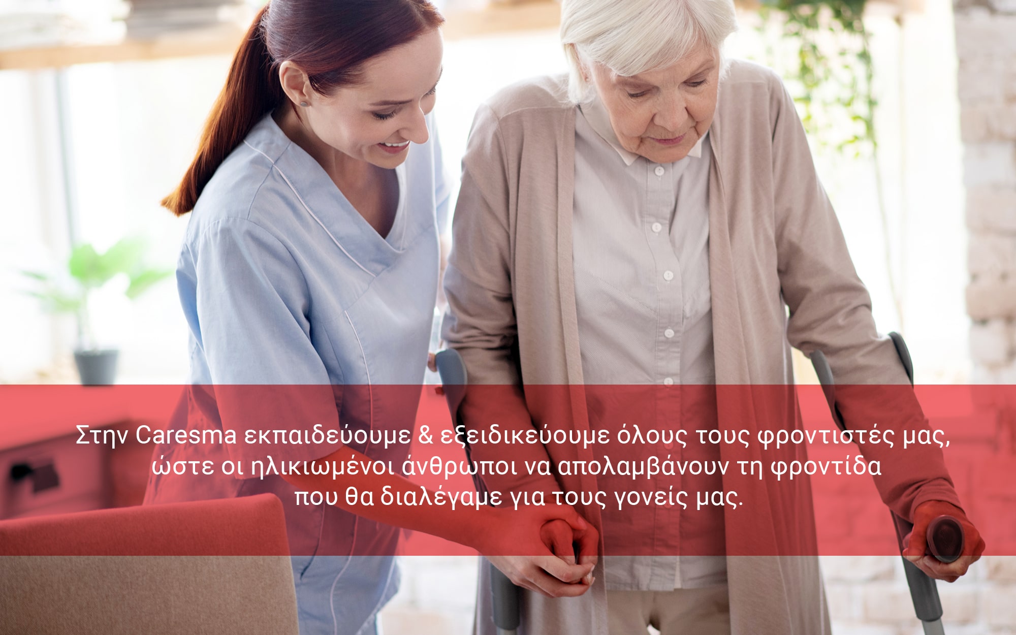
Caresma represents a paradigm shift in the caregiving landscape, addressing the critical care deficit in our aging society through an innovative platform that vets, trains, and connects qualified caregivers with families. The brand needed to transcend the clinical aesthetic typical of healthcare services, instead communicating the profound human connection at its core while still conveying the technological sophistication that powers its matchmaking capabilities.
Target Group
Dual audience of care-seeking families with aging loved ones and empathetic individuals with caregiving potential who lack formal credentials but possess natural compassion.
Creative Concept
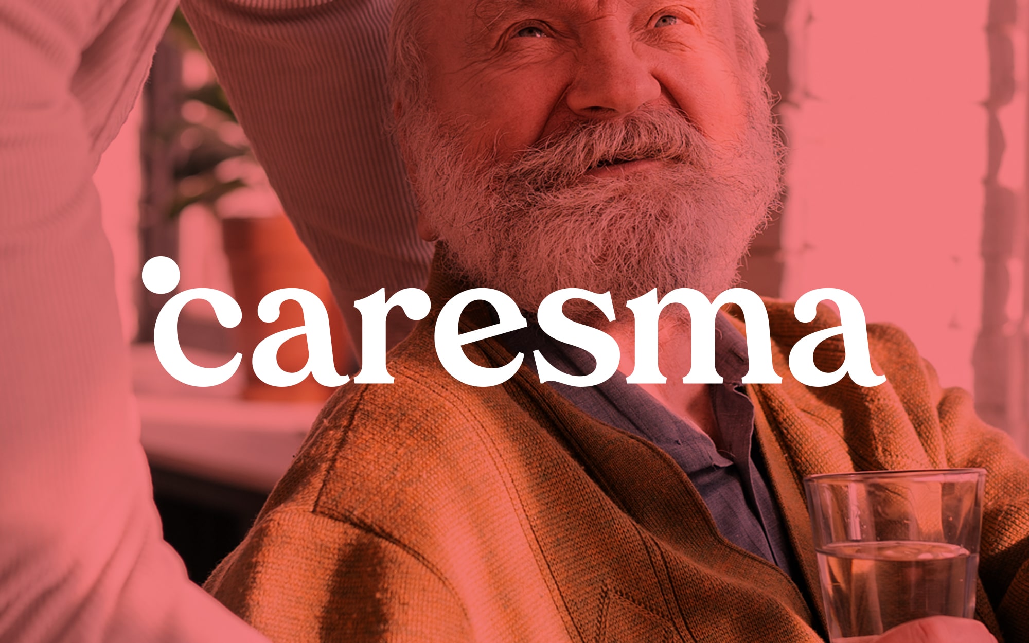
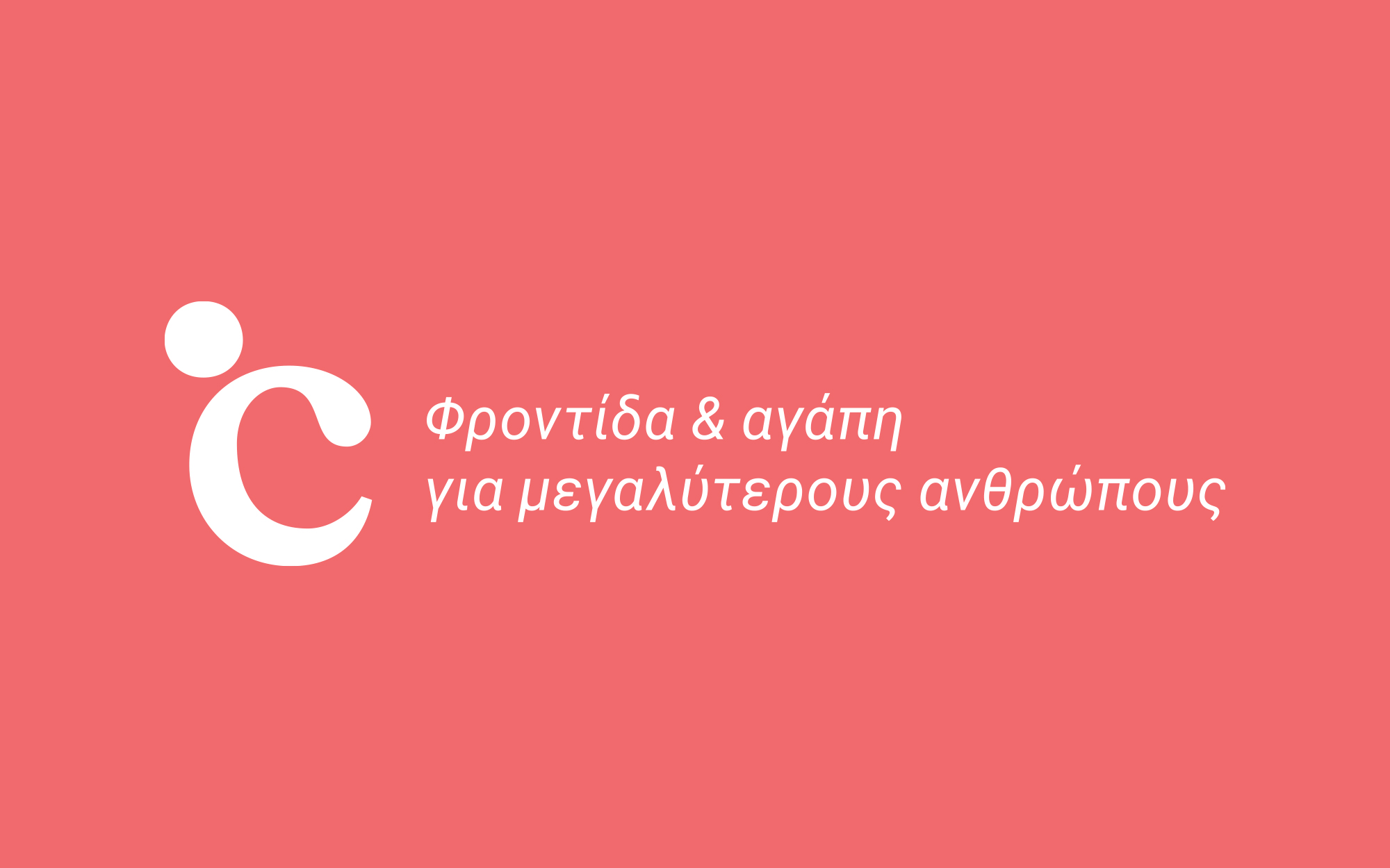
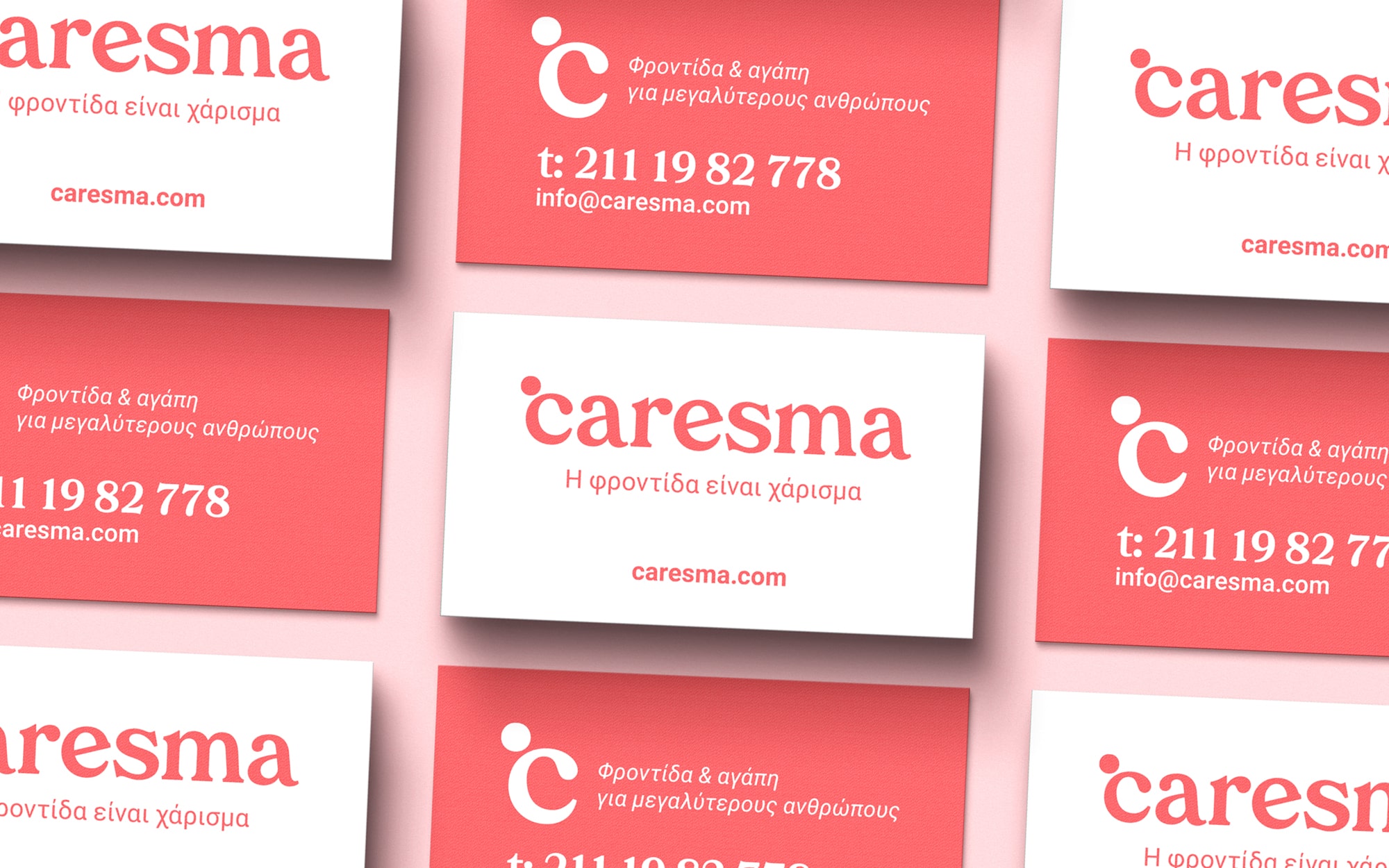
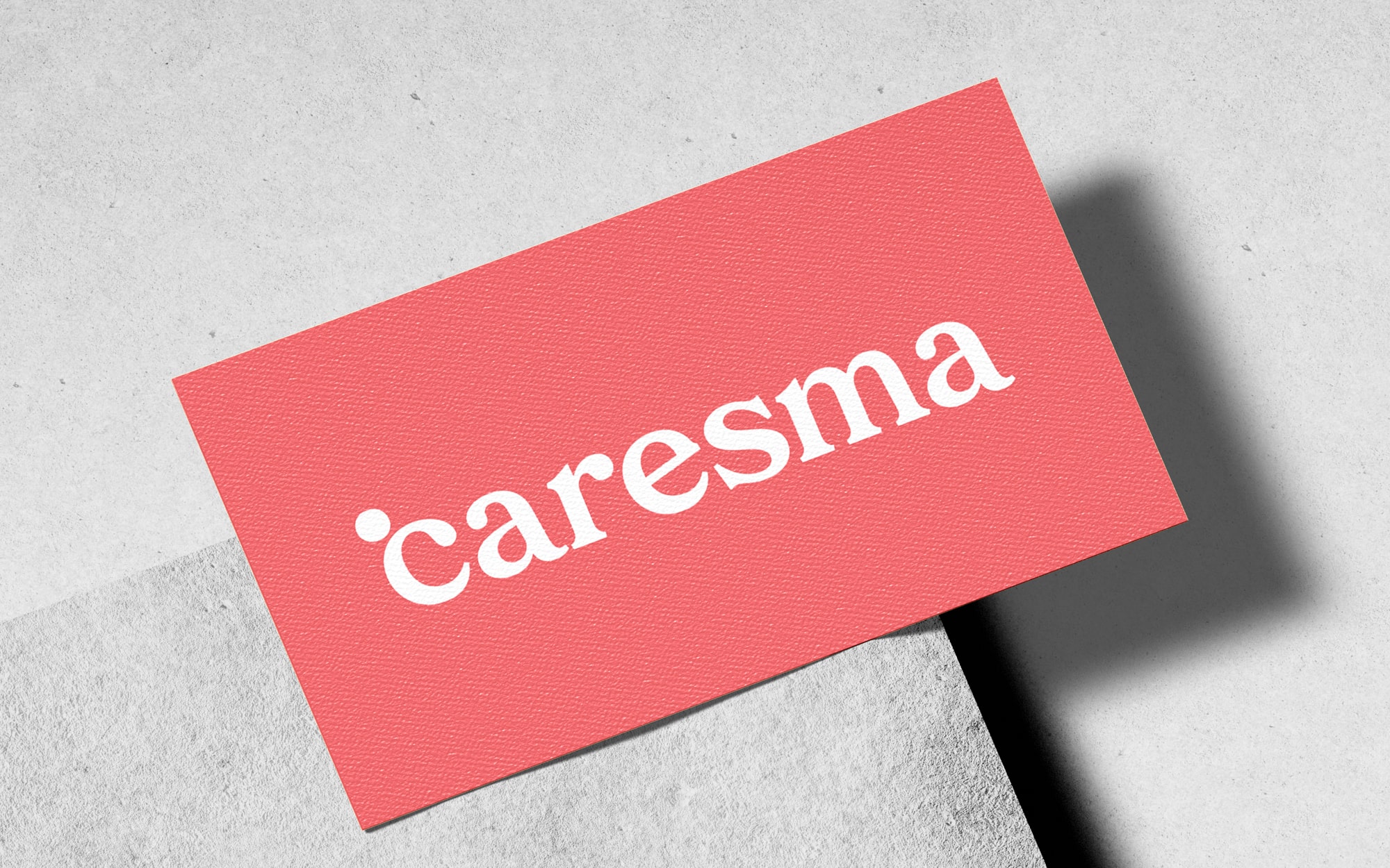
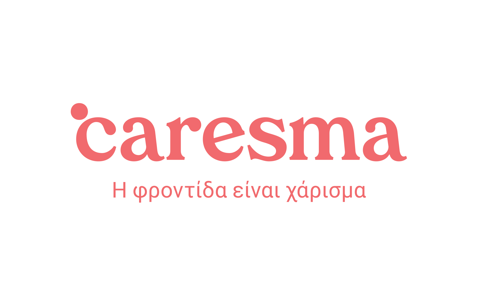
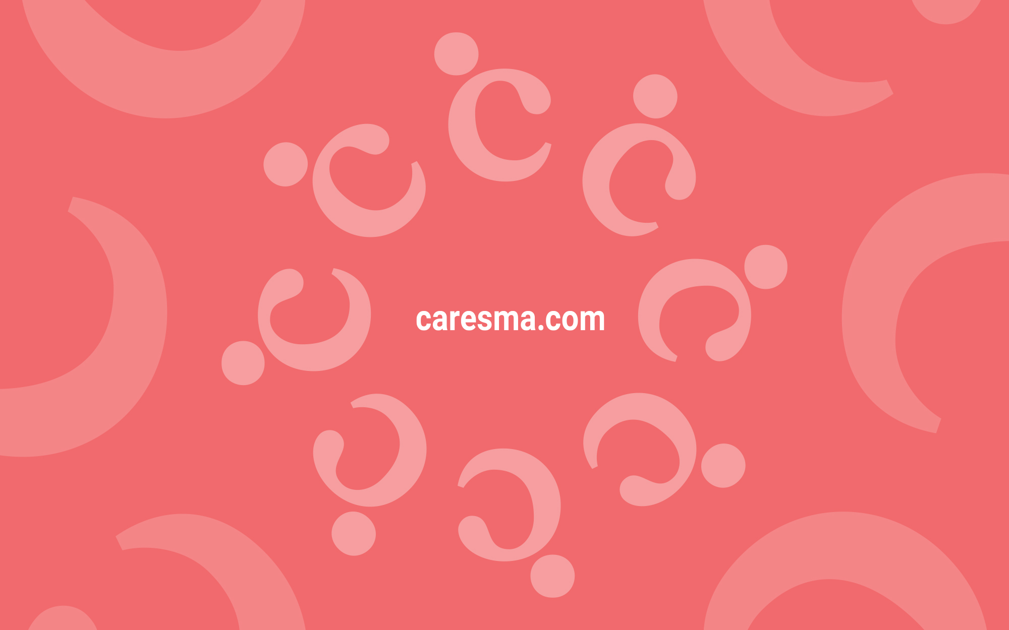
“Caresma” ingeniously fuses “care” with “charisma,” embodying the brand philosophy that caring is an innate gift that can be cultivated. This concept is visually expressed through a symbol where the letterform “c” incorporates a human figure – simultaneously representing the caregiver, care recipient, and their vital connection. The Greek tagline “Η φροντίδα είναι χάρισμα” (“Care is a gift”) reinforces this fundamental belief that with proper support, empathetic individuals can transform into exceptional caregivers.
Design Approach
The visual identity employs a vibrant yet soothing coral as its signature color, evoking warmth, energy, compassion and trust. The typography balances approachability with professionalism through rounded letterforms that echo the human-centered ethos of the brand. The symbol – a stylized “c” with a distinctive dot representing the human element – creates an instantly recognizable visual shorthand for the brand’s mission, resembling the value of giving and the offer of the trained caregivers. This cohesive system stands in deliberate contrast to the sterile blues and clinical imagery prevalent in healthcare branding, positioning Caresma as a revolutionary force that humanizes care.