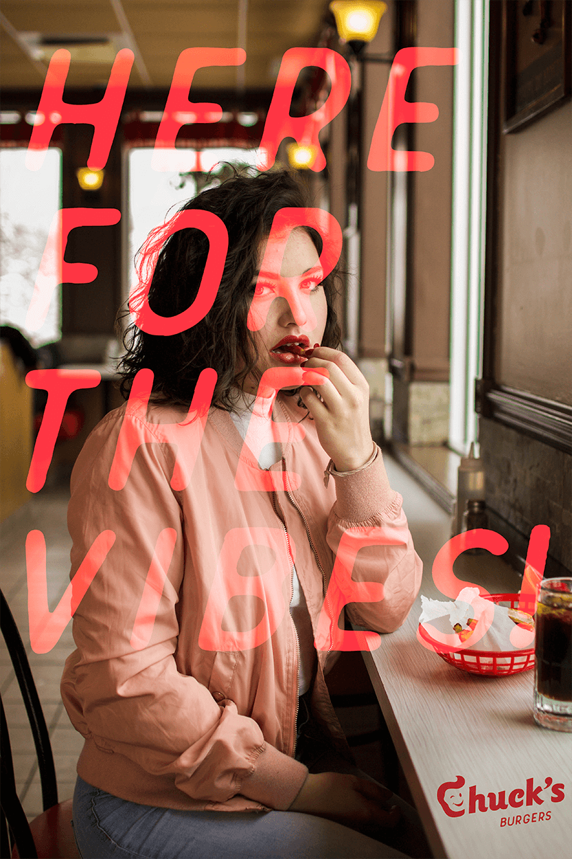
Here for the vibes.
Chuck’s is a Burger-focused Quick Service Restaurant Chain in Kuwait City. The brand is competing in the extremely saturated and demanding market of the Gulf Region, where similar prepositions come a dime-a-dozen (and the longevity of any new entrant if far from guaranteed). The chain is characterized by a fairly simple but no-nonsense take on all-time-classic favourites. In a market that gets overloaded all the time with new, complicated propositions that add little in real terms, there is definitely room for a welcome reset.TARGET GROUP
Quick Service Restaurant customers in Kuwait coming from very varying backgrounds, across different eating occasions.
CONCEPT
DESIGN APPROACH
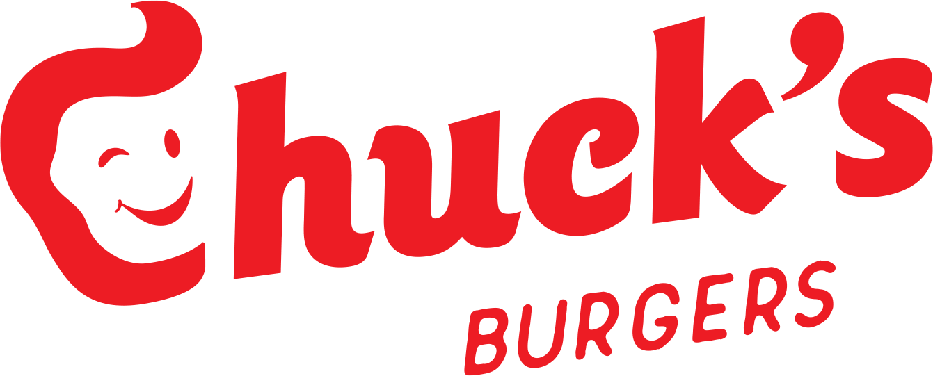
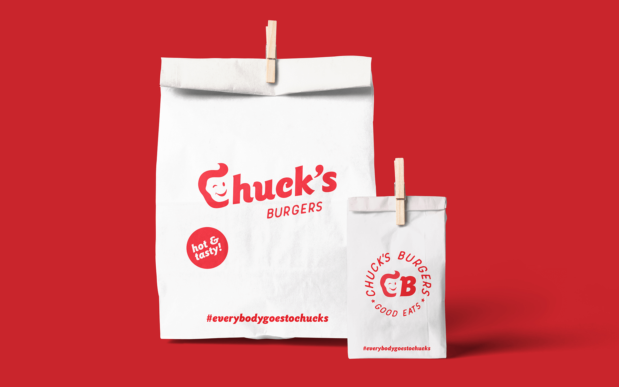
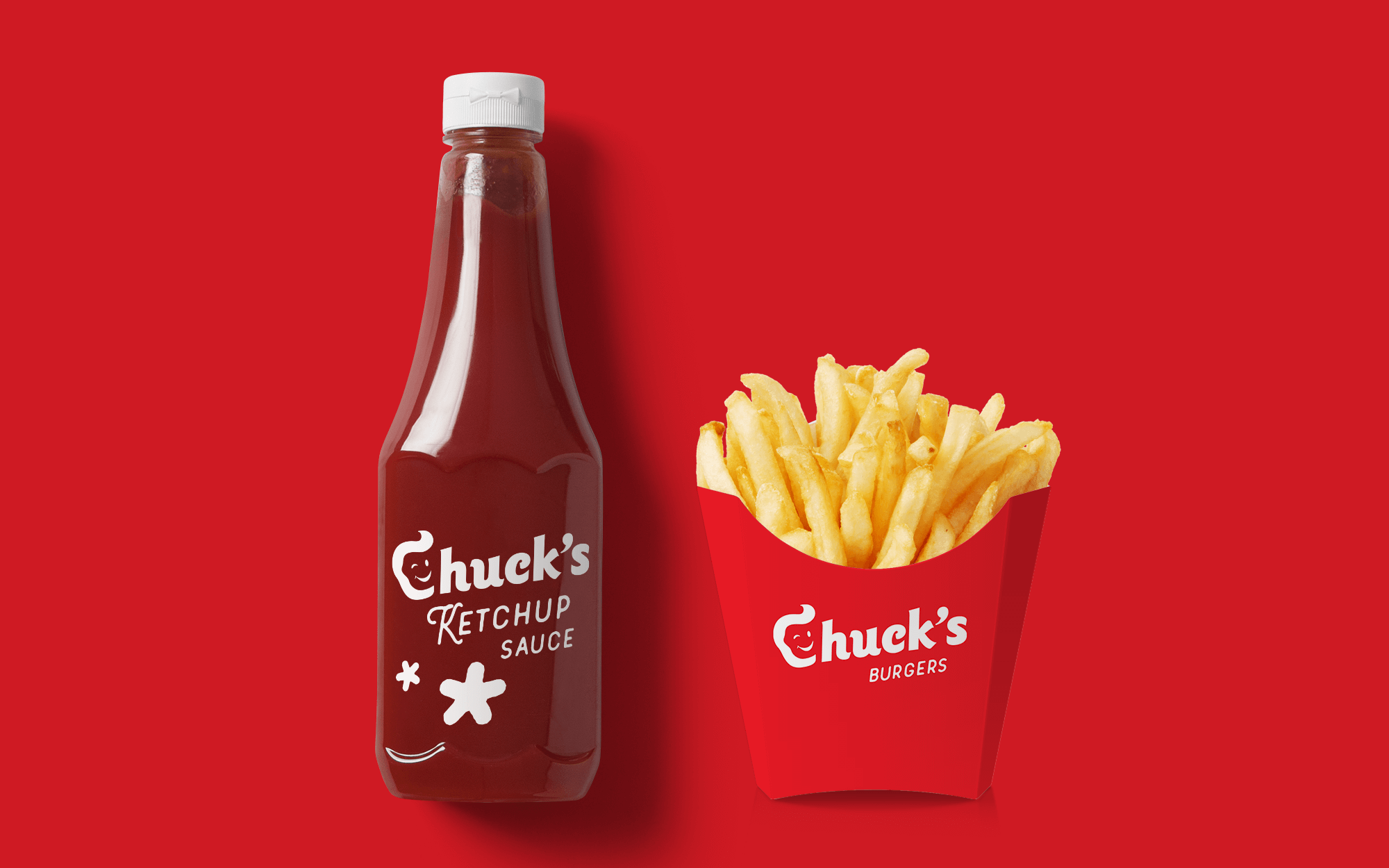
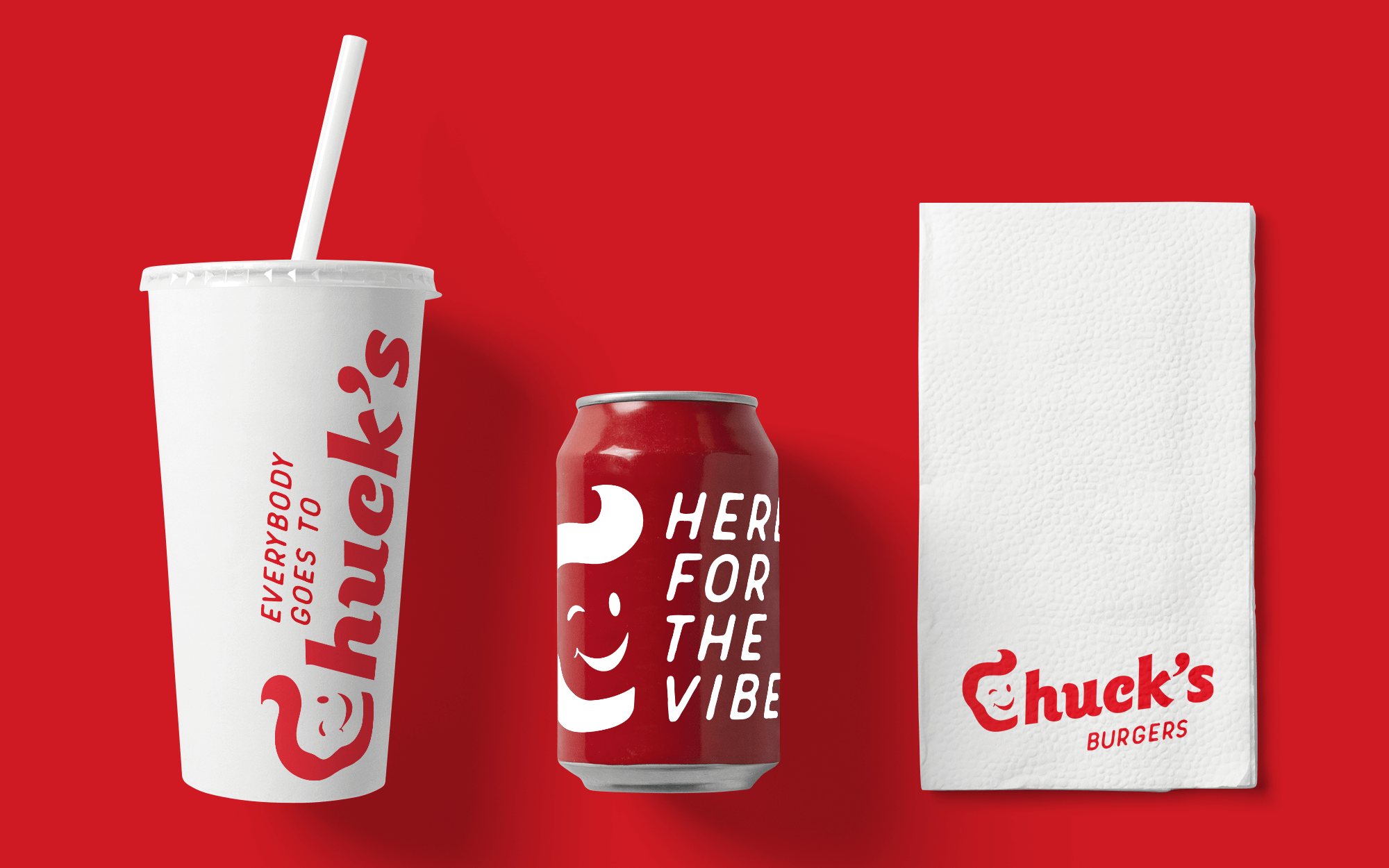
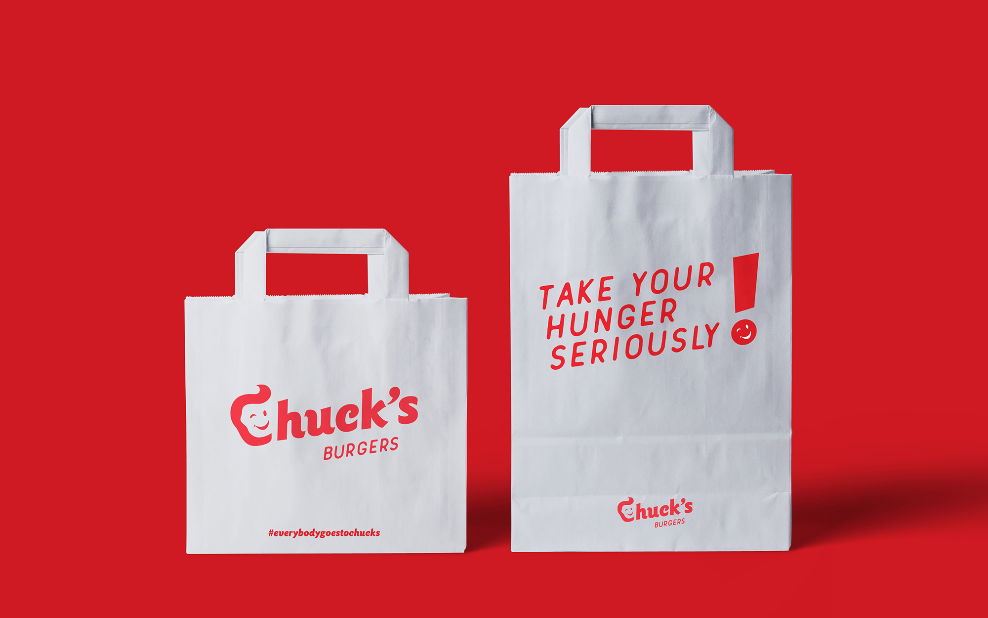
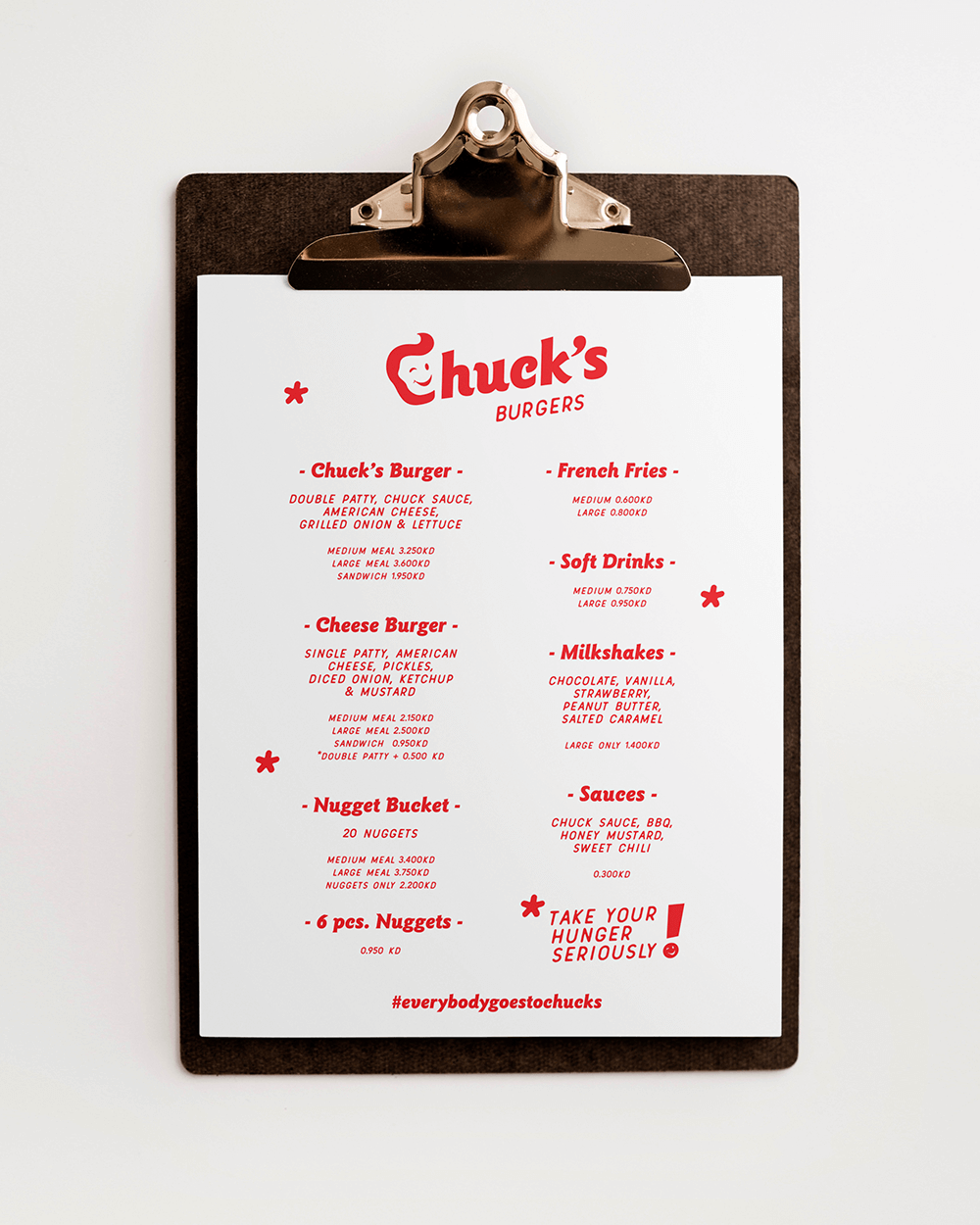
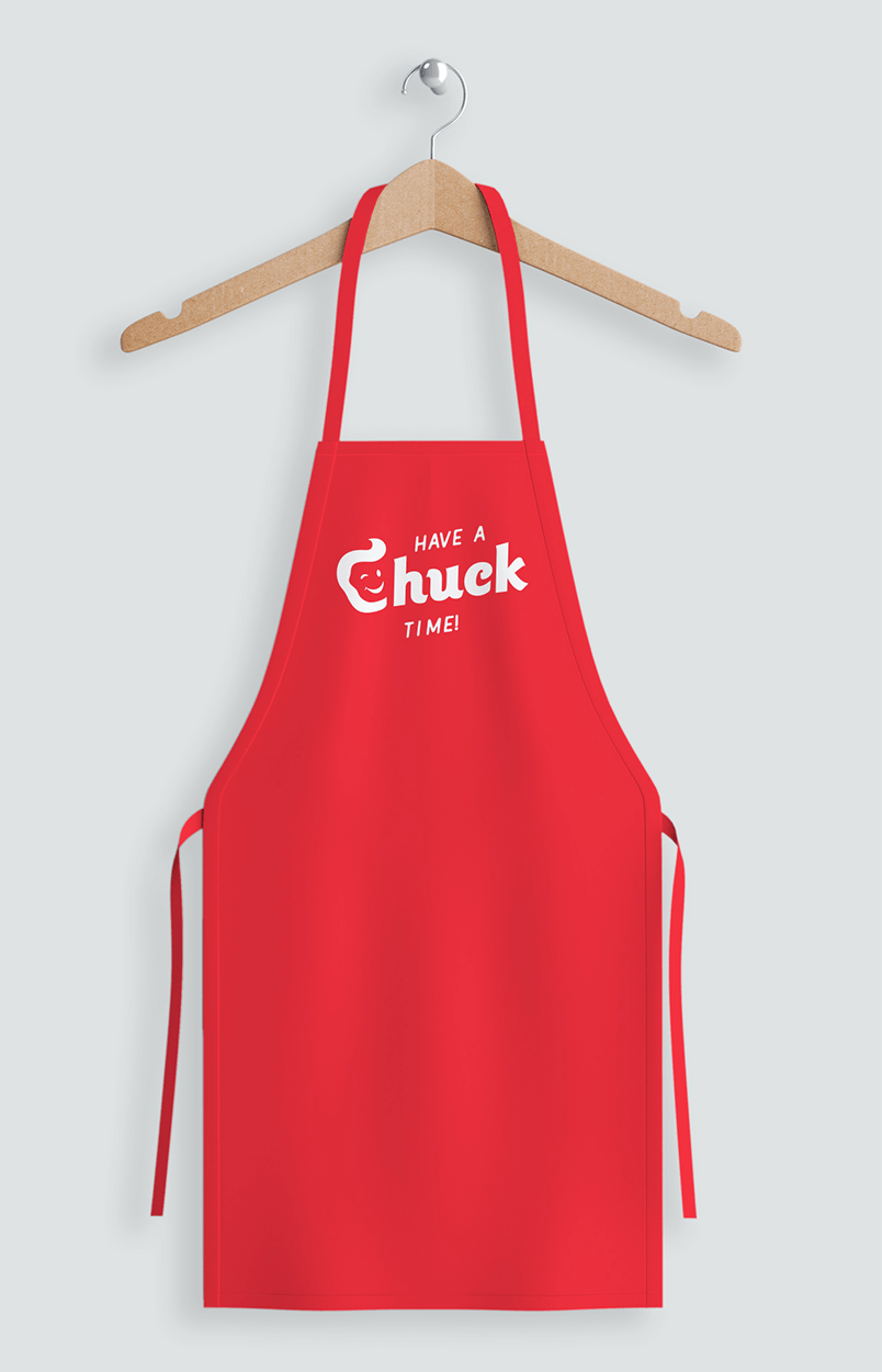
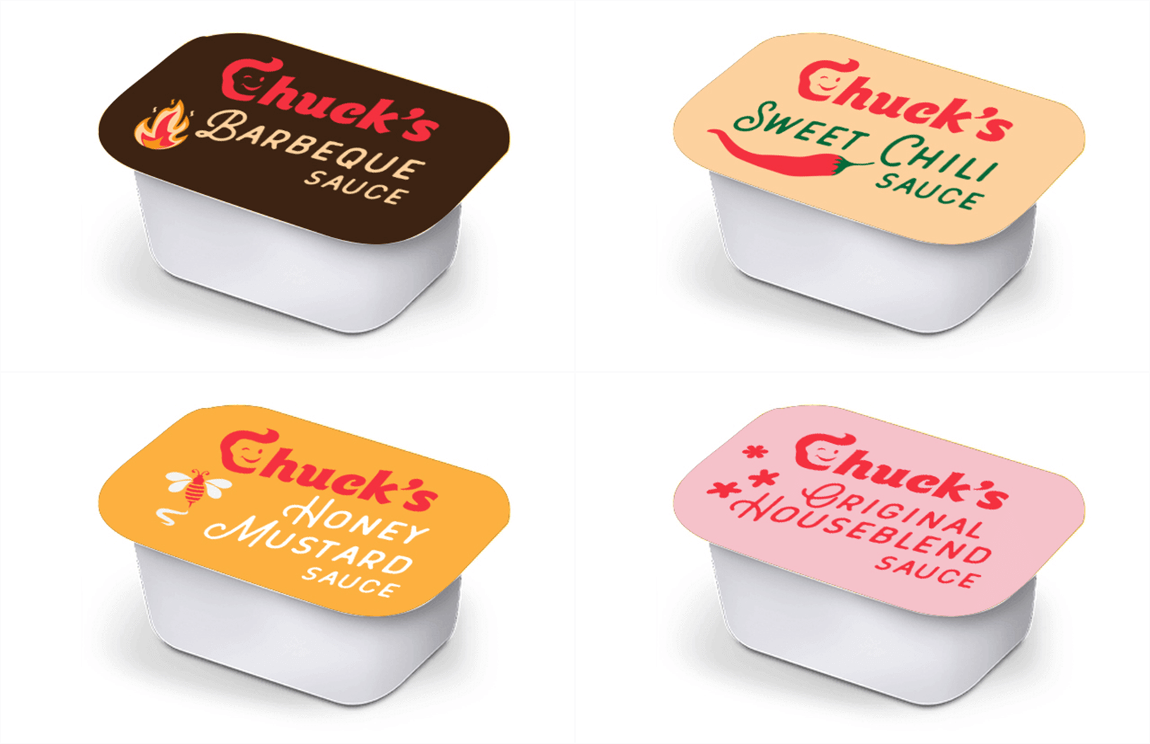
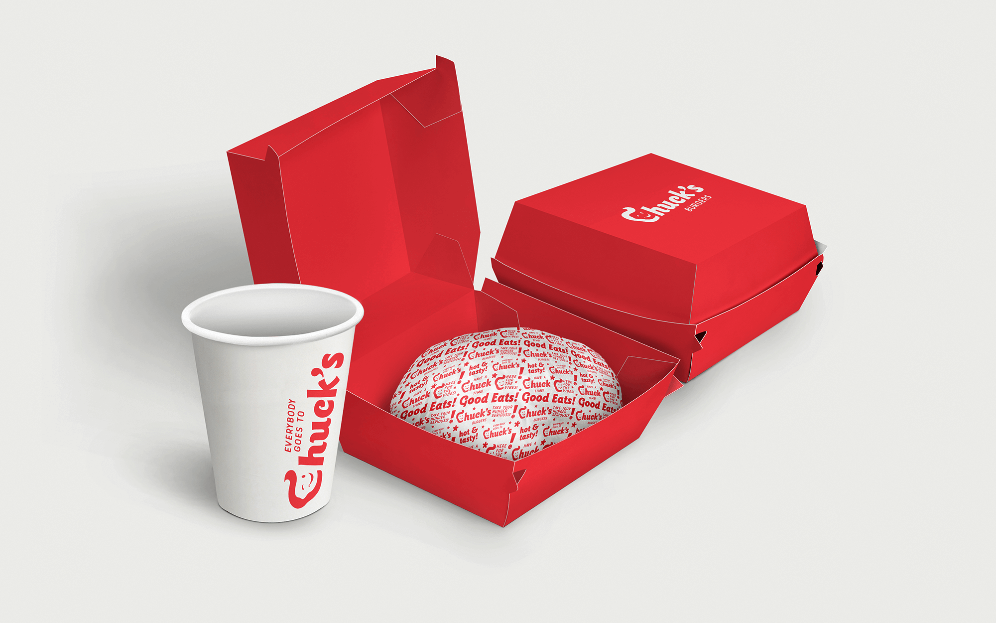
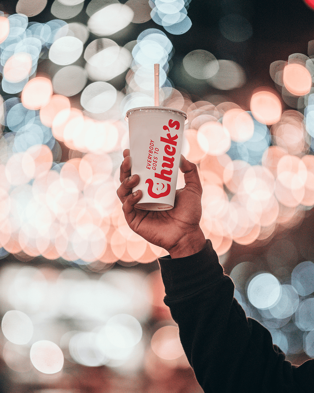
Chuck is basically the name of a guy. No newsworthy founder’s story here to highlight, but the immediacy we wanted to convey could be really served by the personal reference. This is how it was decided to create the outline of a face with the help of the first letter (C) of the brand. Somewhat childish, happy and inviting, it also incorporates a very 1950’s hairdo to further stress the authenticity dimension. We wanted to express an old school look and feel of the brand, but with the minimal design of “now”.
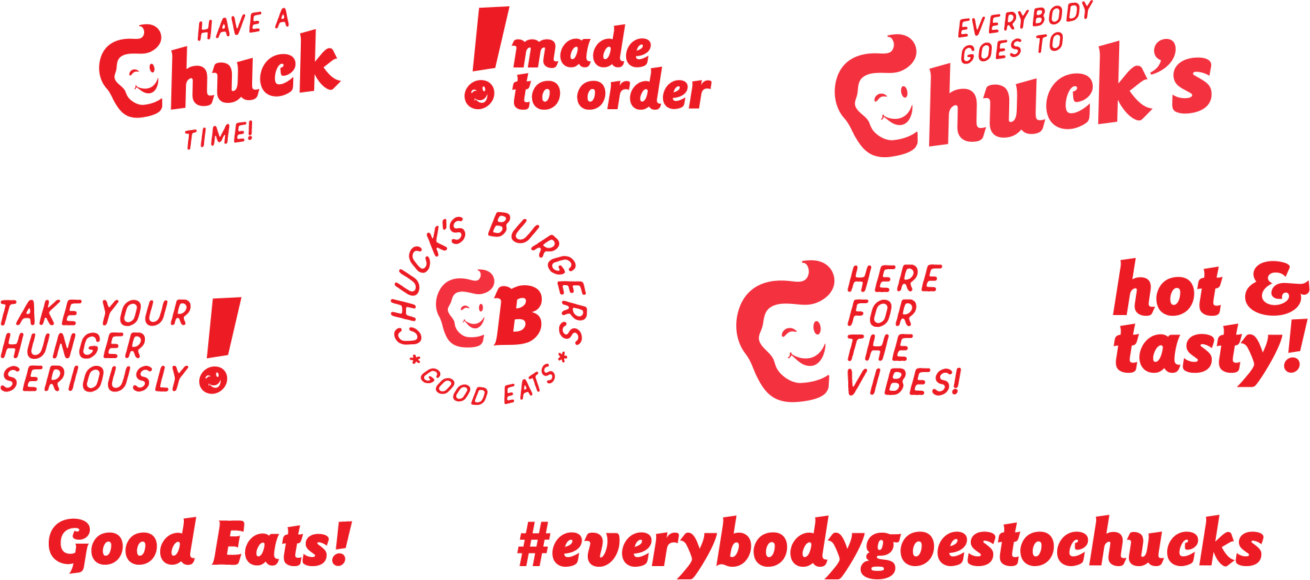
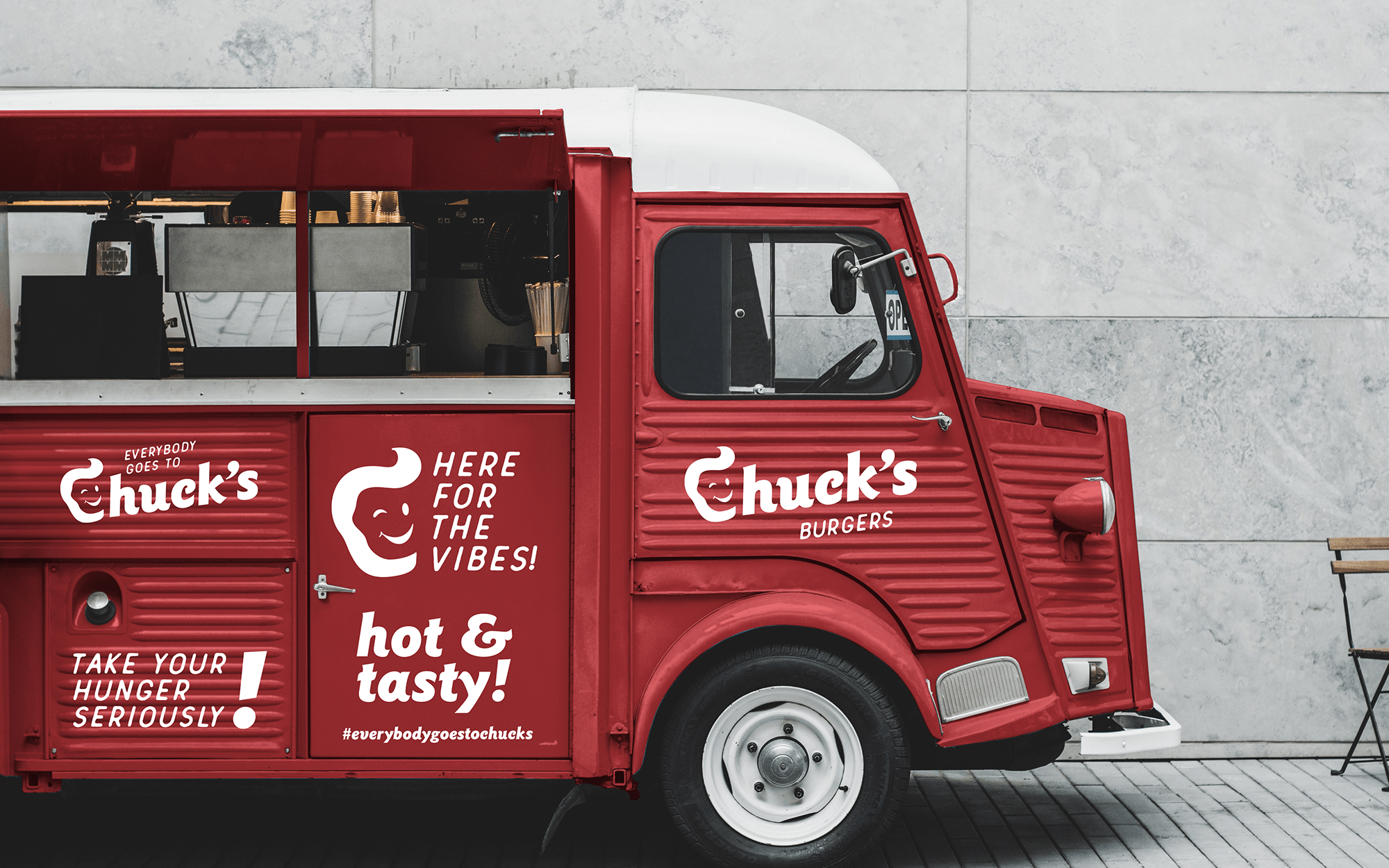
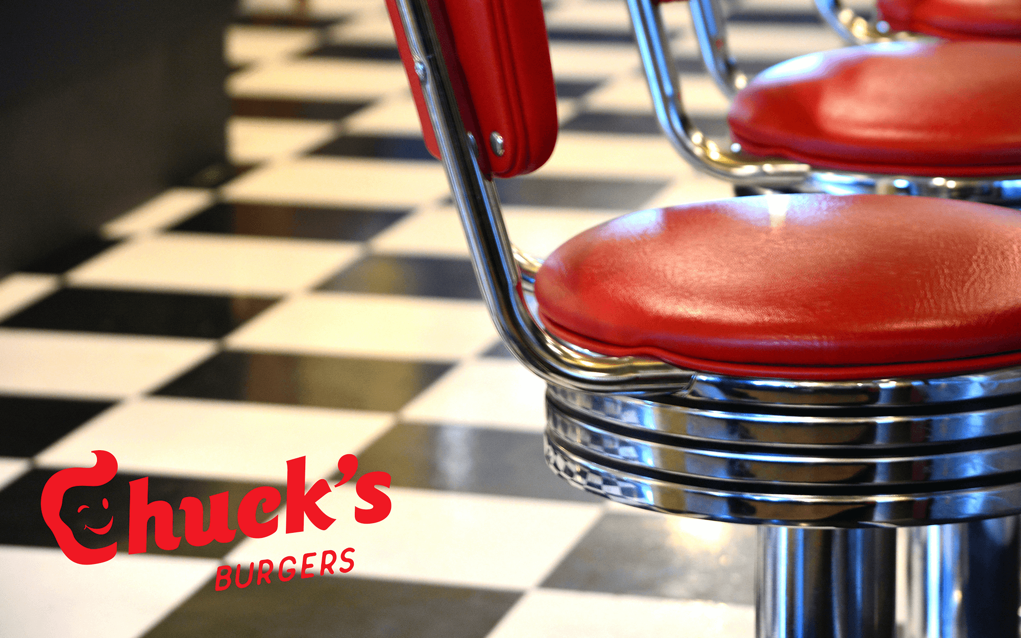
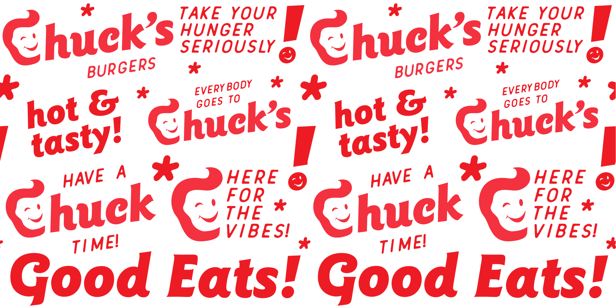
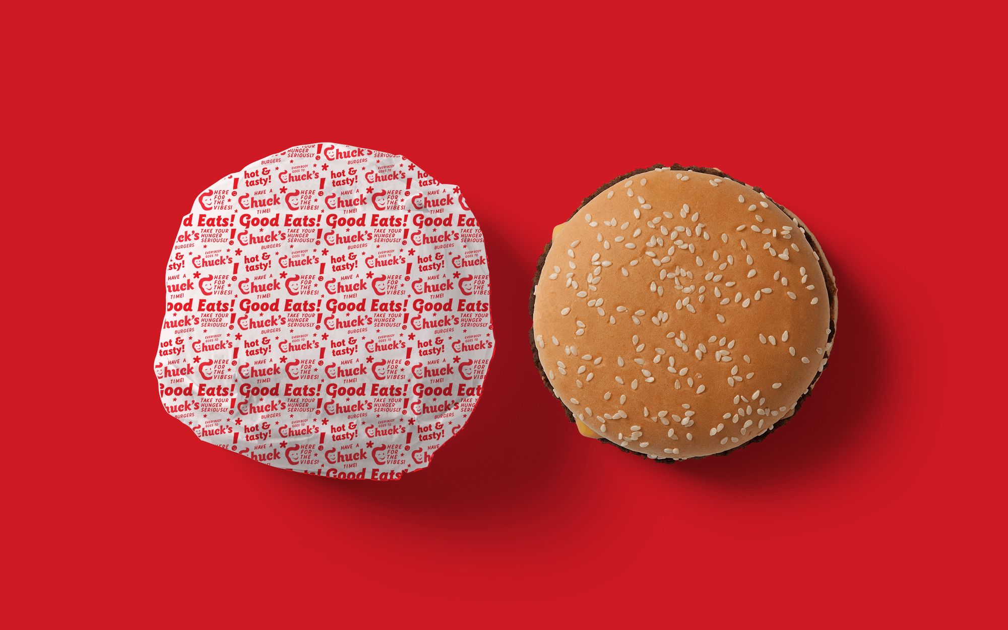
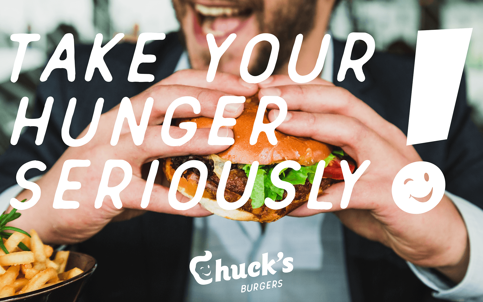
An old school typeface with vintage references works towards the same direction as well as the tone of voice used with various slogans and expressions. Bright red was the colour of choice for the brand that dominates the brand’s visual presence – archetypically fast-foody, full of joy and evoking strong and warm sensations.
