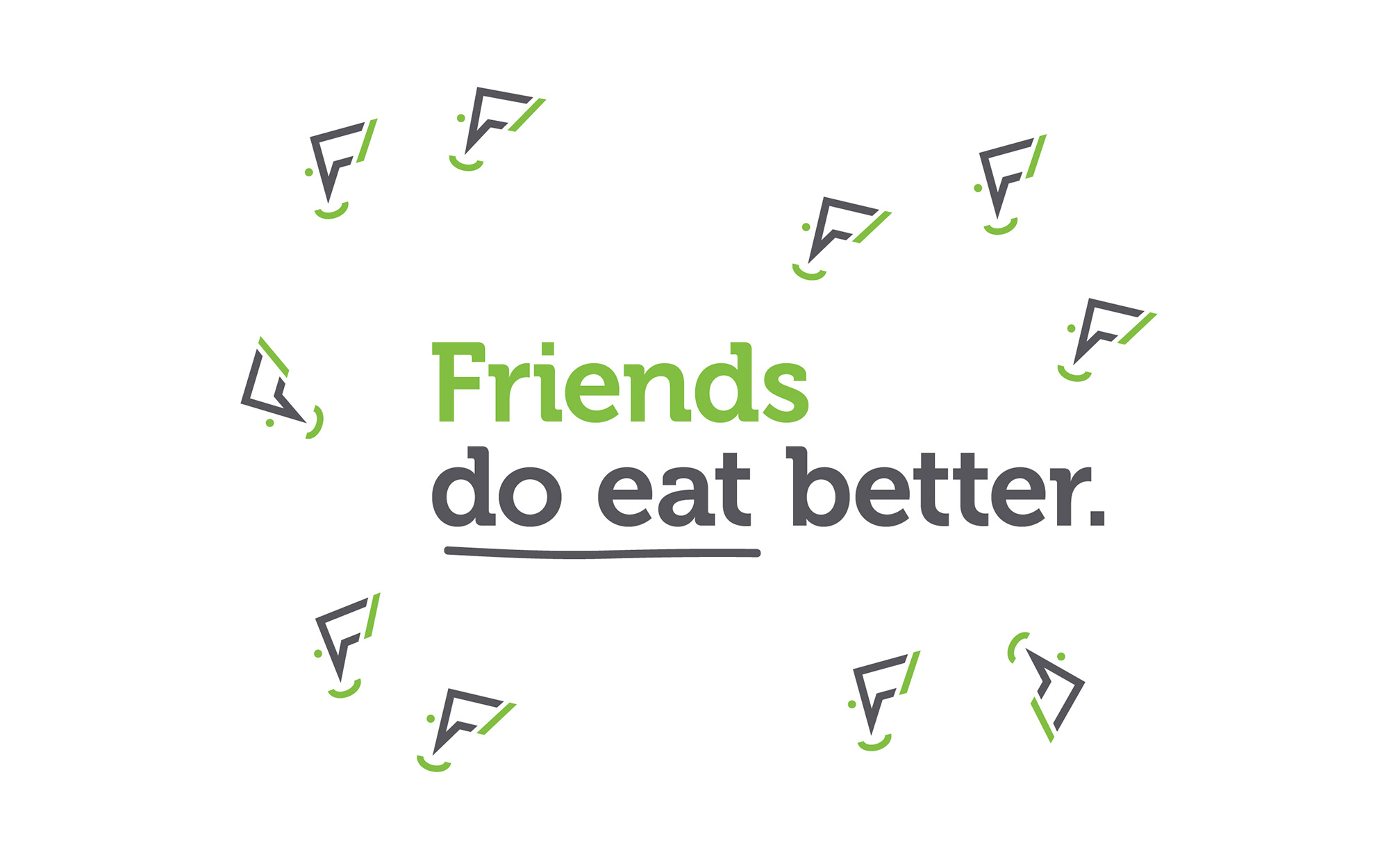
Friends do eat better!
BRIEF
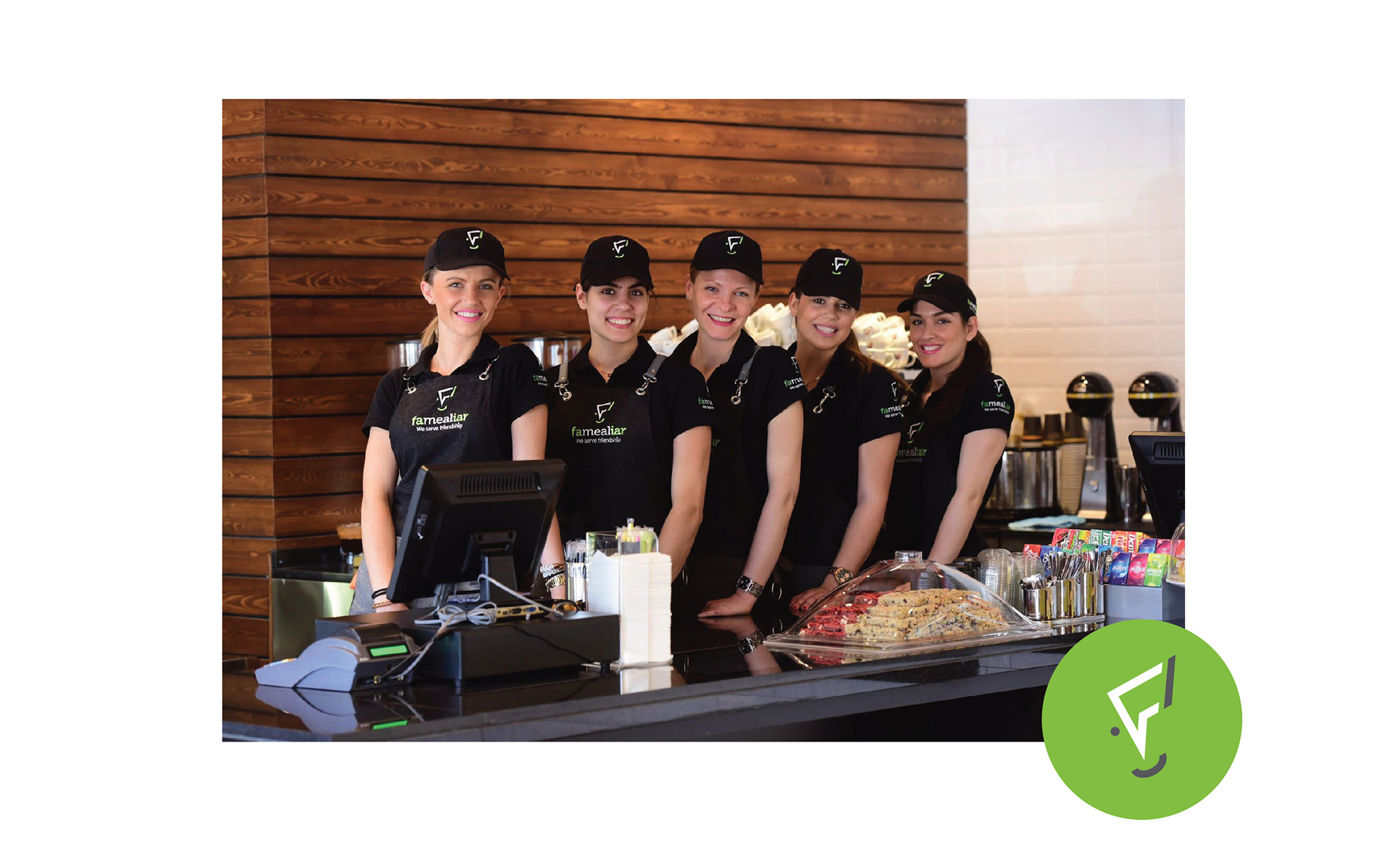
Our client asked us to create a brand (name and logotype) for a new chain of coffee/snack stores that focus on high quality products and friendly service.
NAMING
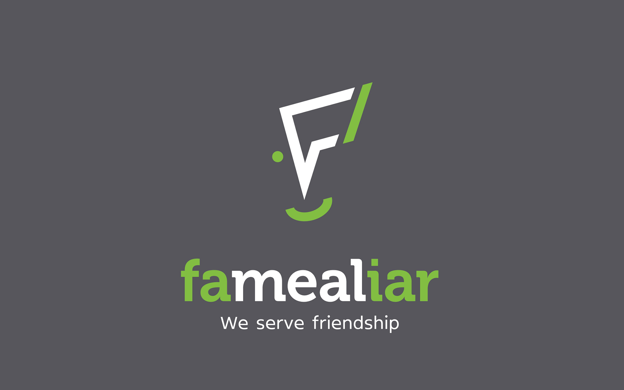
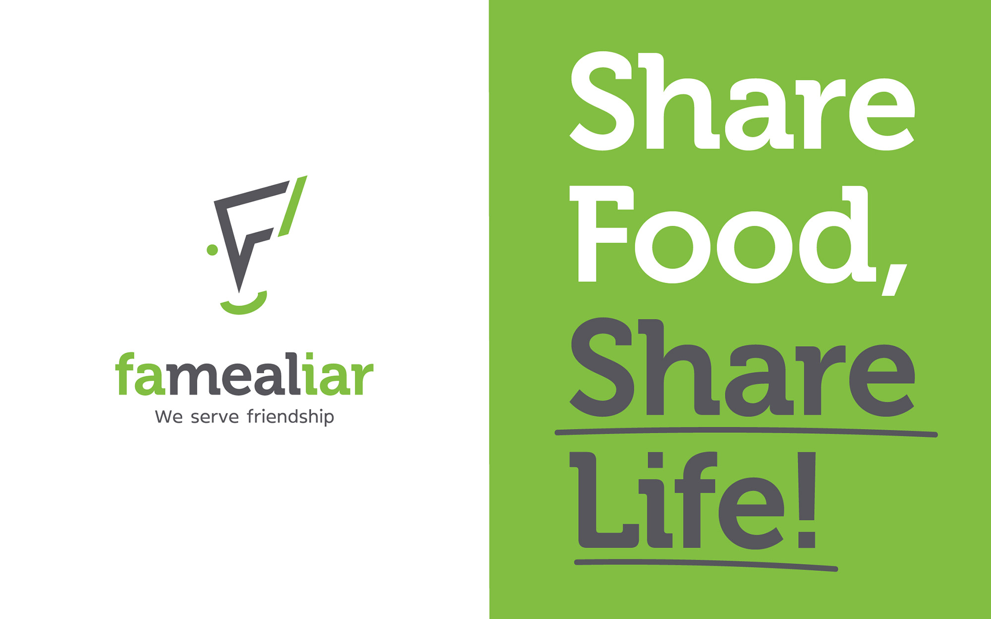
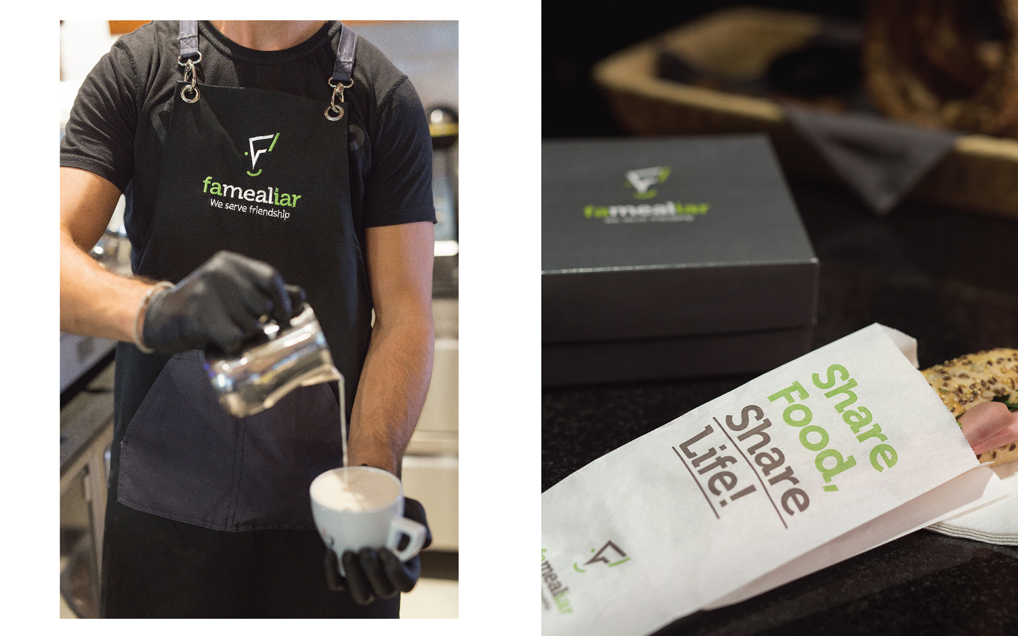
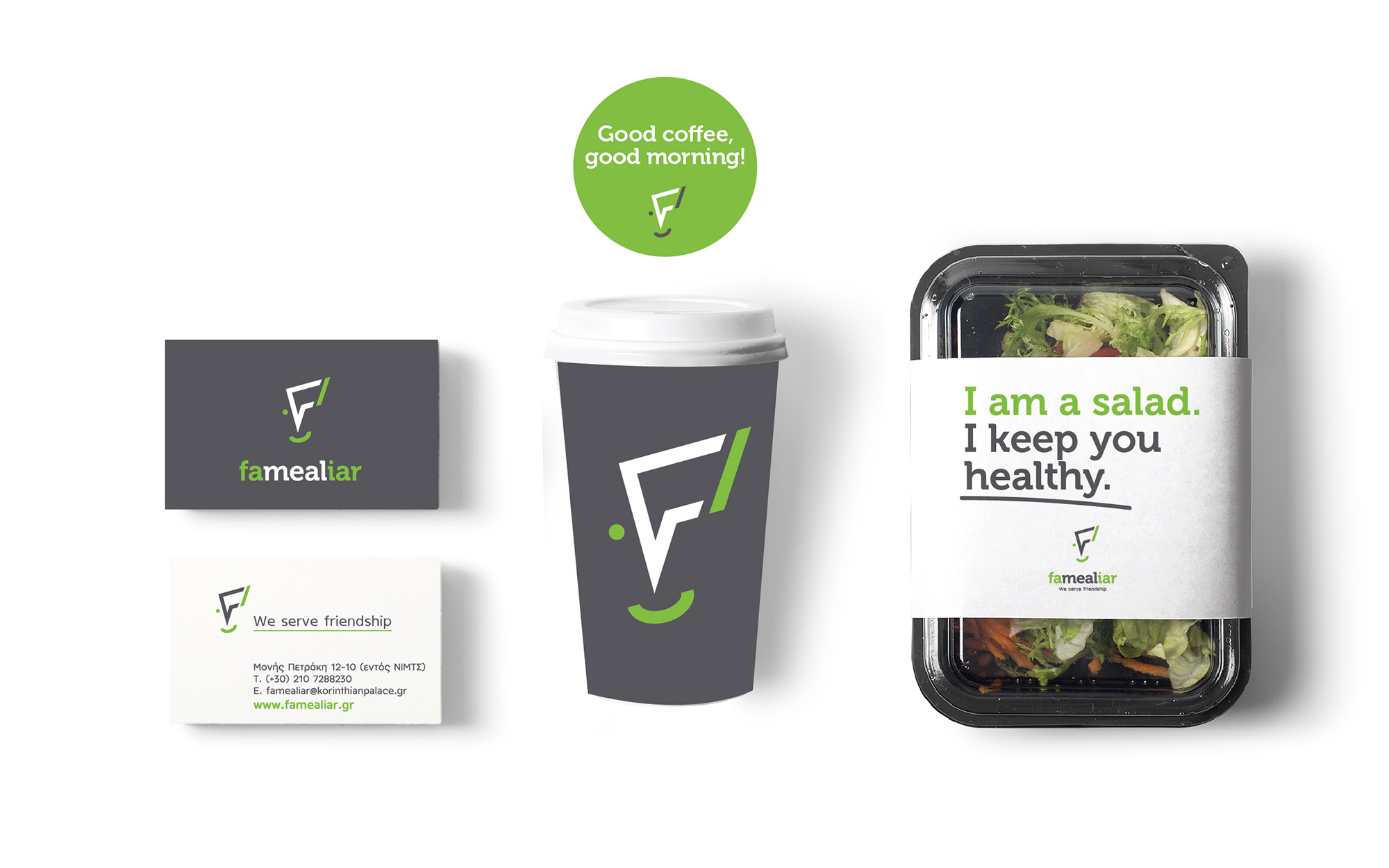
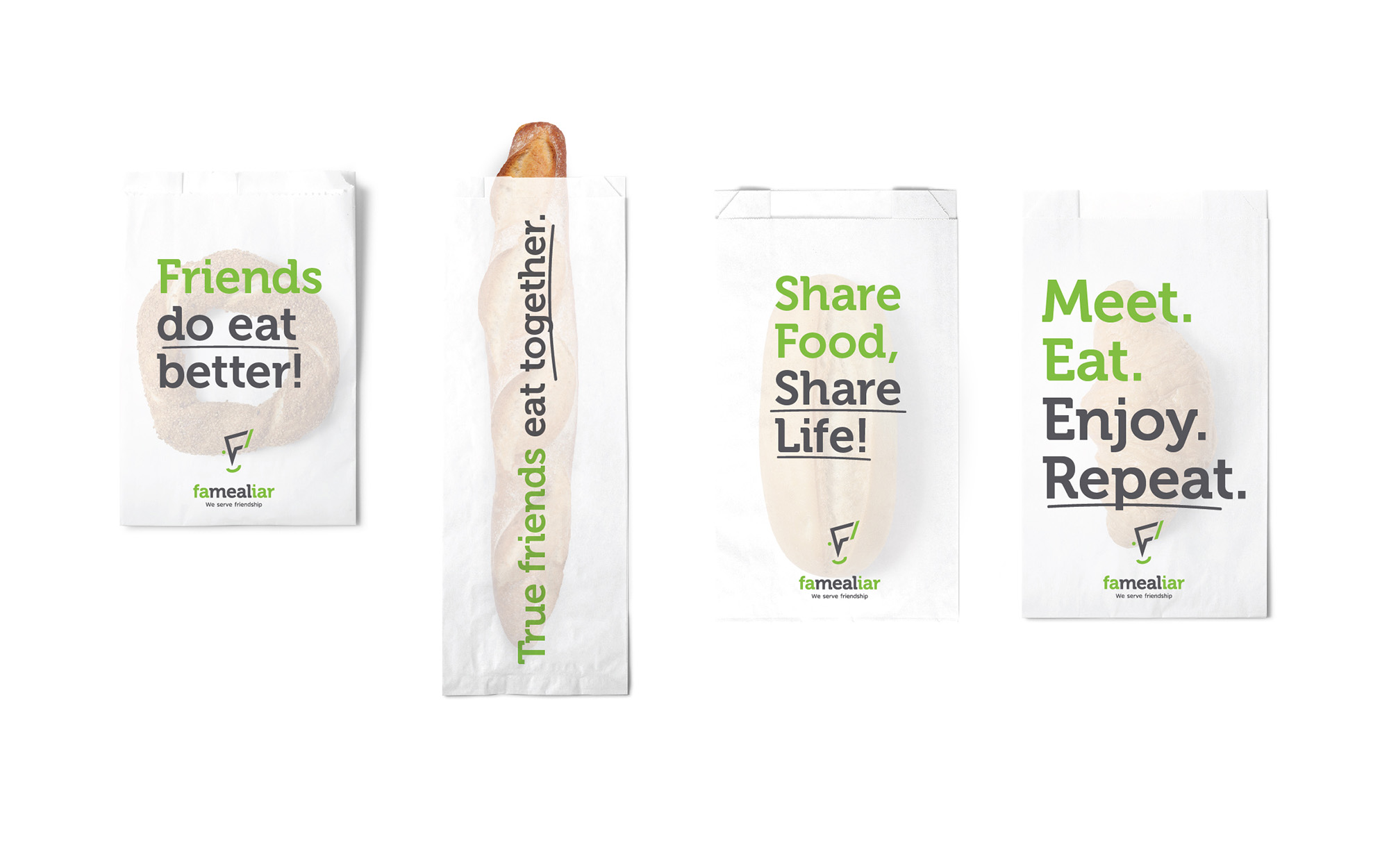
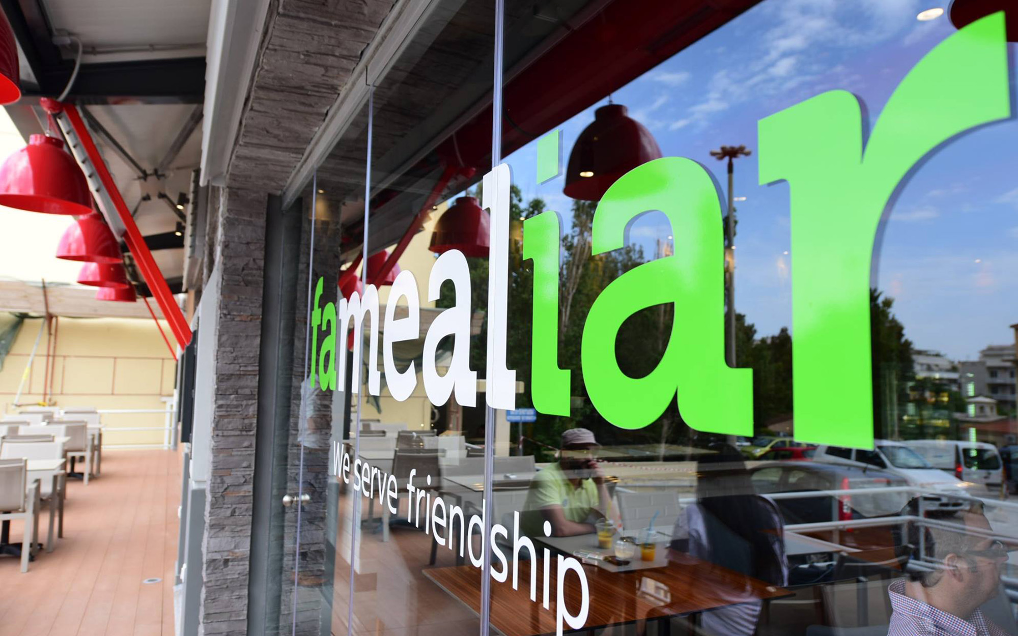
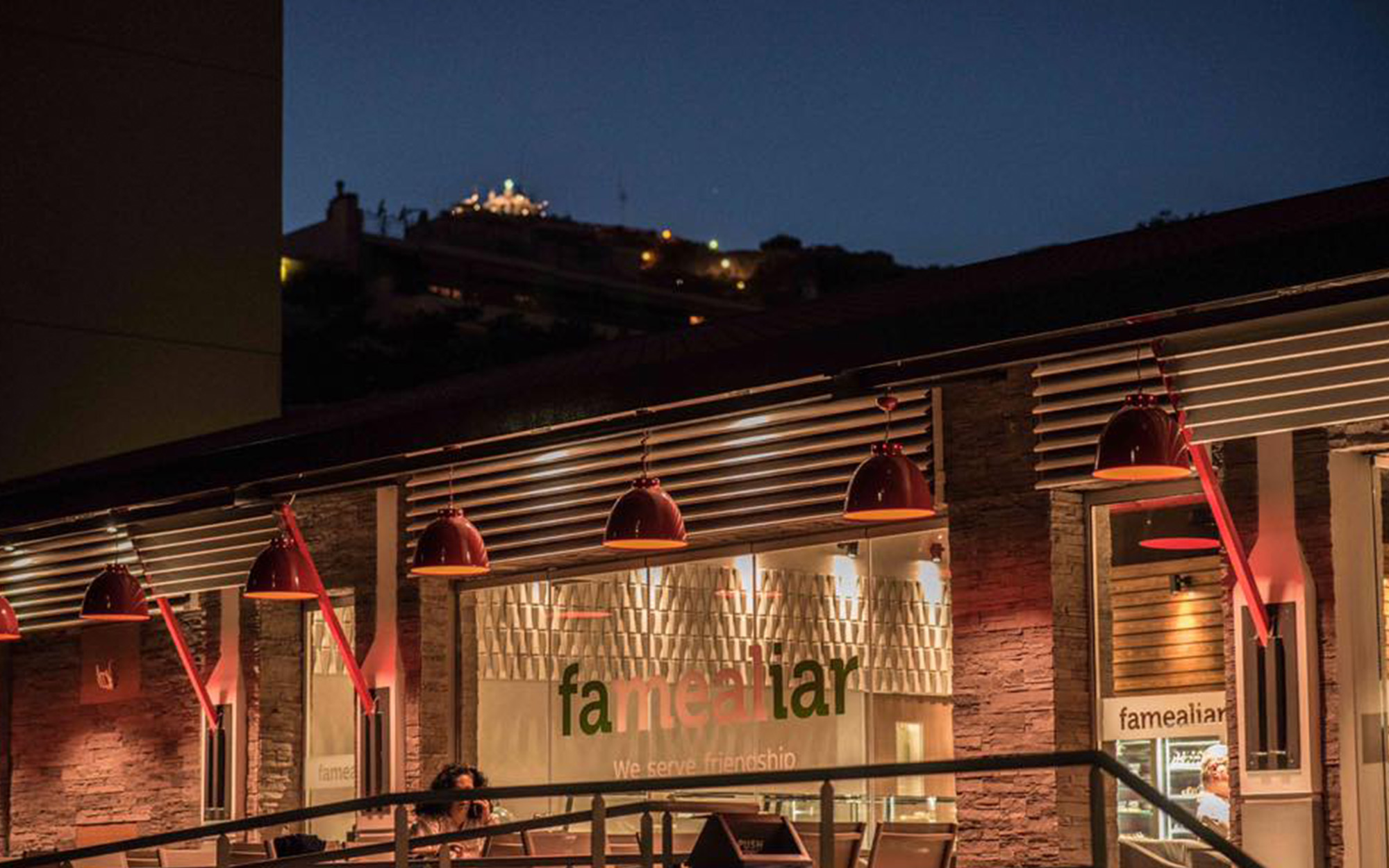
Since Greeks are brought up considering food as a sharing experience that creates bonds and familiarity between people and taking in mind that our client focuses on friendly (almost personal) service for each client, we decided to create a brand name that combines the concepts of familiarity and meal. And this is how the “Famealiar” was born. The slogan “We serve friendship” further emphasizes on the friendly service and since we aimed on making the new snack-café a meeting place for friends and families, we extended our copy strategy on the printed material the clients come in contact with: “Share food-Share Life”, “Friends do eat better”, “Smiles are always on the menu” etc.
DESIGN APPROACH
Familiarity, sharing, conversation and good mood, these four values inspired the creation of our overall design and logotype. A talking bubble based on the initial letter F (famealiar) with the help of a curve and a dot becomes a smiling face that incorporates our strategy. The simple and clear cut design, along with the use of flashy green, dark grey and white create a modern brand that disrupt and, we might say, refresh the way coffee-snack stores usually communicate with their target group. We believe that the general aesthetic treatment along with the high quality of products and services will turn visitors to regular clients.
SERVICES
Brand name, logo, visual identity

Concept & Design: Sophia Georgopoulou
Brand Name & Copy: Nikos Vlachogiannis
Photography: George Pavlakos