A tribute to Mother Earth
Miterra is a company that constantly searches every corner of Greece in order to locate the best products this land has to offer. Miterra’s mission is to bring to its customers the quality of goods that local producers reserve for their own family table and the company’s pledge to her customers is that only the very best are good enough to carry the Miterra brand.
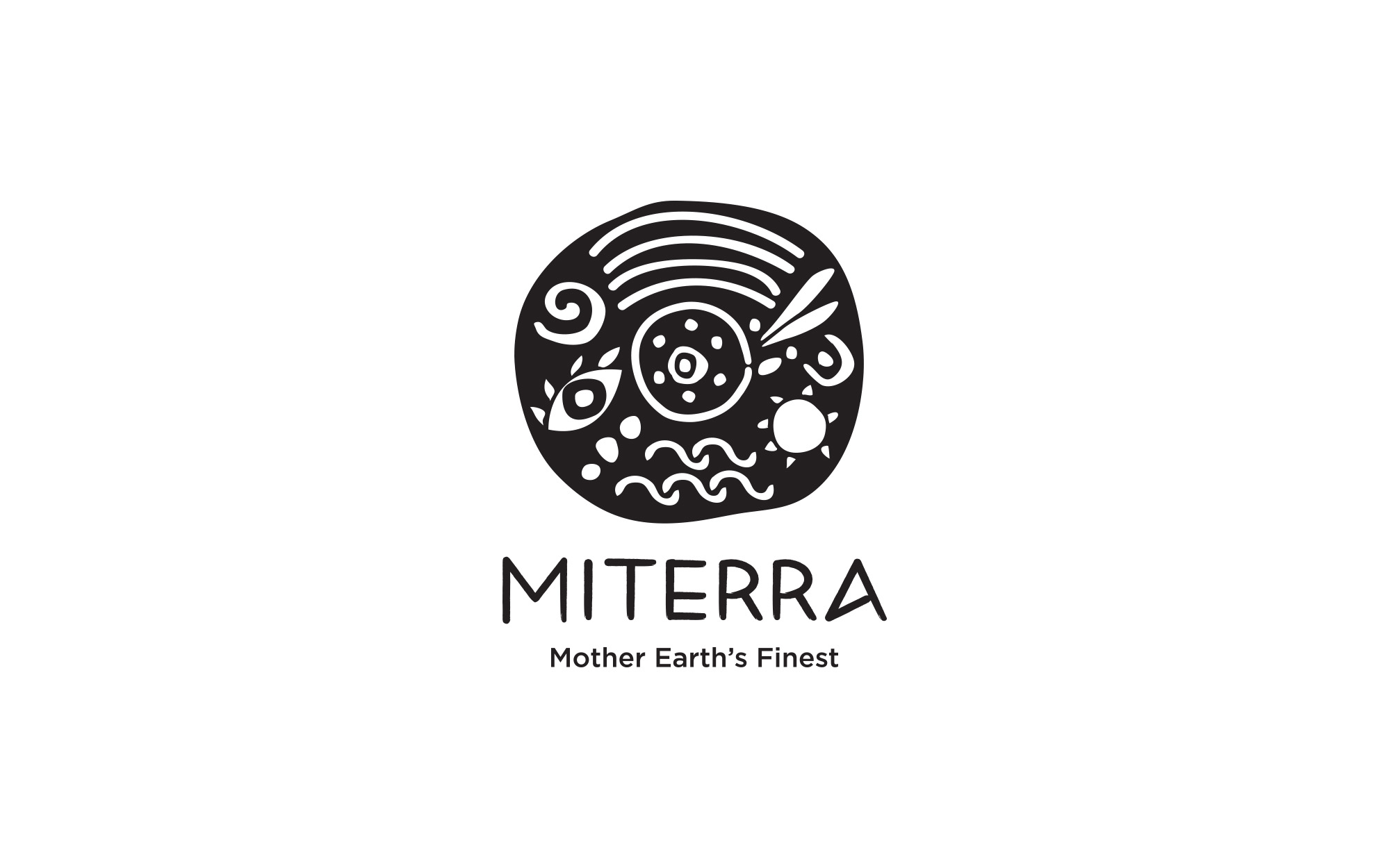
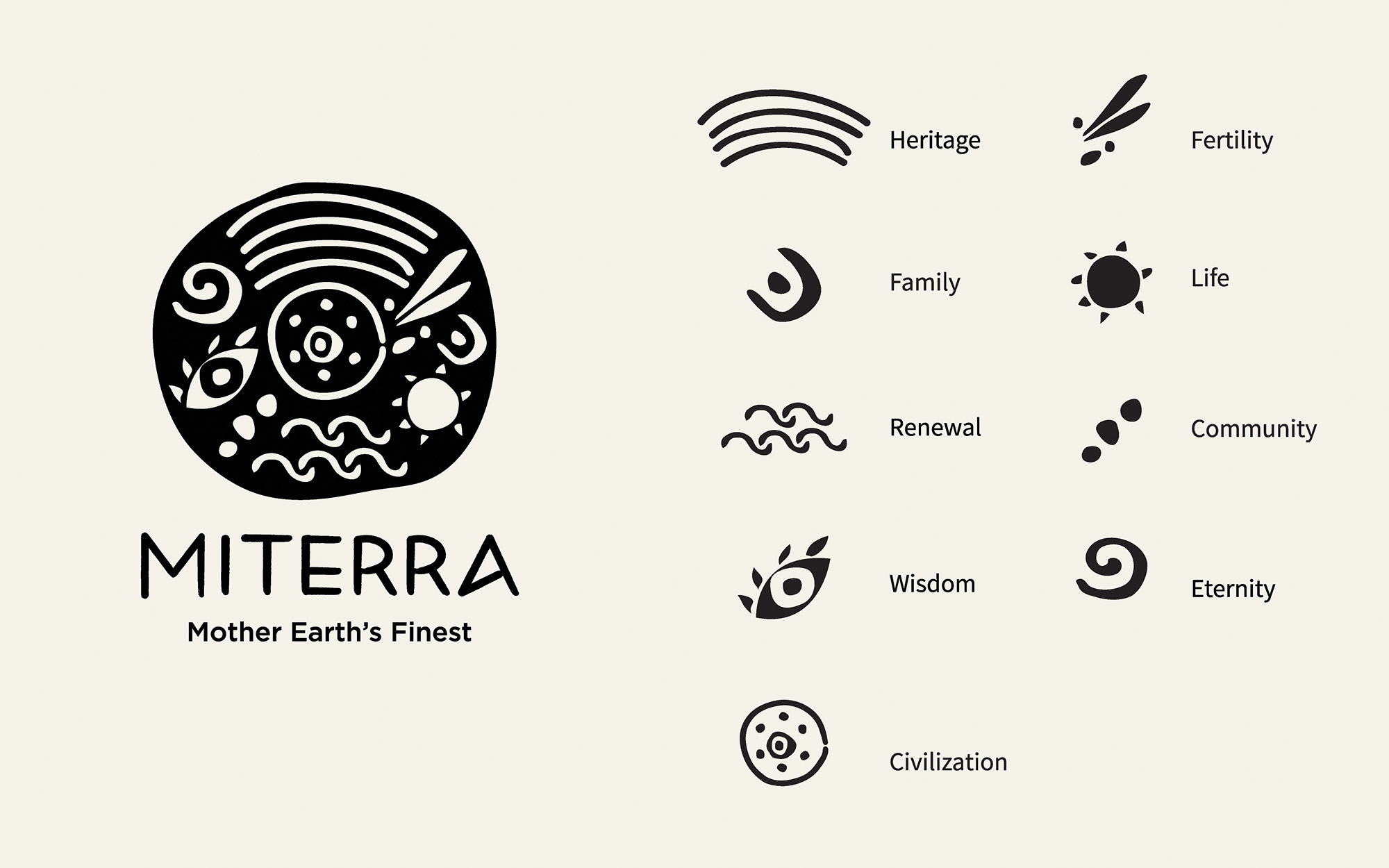
The name, Miterra, ‘mother’ in Greek, is a tribute to Mother Earth for all the wonderful gifts she has bestowed to this land and serves as a namesake to the mother archetype which is shared across the planet irrespective of culture, ethnicity or religion.”
DESIGN CONCEPT
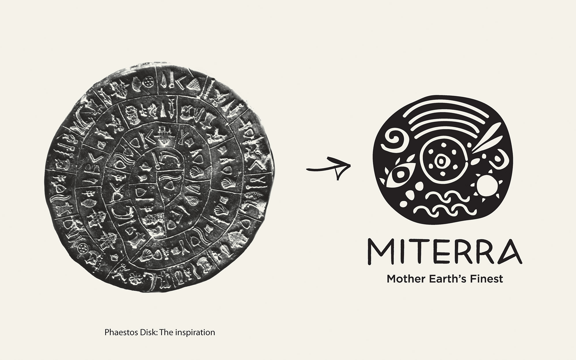
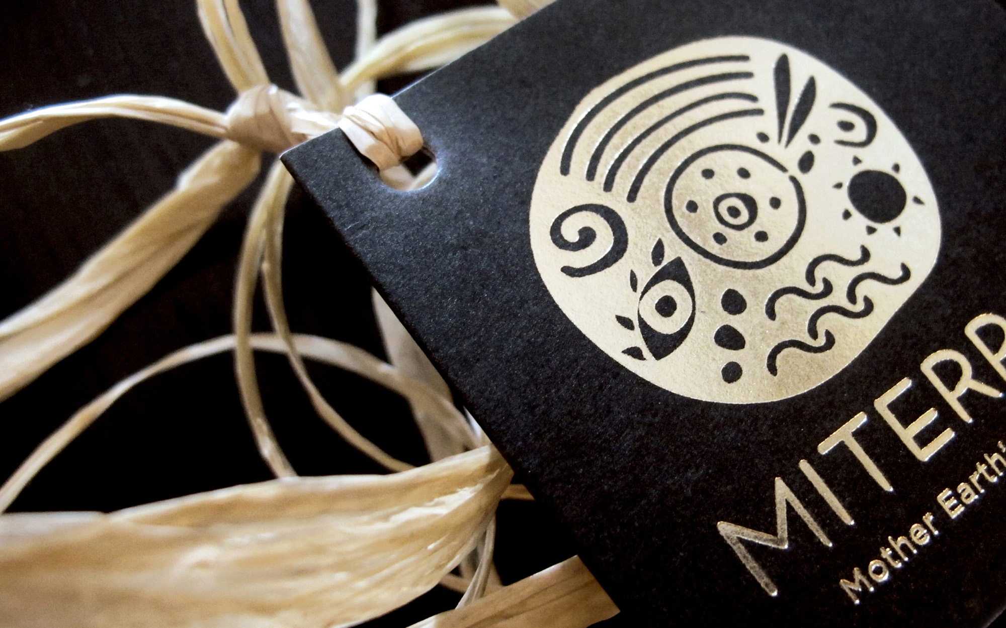
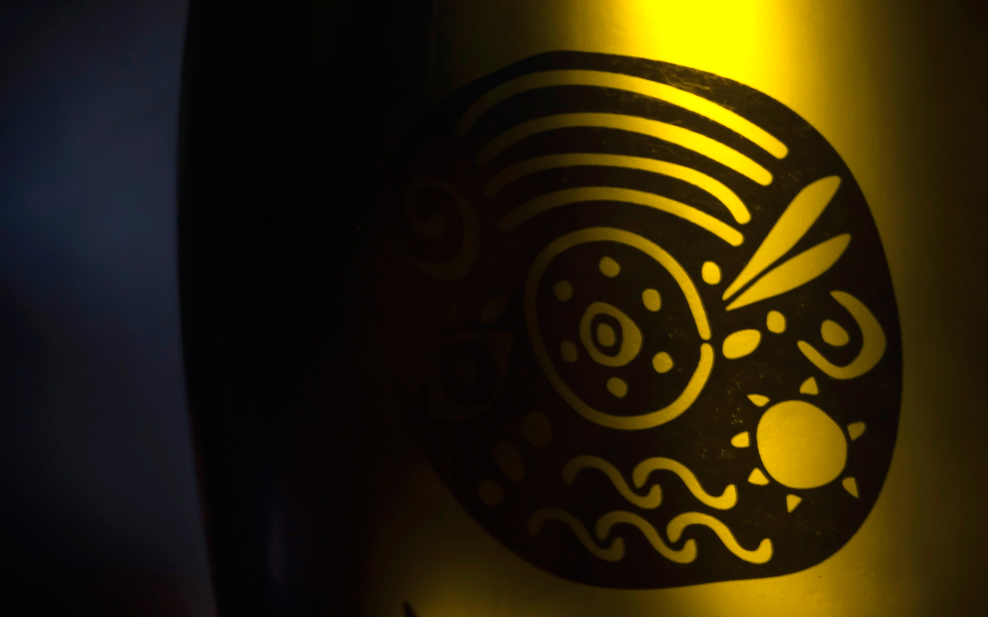
The design concept behind “Miterra” was to create a premium brand that sells the best products that Greece has to offer. The symbol of the logo expresses the values, the history and the Hellenic culture using well known symbolism and it was inspired by the Phaestos Disk and its signs. The logo is strong, sentimental, austere yet easily recognizable as Greek, without being cliché.
Miterra Olive Oil
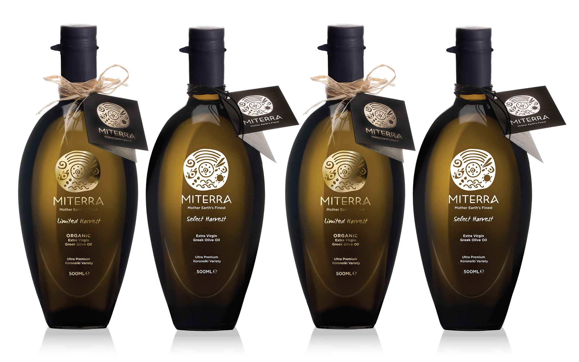
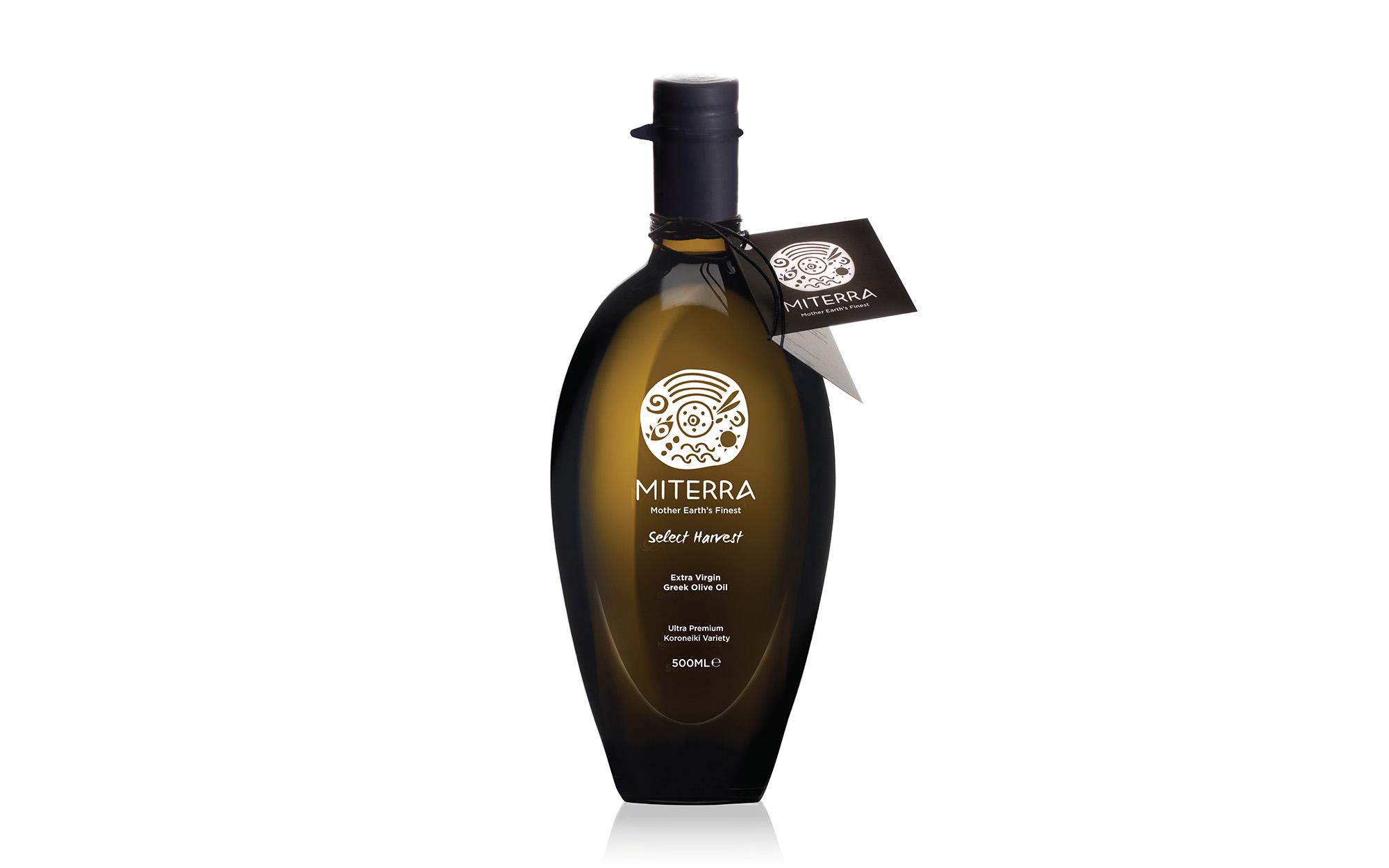
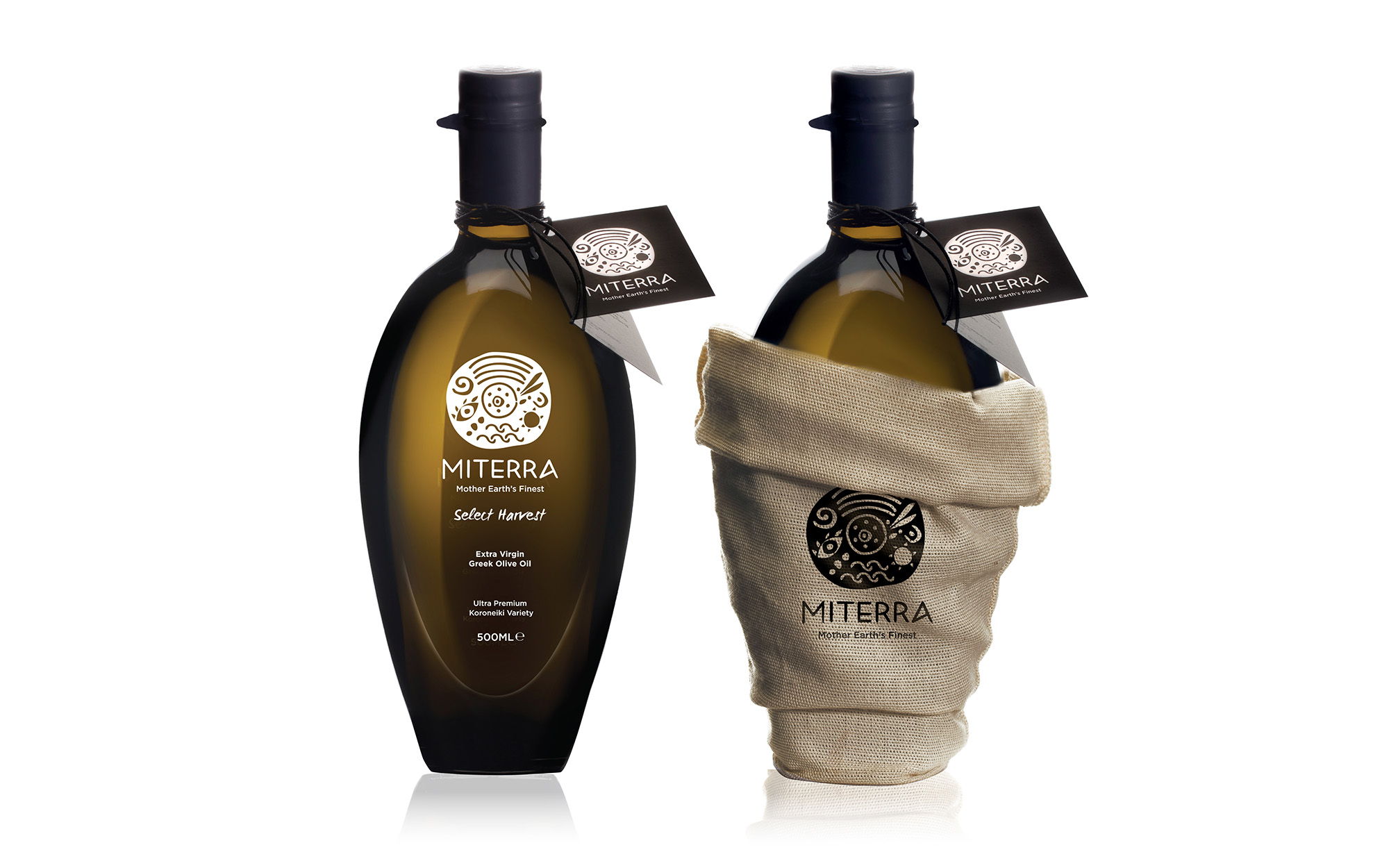
As Miterra’ s main audience is foreign audience and cultures, the main concern designing the olive oil packaging, was to express the ultimate value of an age old product of the Greek land, with elegant and premium design. Two olive oil variants were designed: The gold “Limited Harvest” and the white “Select Harvest”. The unique-shaped bottle (that looks like an olive fruit) reinforces both the premium identity of the product and the brand.
SERVICES
Logo, visual identity, packaging
Client: Miterra Natural Products
Concept & Design: Sophia Georgopoulou
Photography: Vice Versa
Copy: Konstantinos Kontinos
*some of the symbols of the logo were created by Milk Branding Professionals