Quick Bites, Big Smiles!
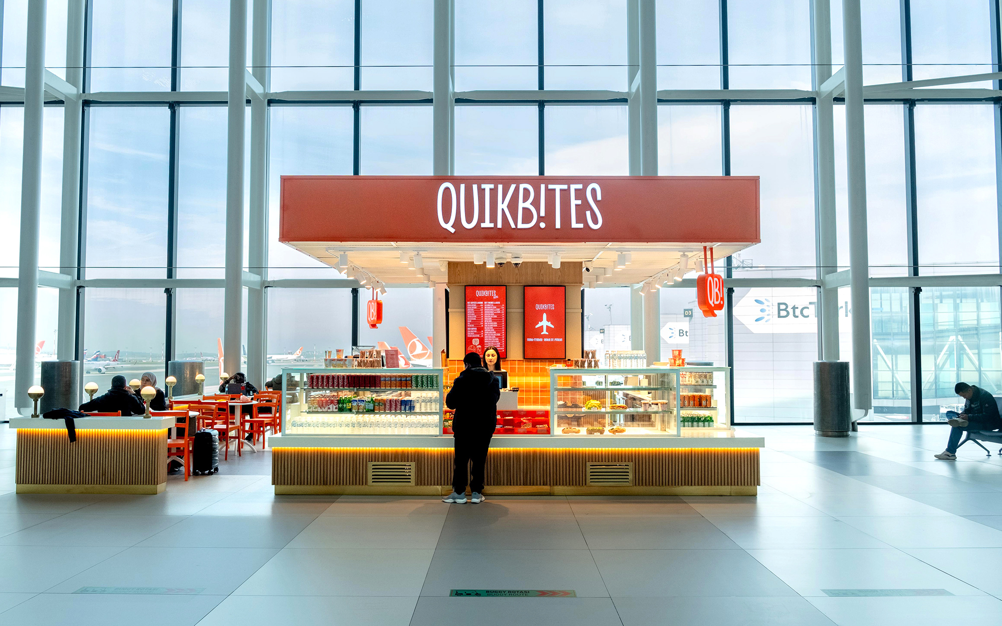
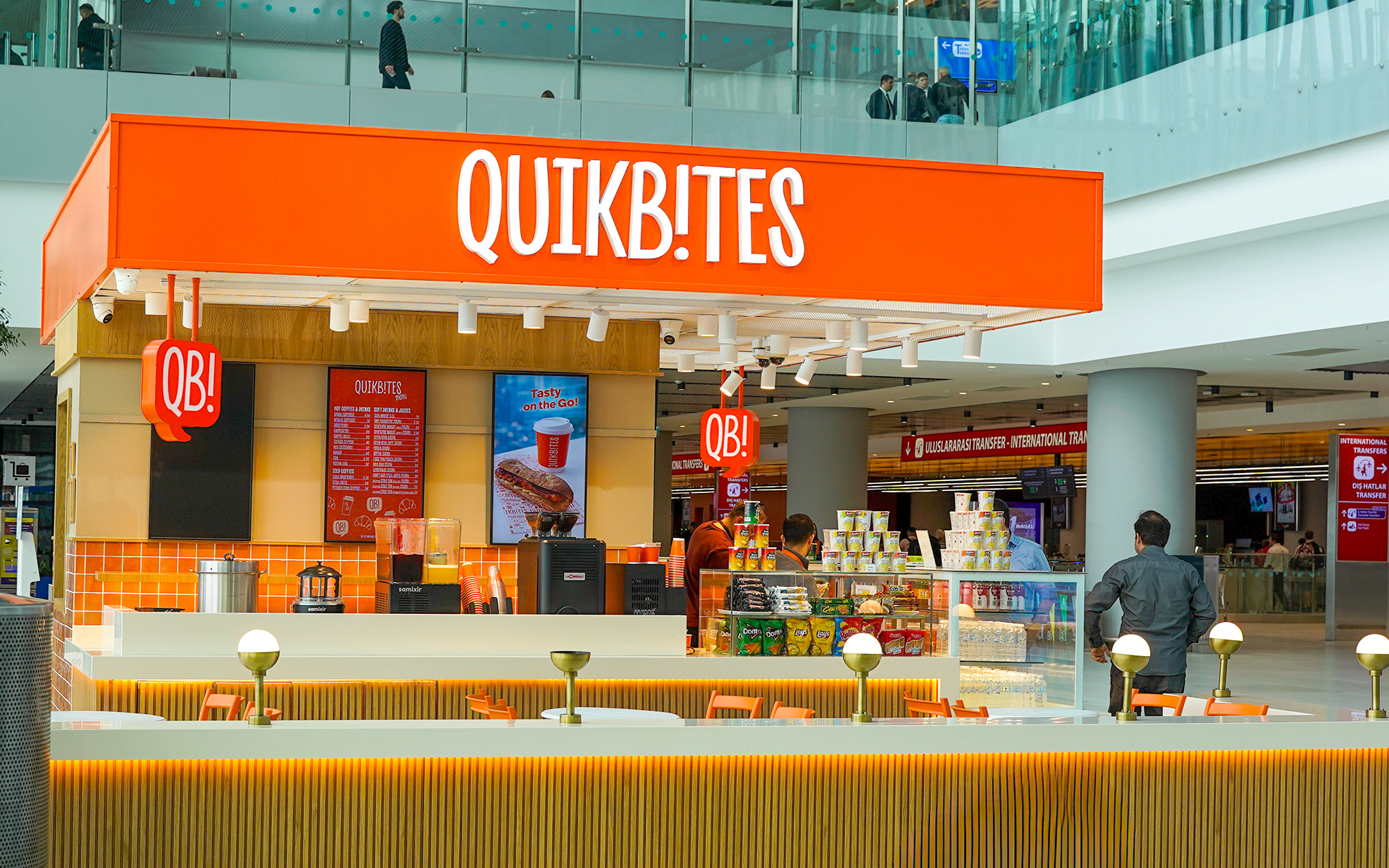
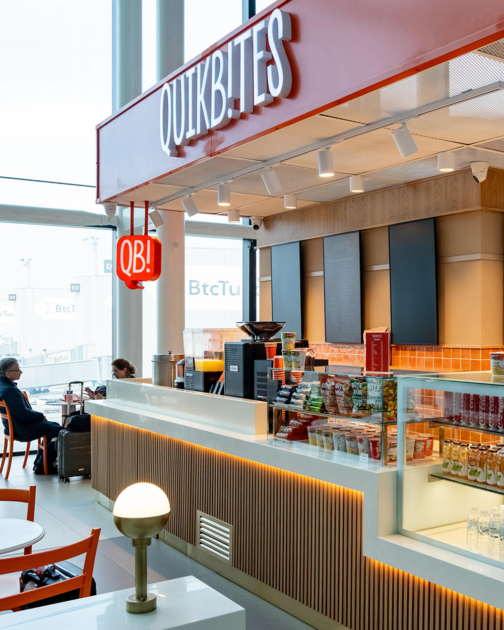
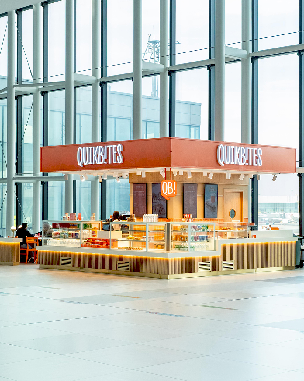
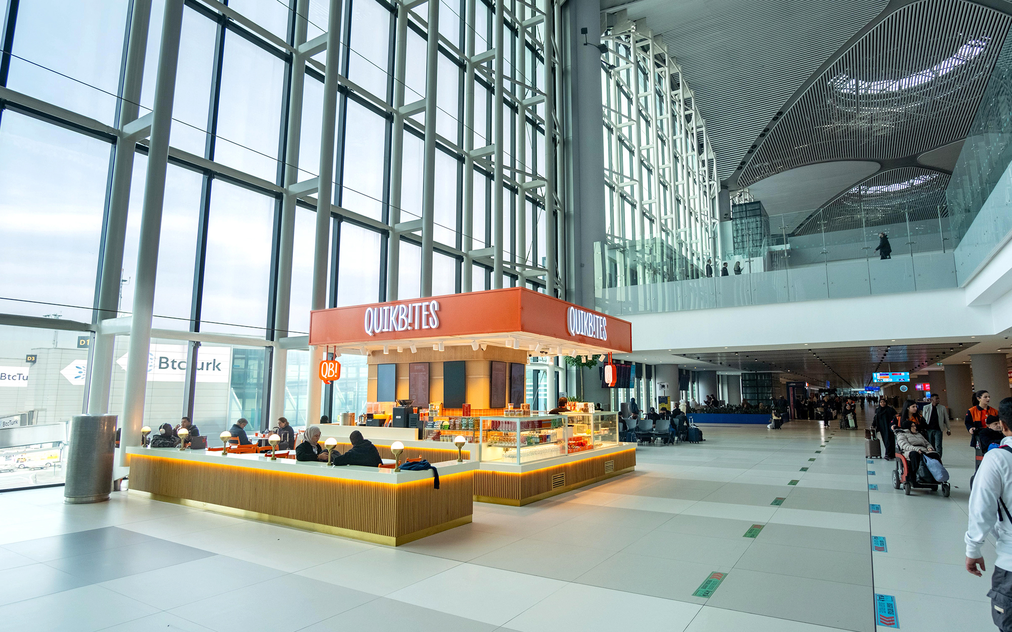
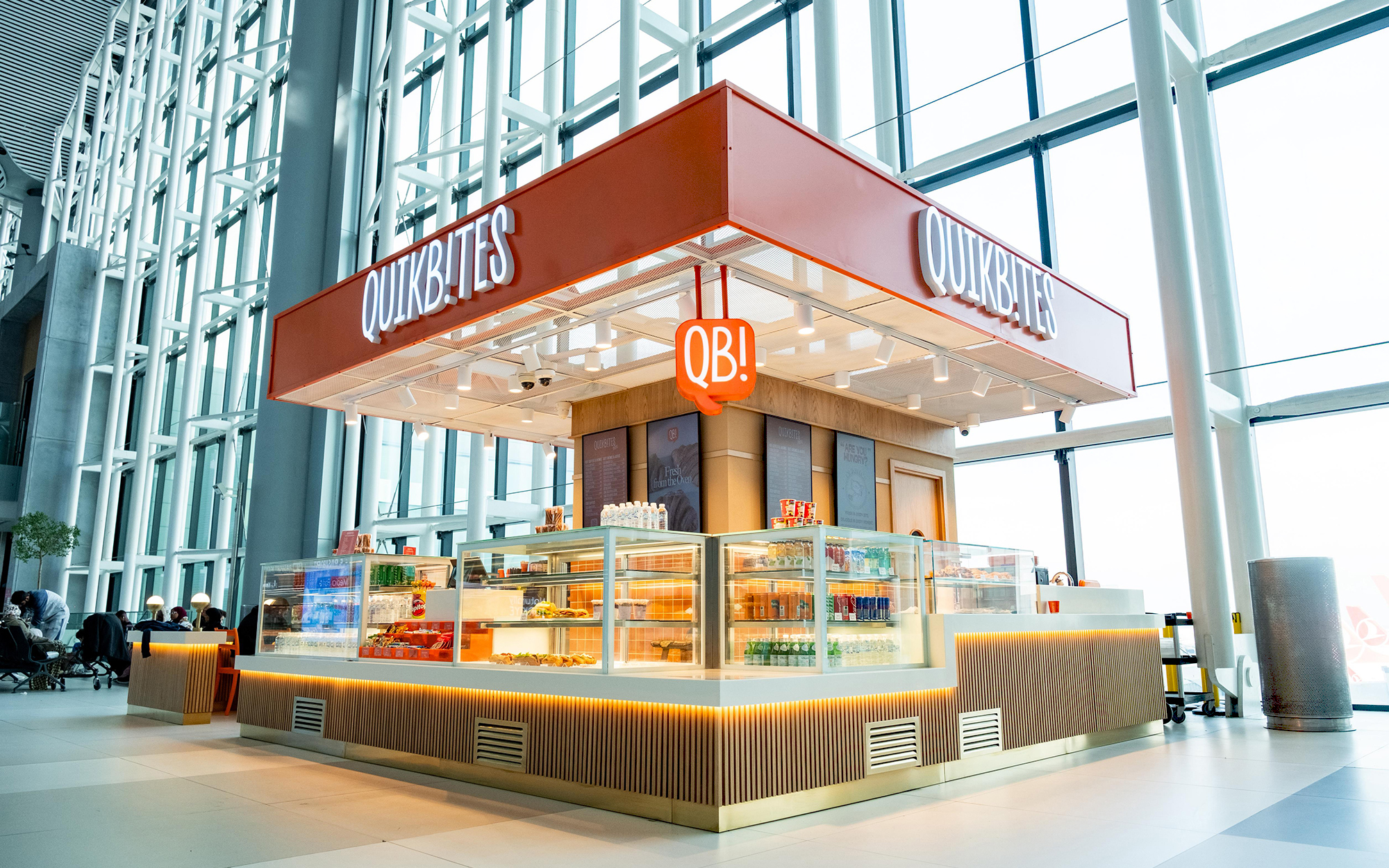
Quik Bites is a grab-and-go food concept designed for the fast-paced environment of Istanbul Airport, offering travelers a quick, convenient, and enjoyable food experience while on the move.
The visual concept is built around the idea of making travel moments feel lighter, friendlier, and more approachable. Inspired by the energy of airports and the spontaneity of travel, the brand combines speed and convenience with a playful personality that stands out in a busy transit environment.
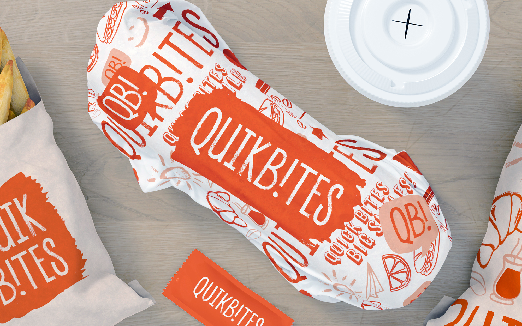
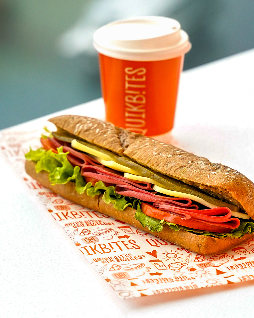
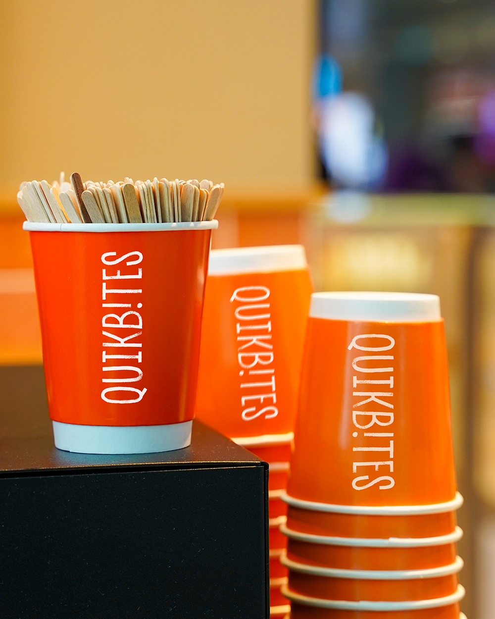
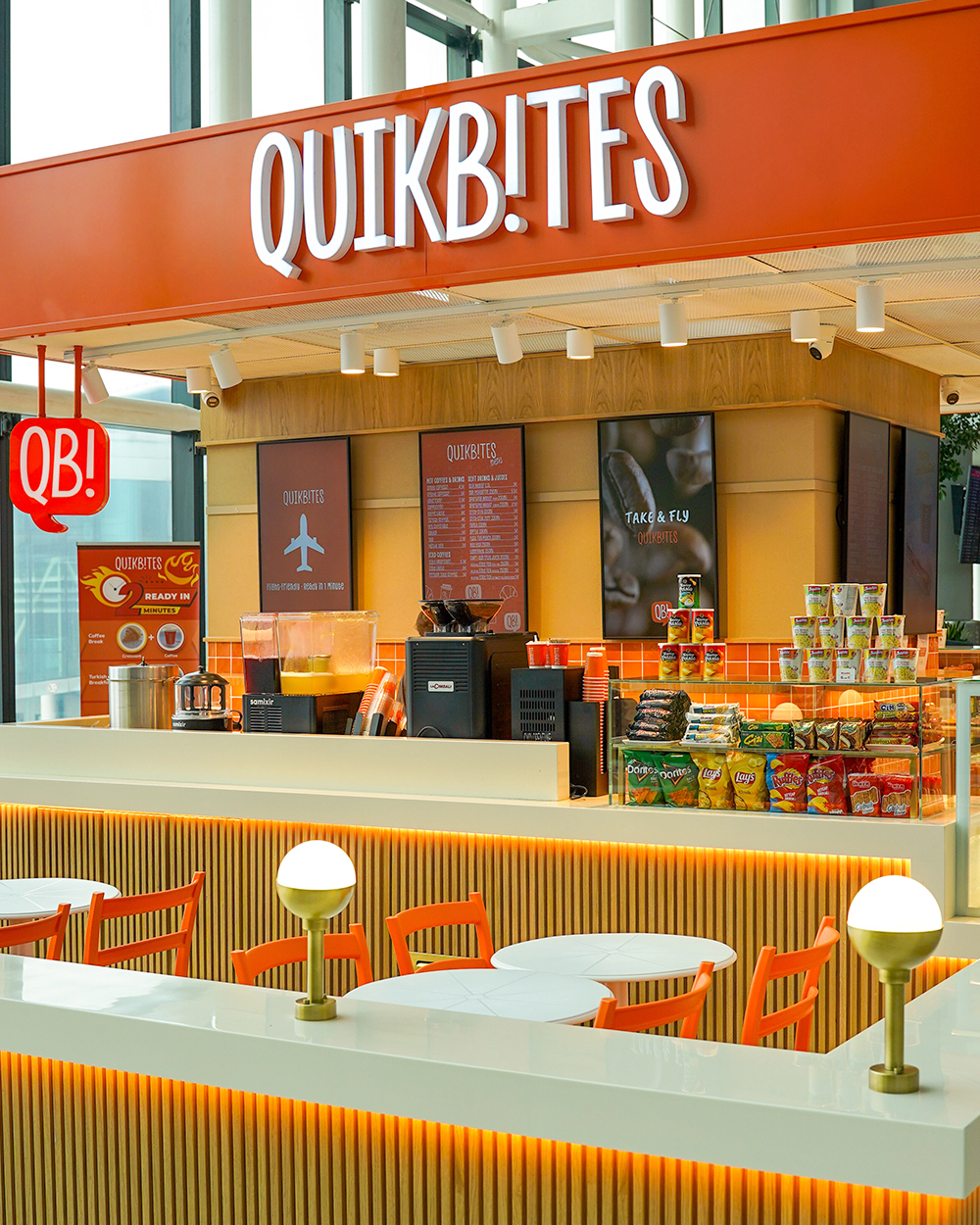
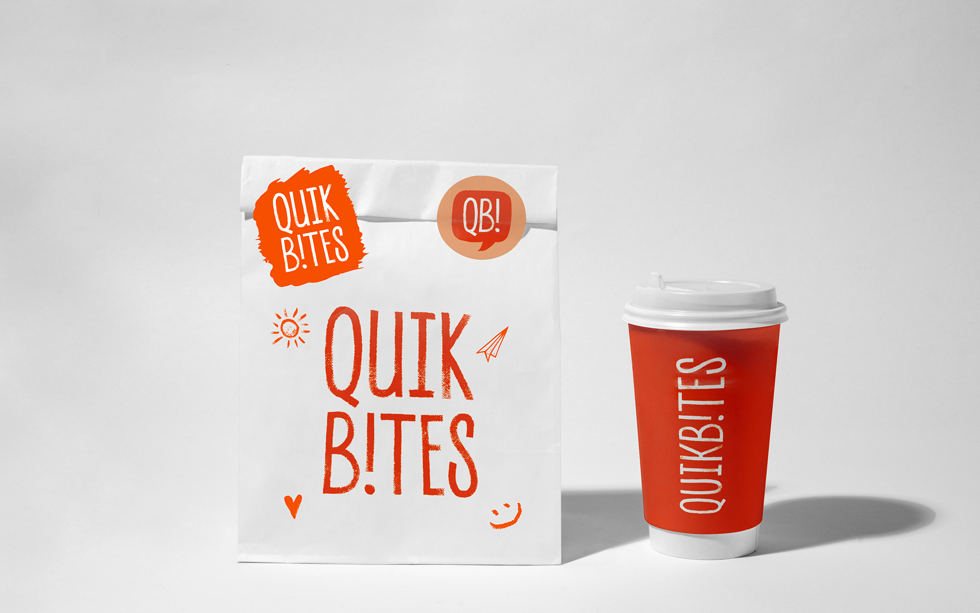
The identity is centered around a vibrant orange color palette that communicates warmth, appetite, optimism, and visibility. In a large-scale airport setting, the bold use of color helps create a strong visual landmark while ensuring instant recognition from a distance.
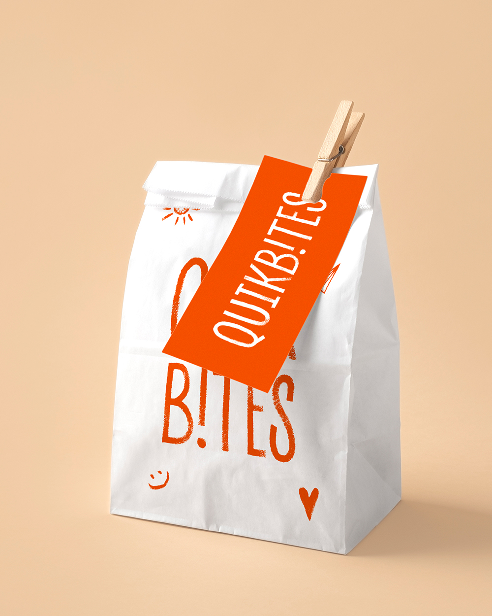
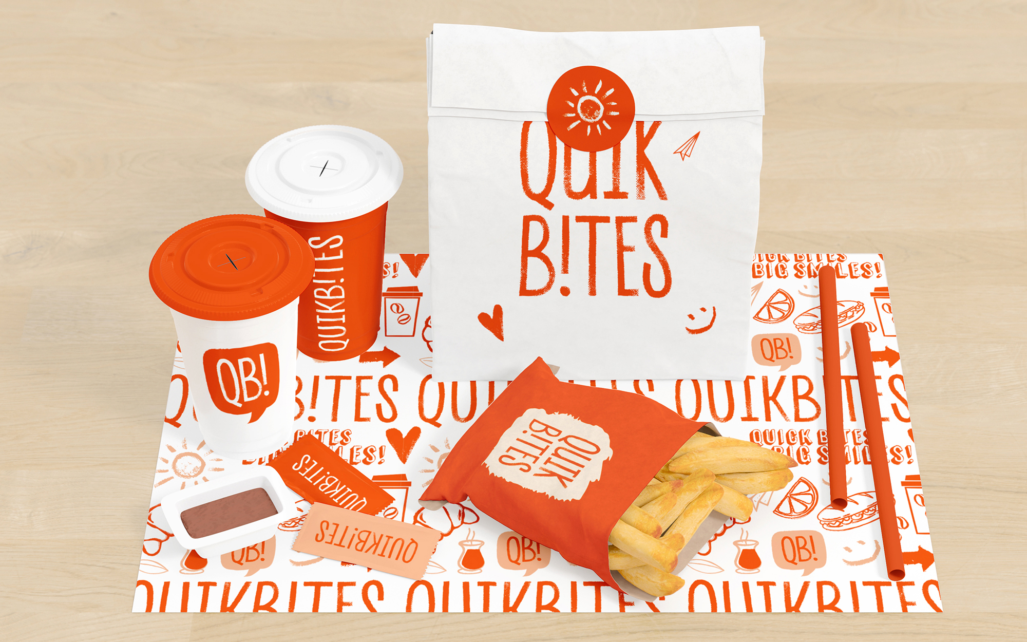
Hand-drawn illustrations and expressive graphic elements bring the brand to life through a playful visual language inspired by travel and food culture.
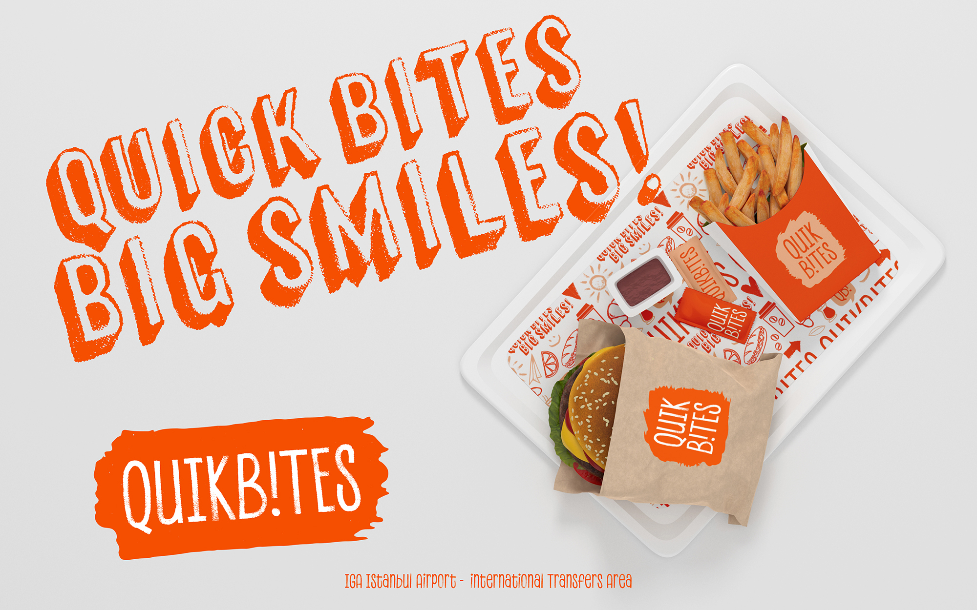
The logo reflects the brand’s energetic and approachable character through a custom wordmark with tall, slightly irregular letterforms that feel human, friendly, and distinctive. The supporting “QB!” speech-bubble icon reinforces the conversational nature of the brand while serving as a recognizable symbol across signage, packaging, and environmental applications.
Bold typography and the tagline “Quick Bites, Big Smiles!” further reinforce the brand promise, creating a voice that feels cheerful, welcoming, and easy to connect with regardless of language or cultural background.