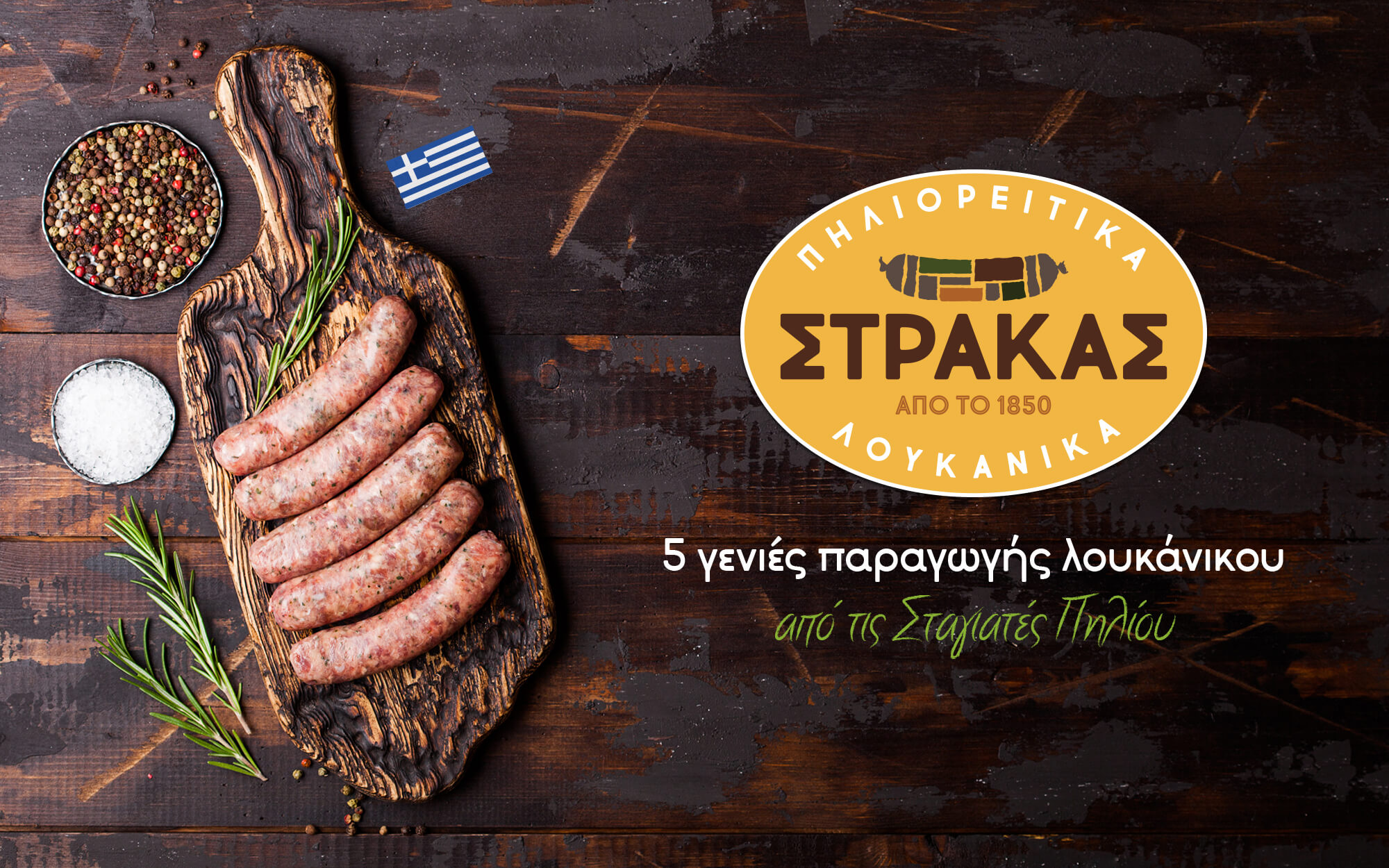
A contemporary tradition
BRIEF
In the not-so-distant past, in the village of Stagiates on the foothills of the legendary Pelion Mountain there were dozens of small family businesses. These have been producing exquisite sausages that were famous across the region and beyond. Somewhere along the way though, the industrialization of food and change of eating habits contributed to the gradual loss of this artisanal treasure. But one family held on to this unique tradition, and does so up to this very day. It is the Strakas family, now already in its 5th generation of sausage makers. Totally devoted to his artistry, Nikos Strakas stays true to the authentic recipes and long-forgotten production methods, using only select, first-grade ingredients. Now Strakas Sausages are ready to pass the torch into the future – a future that is inviting and promising, as people appreciate the authentic more than ever and seek food with local character. The brand is traditional but also as contemporary as ever. All these elements had to be reflected in the rebranding initiative that we undertook.
TARGET GROUP
Appreciators of traditional gourmet flavors in Greece and beyond.
CONCEPT
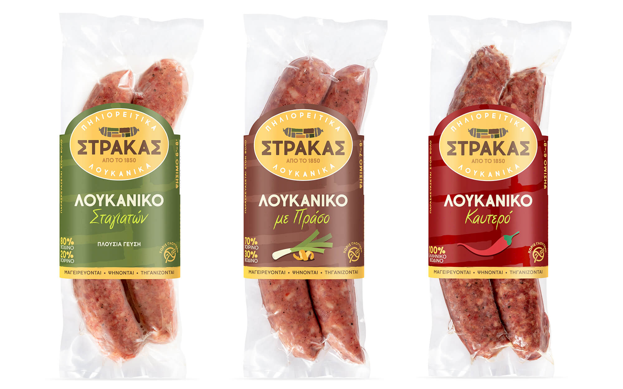
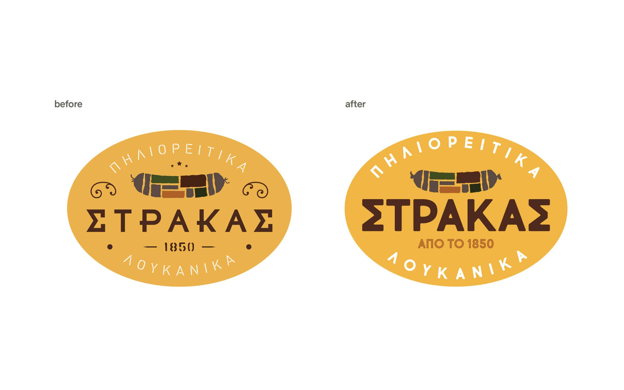
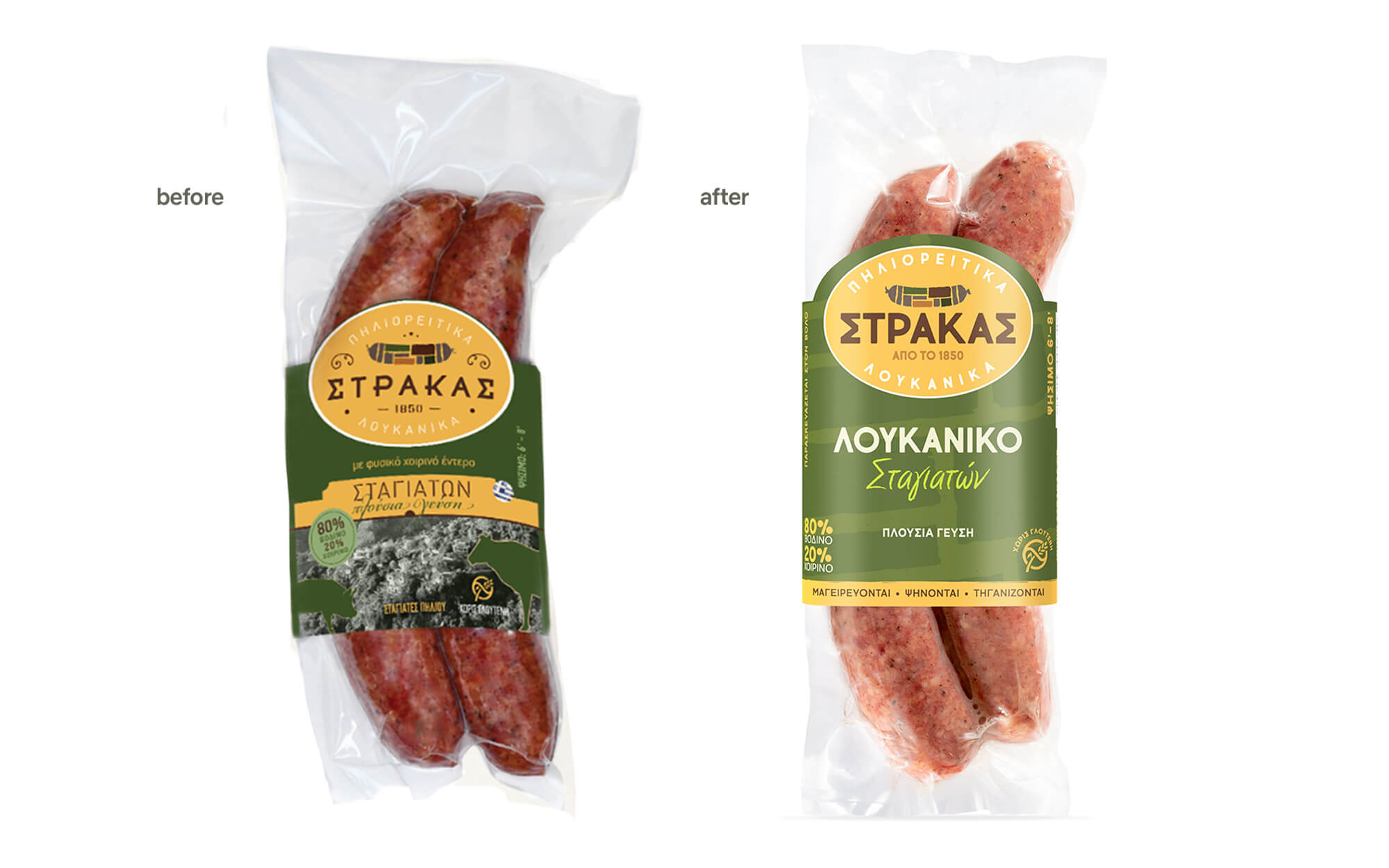
The recognition of the brand against a multitude of competitors was a hard-earned edge, and something that we wanted to keep intact. On the top of that, what was also needed was to increase the distinctiveness factor of each product variant but without losing the connecting thread and power of the mother brand. Thus, it was decided to follow an evolutionary approach rater than a fully disruptive redesign. The point was to safeguard continuity but crucially bring the brand closer to a fresh, contemporary visual expression Critically placed elements should be in position to differentiate the variants.
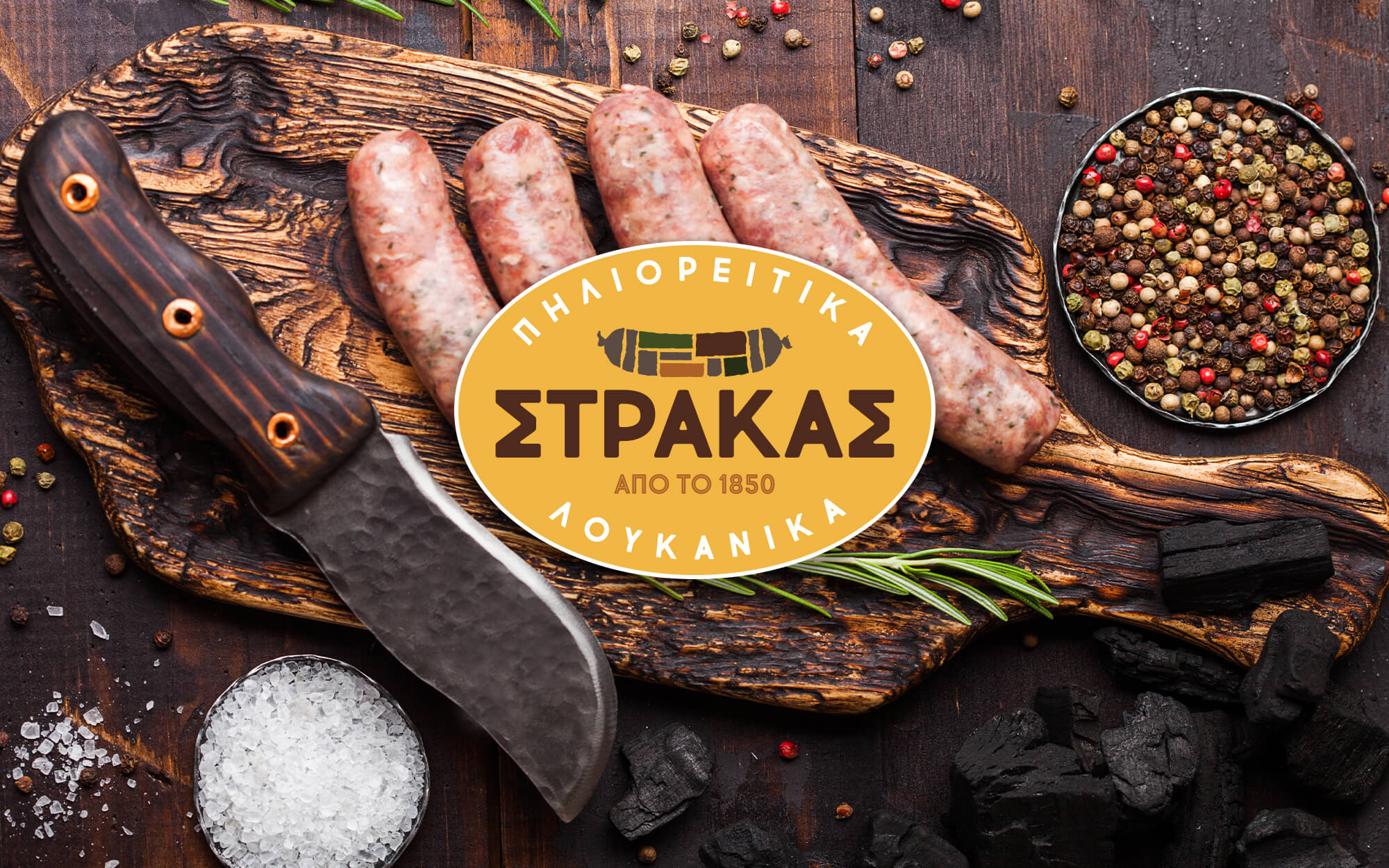
DESIGN APPROACH
We approached each of the brand identity elements with respect, making sure that they remain immediately recognizable. At the same time though we made sure that everything was sufficiently refreshed. Thus, all logo elements were simplified, while decorative details that detracted rather than adding to the end result were removed. The typeface became more minimal and clear, resulting to a more eye-catching whole. The pattern of tiles (reminiscent of the characteristic architectural element of the Pelion mountain) was further elevated in a more contemporary way. Finally, color-coding is intense while the key differentiated ingredient of each variant is always clearly depicted.
SERVICES
Logo Redesign, Visual Identity, Label Redesign
www.strakas.gr