Bringing a classic to today
BRIEF
As more and more Greek olive oil producers look abroad for sources of growth, an increasing number of them turn to design, looking for a great head start and a source of competitive advantage. So, it seems that we are preferred time and again by olive oil producers, which is certainly a good thing! But each case is a different one, and merits a different handling.
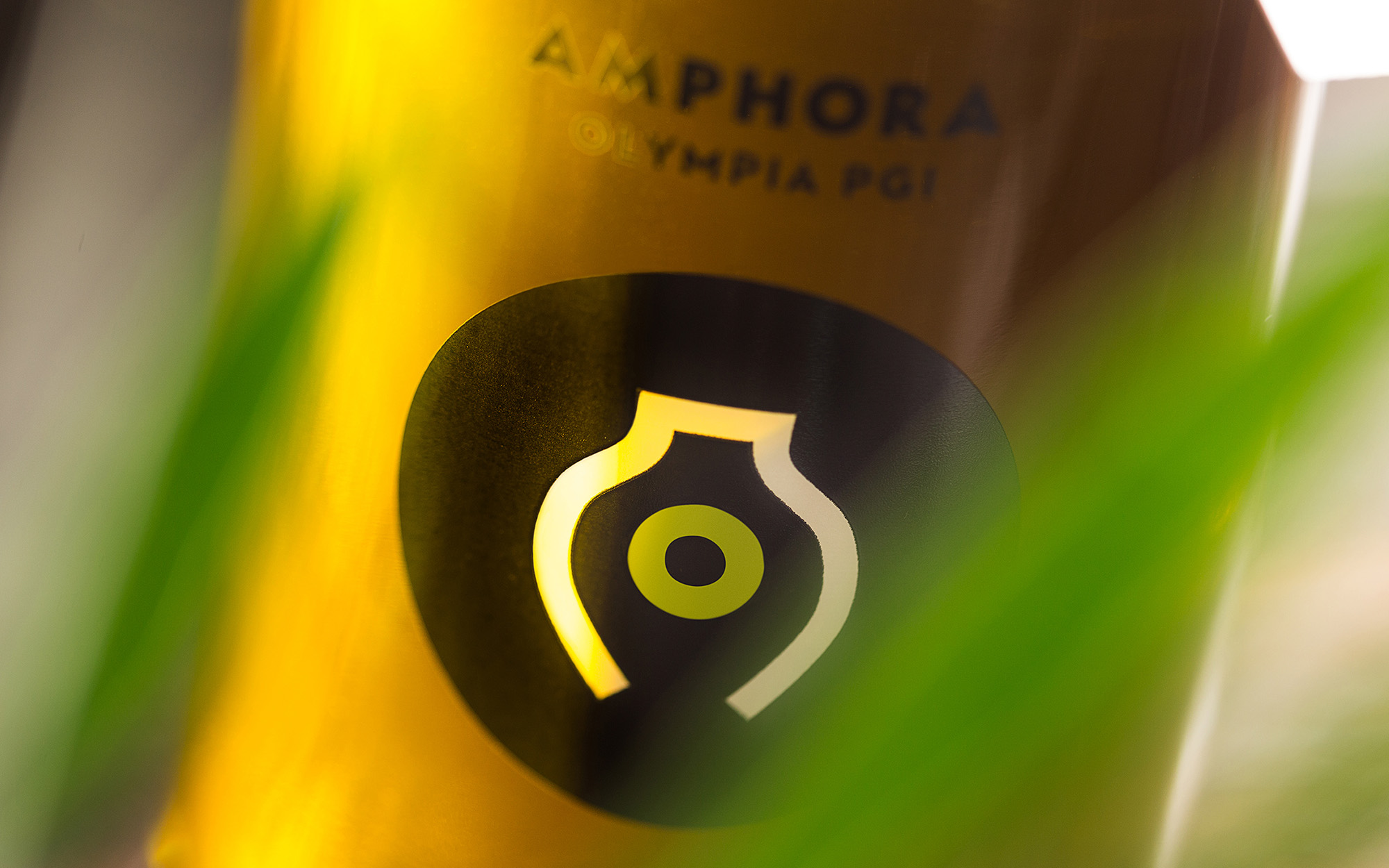
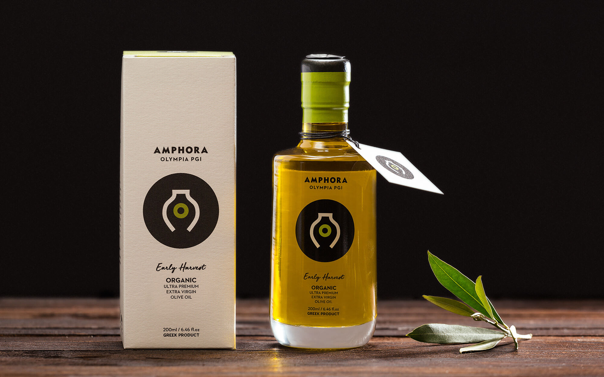
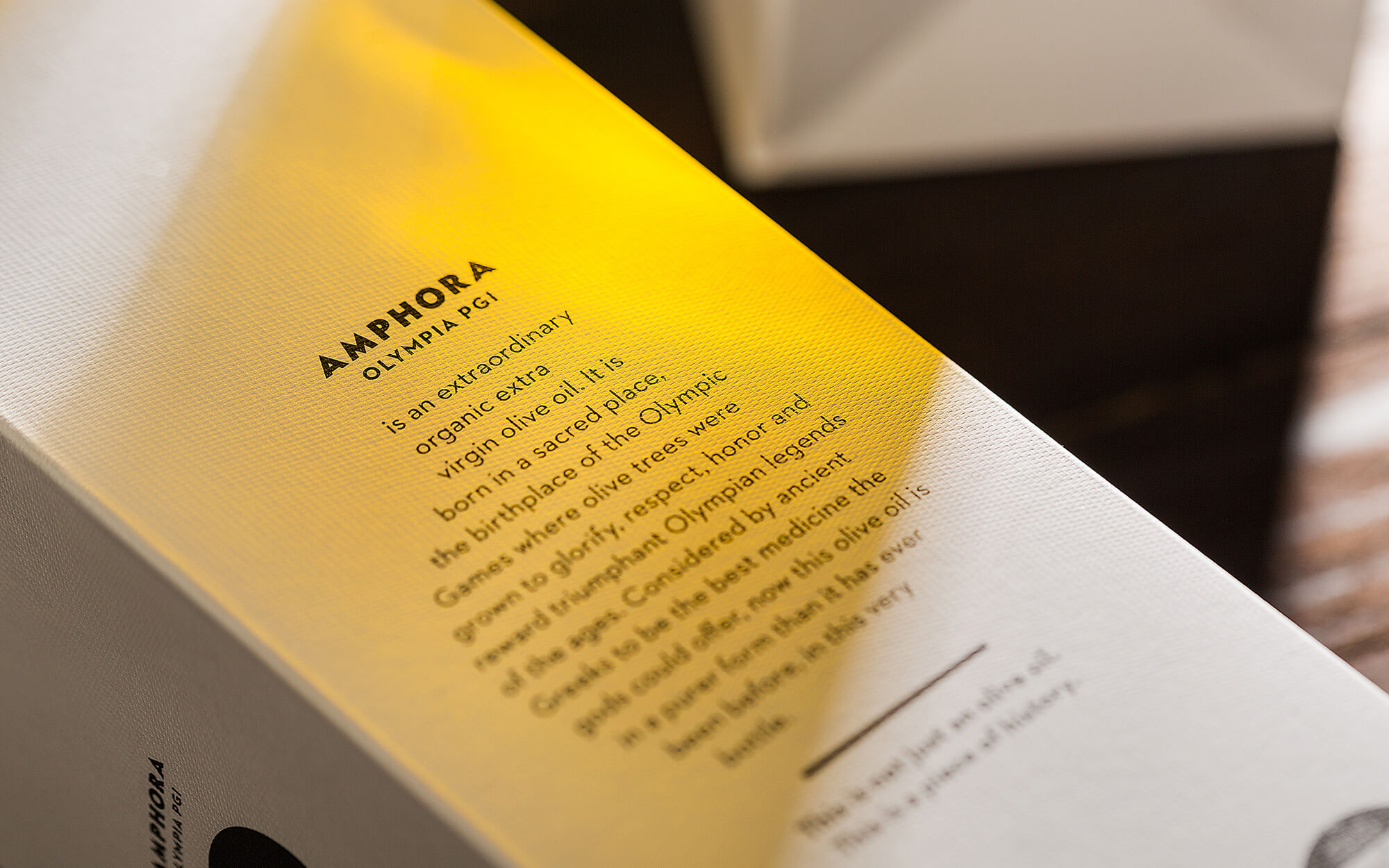
Amphora Olympia was a new brand of premium quality Organic and Extra Virgin Olive coming from the word-famous area of Olympia in the region of Peloponnese in Greece. The key ingredients were there, all was needed was a good touch of design.
TARGET GROUP
Mainstream Olive Oil consumers in export markets outside Greece, mainly in China.
CREATIVE CONCEPT
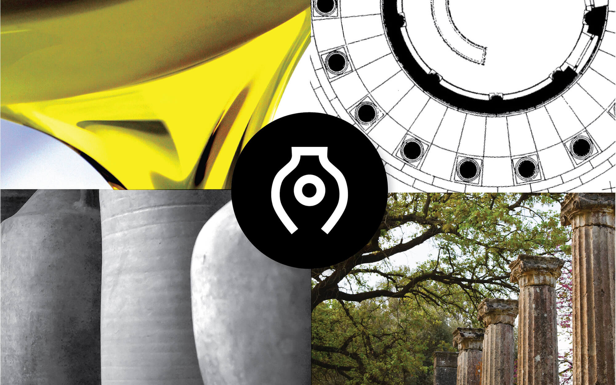
The brand obviously pays tribute to the history of the birthplace of the Olympic Games, ancient Olympia. This is a place where olive trees were grown not only for their fruit but also to honor the triumphant athletes. This is a link worth showcasing and celebrating, but with great caution. The issue is that, design-wise, various links to ancient Greece have been done to death, giving rise to creations that very often look cheap, touristy or outright tacky. What we wanted basically is to keep all the good connotations without the potentially nasty bits. So we decided to focus on well-recognized symbols but given in a fresh way.
DESIGN APPROACH
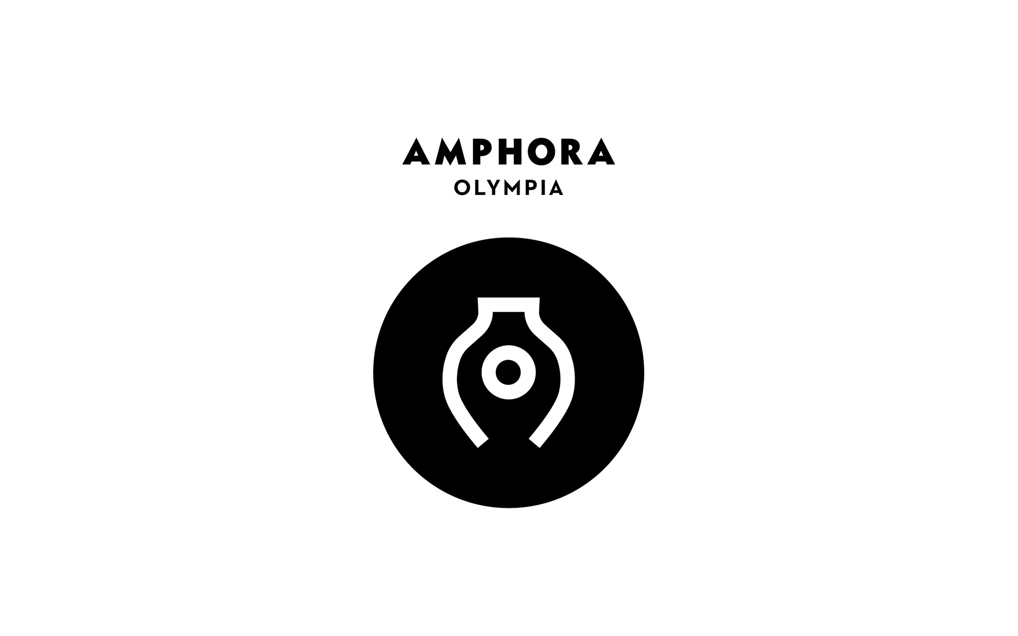
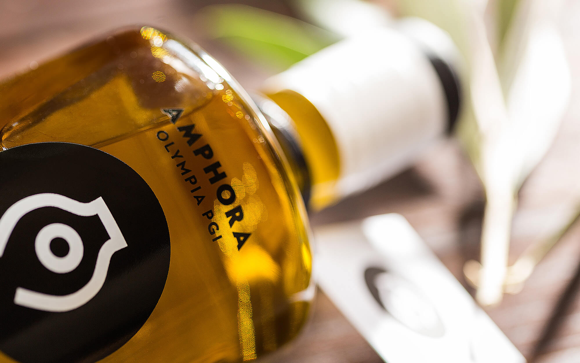
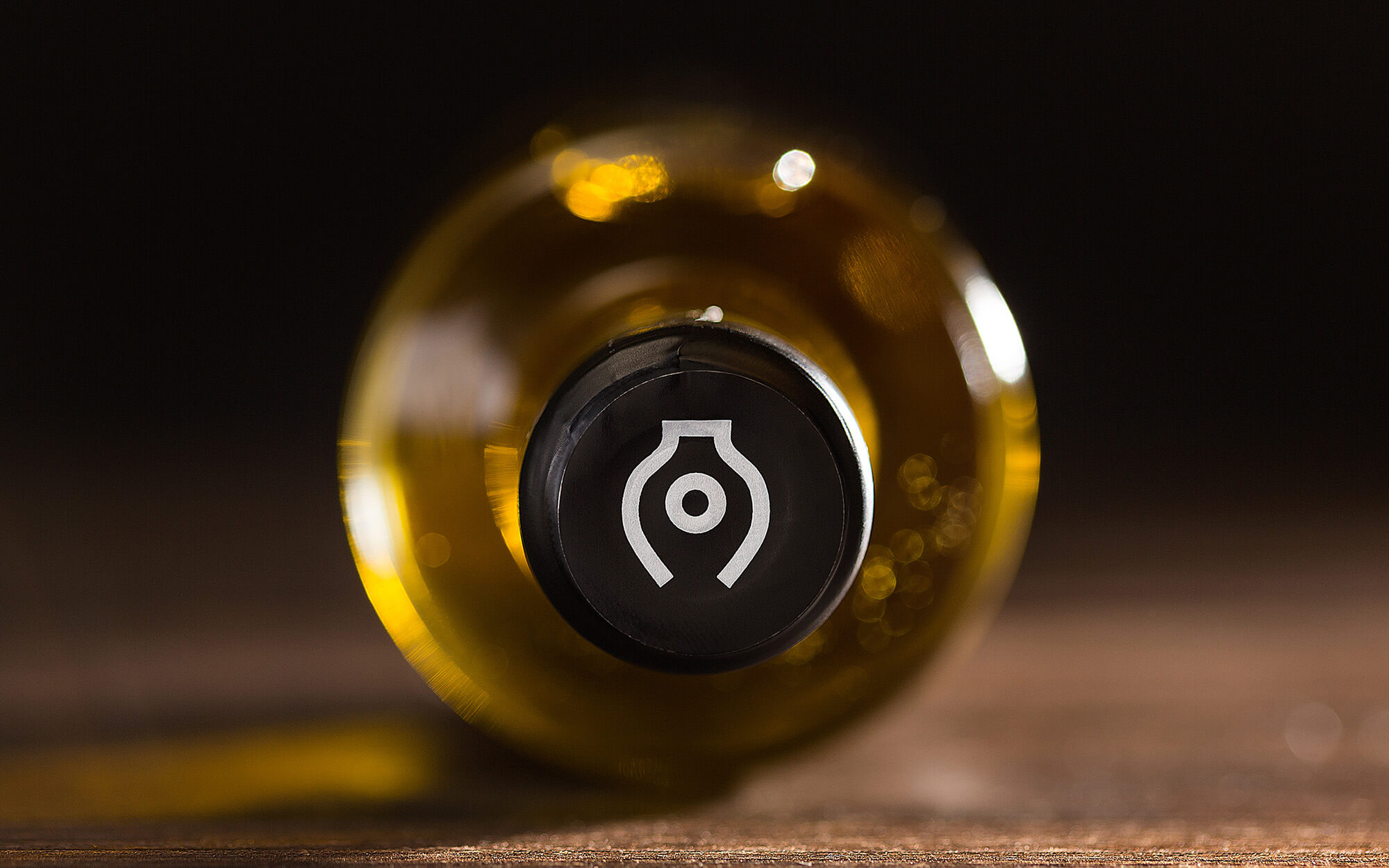
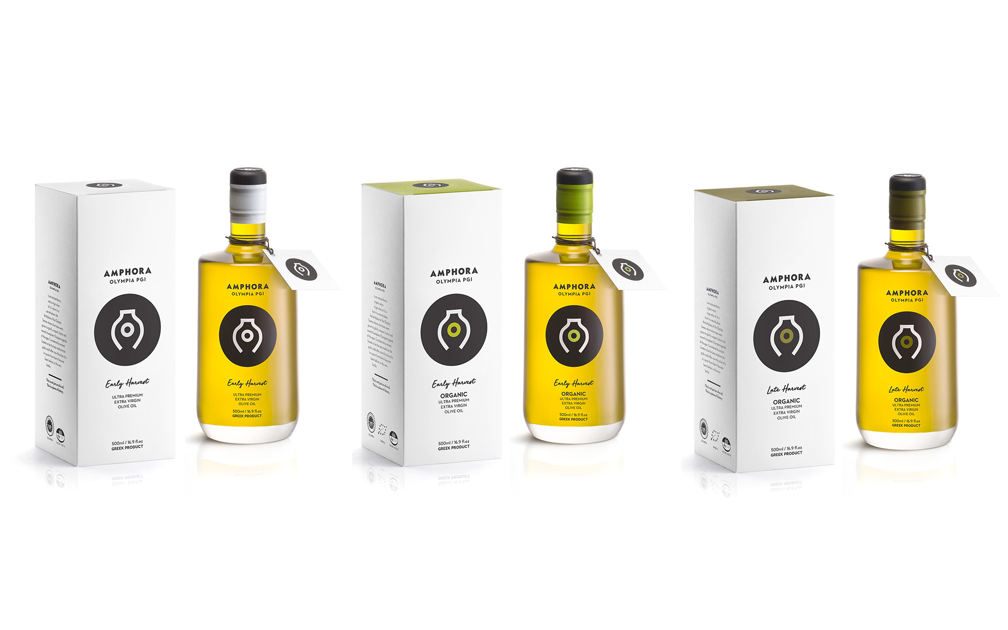
We wanted something minimalistic, more abstract yet directly recognizable. For starters, we decided to celebrate the ancient practice of preserving olive oil in amphorae, the characteristic shape of which led us to a very clear-cut logotype. Crucially, the vessel depicted incorporates a perfect circle in the middle, symbolizing olive oil as well as ancient Olympia (letter ‘O’).
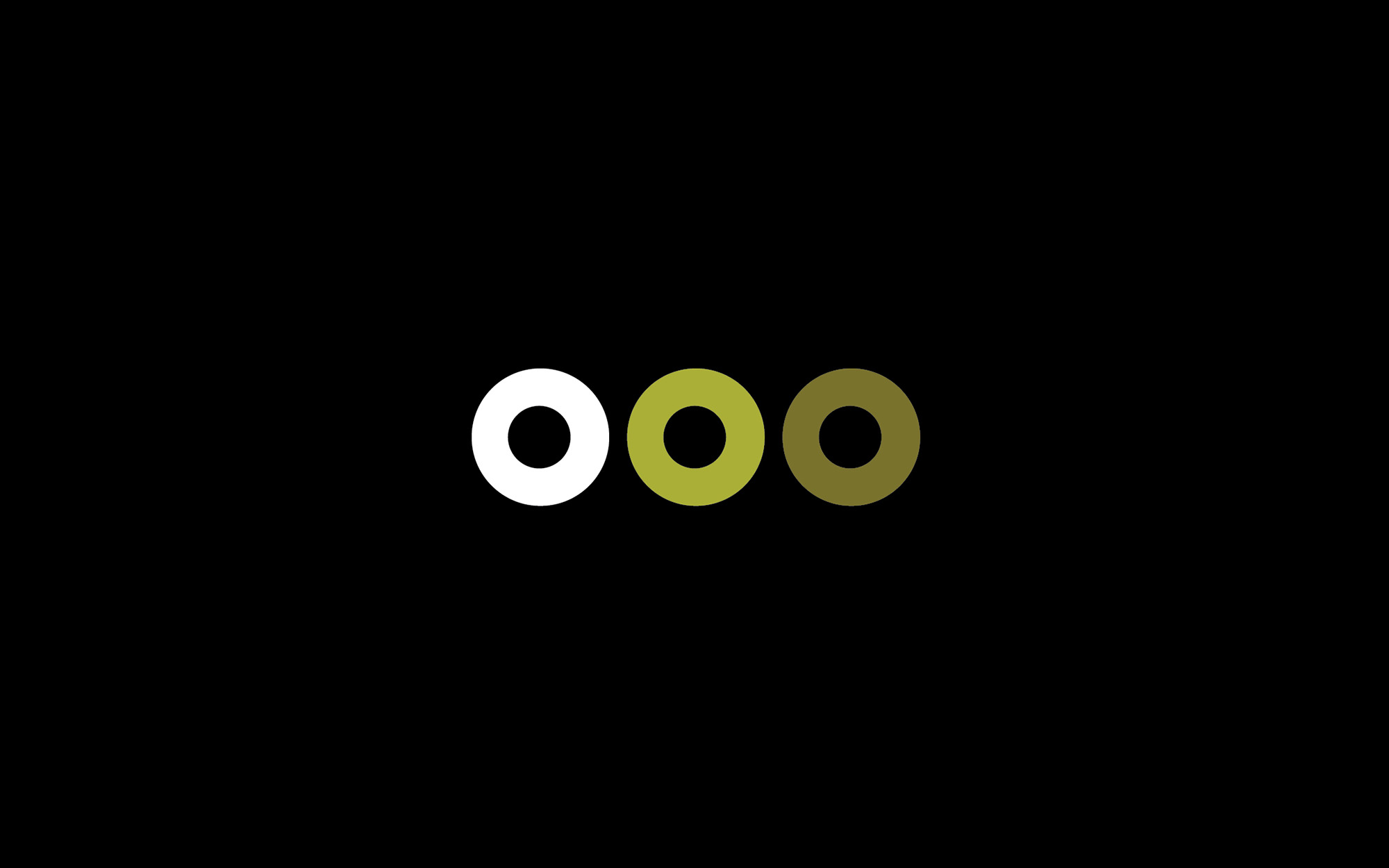
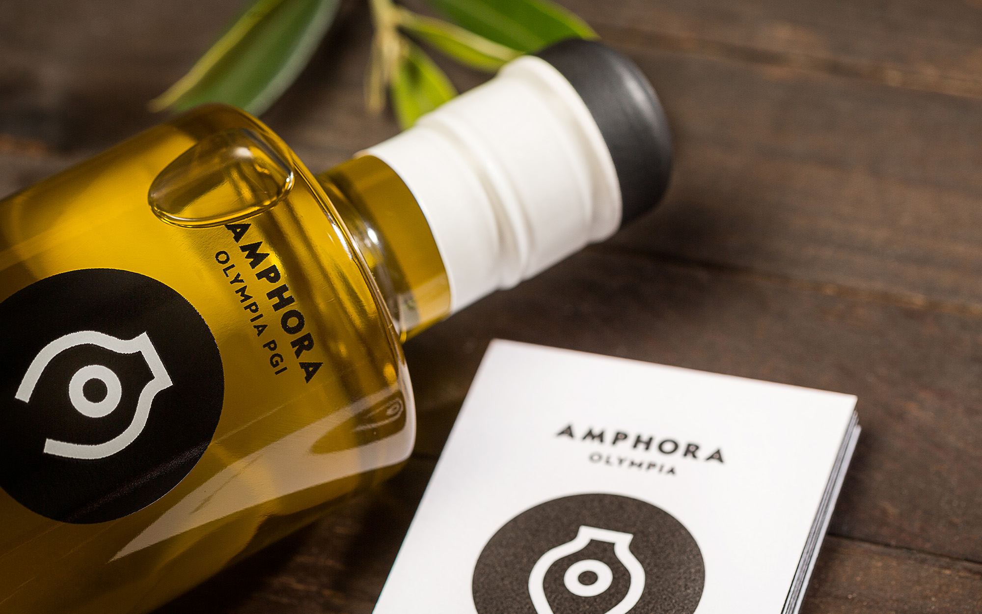
In parallel to that, the placement of the circle at the center of the amphora shape also creates the letter ‘A’, the initial of the vessel. Finally, different colors of the letter ‘O’ were chosen to color-code the available variants. With this practically being the only visual differentiation across variants, the family look was further enhanced.
SERVICES
Logo, brand identity, packaging

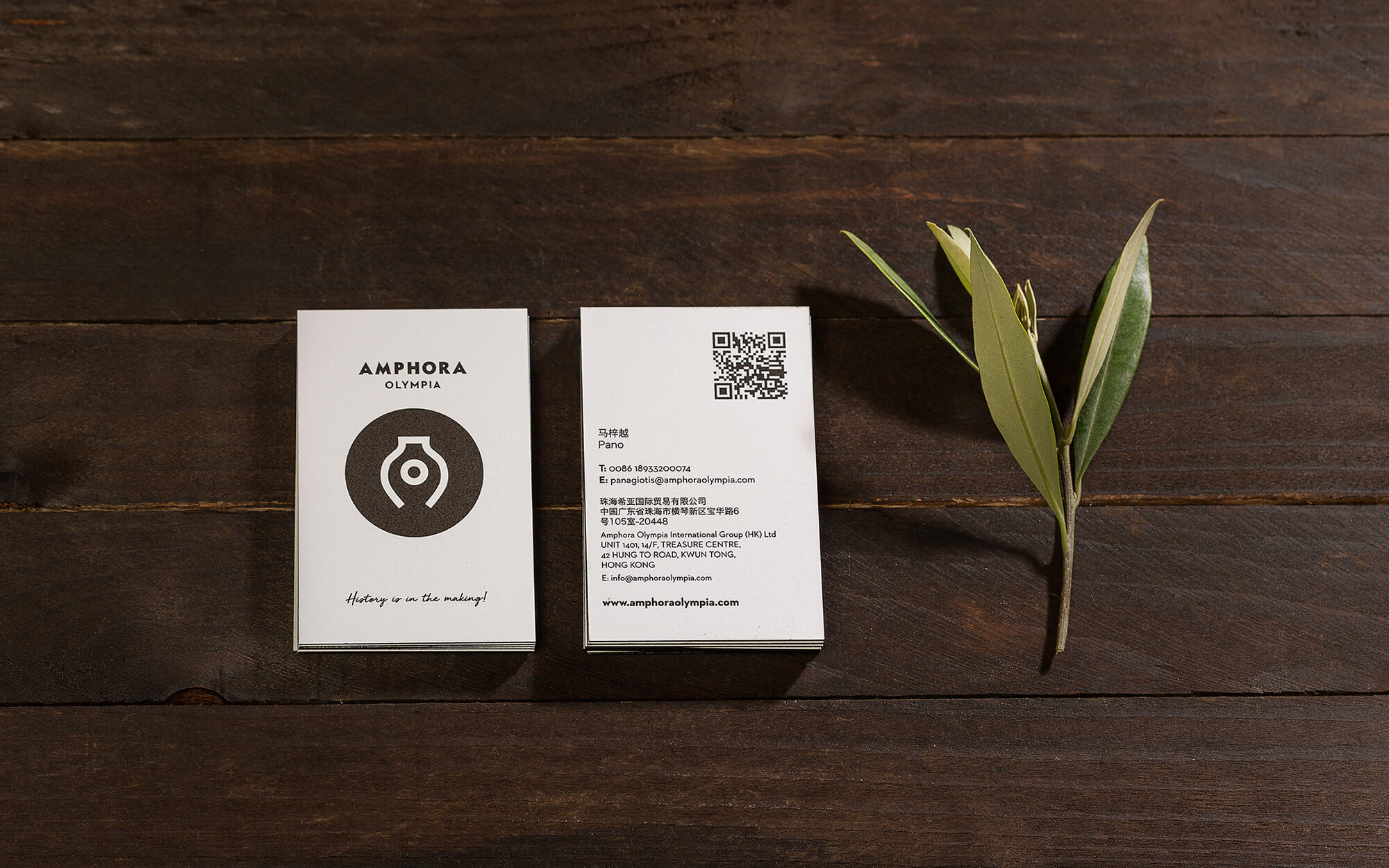
Concept & Design: Sophia Georgopoulou
Tagline and Copy: Nikos Vlachogiannis
Photography: George Pavlakos
Bottle Printing: Kouvelas S.A.
Identity & Box Printing: Pallas