An epic story worth tasting
BRIEF
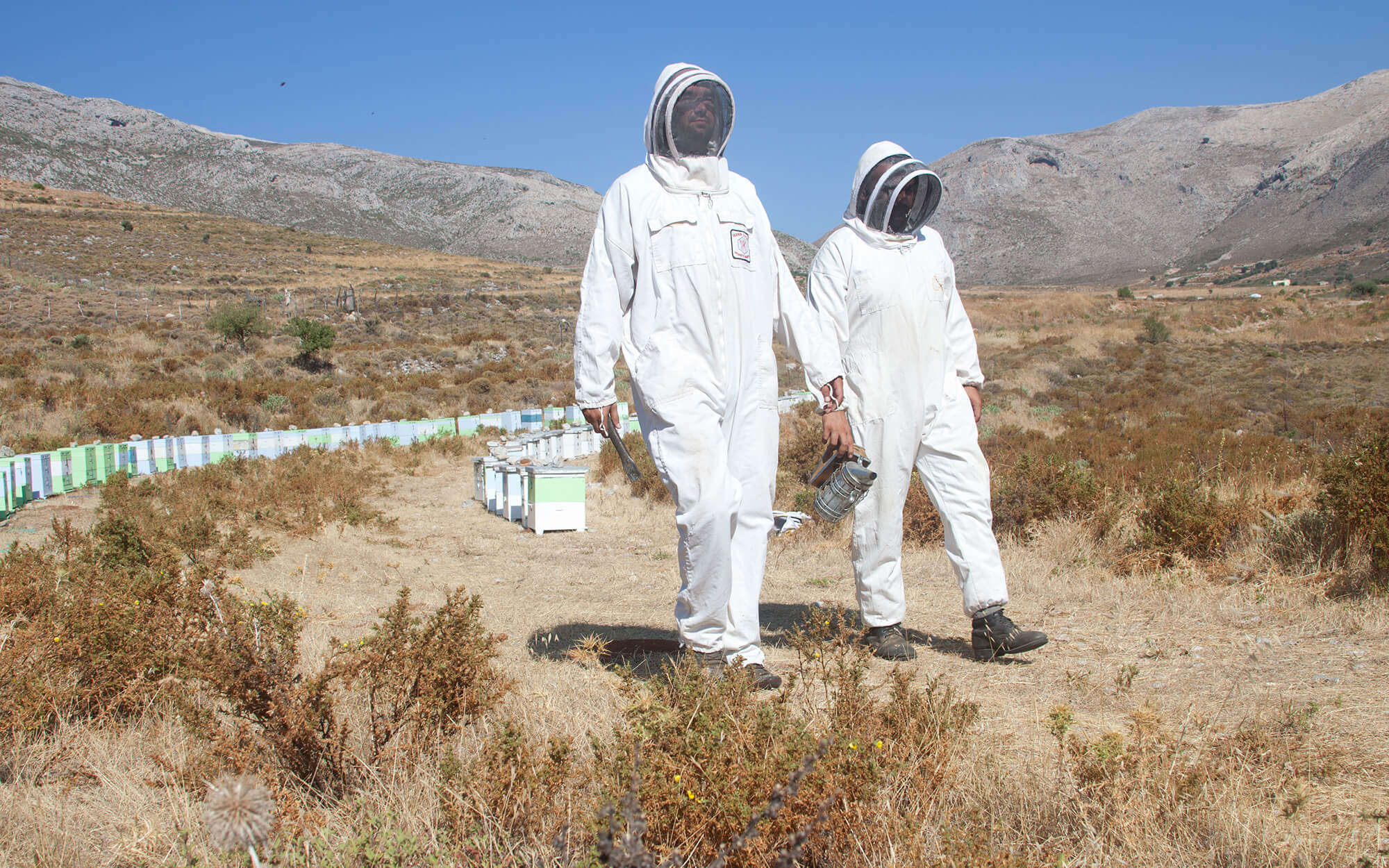
It is fair to say that the number of honey alternatives in the market is truly mind-boggling. Consumers, who are spoiled for choice, can get really lost among the countless options. It is even tougher when a brand has export intentions in any of the key Western markets. This was the case that we got in our hands when we were approached by a honey producer from the Greek island of Kalymnos, in the southeast Aegean Sea.
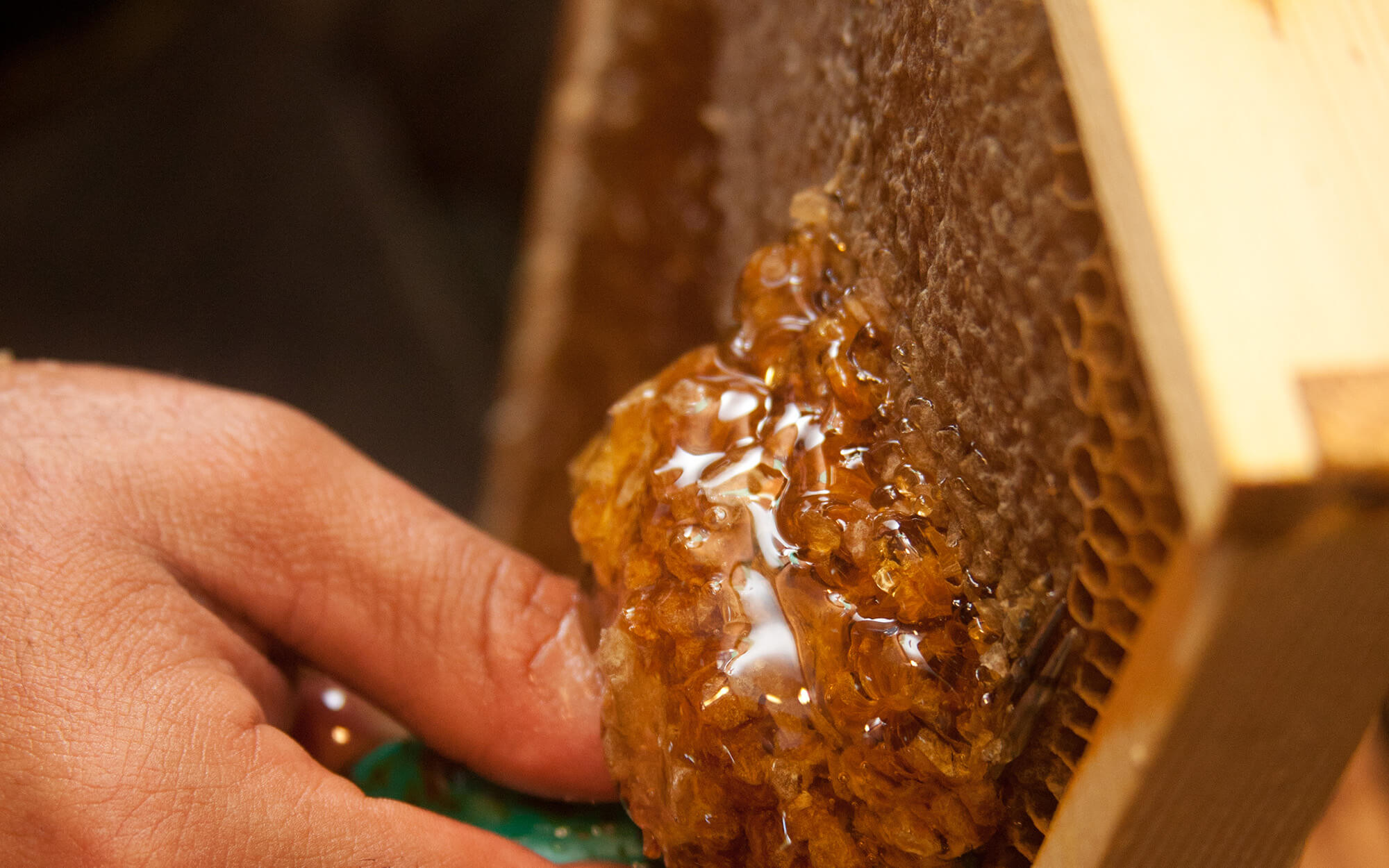
Before moving on, understanding the product itself was central to the progress. Through long talks with the clients, beekeepers themselves, we learned about how painstaking the whole process can be. What levels of dedication beekeeping demands in order to achieve top quality honey and how much personal effort is needed in the process. This realization fueled both the name creation and the visual creative process.
TARGET GROUP
Honey consumers both in Greece as well as key Western export markets
CREATIVE CONCEPT
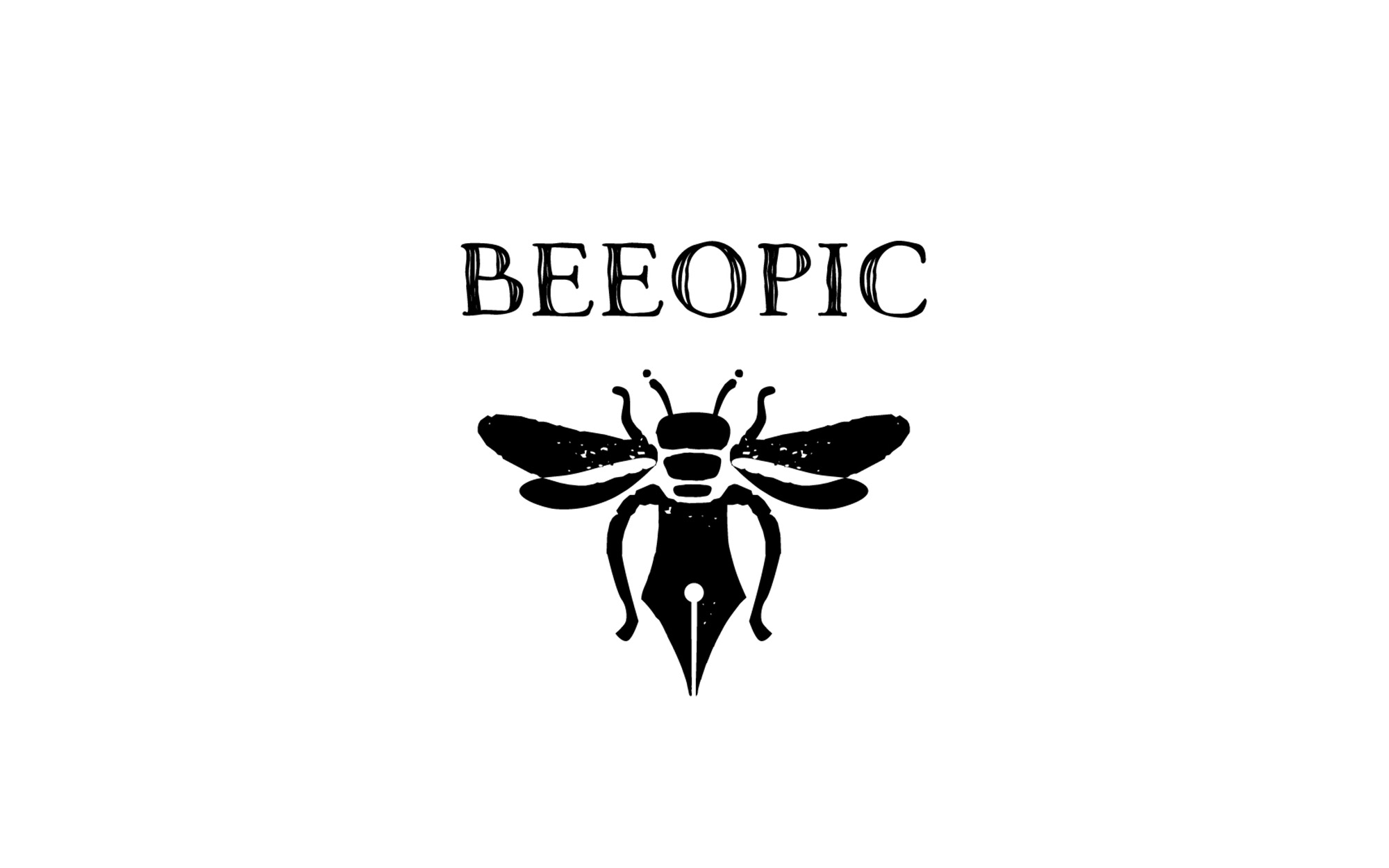
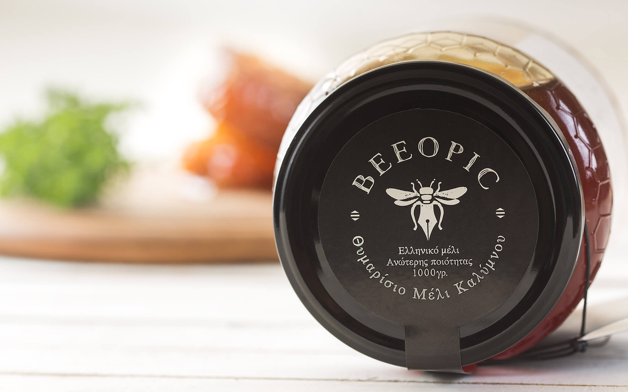
Coming up with name that really works was central to the whole project. We started from the deeper understanding of the fact that beekeeping is not just a business but a way of life. It is a challenging way of life that demands the beekeeper to closely follow the needs and particularities of his beehives. In a sense, it is the bees themselves that set up and dictate the beekeeper’s life. Thus we came up with the name BEEOPIC – a play on the English word ‘biopic’ which is used to describe a cinematic or television biography of a person. From that point and on, things took their natural course.
DESIGN APPROACH
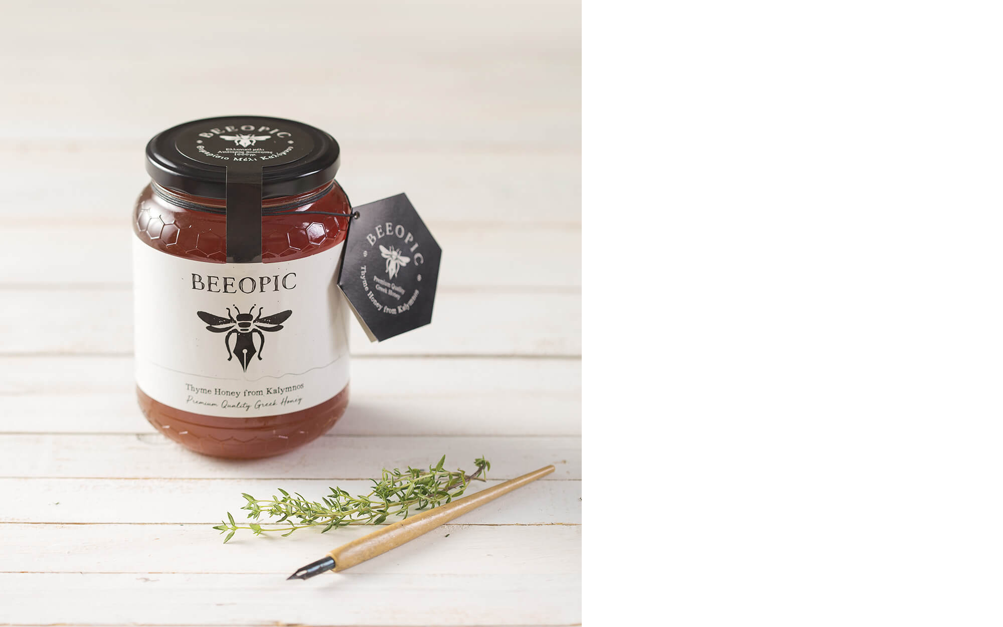
By following this reasoning and line of thought, we created a logo that combines the well-recognized outline of the bee with a fountain pen that takes the place of it slower part of the body. The pen is obviously the medium that is used to write stories – in our case, the biopic of the beekeeper and his relationship with his creation, the precious honey.
Adding to the desired take-outs, the rough black and white design of the packaging leaves more breathing space to the powerful logo. Finally, a seal-like carton is added to the neck of the jar at the shape of a hexagonal honeycomb, while the same pattern is repeated on the jar itself.
SERVICES
Brand Name, logo, visual identity, packaging