Look what the dove brought in!
BRIEF
Greek Olive oil is witnessing an export boom, but in a highly competitive global environment everything lies on the detail – and a great product is just the start. Kalidona is a company that deals with labeling and trade of Greek Olive oil, addressing exclusively the export market. The name of the company is drawn from the eponymous region in the region of Peloponnese, at the south of Greece, an area that is renounced for great olive oil since antiquity. The client wished for an identity that would celebrate its Greek origin and the fact that the company brought the best that this land has to offer across the globe.
TARGET GROUP
B2B importers of specialty products across the globe.
CREATIVE CONCEPT
We envisaged a recognizable logo that would act primarily as a seal of quality. The Greek connections were a must, but without resorting to obvious folklore references that offered little differentiation while looking dated and tired. So the idea took shape: seal-like, obviously Greek, fresh, and clearly embodying the concept of ‘bringing’.
DESIGN APPROACH
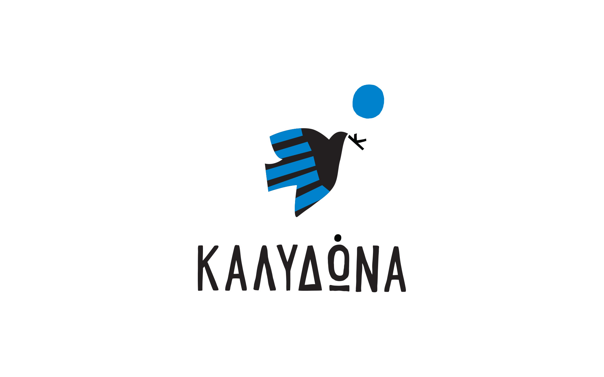
The logo is based on the very recognizable figure of a dove – the bird associated with the bringing of news, typically good ones. Classical iconography depicts the dove with an olive branch on its beak, so the olive association is very much there in everybody’s mind. Instead, it was decided to put the initial ‘K’ on its beak, bridging the expected with the unexpected. On the top of that, the wings of the dove embody the well-known light blue stripes of the Greek flag, unmistakably denoting the origin. Thus the dove carries Greece to the edge of the world, binging along the message of superior quality and flavors and sharing Greece’s unique gifts.
SERVICES
Logo, visual identity