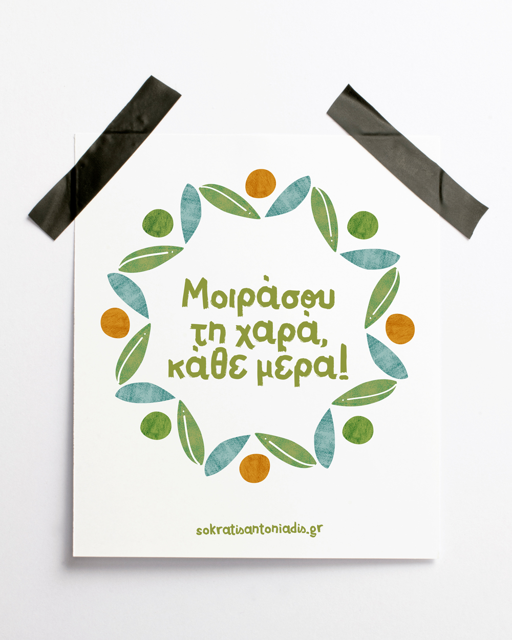
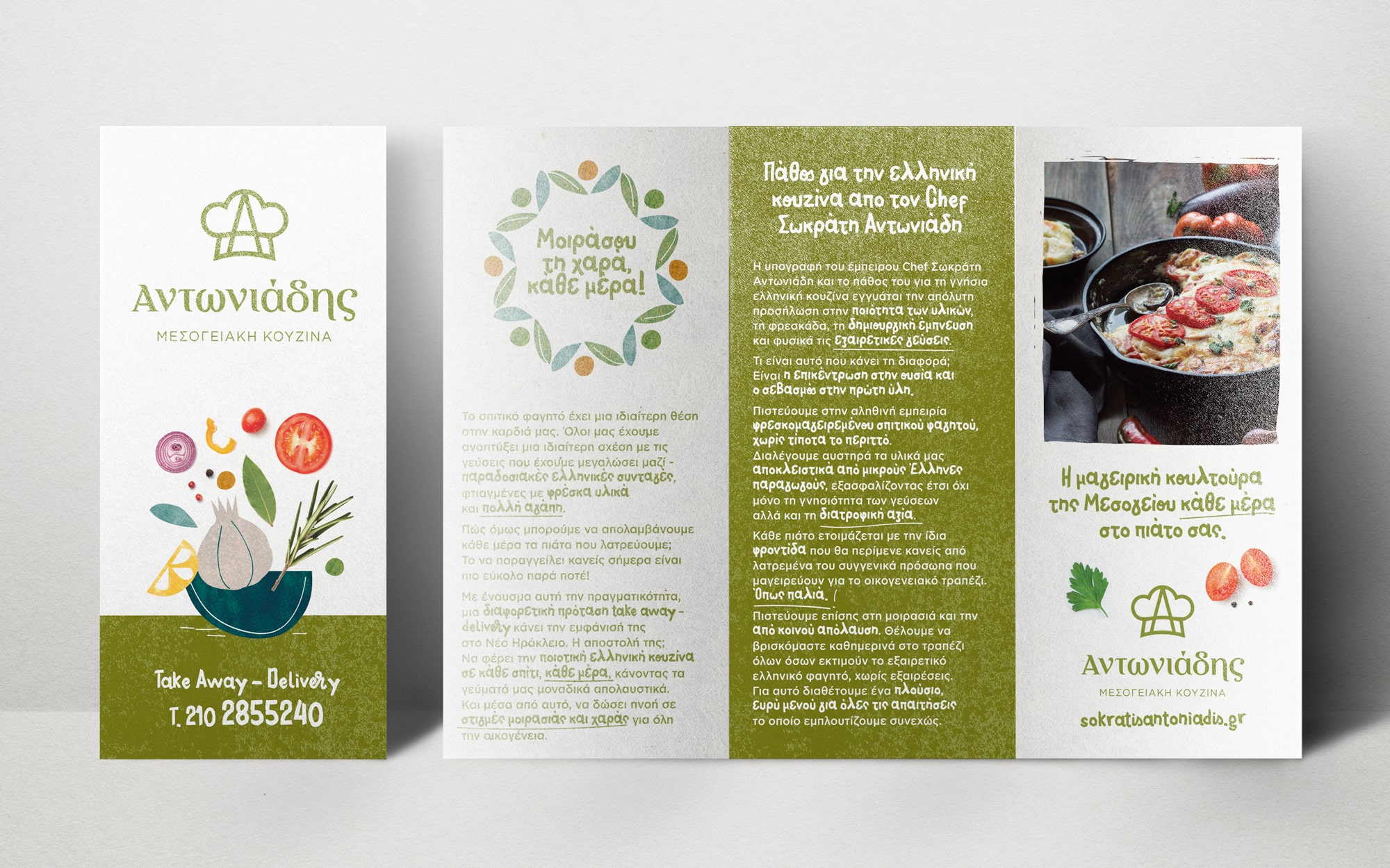
Share the joy, everyday!
BRIEF
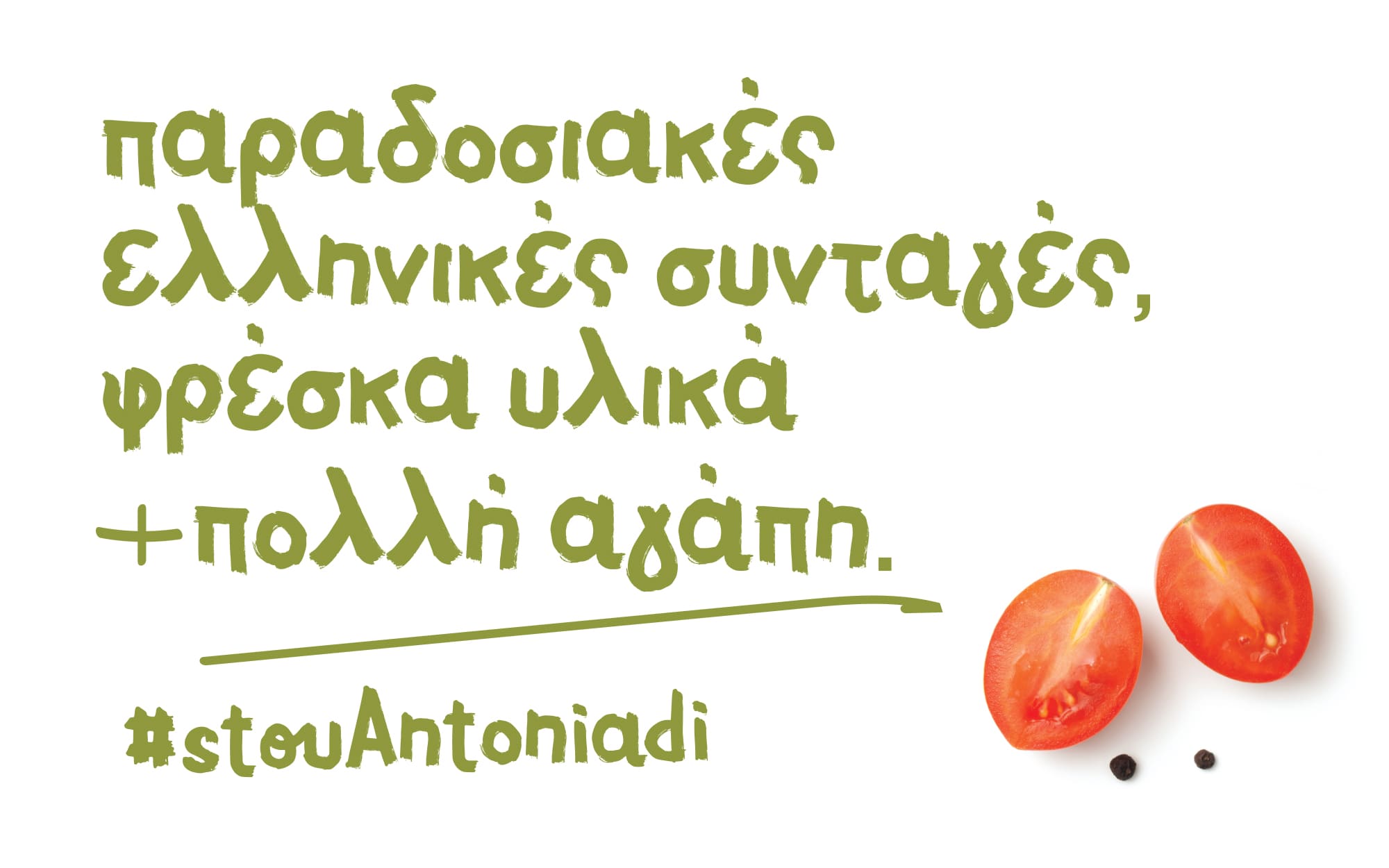
Everyone in Greece has a special relationship with the flavors they grew up with – classic, traditional recipes, made with fresh ingredients and lots of love. This kind of food is increasingly difficult to find and order, at least at reasonable prices accessible to all. The experienced Chef Sokratis Antoniadis believed that this had to change. His vision? To bring quality Greek cuisine to every home, every day, making our meals uniquely enjoyable. And through this to give life to moments of sharing and joy for the whole family. The way to get there? Ingredients sourced exclusively from small-scale local producers, absolute dedication to original flavors and lots of love and care in the mix – the same that you would expect from beloved relatives cooking for the family table. Like old times. And all that in old-school prices and exceptional value.
TARGET GROUP
Contemporary urbanites, families and individuals who want to have the cake and eat it: the convenience of delivery and takeaway and access to delicious all-time favorites every day, without breaking the bank.
CREATIVE CONCEPT
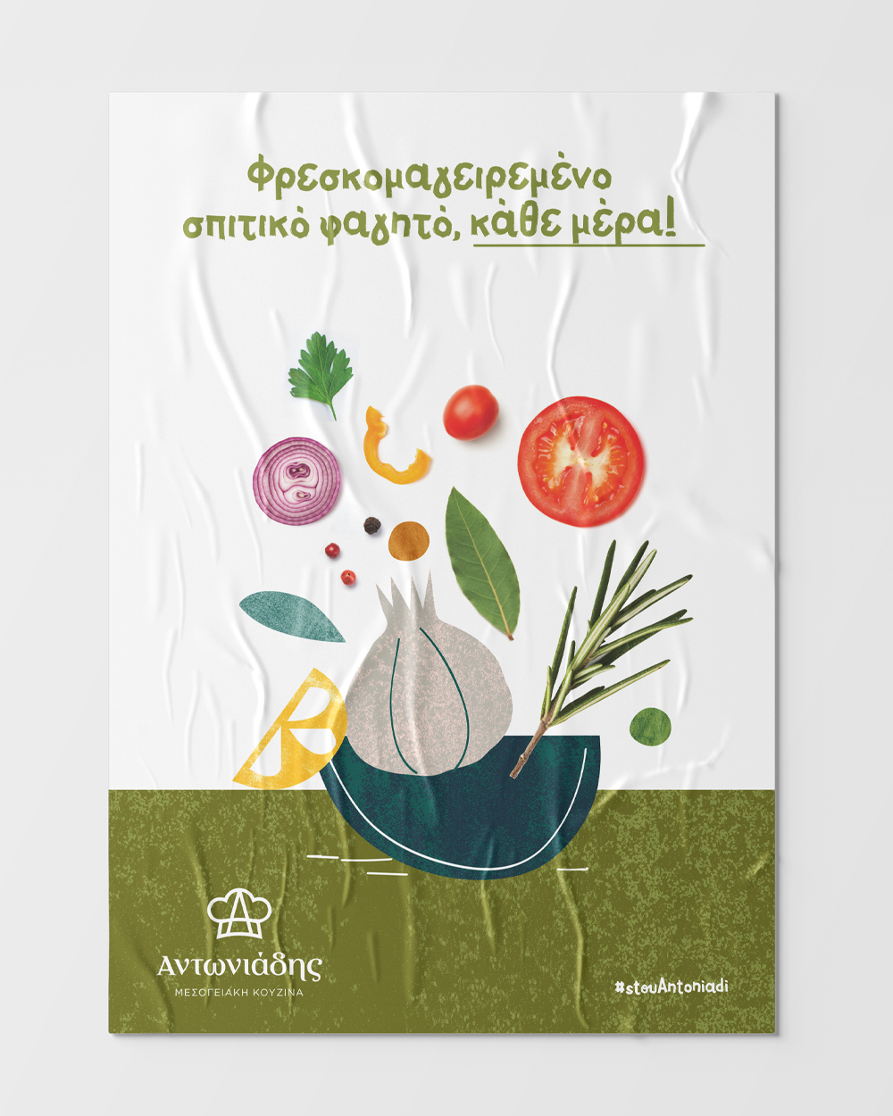
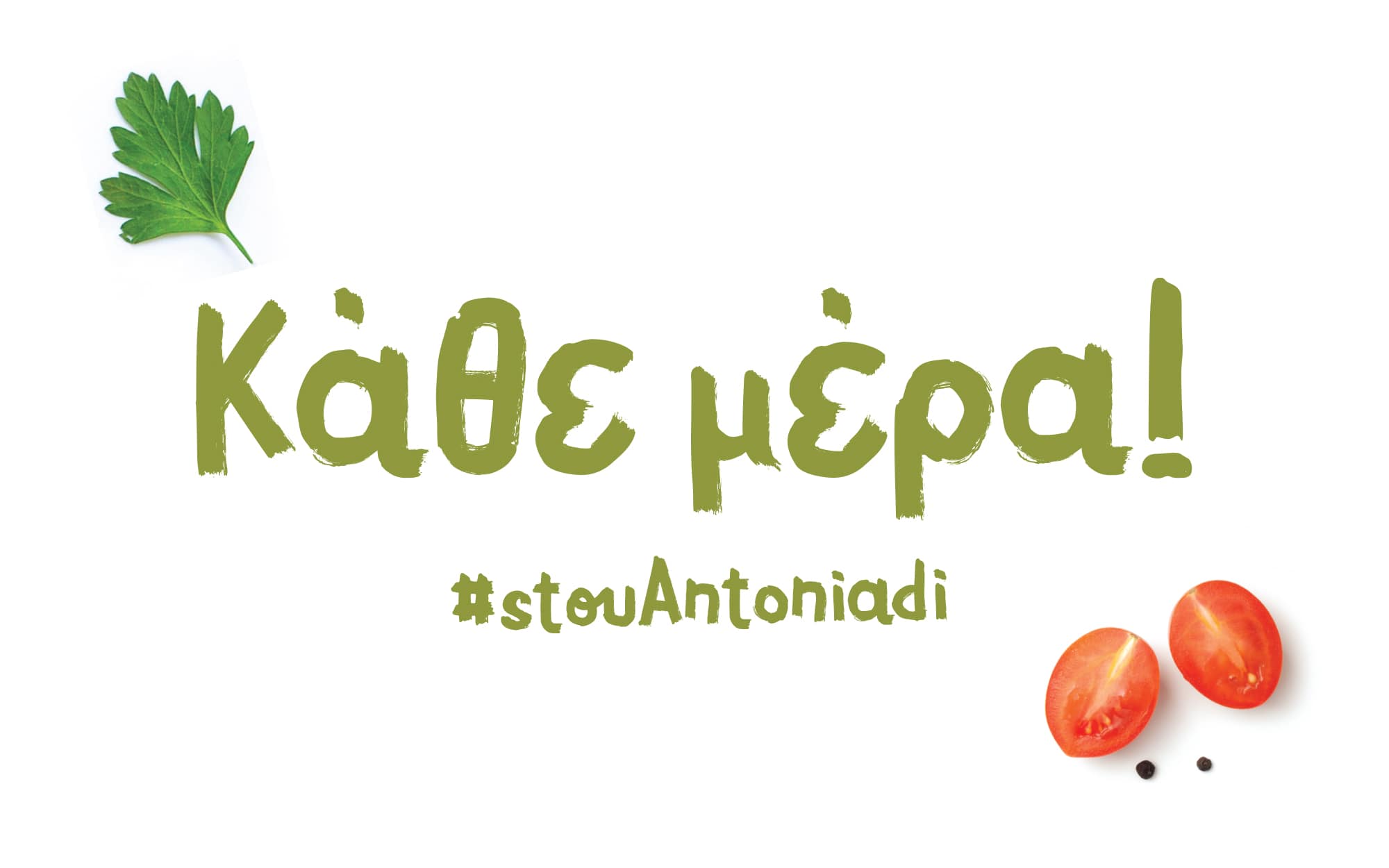
This is a proposition that above all is based on the warmth and appeal of familiarity. And this is the reason that we needed something accessible and directly recognizable for the main brand logo. Apart from that, we also needed a series of supportive visuals to convey key elements of the proposition such as, for instance, the purity and quality of the ingredients used, the harmony of the combinations and the taste appeal of the end-result.
DESIGN APPROACH
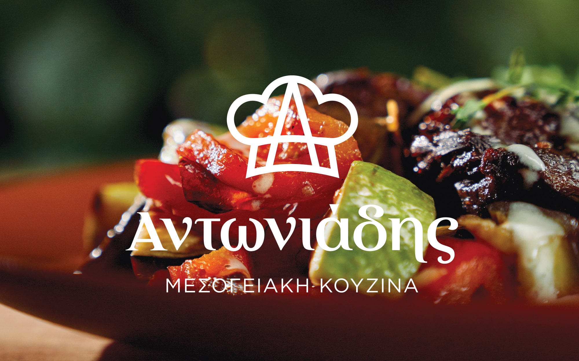
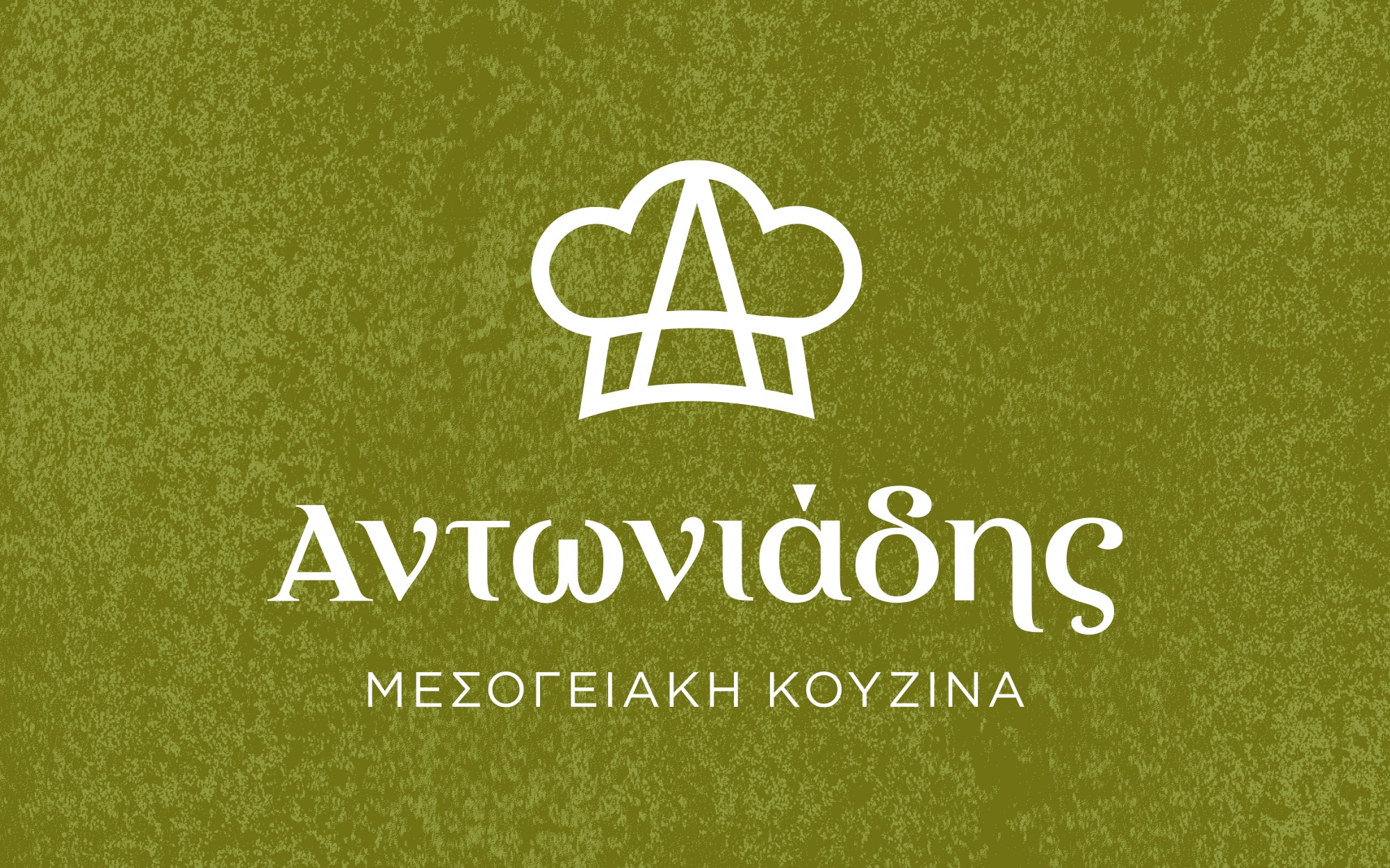
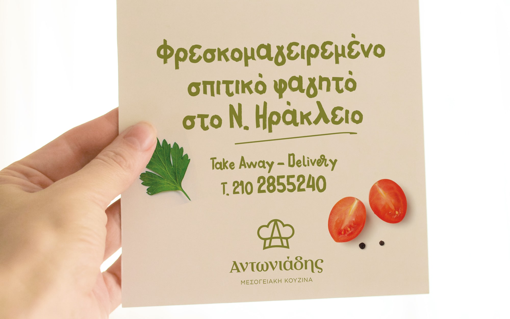
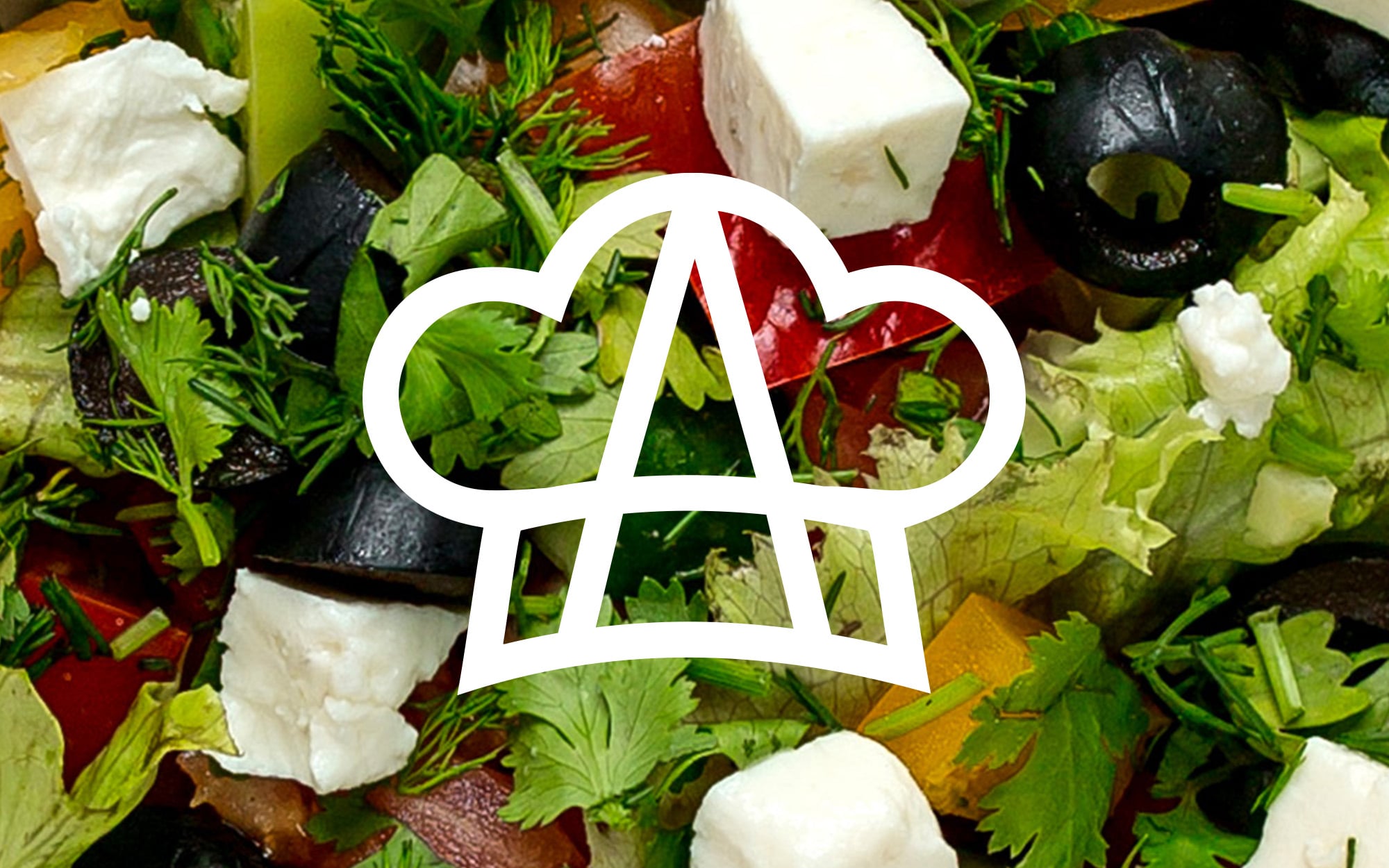
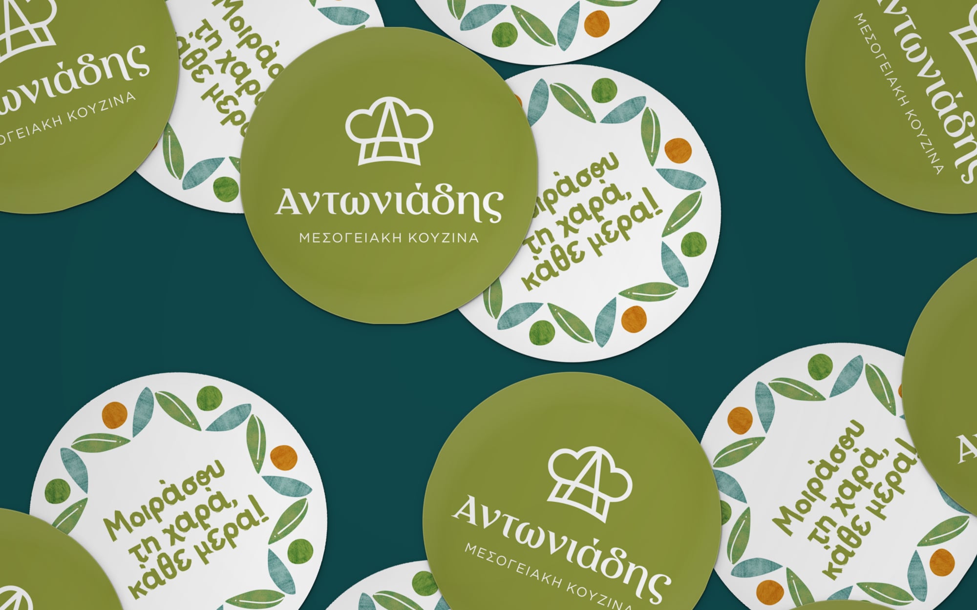
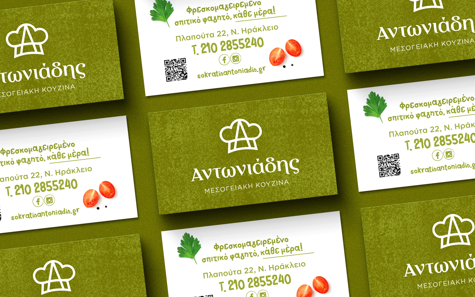
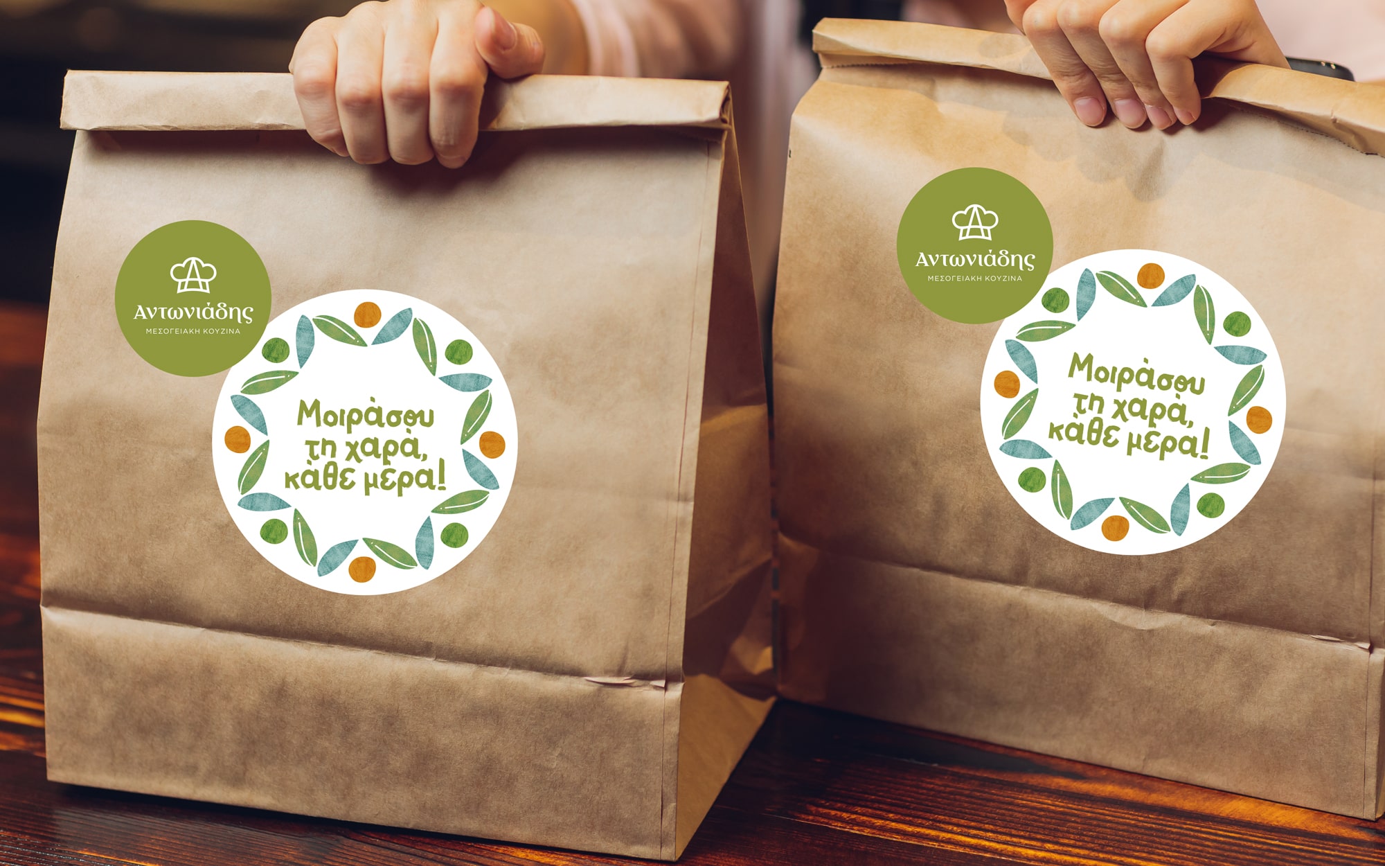
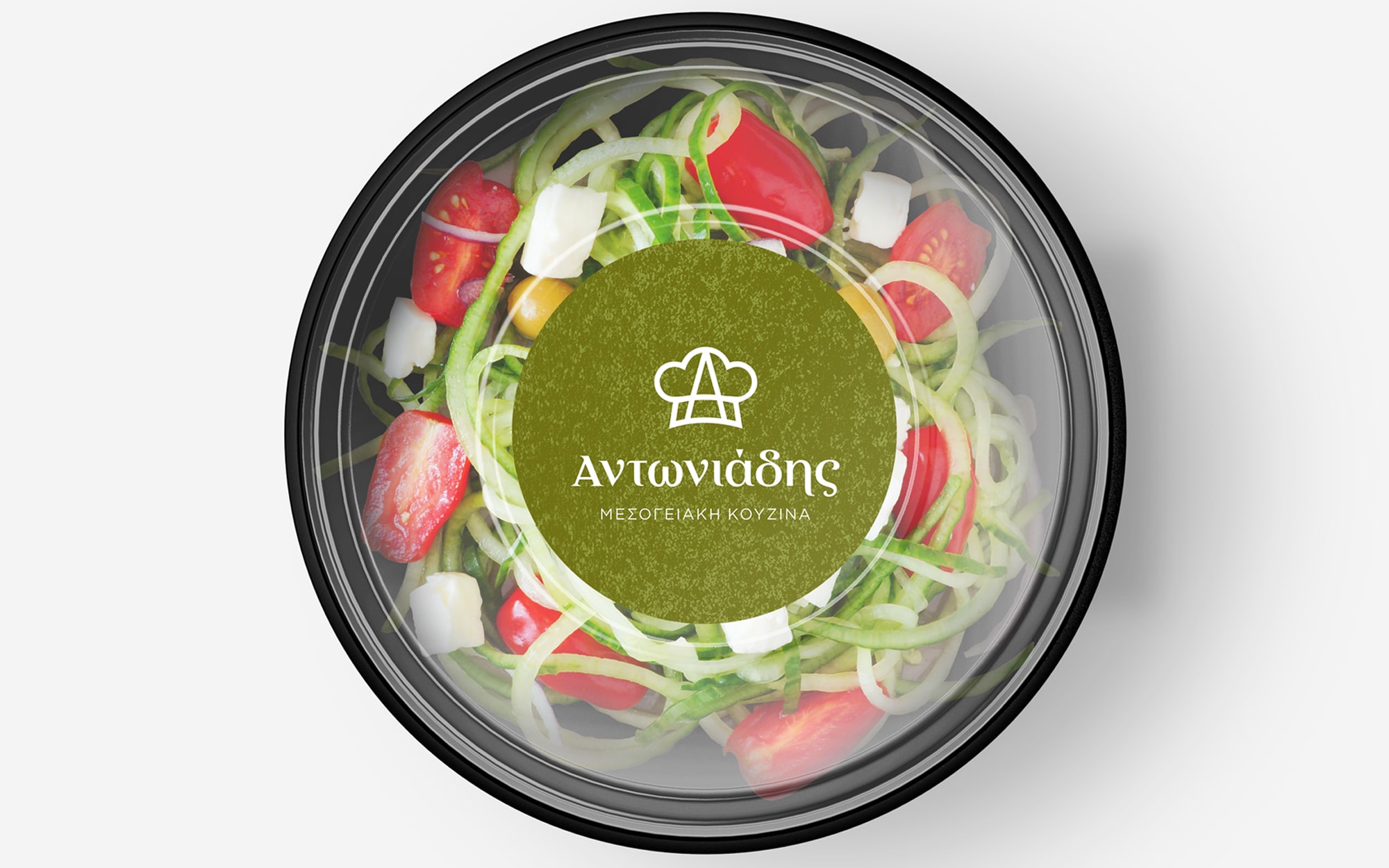
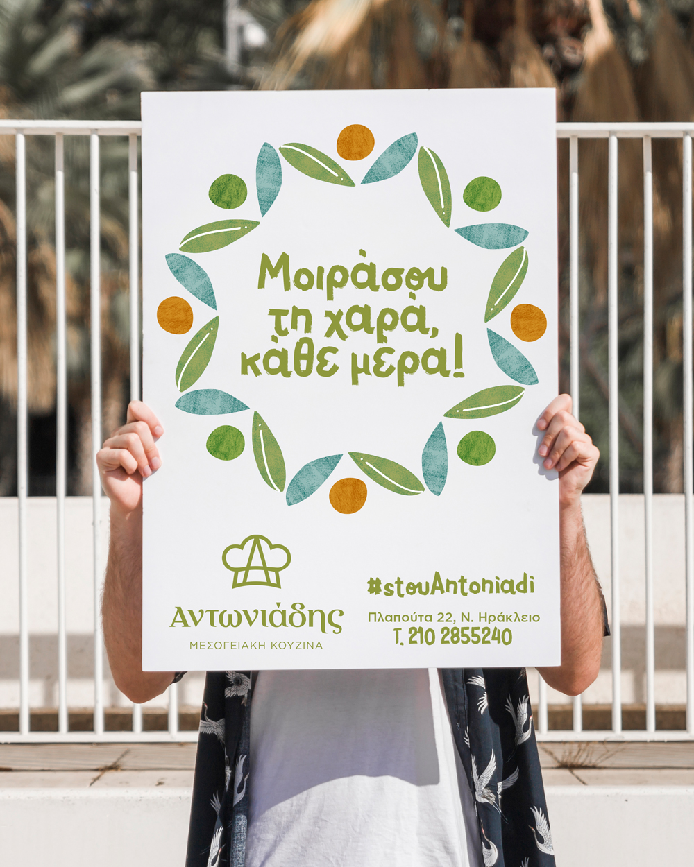
The first letter ‘A’ of the chef’s surname constitutes the core of the brandmark. It is enclosed in a shape that is directly recognizable as a toque blanche – the classic chef’s hat. This is a deliberate nod to the past and old-school cooking artistry, away from the loud logic of today’s celebrity chefs who often prioritize novelty for its own sake. The cloud—like shape that is incorporated, together with the arrow-like effect of the letter ‘A’ that points up, make a subtle reference to great quality and heavenly flavors. The name of the chef is given in a special typeface that draws inspiration from books of the past, while feeling perfectly comfortable in the world of today. The same has been applied to all accompanying texts. Finally, some special branding elements have been designed, such as a seal-like visual device that encircles the tagline ‘share the joy, everyday’. It employs olive leaves and fruits that work in the same direction: a combination of sweet nostalgia and a promise for the authentic taste experience that you crave for.


Verbal Identity & Texts: Konstantinos Kontinos