Past-to-present-to-future for Greek food culture
Sophia Georgopoulou | Design – ALL RIGHTS RESERVED
Concept & Design currently available
BRIEF
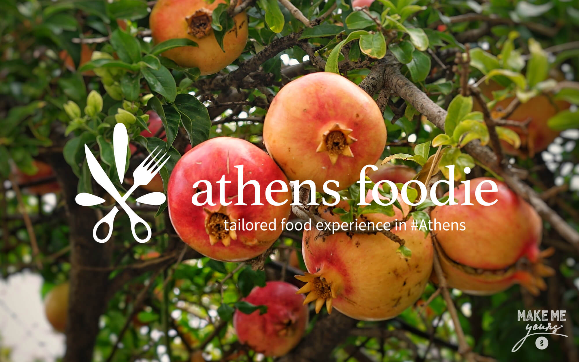
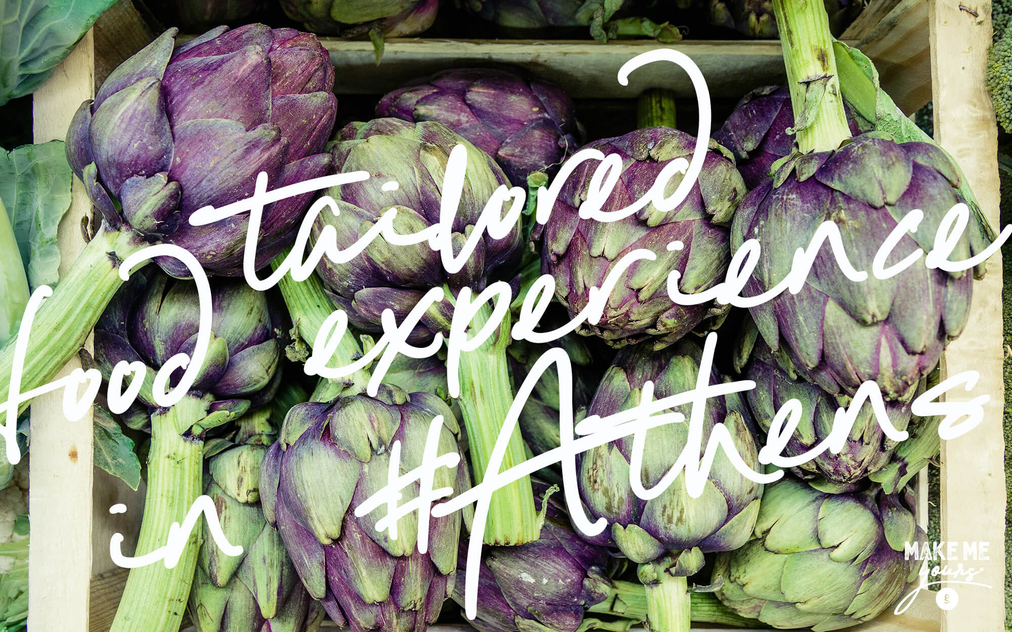
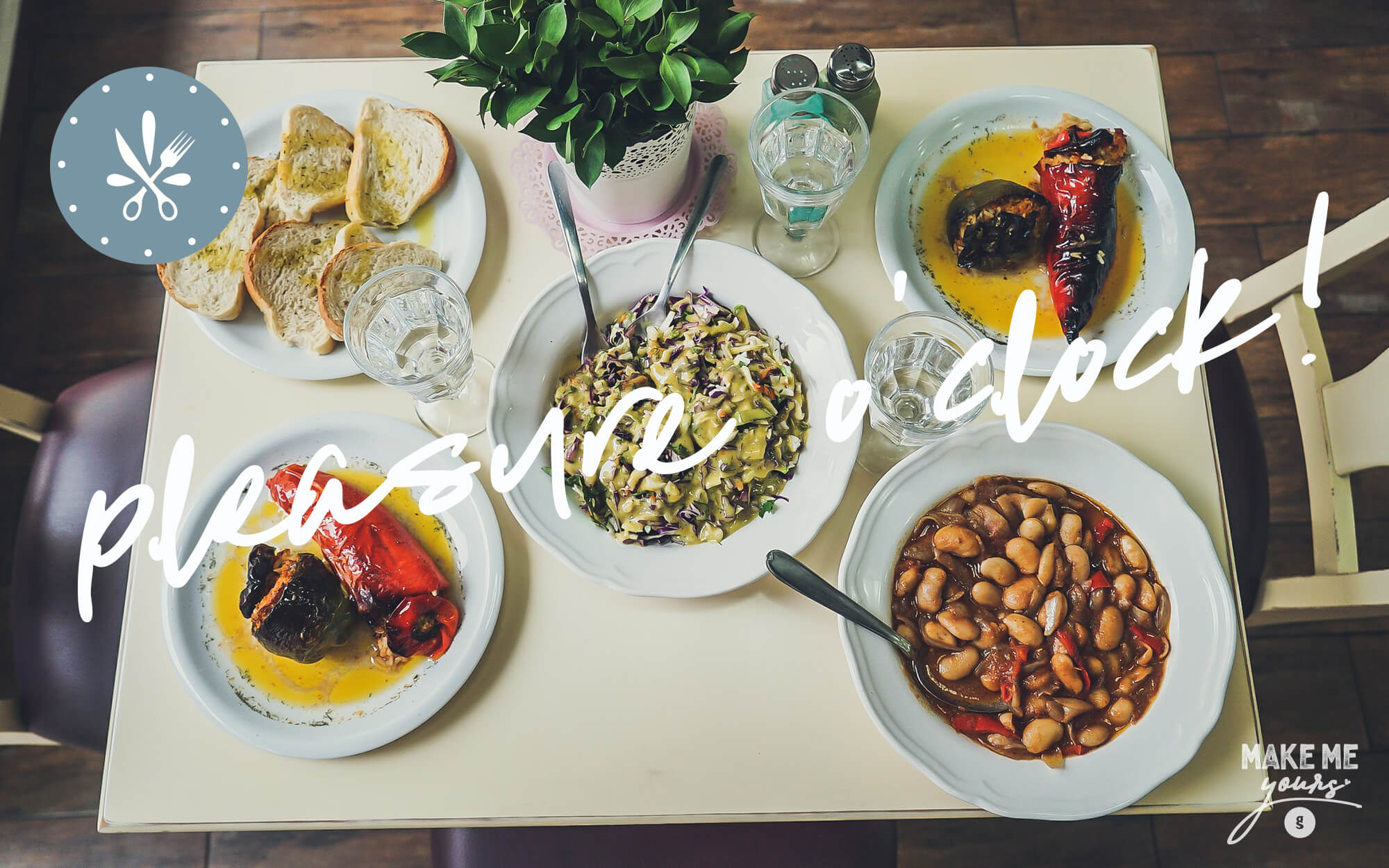
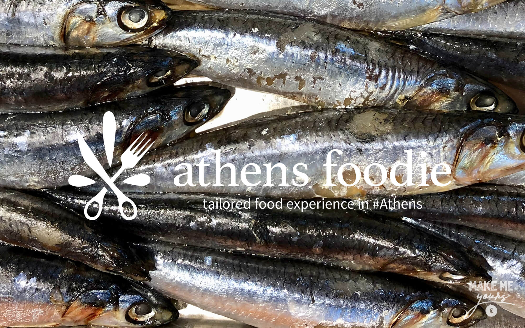
Greek food and cuisine are witnessing an unprecedented renaissance, as global interest in traditional as well as modern culinary offerings is constantly on the rise. And apart from the obvious economy sectors that benefit from this mega trend -such as food & beverage and restaurants – there are many new businesses that have some fresh, innovative ideas on how to successfully ride this wave. Meet the Athens Foodie – a blog-based service that introduces travelers and visitors of the city to the wonders and hidden gems of Greek food. The idea is quite simple: just contact us and we will open the door to a mouth-watering range of Greek food experiences, ranging from contact with an expert grandma who can teach you how to knead dough and make bread, to tips where to find the best of any imaginable Greek dish in the city, to secret locations that offer the freshest and most wholesome ingredients.
International visitors to the city of Athens, who want to experience the authentic and prefer their vacations to wander off the beaten path.
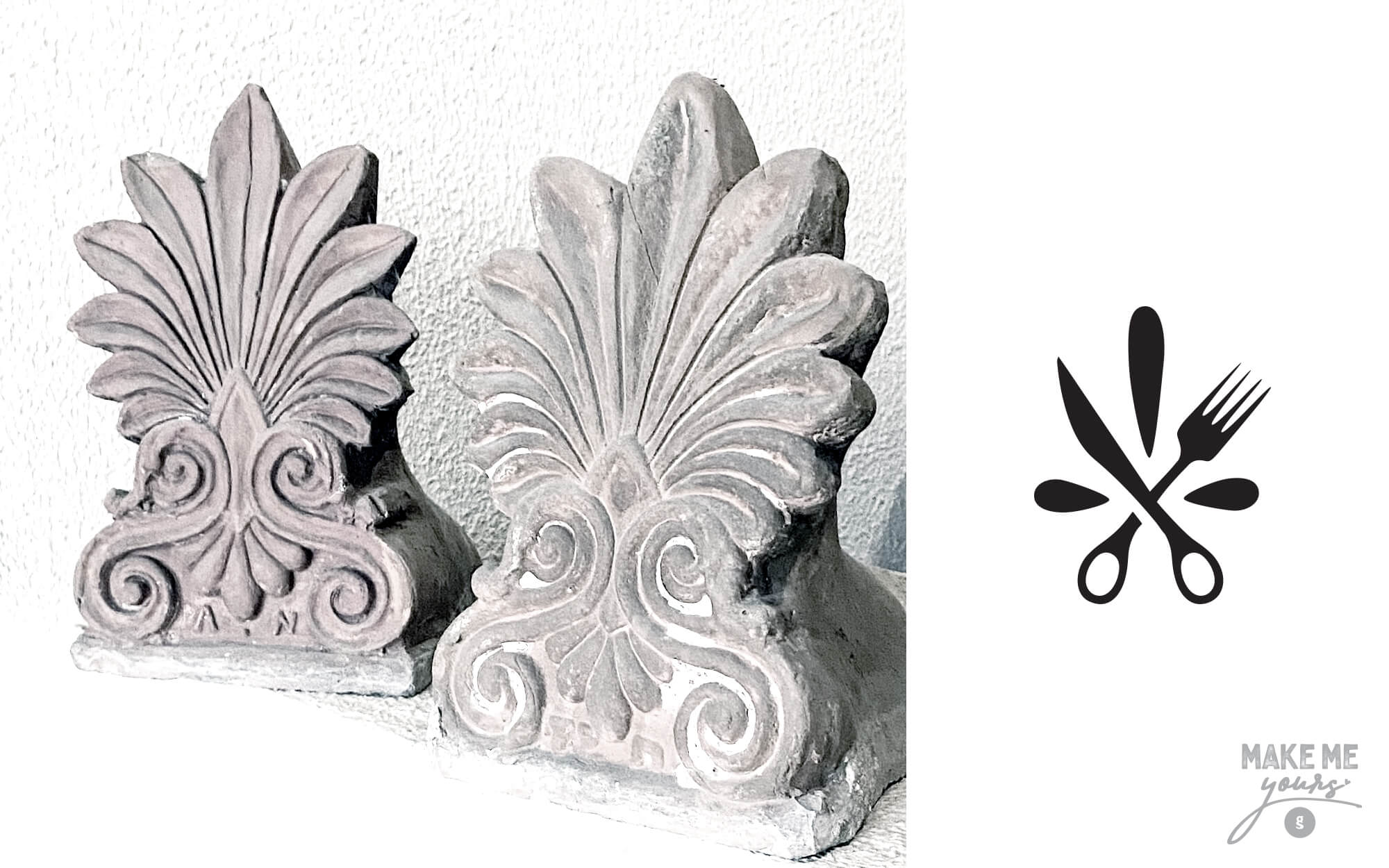
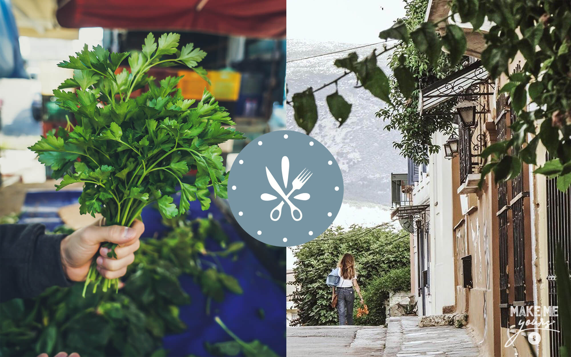
The conventional imagery of Greek food for many years has been stuck to stereotypes. Most of the times these were expressed visually in ways that were too obvious and too tired for our liking. For sure, we wanted to covey the idea of something quintessentially Greek – but without resorting to any of the folklore and touristy references that have been the unfortunate rule so far. We thus sought inspiration in more subtle items and symbols.
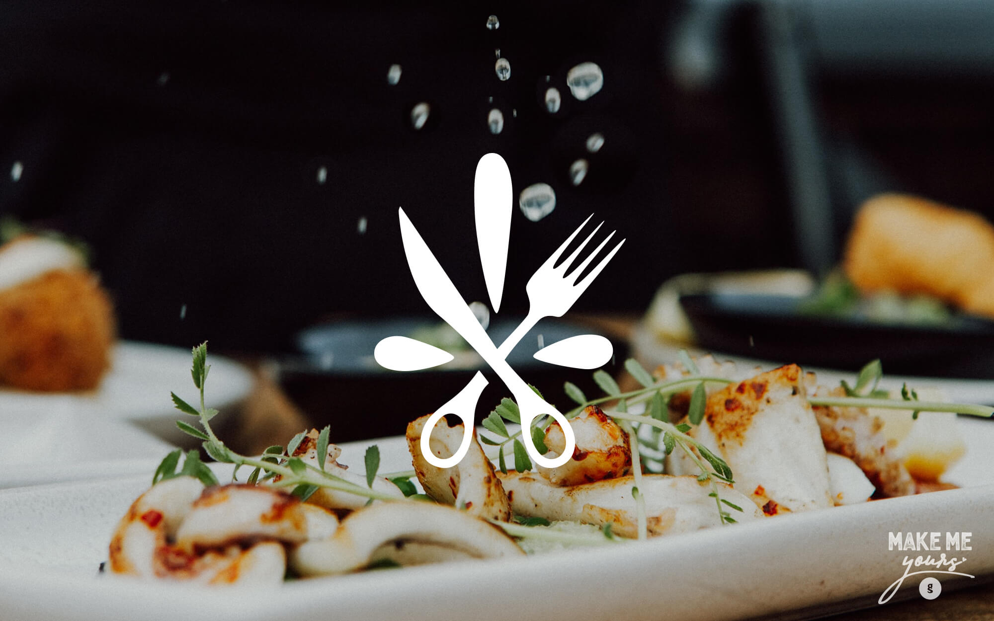
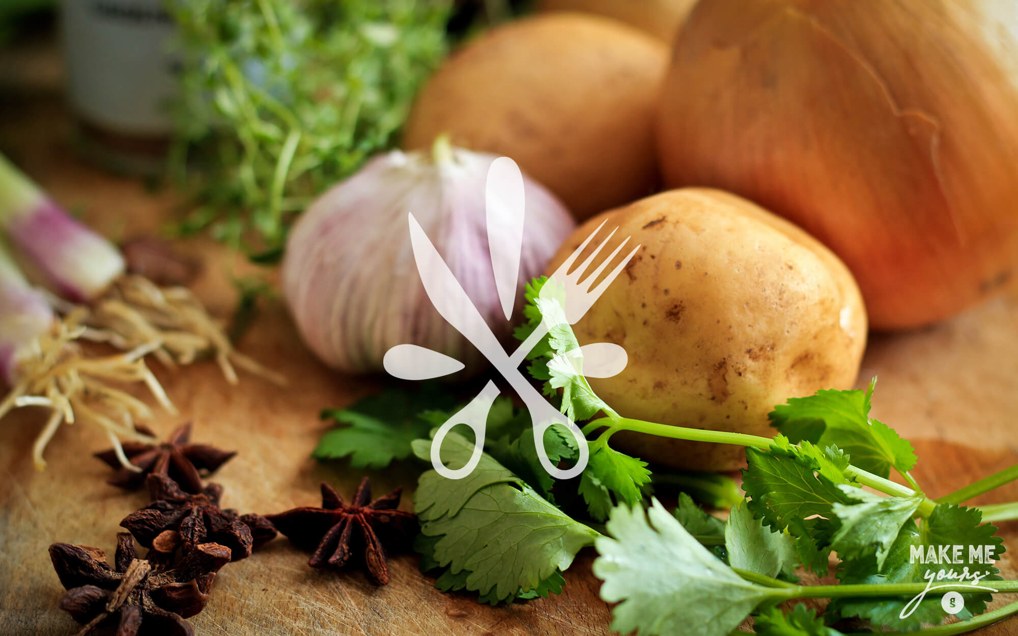
The Greek version of the antefix, the vertical ceramic block that terminates the covering tiles of a tiled roof, is locally known as ‘Akrokeramo’ (literally: edge tile). It usually employs plant-inspired designs and it is an extremely characteristic feature of classical and neoclassical architecture. We thus created a symbol highly reminiscent of the Akrokeramo, but consisting of a fork, a knife and a three leaves. The fork and the knife have a scissors-like grip, a direct reference to the tailored experiences offered. Finally, all these are embedded in a circle with dots all around, resembling a clock – a suggestion to the around-the-clock availability of the experiences offered. Classic yet contemporary and definitely memorable, the end result is a solid base for the brand to build upon.
Logo design, brand name, design concept


Brand name & texts: Konstantinos Kontinos
Photos: Unsplash