A breeze of fresh branding air
Sophia Georgopoulou | Design – ALL RIGHTS RESERVED
Concept & Design currently available
BRIEF
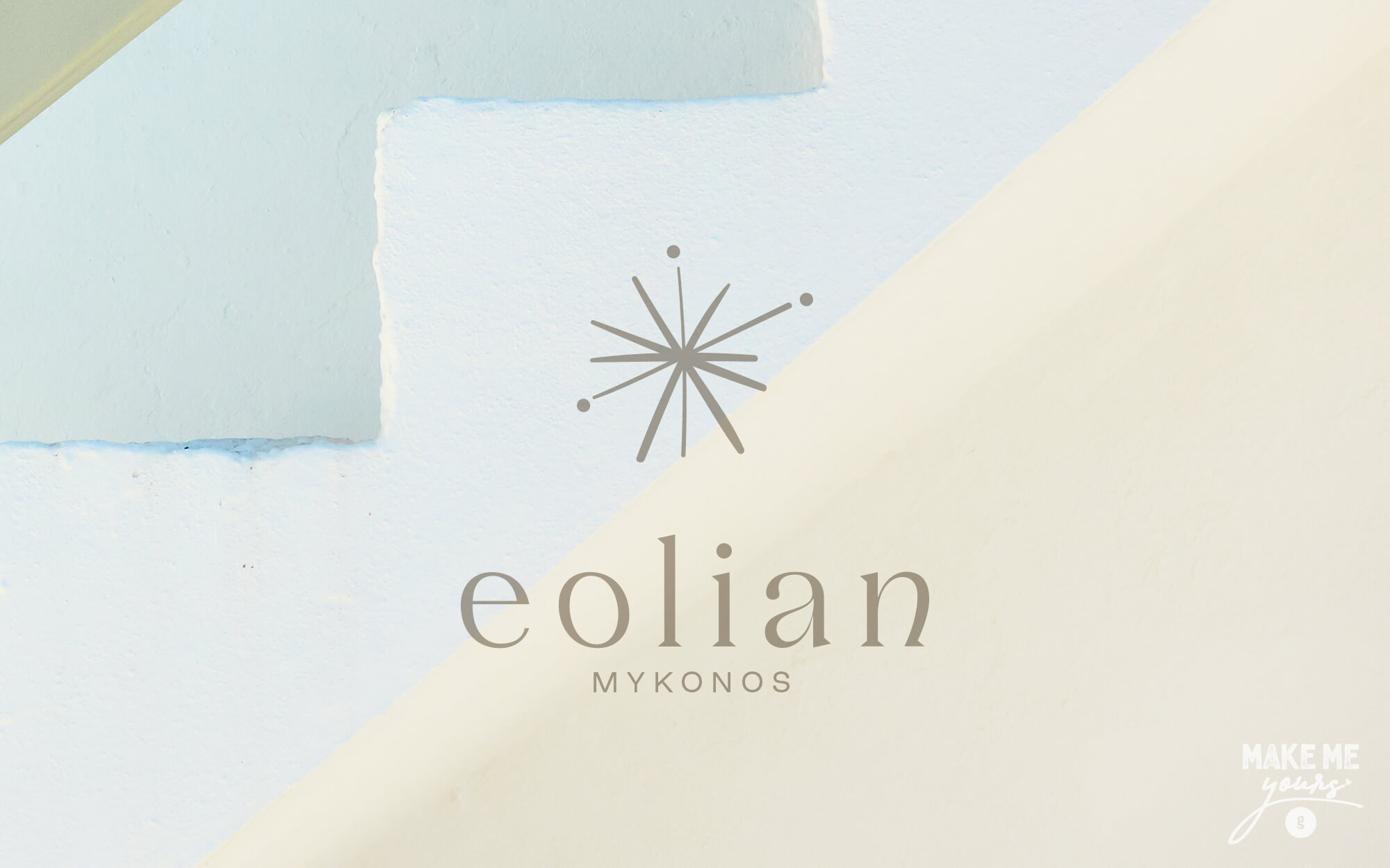
Local and global competition of holiday options is fiercer than ever. In this effort, a well-thought branding can prove a great ally against a sea of unexciting sameness. This was well understood by the people behind Εolian Villas, an exclusive resort in the world-famous island of Mykonos – also known as the ‘island of winds’. The resort needed a simple yet powerful identity that would resonate with its upscale and highly eclectic target audience. In these circles, anything too loud is out of the question. This highly desired quality of being meaningful without being obvious or loud was essential to the brief.
TARGET GROUP
International travellers with a discerning taste, and people who are after a special kind of luxury – more subtle, giving emphasis to transformational experiences and feelings. CREATIVE
CONCEPT
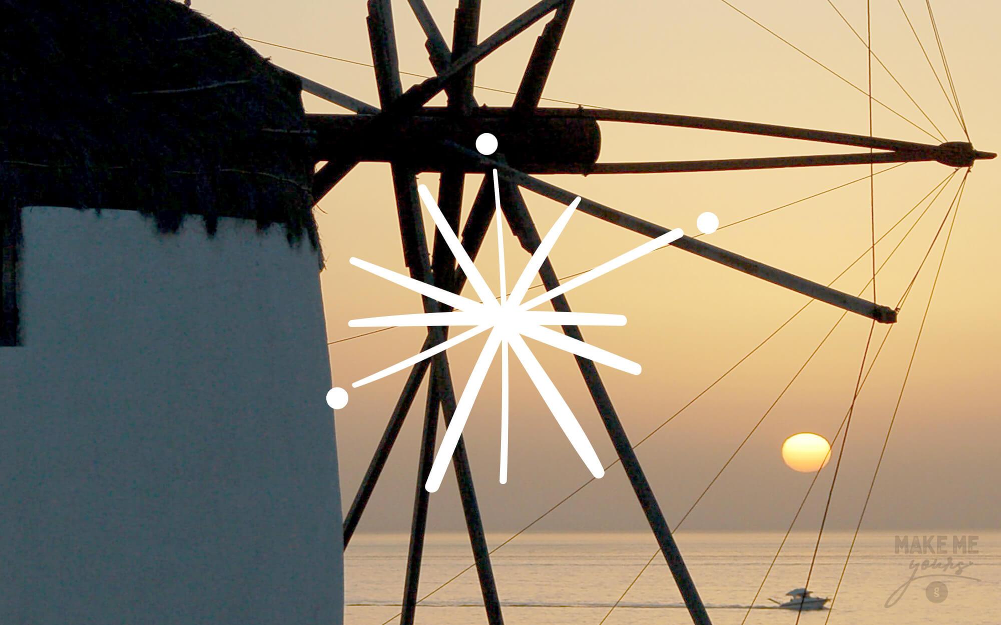
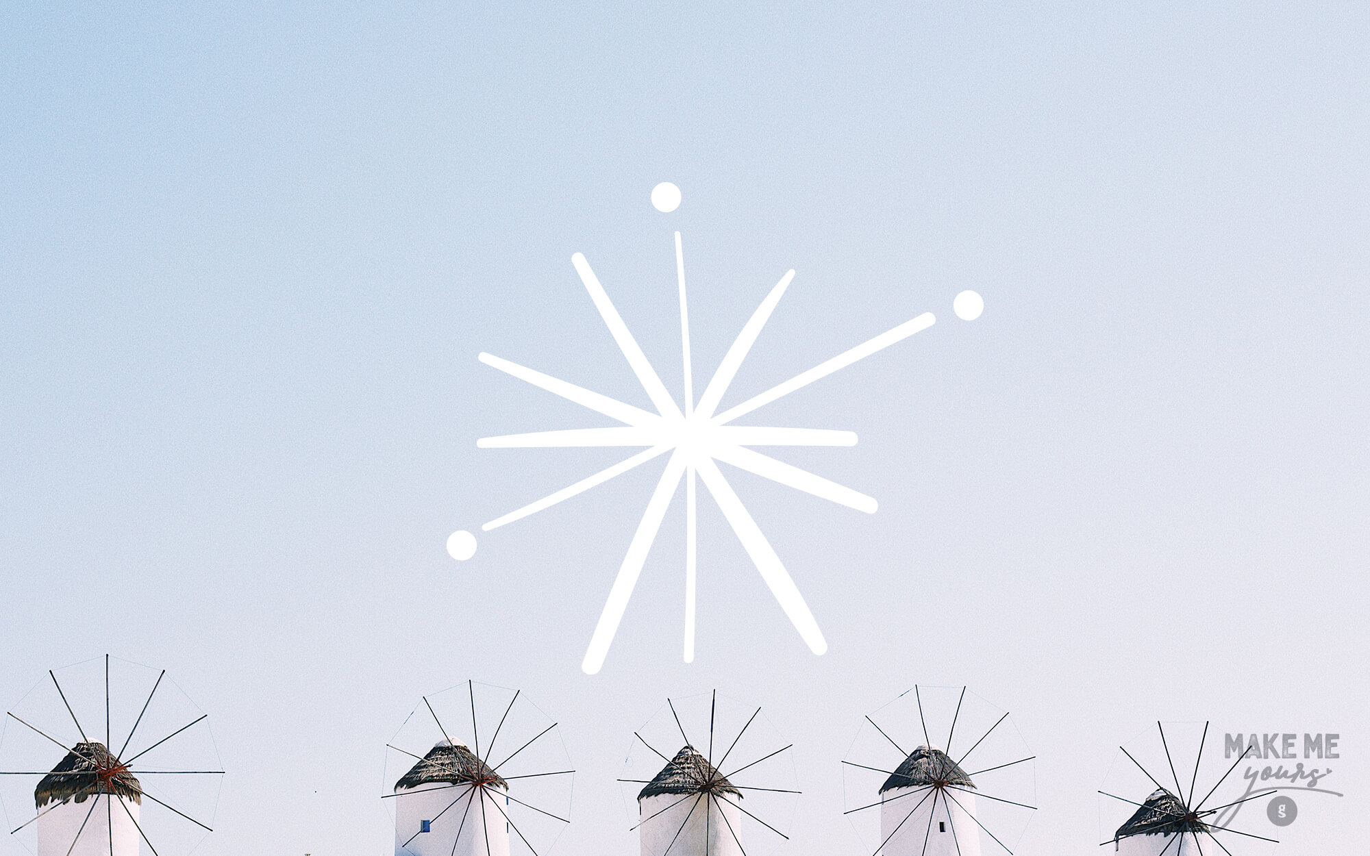
The name of the resort was central in the creative process. This clear reference to the wind, so typical in this island, was begging for visual expression. The most obvious way to go was to draw inspiration from the well-recognized windmills of the island, a world-famous trademark. The problem? This is too obvious – and obvious was a bad idea, especially given the targeting of the resort. A different path was required.
DESIGN APPROACH
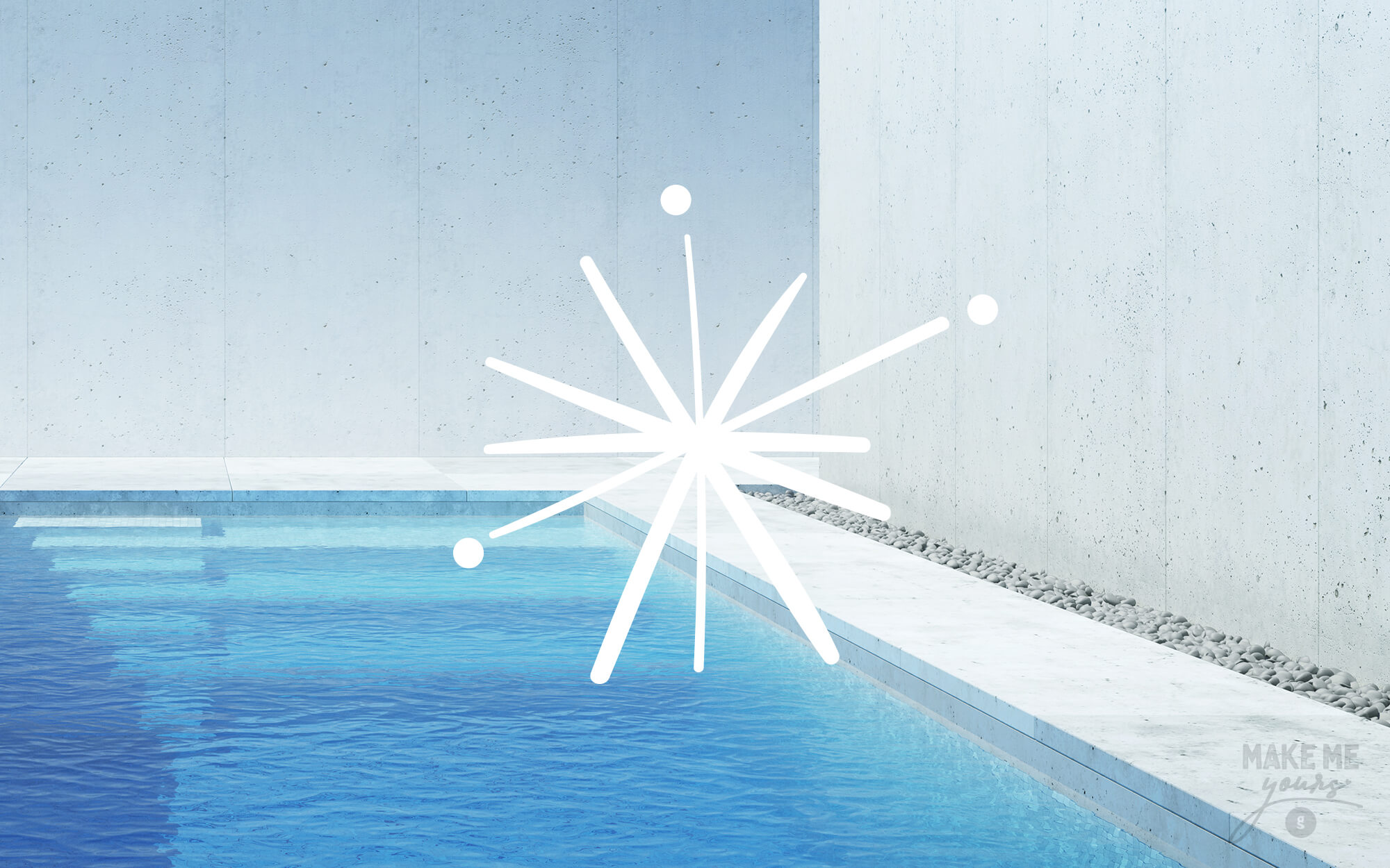
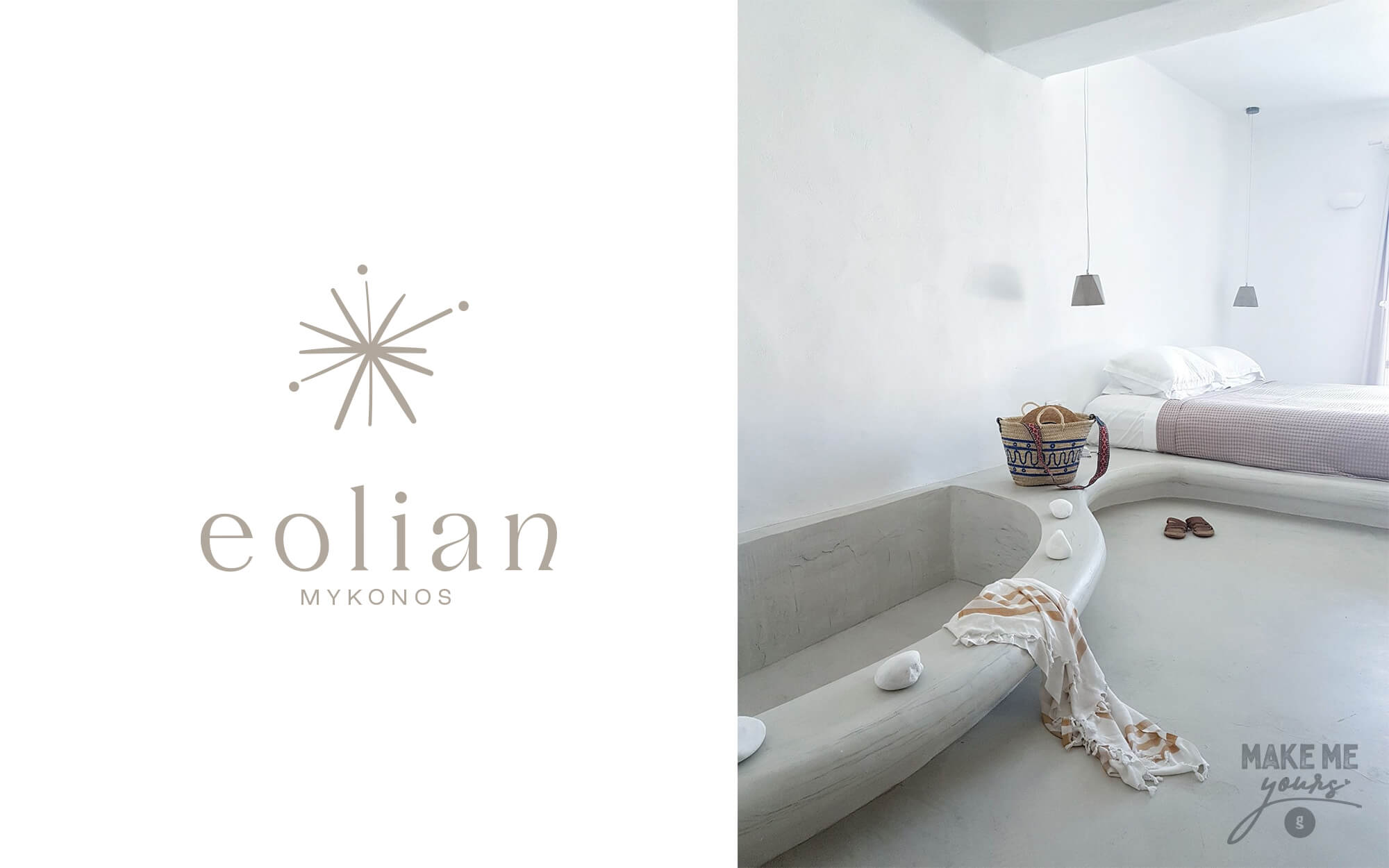
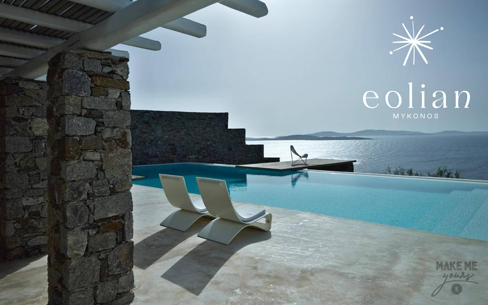
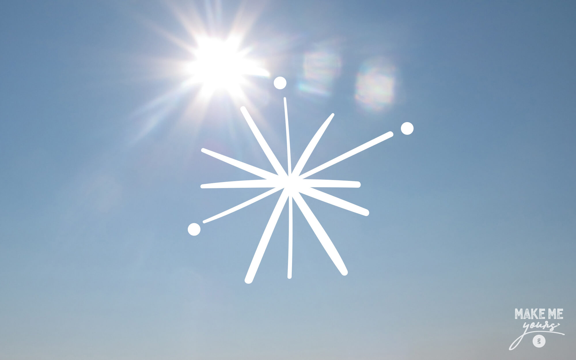
What are the mental associations of ‘the wind’? As it is invisible, it can be perceived only through its effects. And one of the most well-recognized representations of this is the dandelion seedhead, with individual seeds breaking off in the wind. This imagery is associated with wish-making and also freedom, connections really welcome when it comes to the highly emotional and individualistic nature of holidays. It also helps a lot that the basic shape is reminiscent of a vibrant, exploding sun, something that works very well with the idea of emotional overload. And still, as the link to the traditional windmill is too useful to ignore, the shape of the logo is indeed remotely windmill-like but without resorting to easy visual solutions. The final touch is the golden color, a reference to the upscale targeting of the resort. Now the seeds of the brand are ready to be carried off by the wind to the edges of the Earth.
SERVICES
Logo design, brand name, design concept

Brand Name: Konstantinos Kontinos
Photos: Unsplash