‘C’ for (super) Coolness
Sophia Georgopoulou | Design – ALL RIGHTS RESERVED
Concept & Design currently available
BRIEF
Operating an Optical Store is a demanding business – before everything, you’d better draw some attention by your look and feel, because at the end of the day the brands and the models that you sell are pretty much the same as the next guy. This realization often drives many stores to use extreme visual devices, but the result rarely does any justice to the original intentions – basically, you end up being noticed for all the wrong reasons. The people behind COOLSUPERCOOL eyewear were very much aware of these challenges, and it came as no surprise that they wanted to follow a different path, that of a pop-based minimalism.
TARGET GROUP
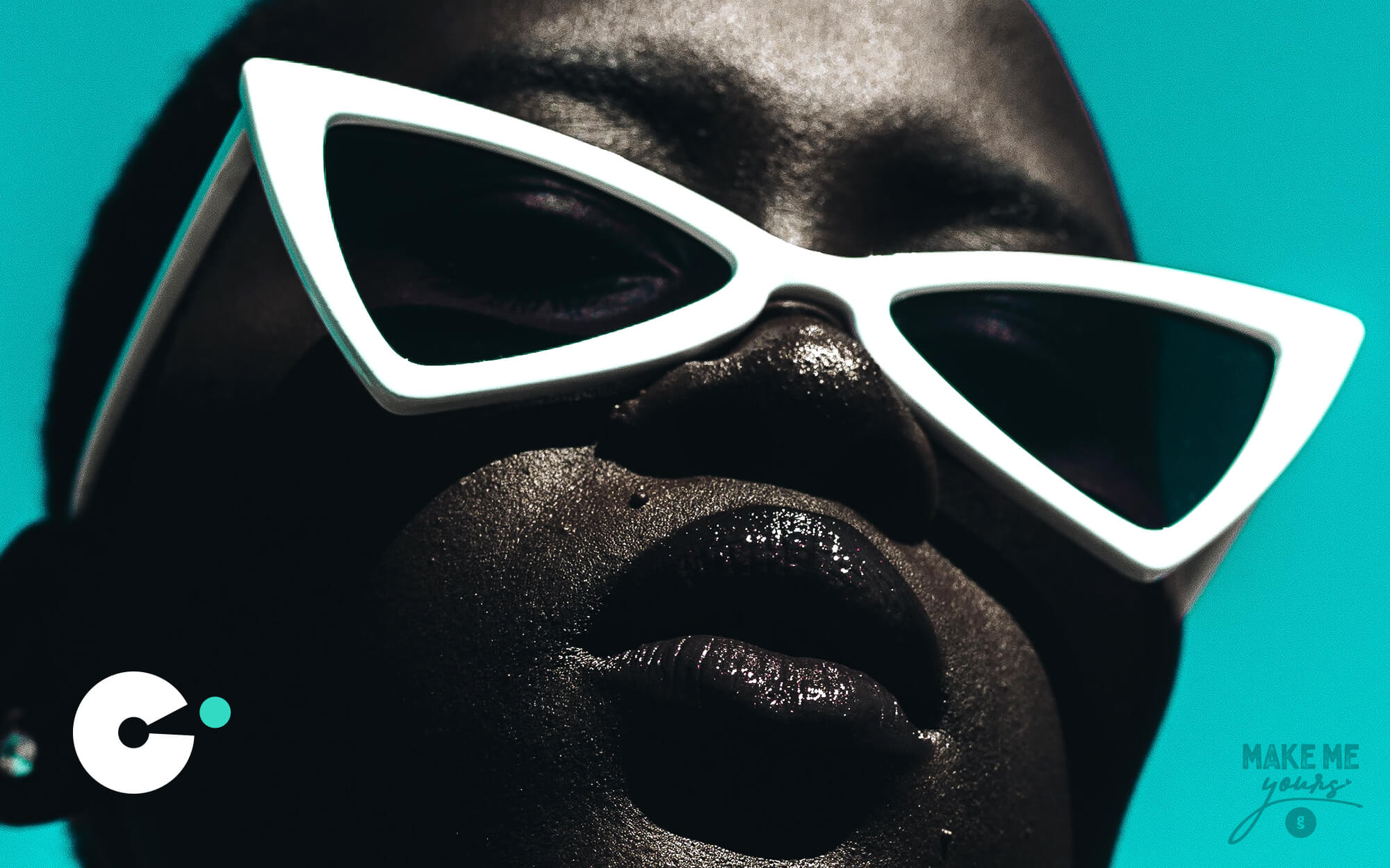
The store and brand are after a broad audience but with a certain focus on younger, trend-conscious crowds.
CREATIVE CONCEPT
On the basis of the original vision of what the brand should be all about, we decided to go after a stripped-down pop aesthetic. And though it was desired for the end result to suggest an Optical Store at some level, it was equally if not more important to position the store as a fashion spot, a place where trends are expressed and things are happening. By following this logic, we approached the design challenge as if working for a fashion brand, say, a clothing brand or even a pop music band.
DESIGN APPROACH
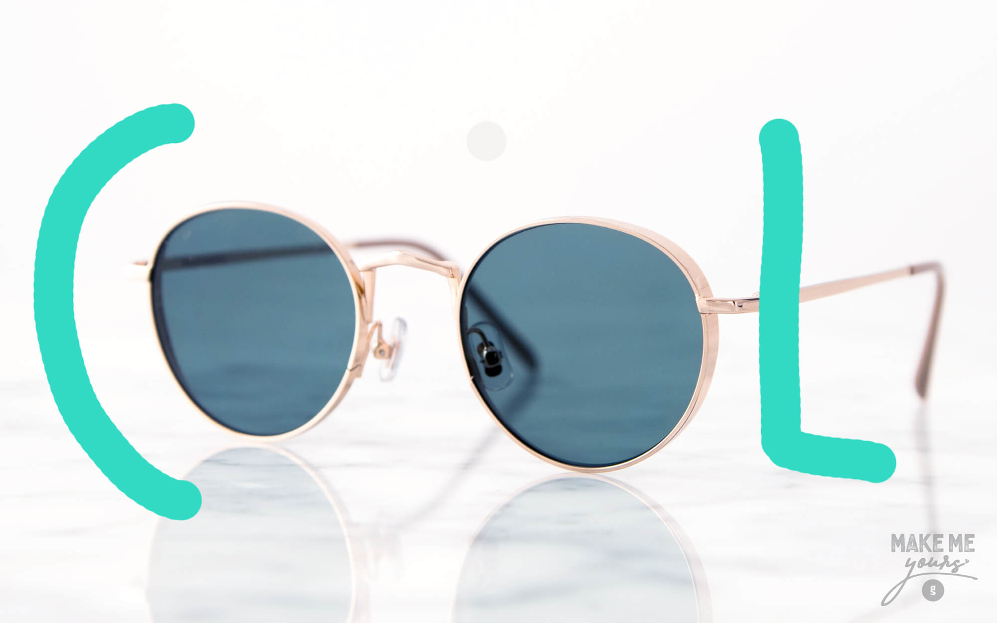
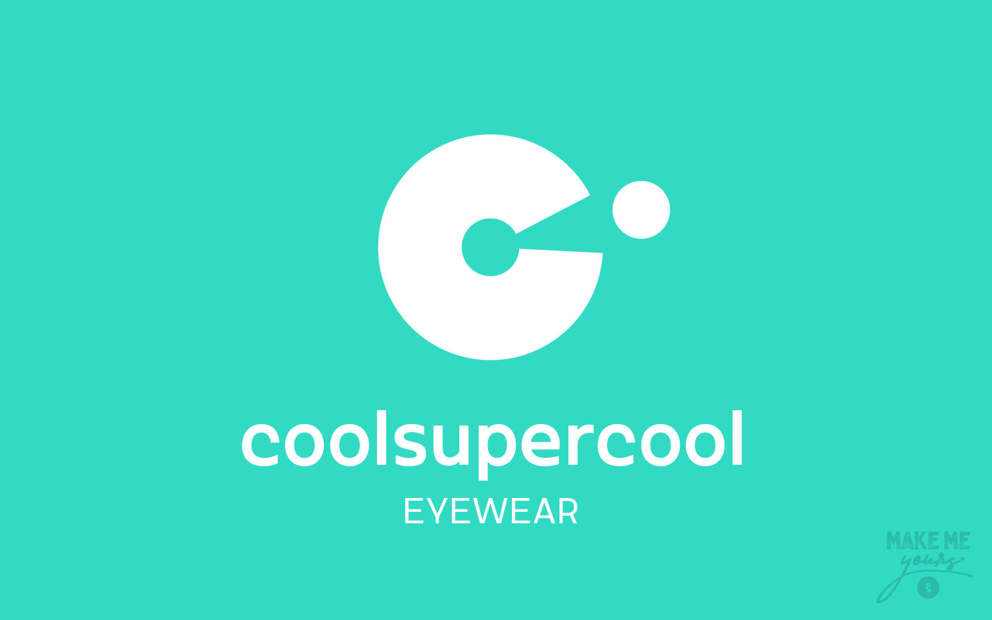
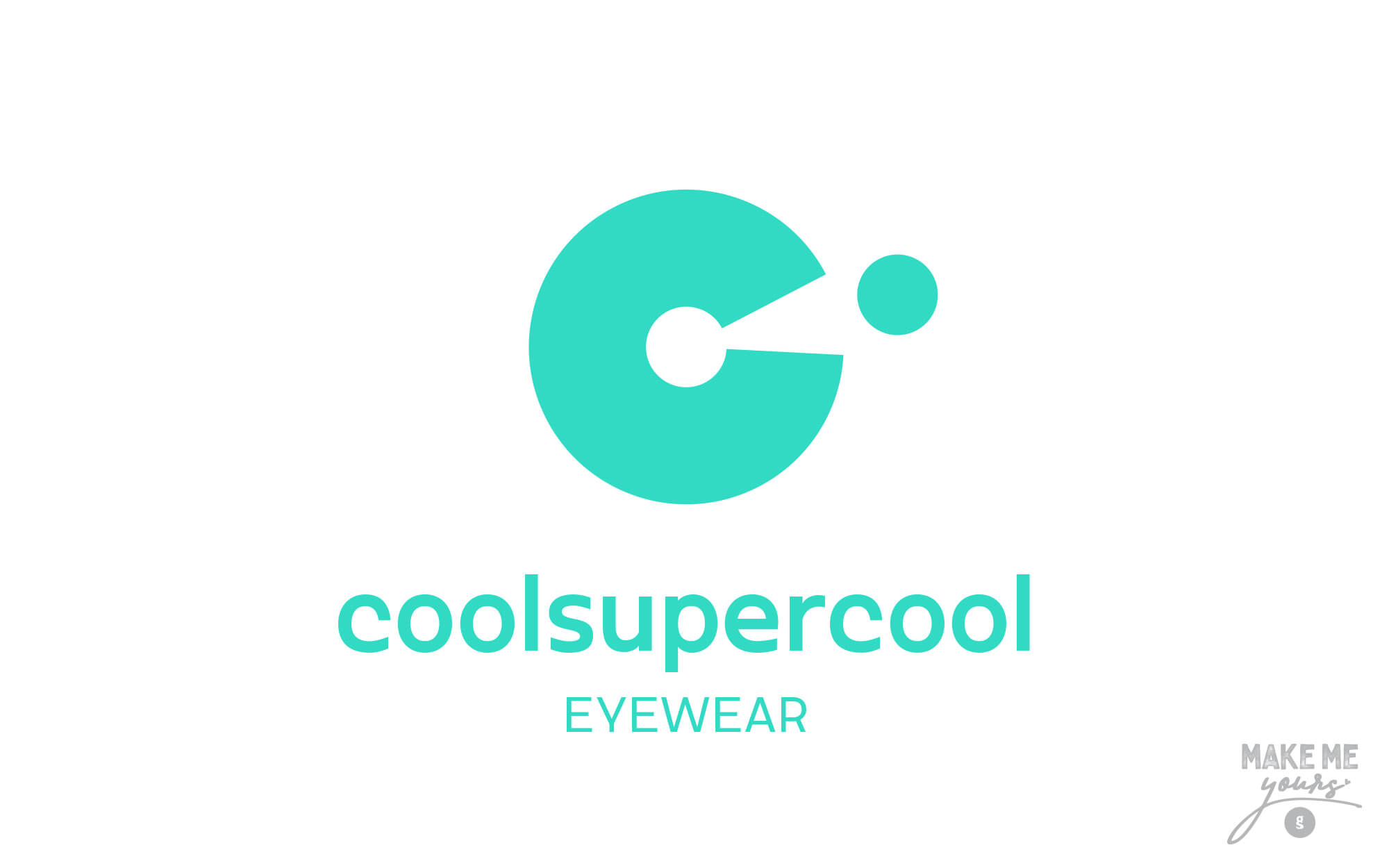
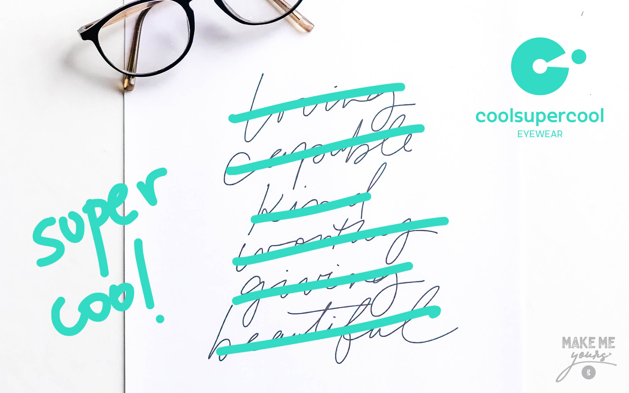
The first letter of the brand name (the ‘C’) is very versatile and open to exploitation. We decided that it should play a central role in the logo, because (for starters) it is remotely reminiscent of an eye outline, with the ‘opening’ of the letter standing for the cornea and the pupil – the sections of the eye that receive the light from the outside environment. Following this logic, the dot outside the eye stands for the stimulus that comes from outside – to be finally represented as a mental version of the dot, inside the eye and eventually in the brain. Thus, this broken-down representation of how vision works was given simply – but also indirectly enough so as not to be too obvious. The clear colors, simple lines and unassuming typeface complement the everyday, approachable character of the brand with an end-result that is as pop and uplifting as we wished in the first place.
SERVICES
Logo design, brand name, design concept


Brand Name: Chris Baskakis
Texts: Konstantinos Kontinos
Photos: unsplash