Going back to basics in a natural way
BRIEF
Consumer demand for natural care products has witnessed an unprecedented growth. As expected, many brands from around the globe have tried to jump the bandwagon, eager to get a good slice of an ever-growing pie. As a result competition has skyrocketed, making it really tough for any new entrant to shine through. Basic Naturals was a new series of 100% natural handmade skin care products with relatively small means but with high expectations. Crafted in small batches in Connecticut, USA, Basic Naturals use only the finest organic ingredients Mother Nature has to offer and are created exclusively on the basis of time-proven, mild production techniques. All these somehow had to be brought to surface and celebrated in the identity that the brand wanted to create from scratch.
TARGET GROUP
Women who favor natural skincare solutions in the USA market
CREATIVE CONCEPT
The name itself at face value sounds a bit generic, flat. But think about it a bit more and it sounds like a purposeful assertion. Only something really good would be so sure of itself so as to claim directly both simplicity and naturalness, without resorting to elaborate words and suggested meanings. This is something that is worth celebrating. Thus, the new identity had to be both basic (simple, not loud, stripped down, directly accessible) and natural (not contrived, shouting ‘nature’, mild). This was the starting point of the creative process.
DESIGN APPROACH
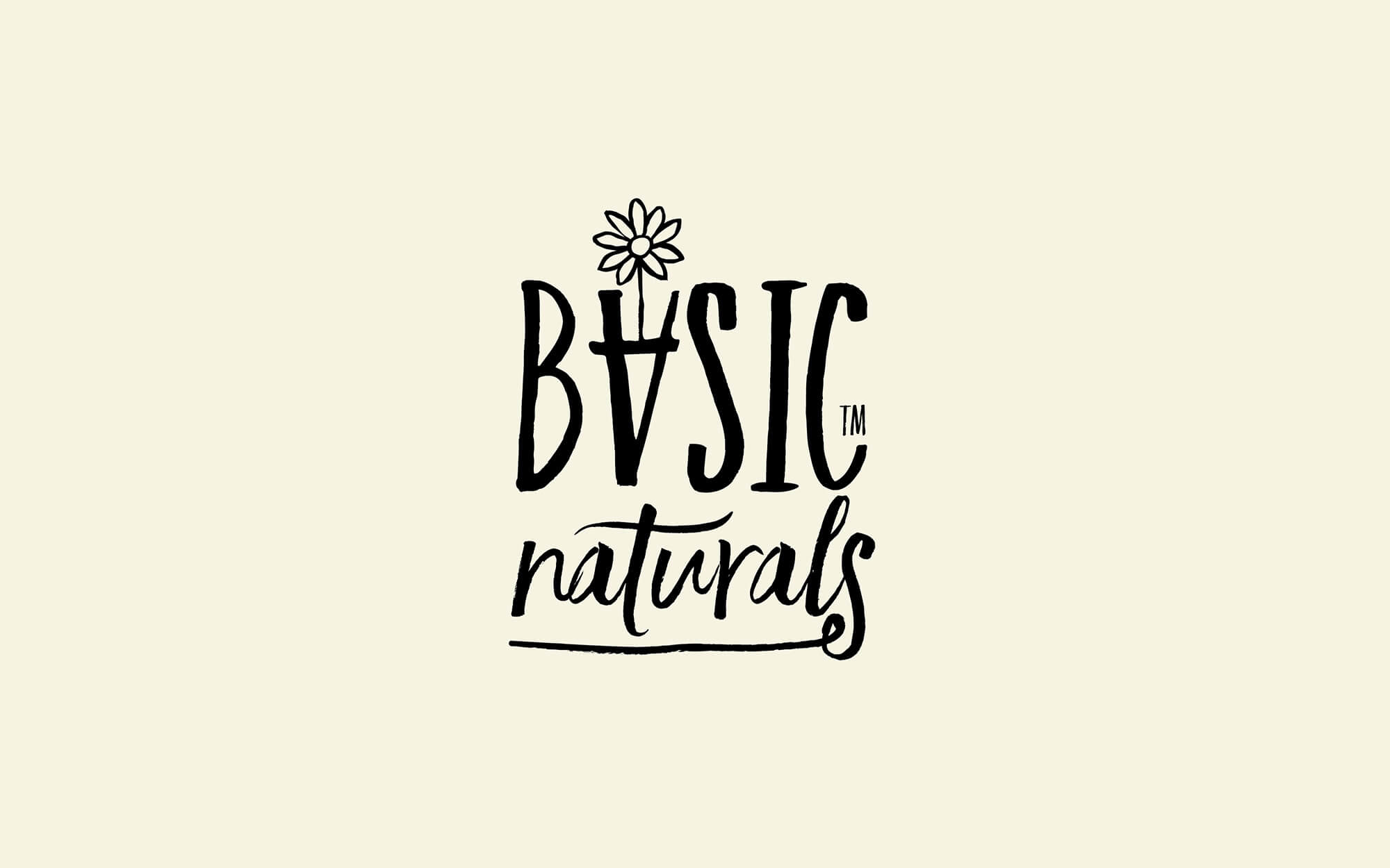
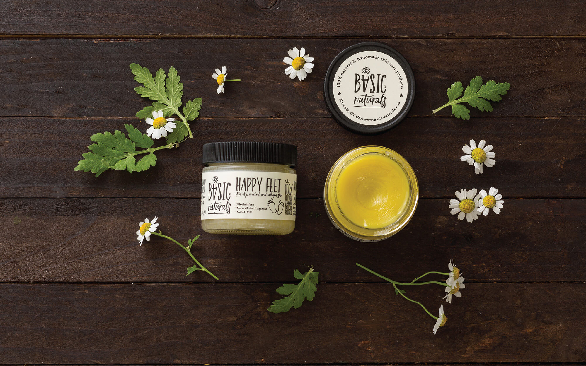
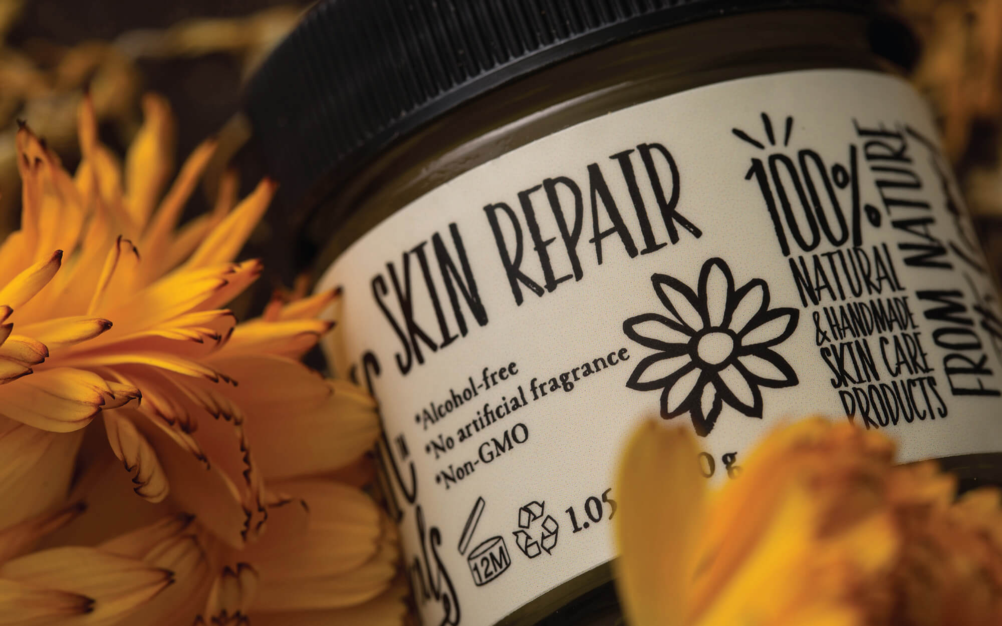
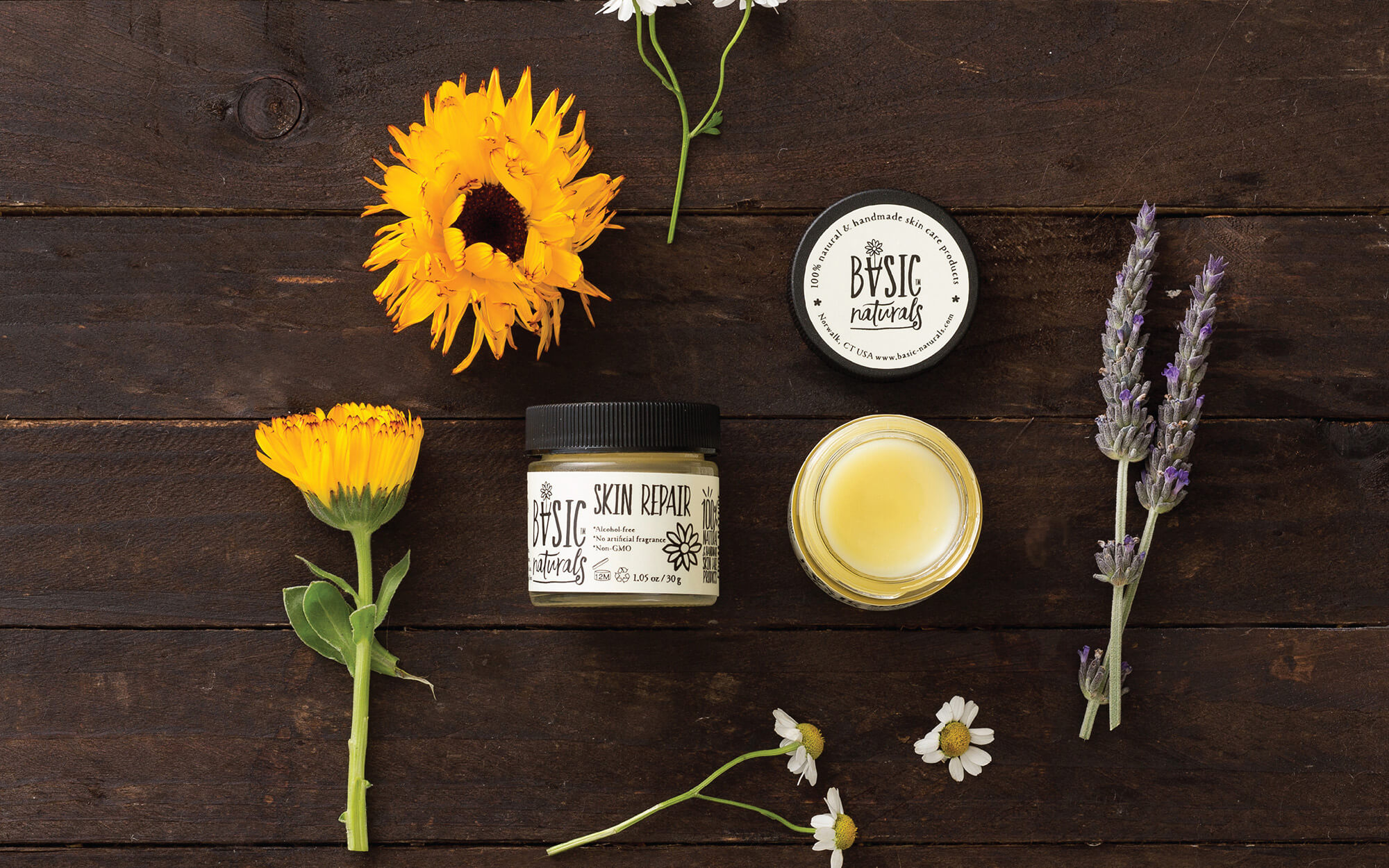
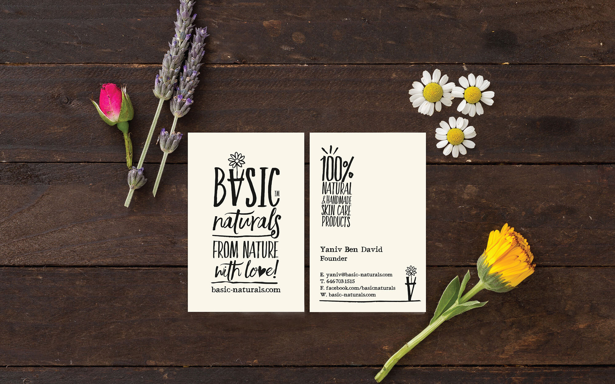
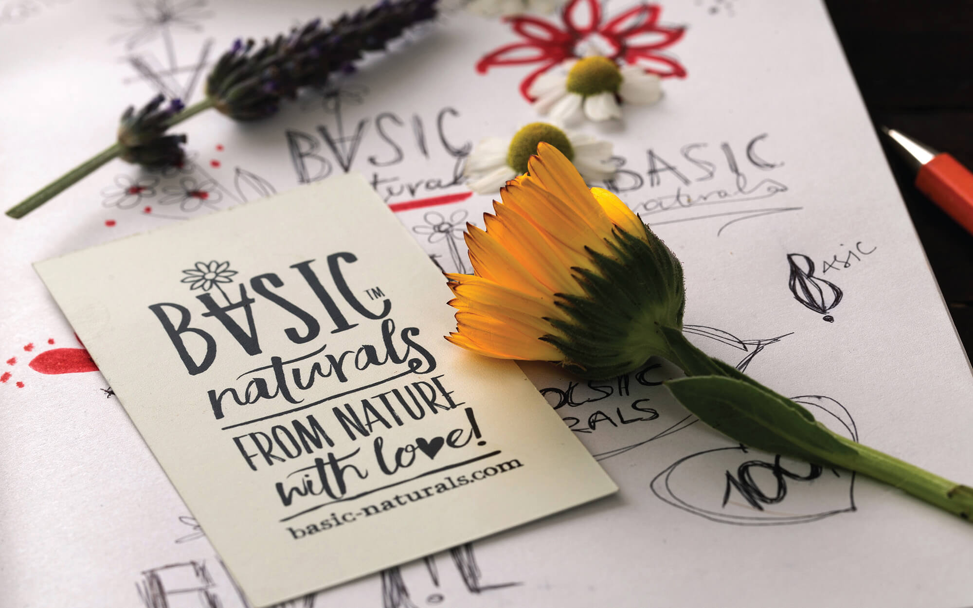
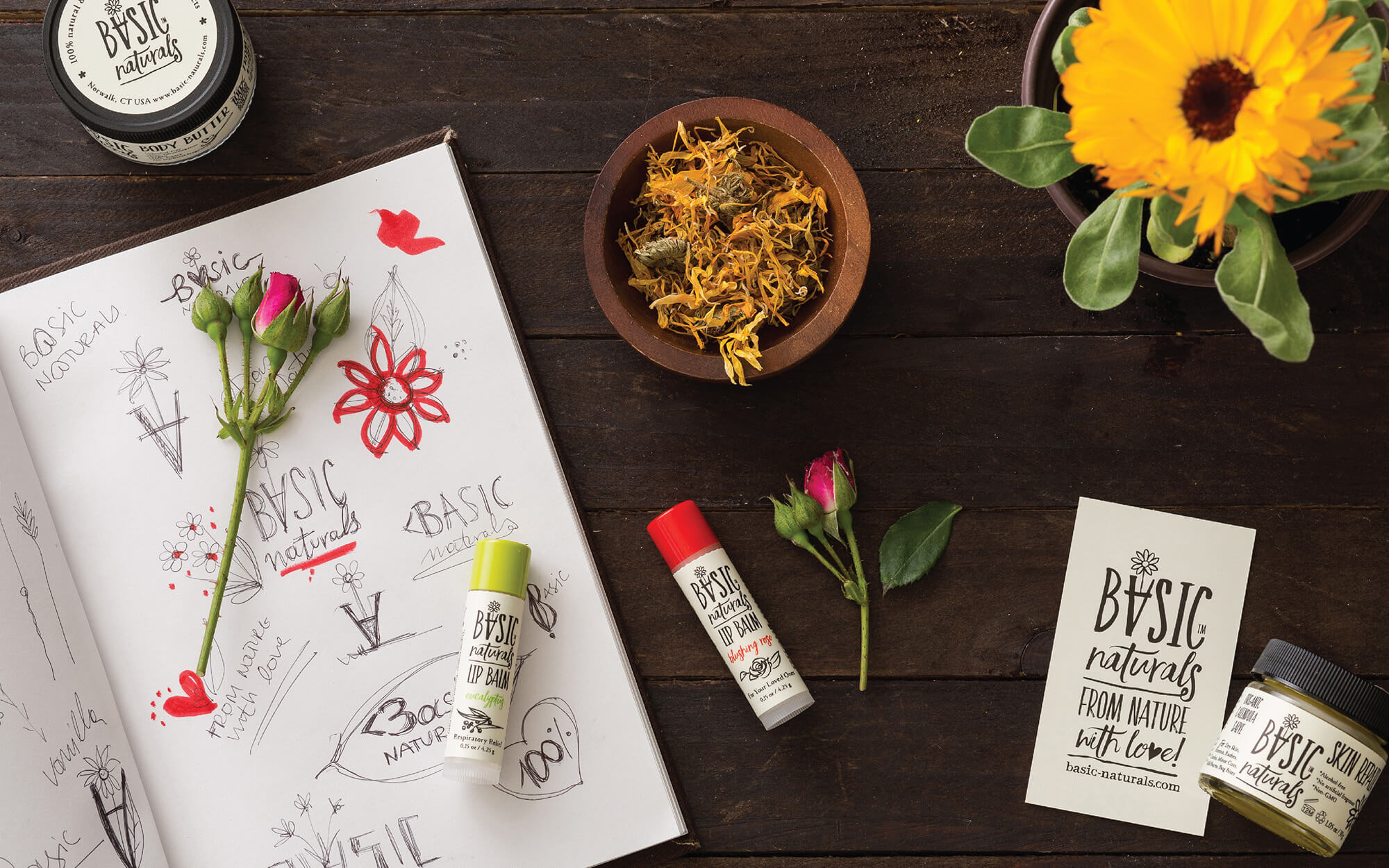
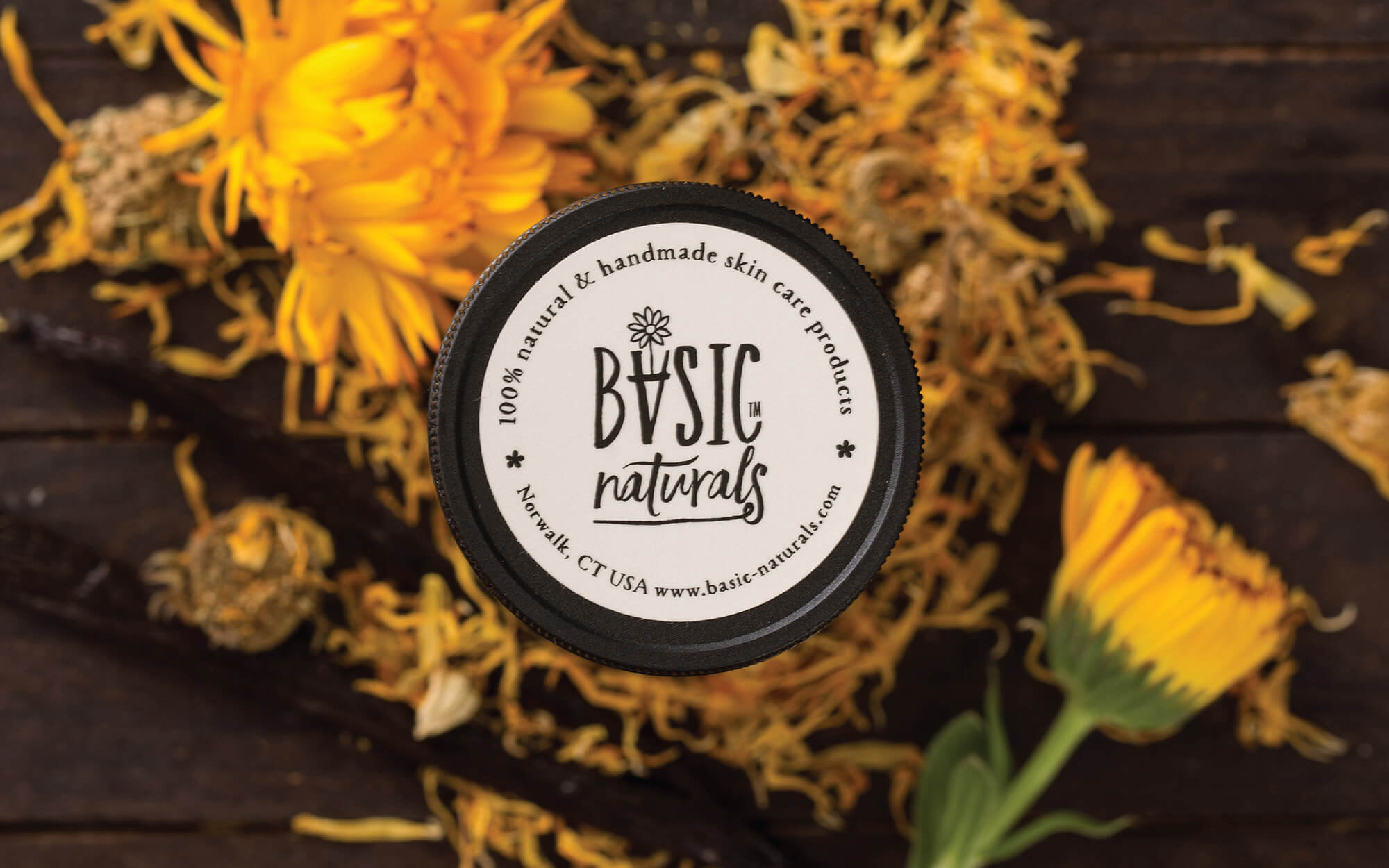
In line with the above and totally respecting the brands’ origins and values, a logo was created that incorporates in the word ‘BASIC’ the element of a flower pot in the shape of an inverted ‘A’. On the top of that, the Calendula flower depicted constitutes a wink to the first product created that was based on this very plant, a plant that itself suggests simplicity, mildness and joy.
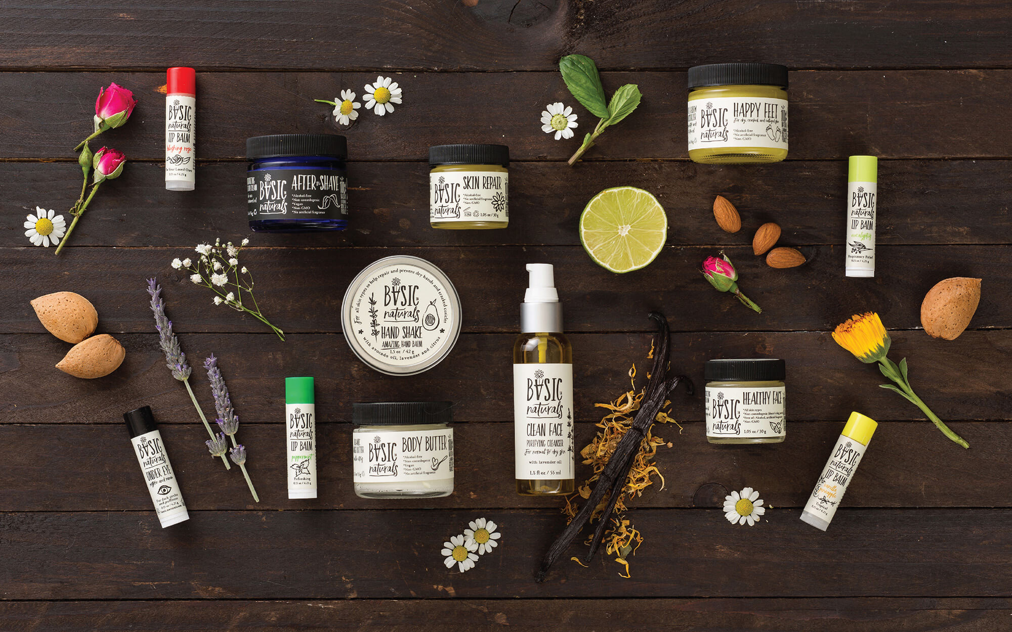
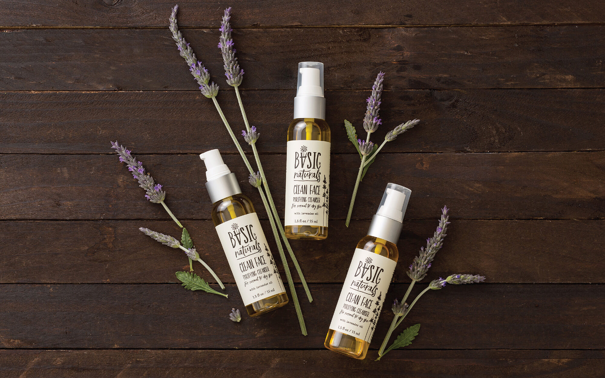
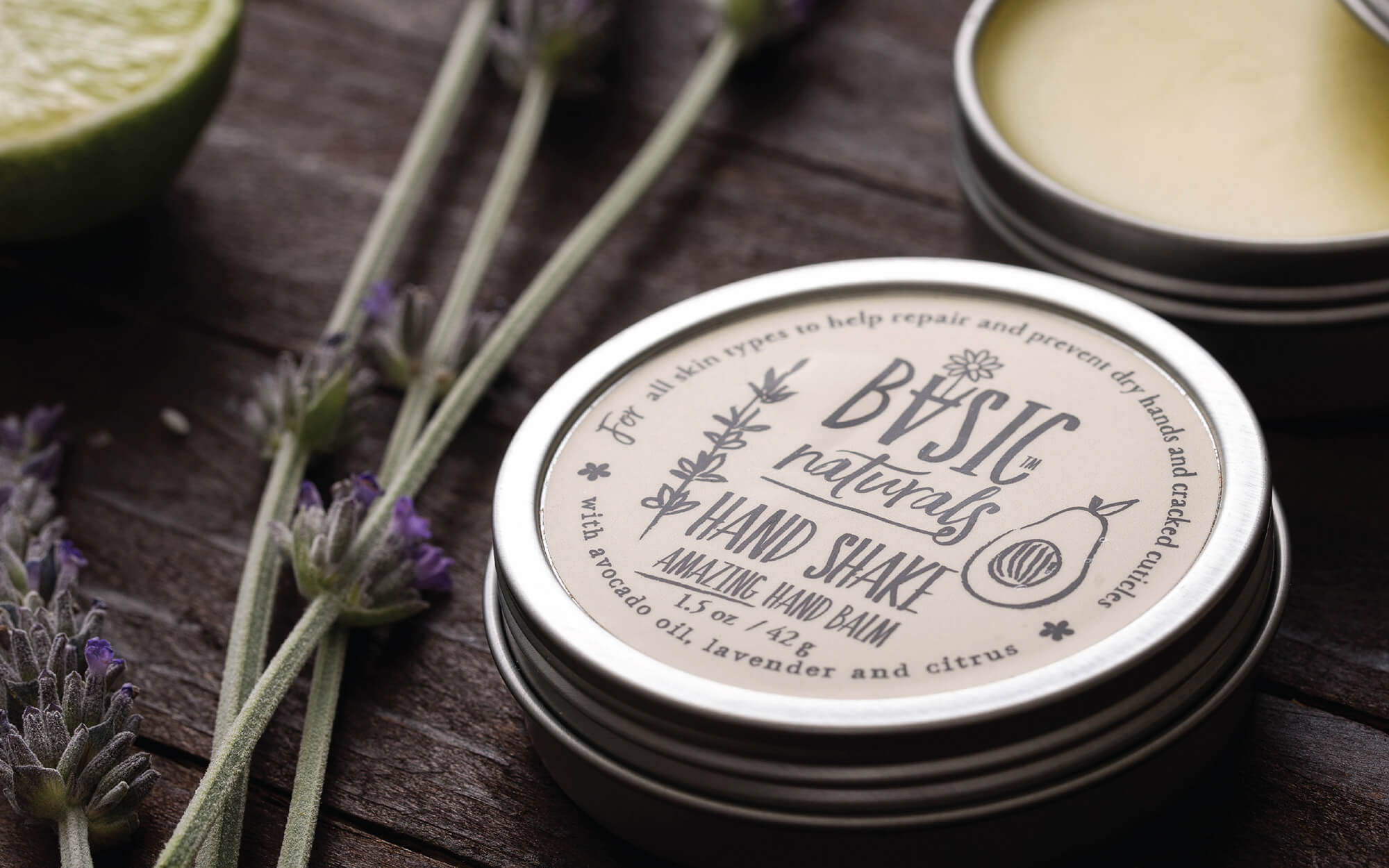
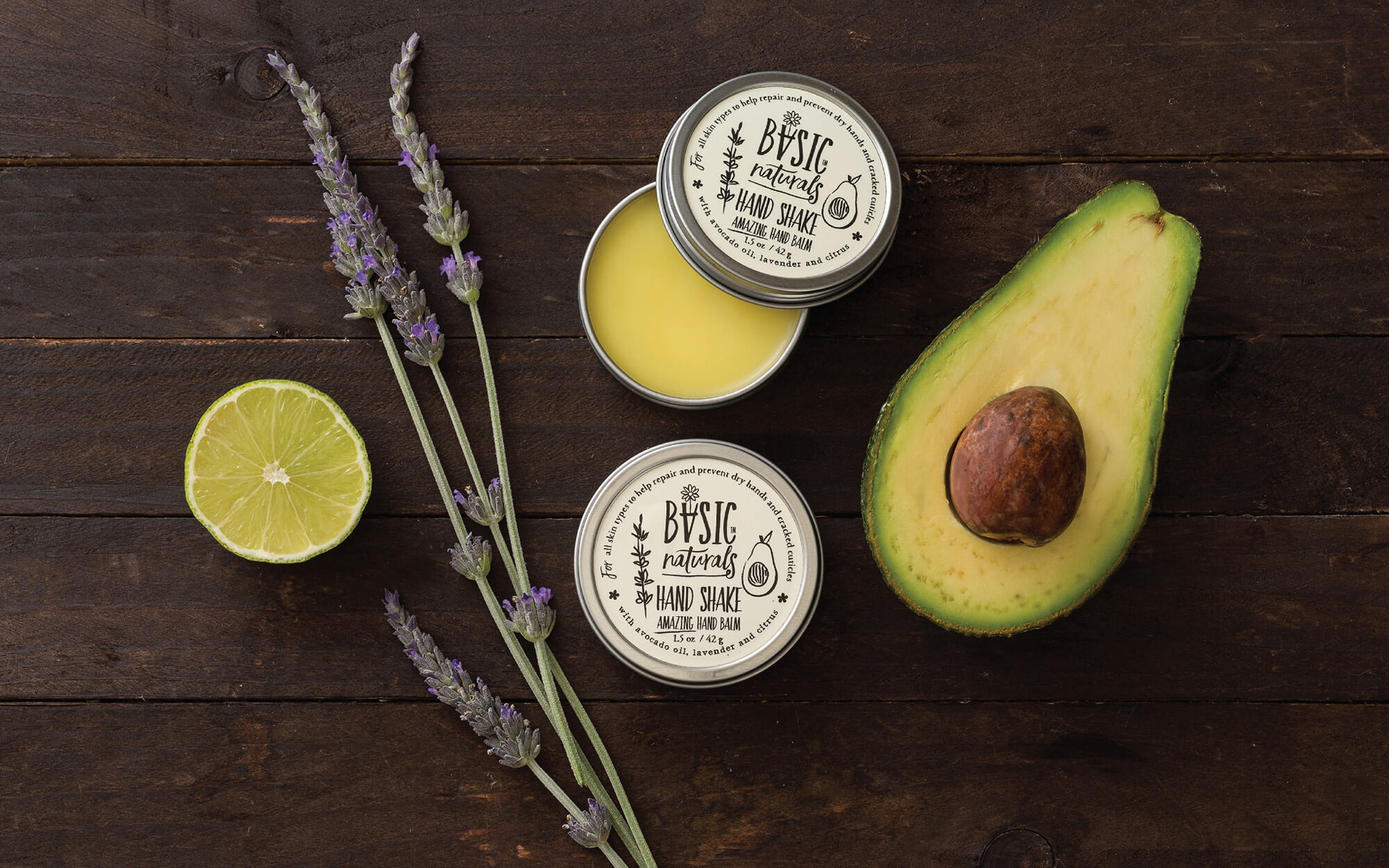
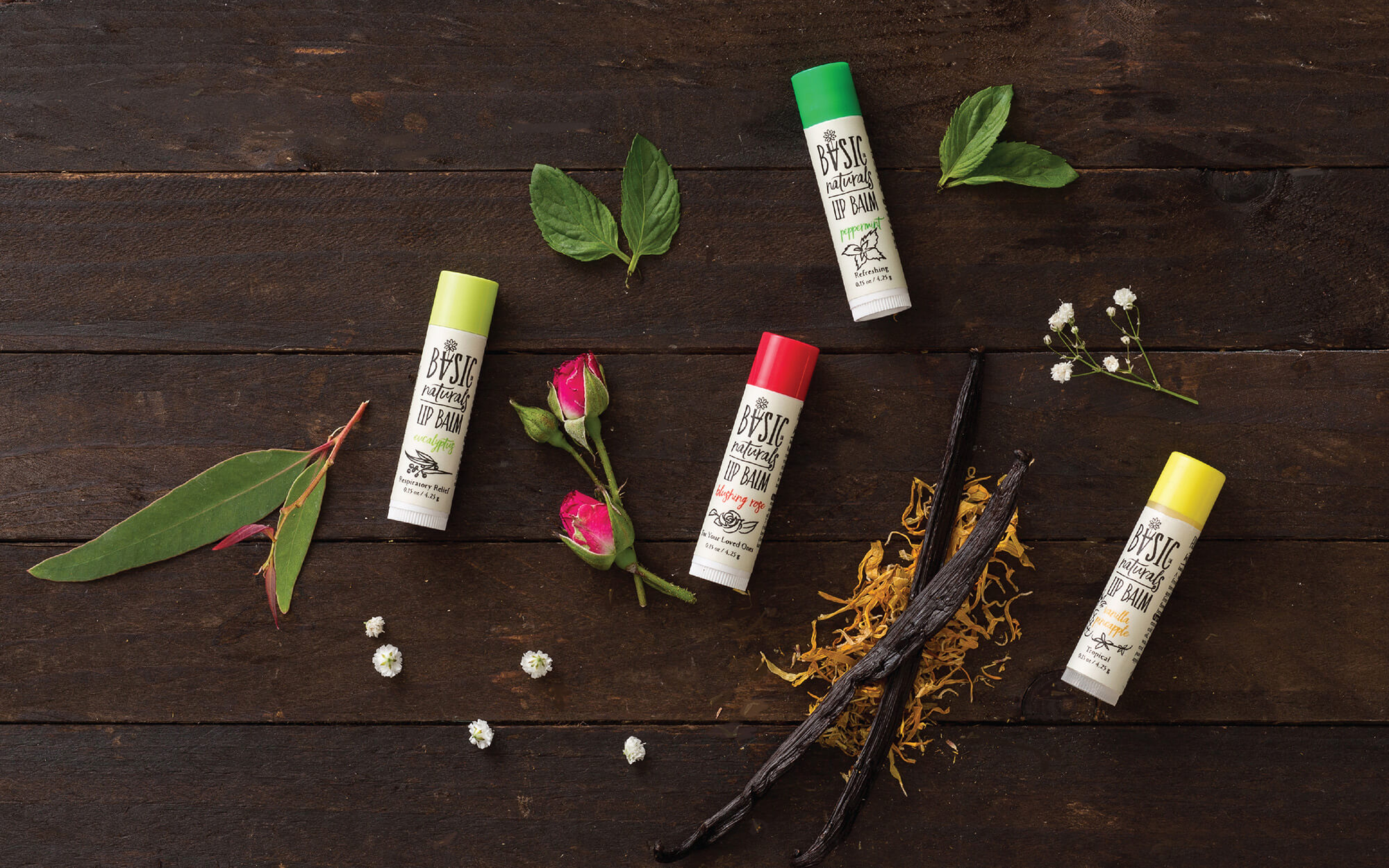
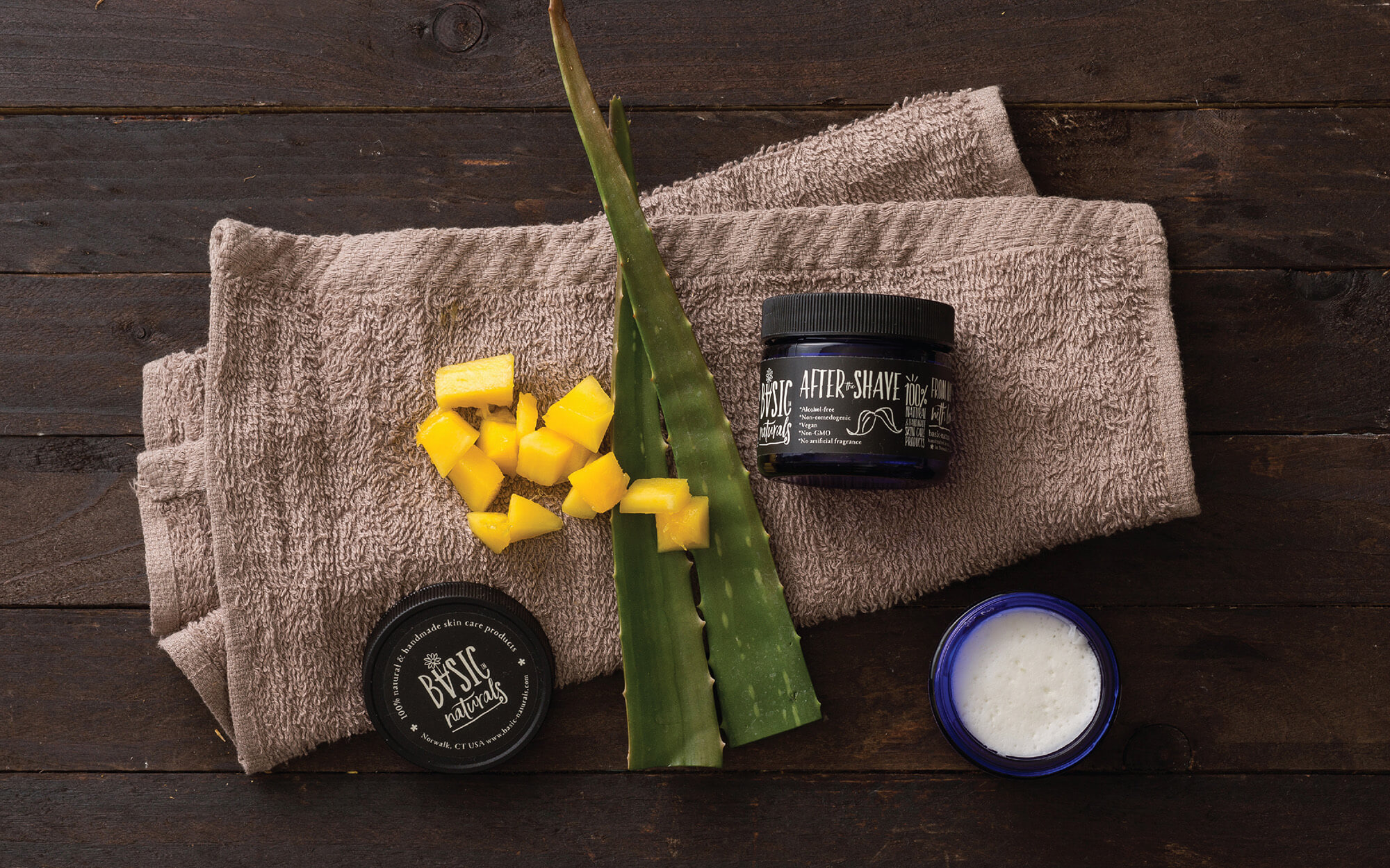
Continuing in the same logic, the visual identity and labels of the brand uses earthy primary colors whilethe typography connotes a handwriting style, simple and frank. Finally, the design of all individual products integrates an original pictogram-illustration that relates directly to what the product is and does for the user.
SERVICES
Logo, brand identity, packaging
Client: Yaniv & Danielle Ben David
Concept & Design: Sophia Georgopoulou
Photography: George Pavlakos
