An identity with a certain roar
BRIEF
Greek wine is witnessing a true revolution lately. Local winemakers are creating increasingly more qualitative wines and are doing their best to outdo each other – at the consumers’ delight. In many cases, product quality is certainly there but the look and feel of the brands does not necessarily follow suit. Often it is stuck in the past despite the wine itself having moved on. Identity revamp thus is not uncommon among winemakers lately. One such case was Barafakas Winery. The winery is located at the Nemea region of Peloponnese, a region that has been inexorably linked to wine-making since the days of antiquity. This is a great starting point for sure, and one that somehow had to be incorporated into the new identity that was required.
TARGET GROUP
Primarily Greek wine lovers but with an eye on export markets
CREATIVE CONCEPT
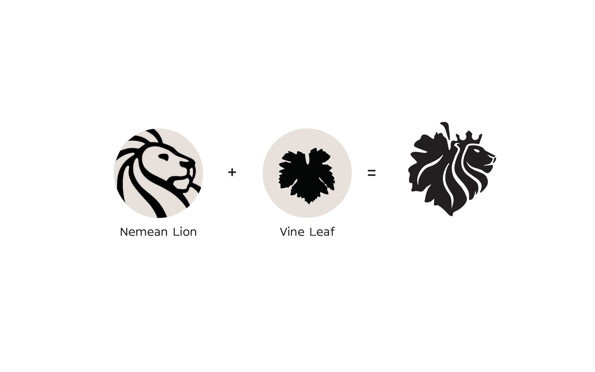
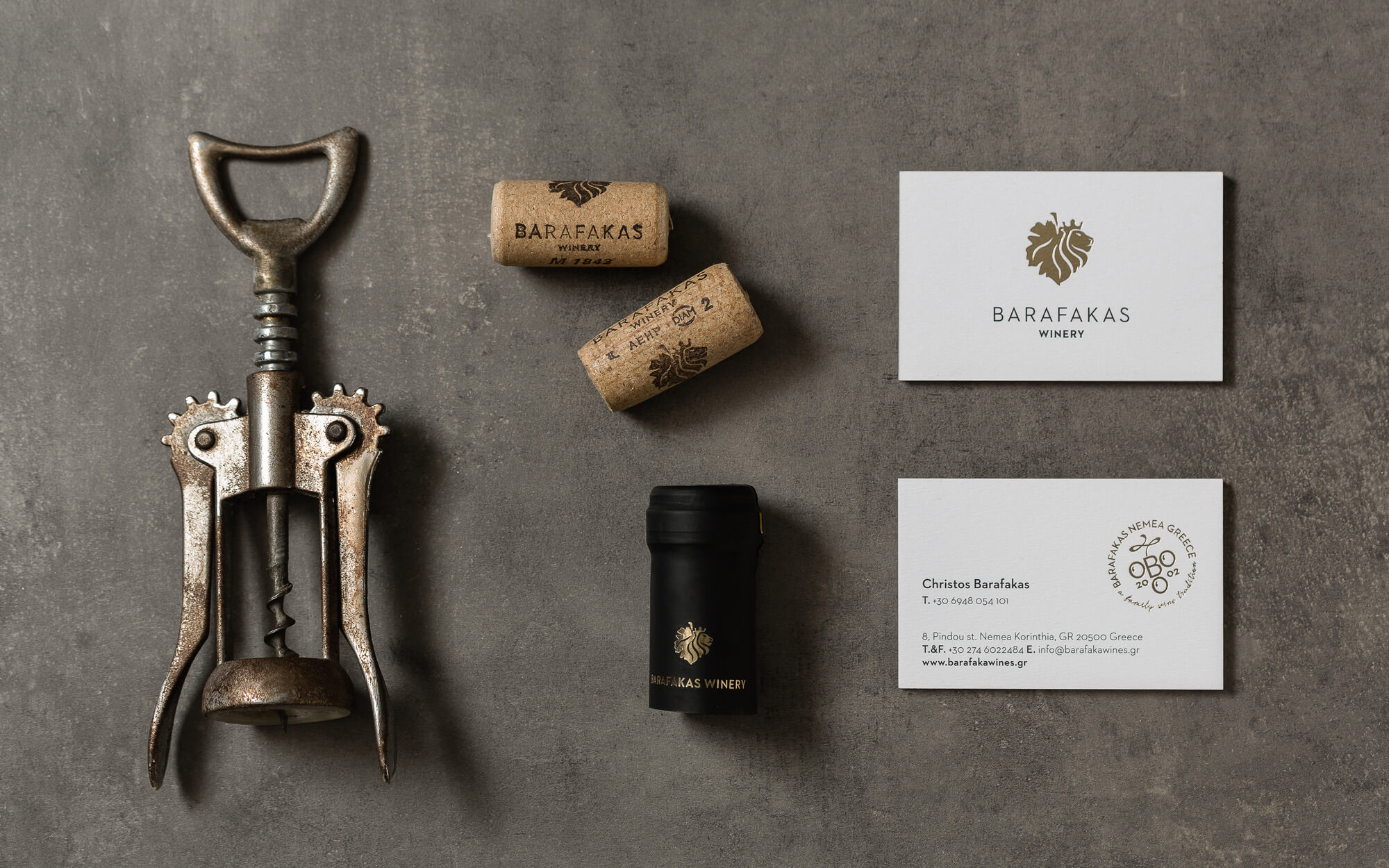
We chose to focus on highlighting the status of the Winery and the quality of its products by creating a design that combines both the vine culture and the far-reaching history of the area. And the most characteristic piece of history (actually legend) was the Nemean Lion, the killing of which was one of the most well-known labors of Hercules. This was the main source of inspiration.
DESIGN APPROACH
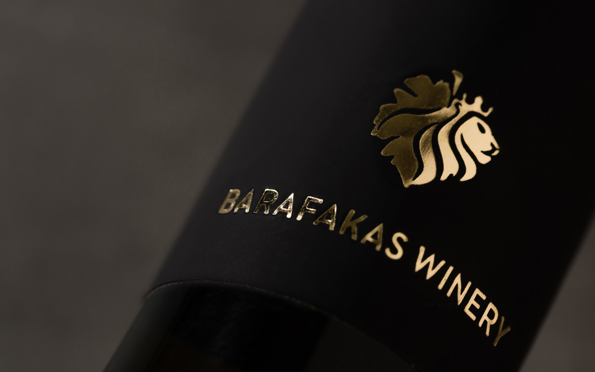
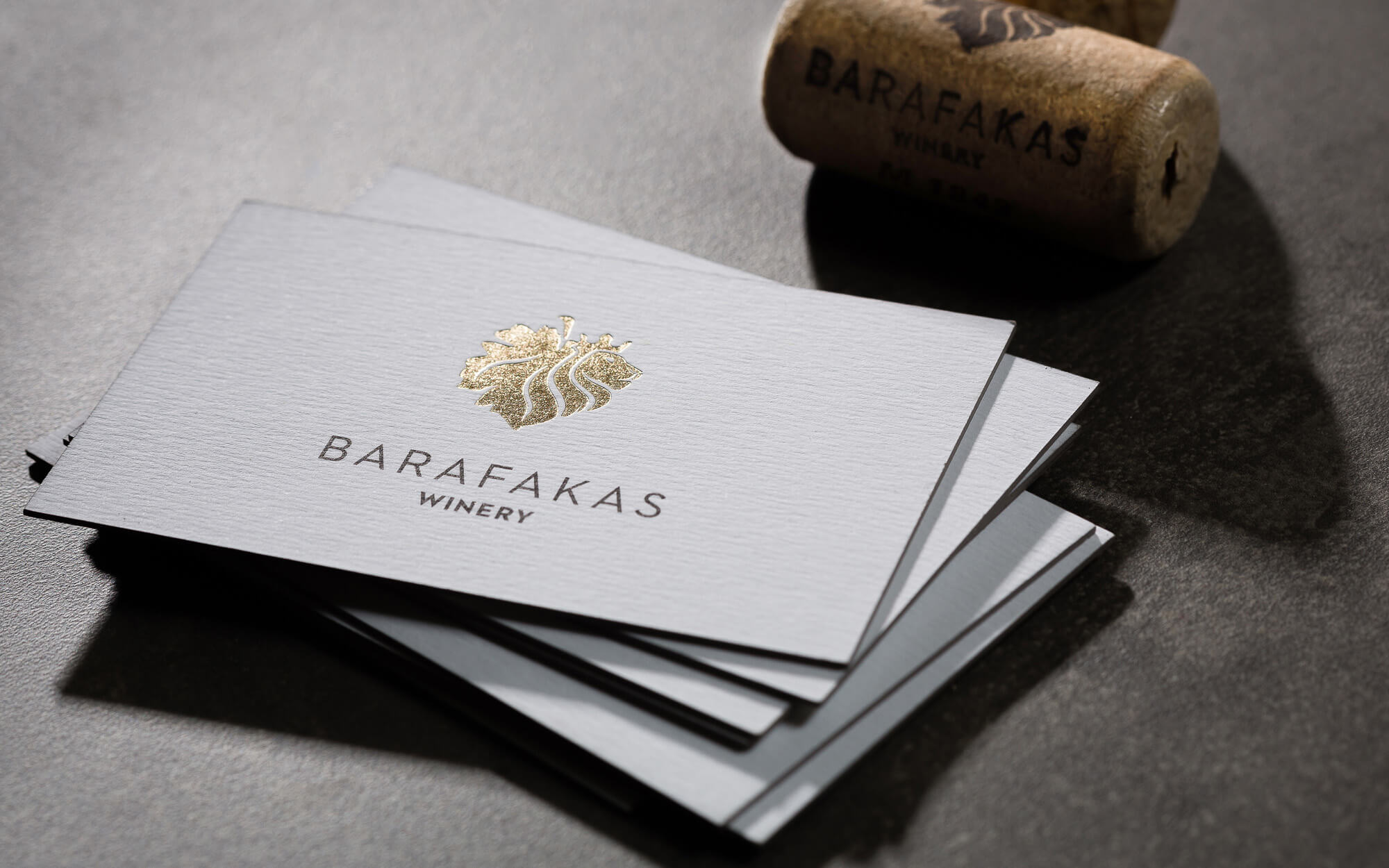
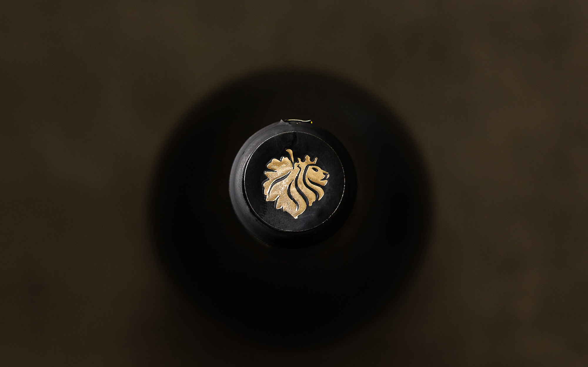
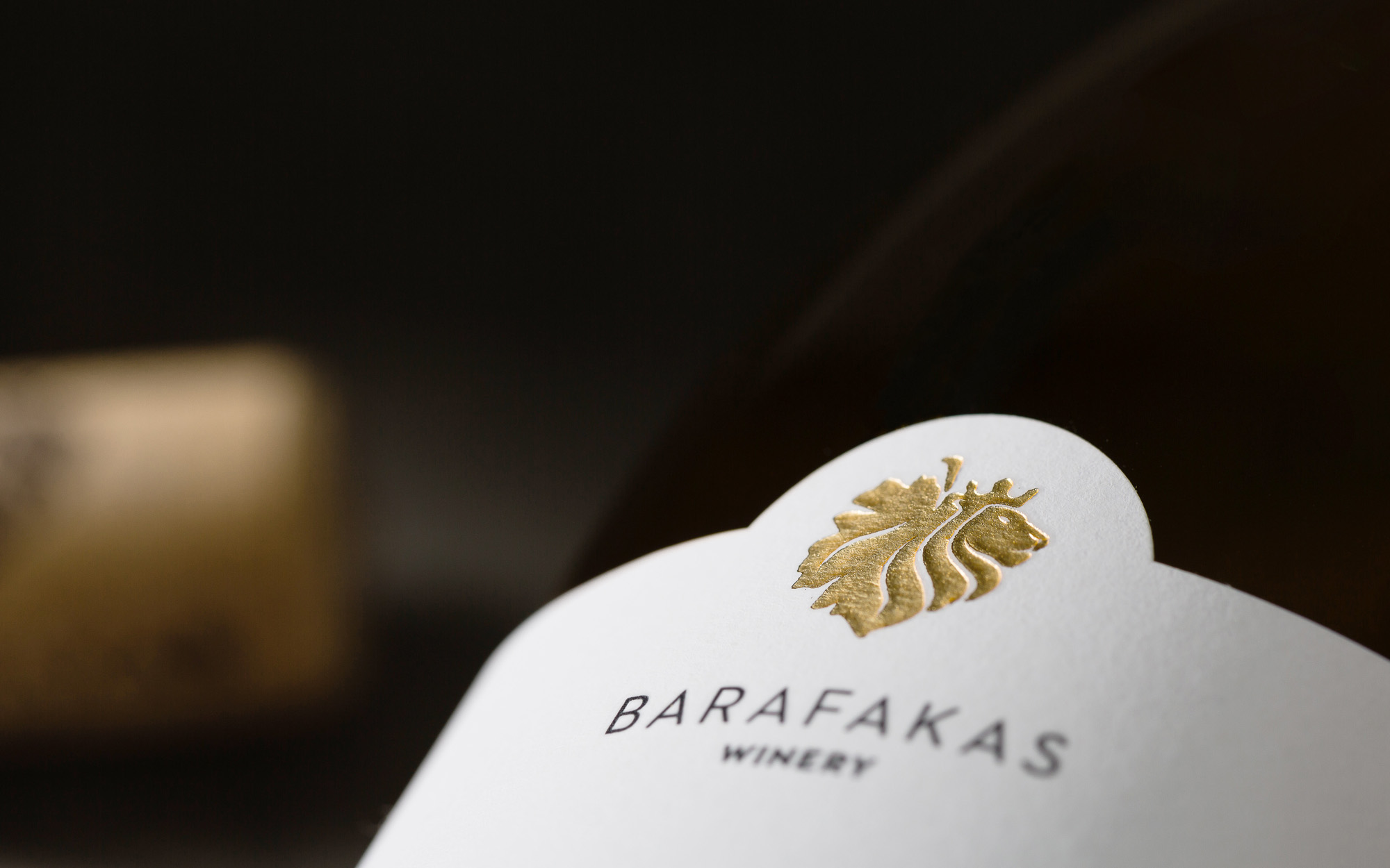
So, in line with the above in the process of logo creation we came up with something quite novel, a hybrid visual that we ended up calling the “Vine Lion”. This is consisted by a vine leaf that at its right side is actually the head of a crowned lion. The lion’s mane is incorporated seamlessly into the leaf’s veins – and vice versa. The color palette applied was equally regal in its own right. The gold and gray colors were chosen in order to emphasize the Winery’s quality and status, while the deep red hue applied aims to remind of the region’s long-standing tradition in the production of excellent Agiorgitiko variety wines.
SERVICES
Logo, visual identity
Concept and Design: Sophia Georgopoulou
Printing: Petros Daniil
Photography: George Pavlakos
