A fruitful approach to Mediterranean snacking
BRIEF
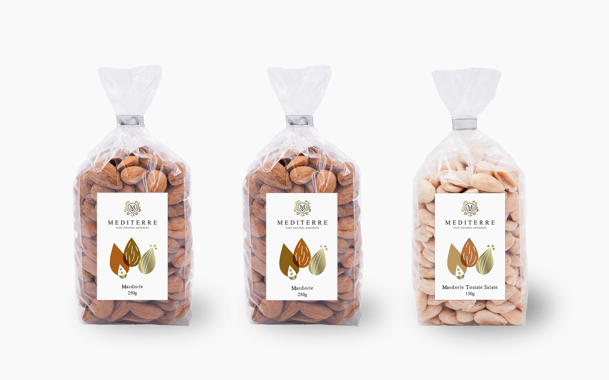
Mediterre is a Swiss company that deals exclusively with top-choice Mediterranean products. Their absolute commitment to quality has led them to found Cooperativo Mediterre. This is an association of farmers with whom they have developed a personal relationship that can guarantee that only the very best reaches the Trader. A key line of Mediterre was their Dried Fruits & Nuts line, in need for a distinctive identity that would carry over the core Mediterranean values.
TARGET GROUP
Health-conscious snackers in central Europe.
CREATIVE CONCEPT
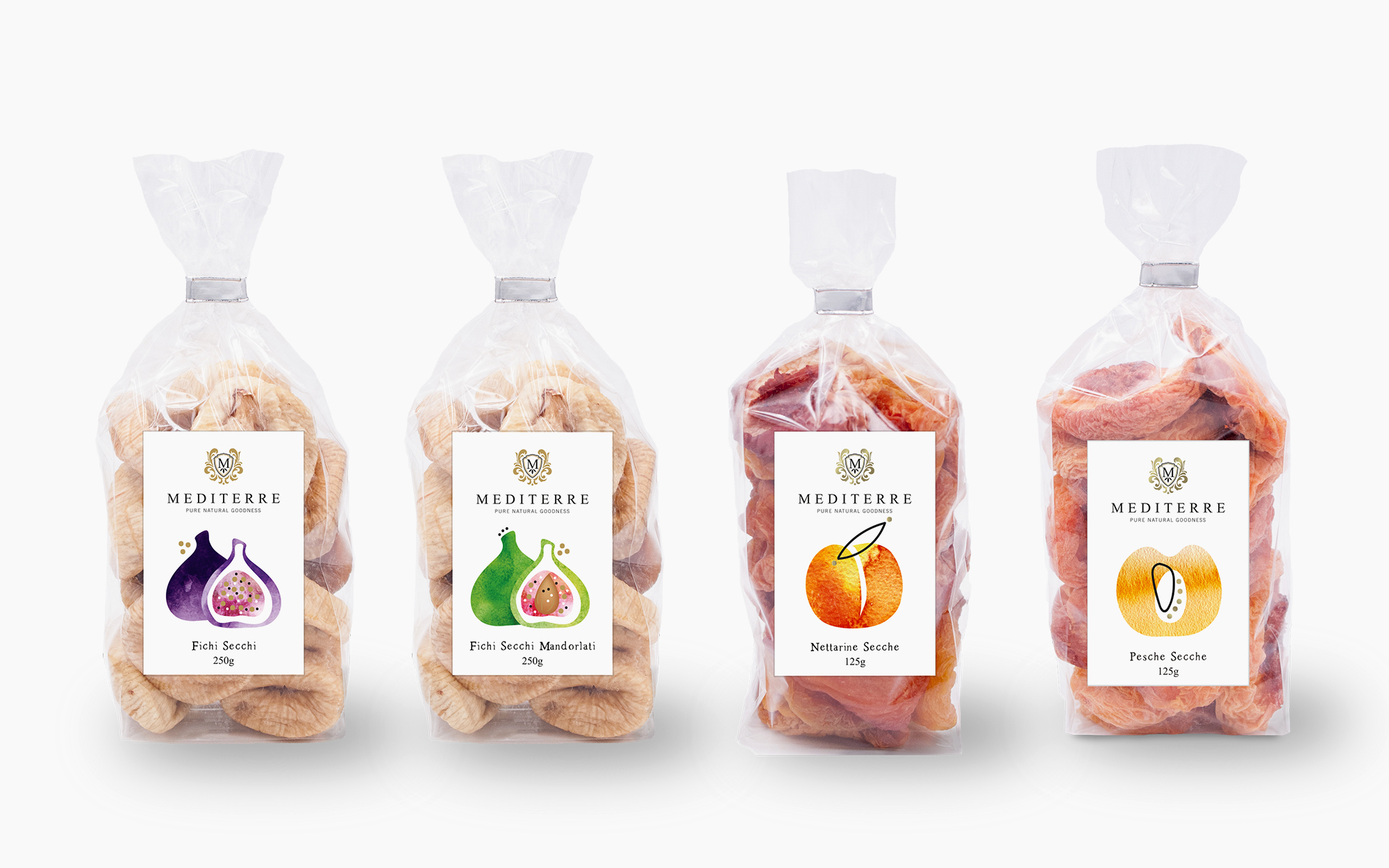
The logo and the core corporate identity directives were a given. We had to create a preposition that would exude the idea of tightly-knit a family of products united by common qualities and values – yet celebrate each variant and the fruit or nut involved.
DESIGN APPROACH
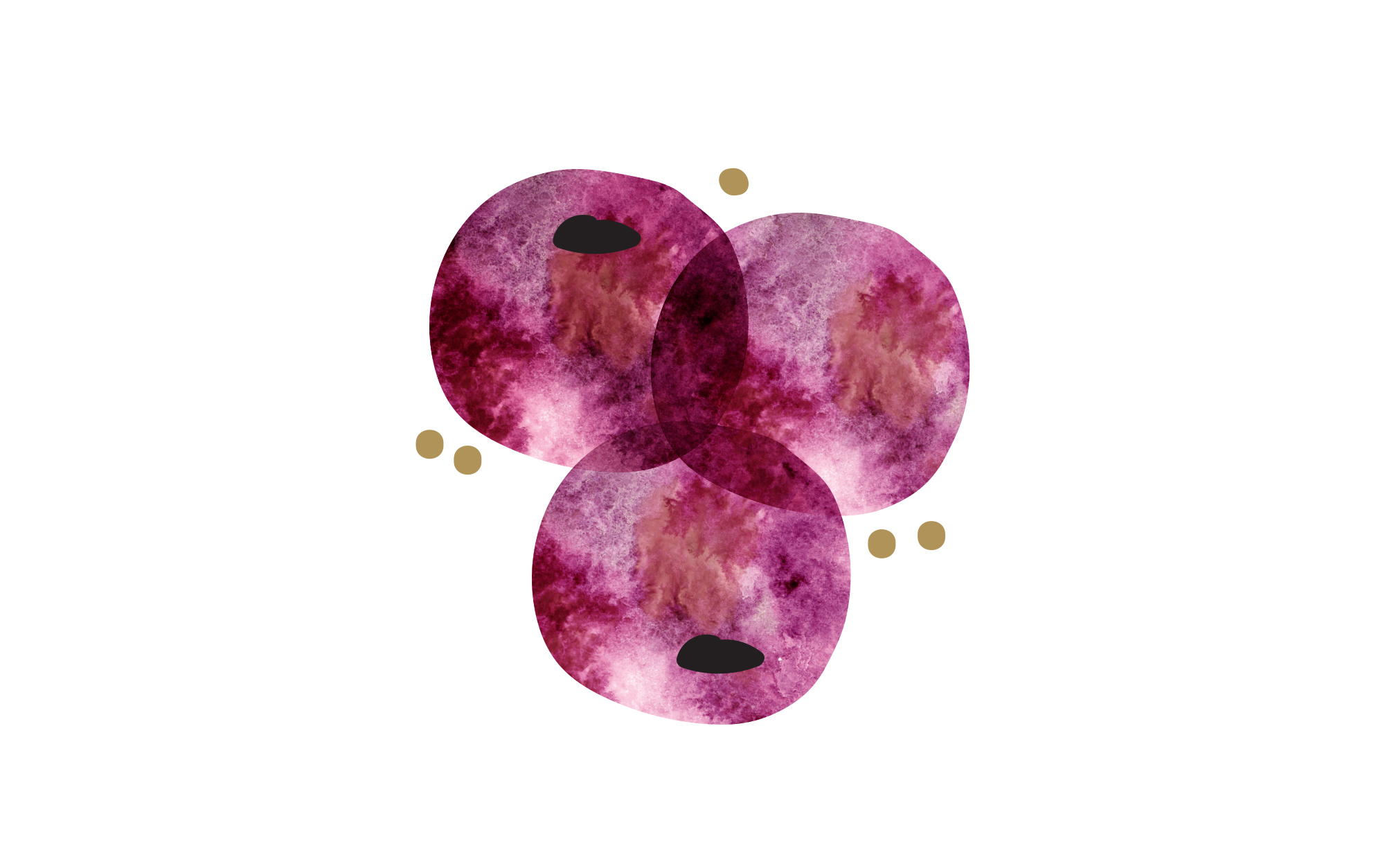
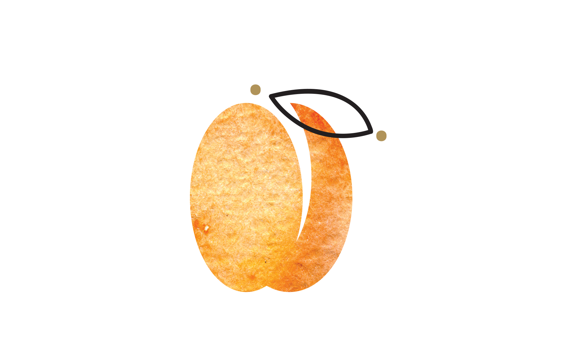
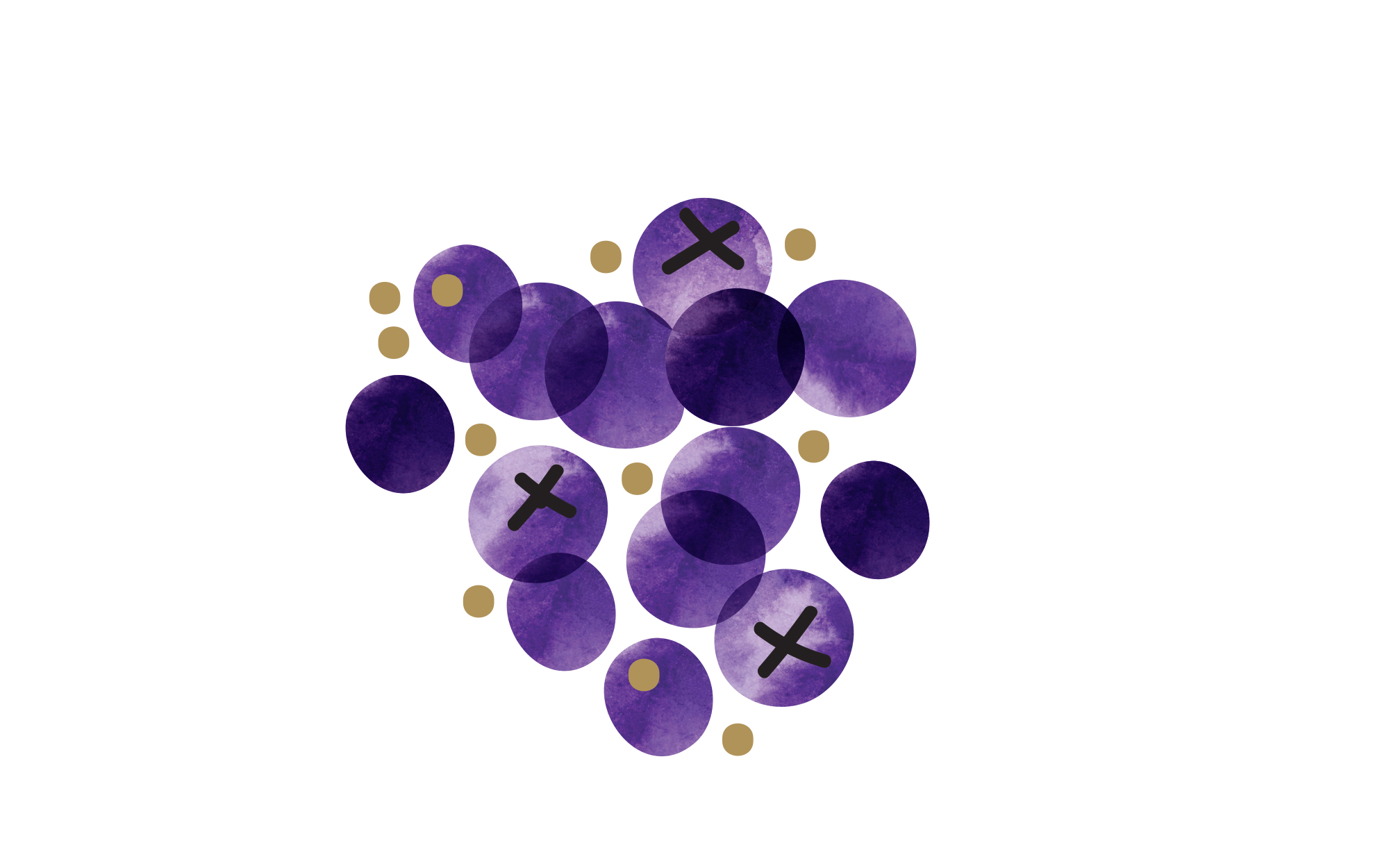
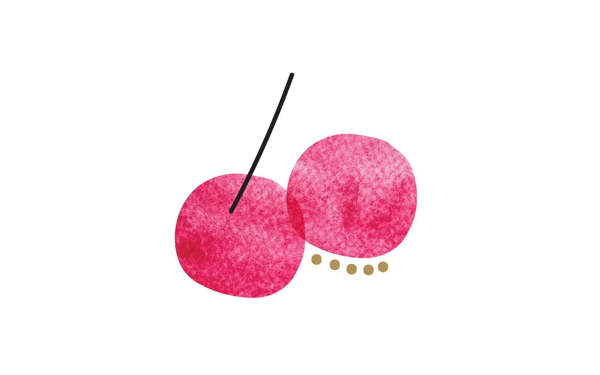
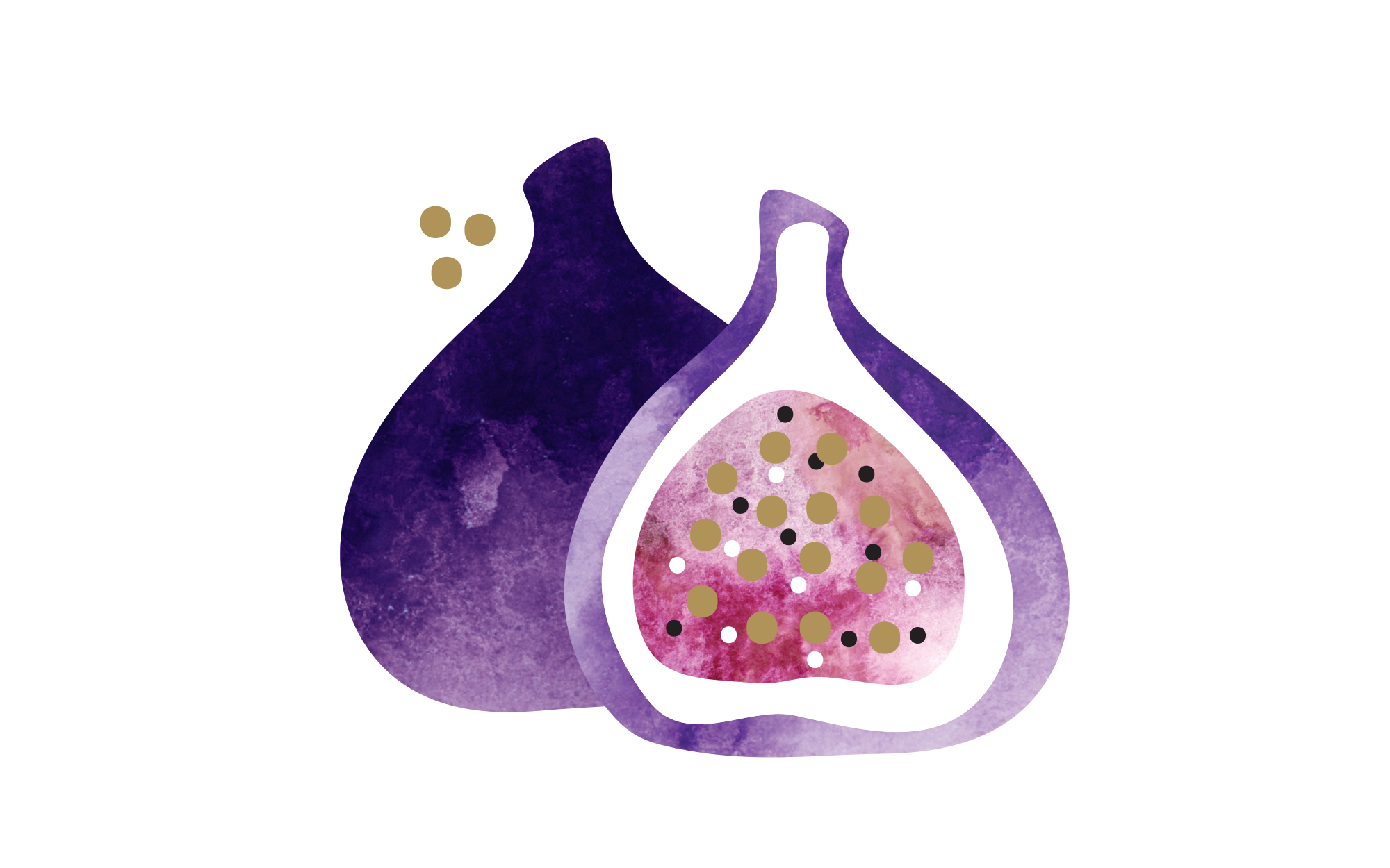
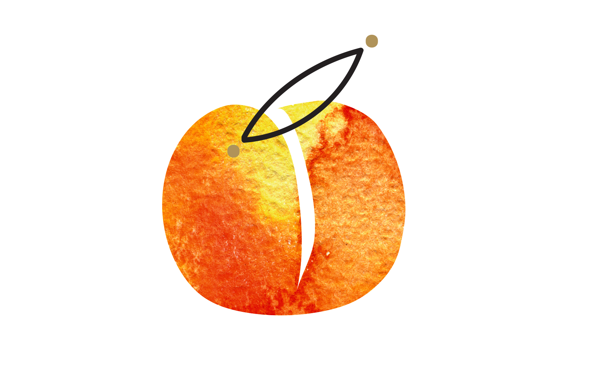
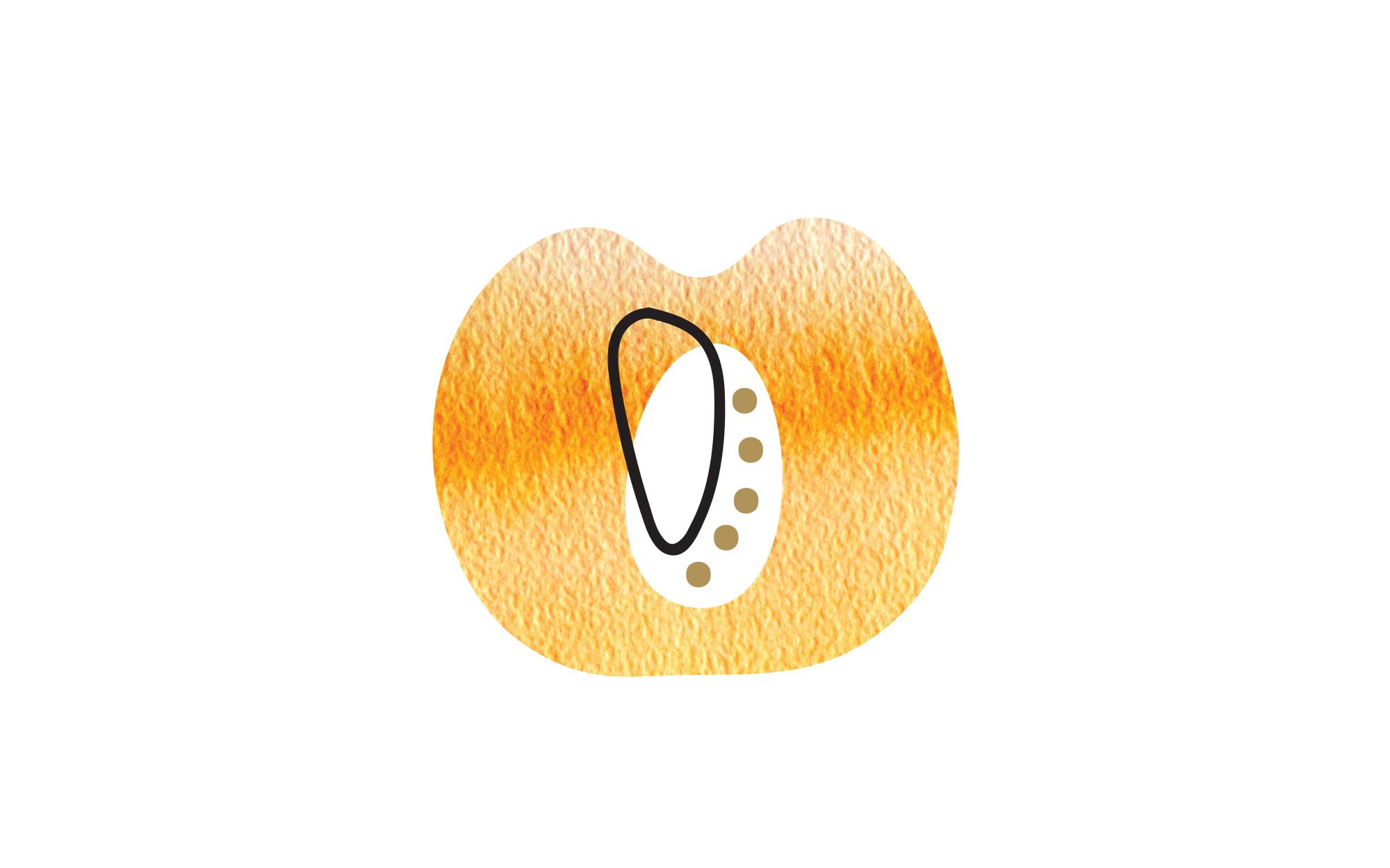
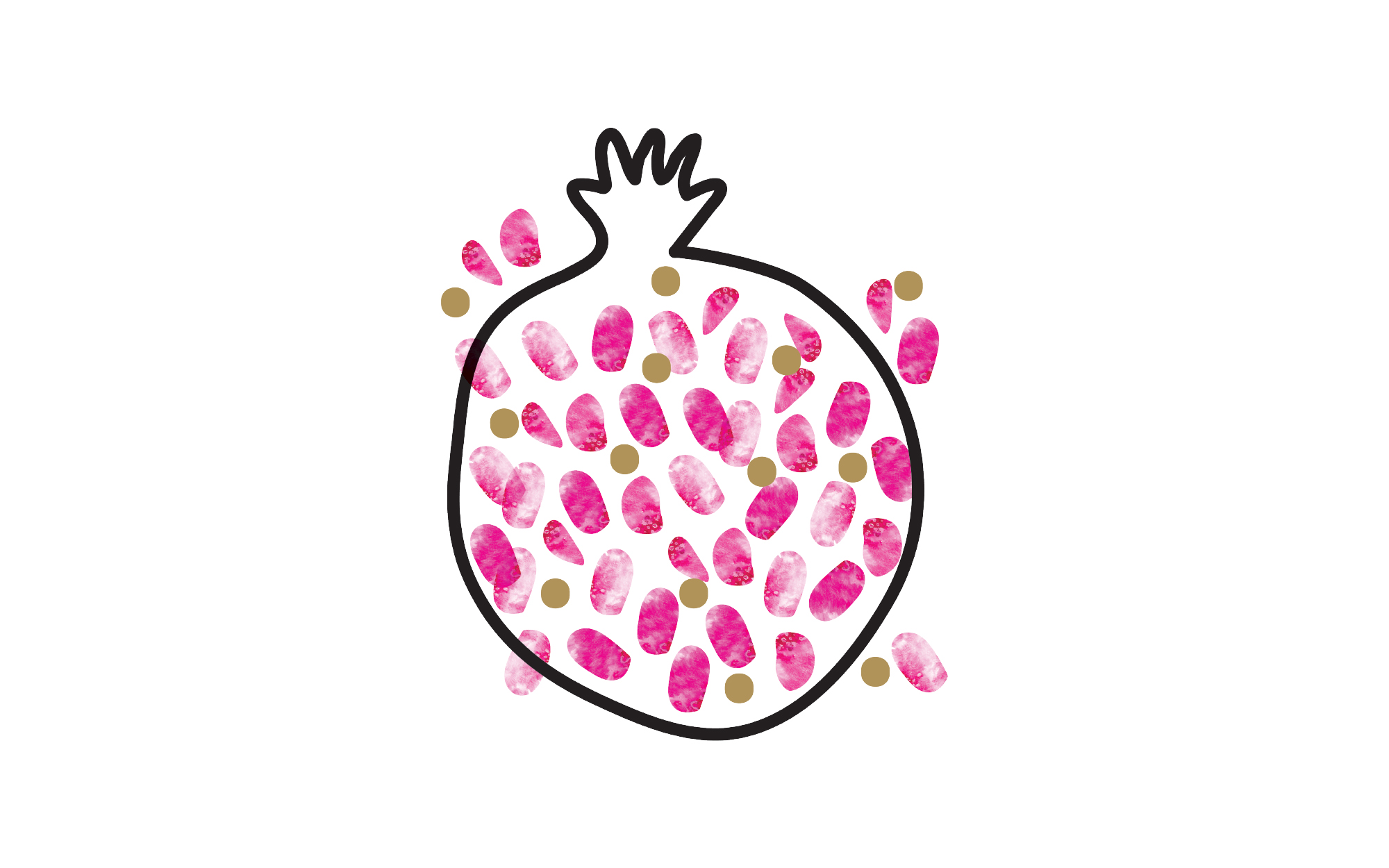
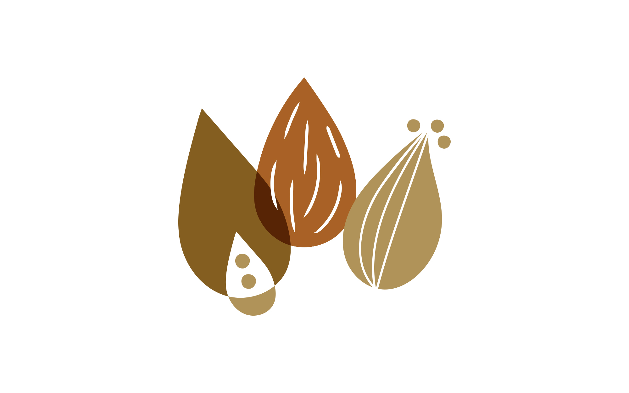
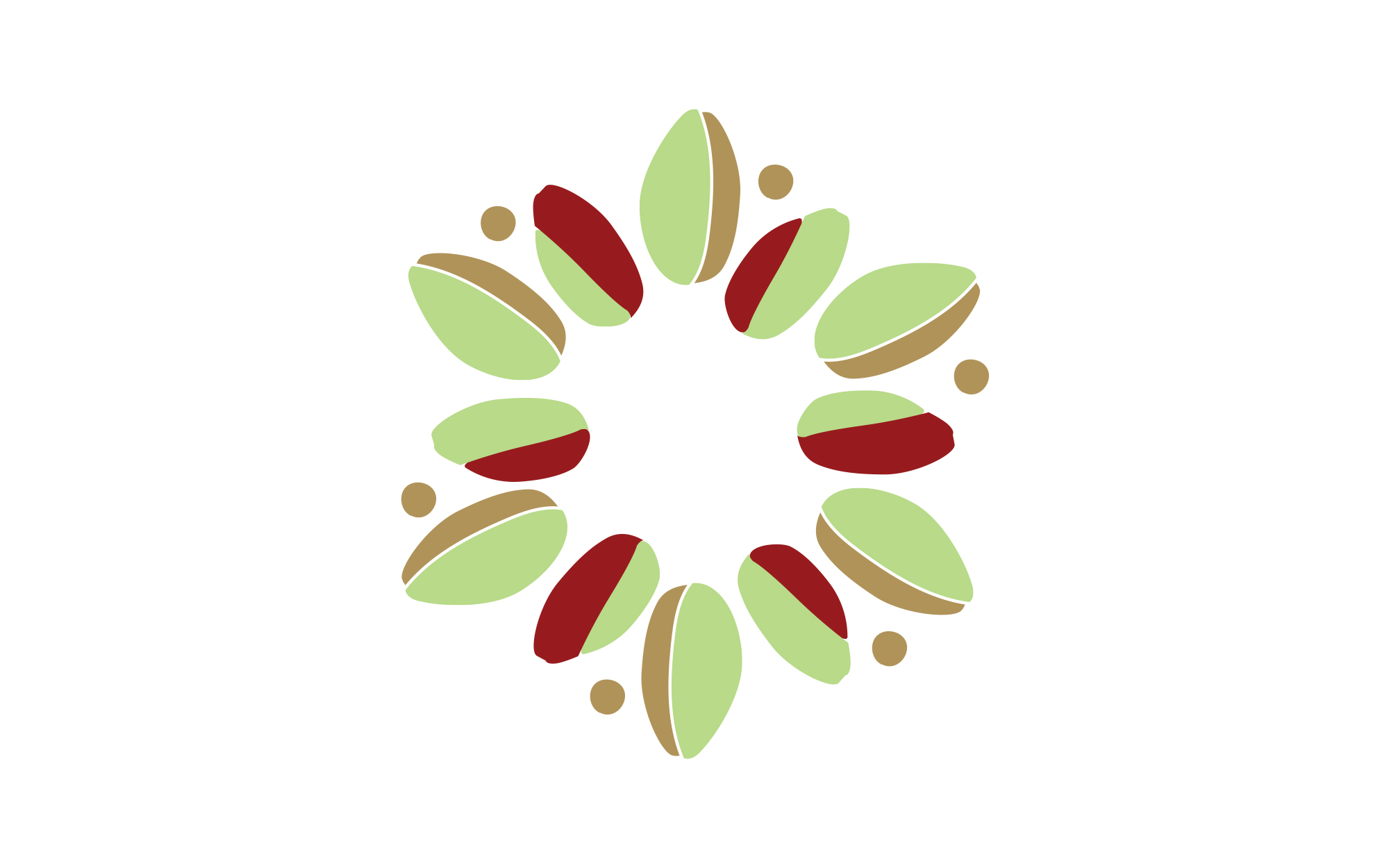
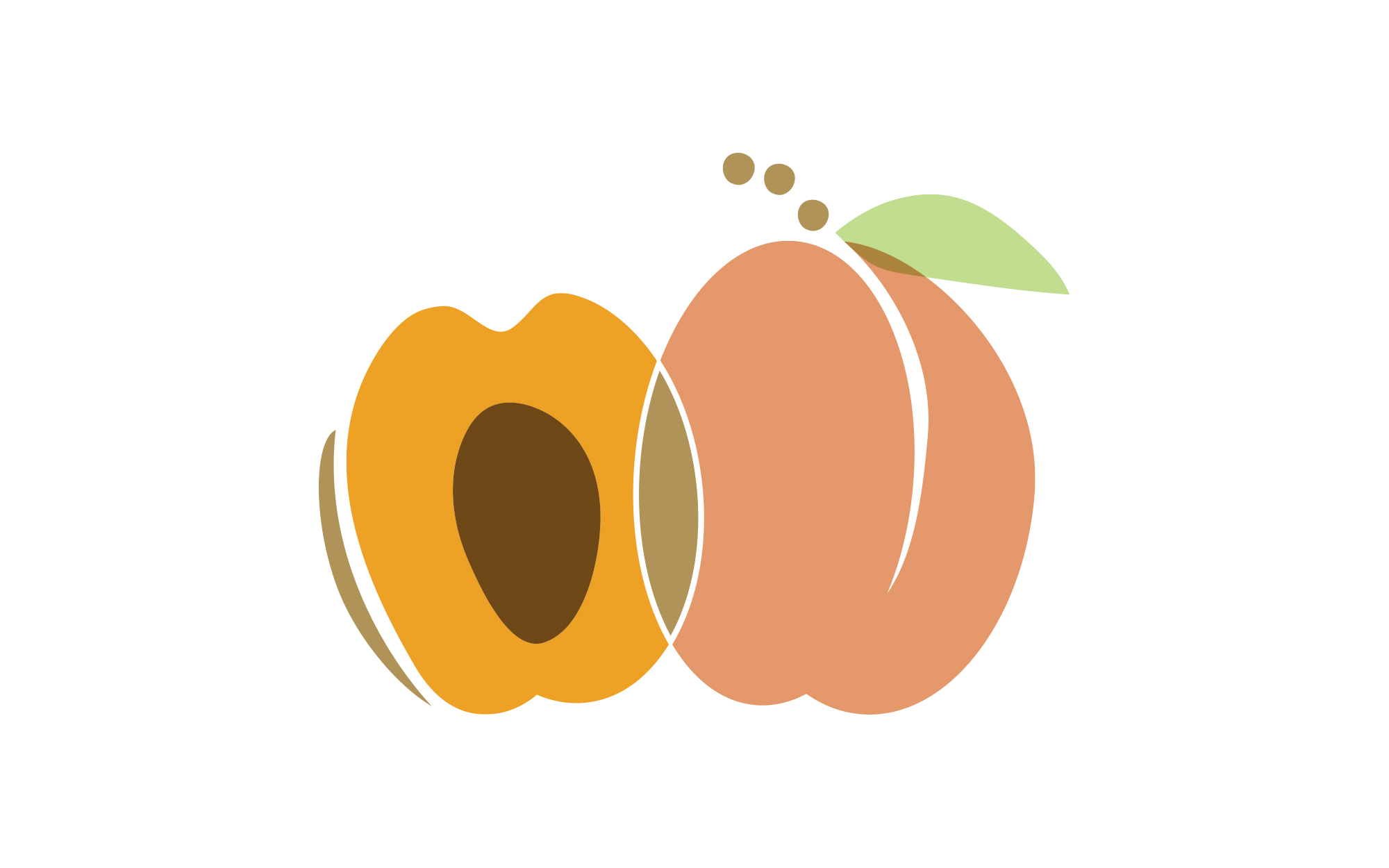
With the unmistakable value of Mediterranean simplicity in mind, we broke each fruit and nut down to its most basic, archaic shapes and colors, often including characteristic cross-sections. Only warm, welcoming colors were employed to enhance friendliness and approachability. Fruits and nuts of similar origin yet different flavors were differentiated by playing around with their shapes and placement. Playful and cheerful, inviting and delicious the end-result suggests a feast for the senses – yet a very much nutritious and healthy one.

