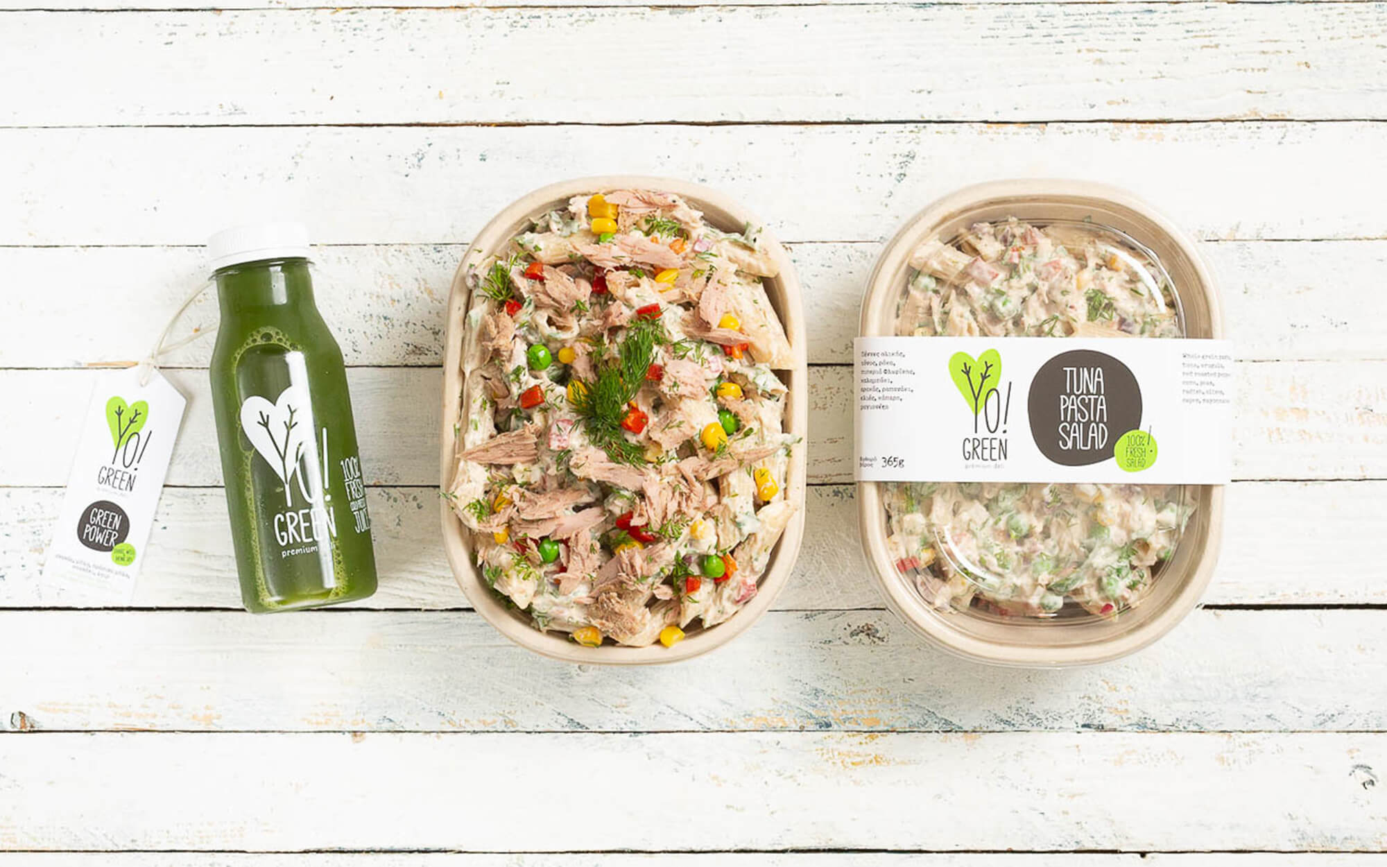
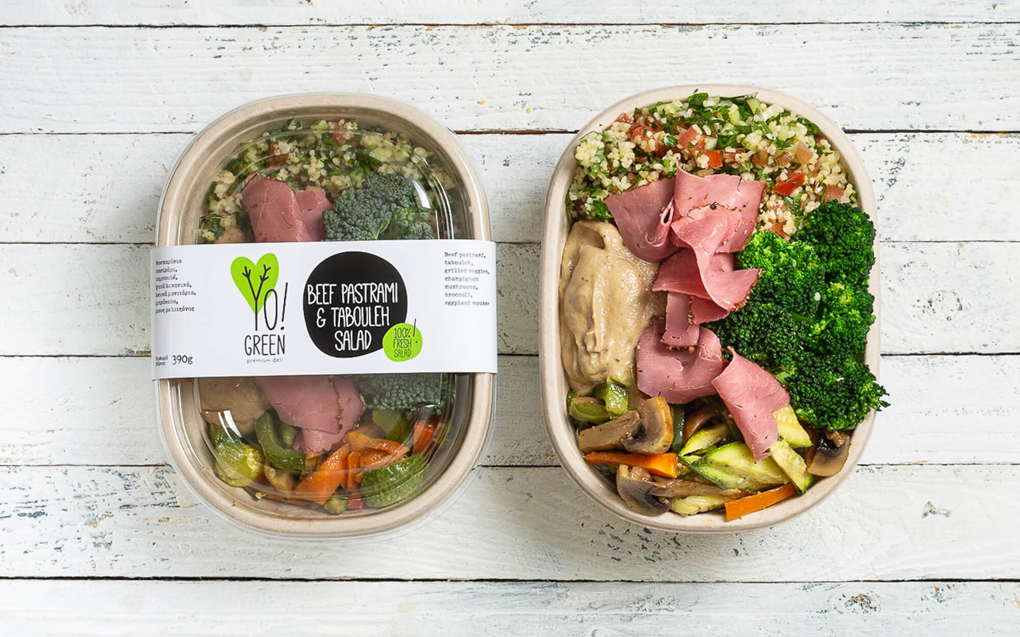
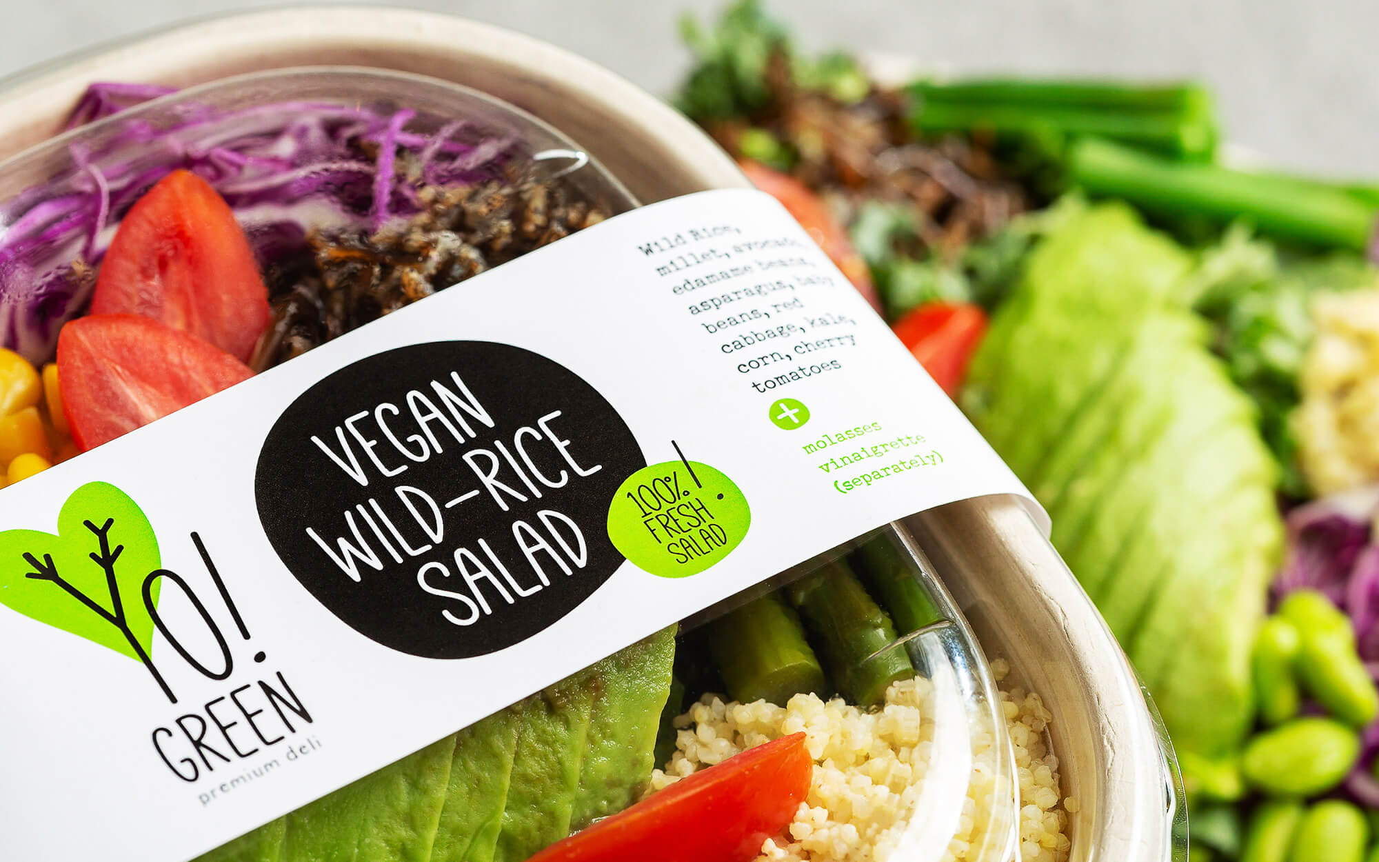
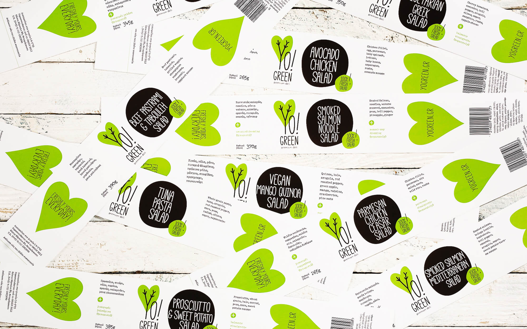
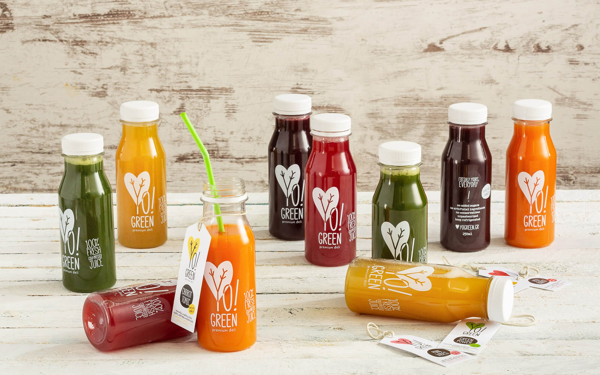
A tree bursting with health and flavors
BRIEF
Consumers become increasingly health-conscious, but at the same time more easily bored, more experimenting and less ready to sacrifice pleasure. During the recent years many companies and business have tried to solve this conundrum, with various degrees of success. It takes a good planning and many elements in place in order to make it in this fiercely competitive environment. Yo! Green is a premium deli committed to combining the healthiest ingredients in a way that rewards the senses. Pure, fresh ingredients, paranoiac fixation with quality, home-like care and everything hand-made is their way of getting there.
TARGET GROUP
Smart, time-deprived urbanites who want the best combo of healthiness and pleasure without any concessions whatsoever.
CREATIVE CONCEPT
What was needed was an identity that would carry across the messages of ‘good for you’ and emotional elation in equal measures. No side of the story should be overpowering the other – the balance of these two is basically what the brand is all about. The name itself works towards that direction – ‘Yo!’ standing for uplift and ‘Green’ for naturalness.
DESIGN APPROACH
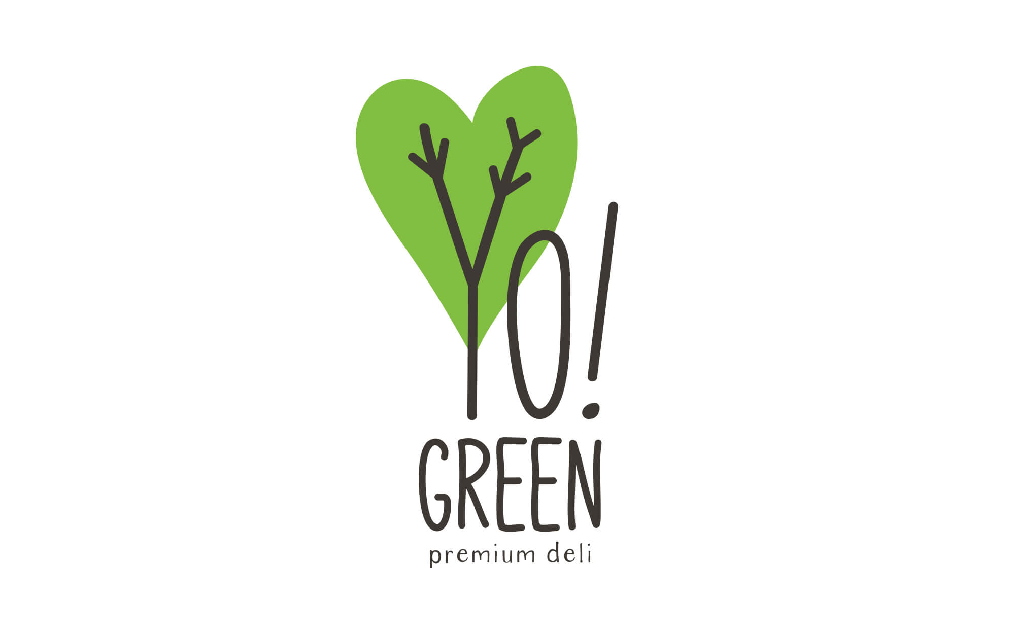
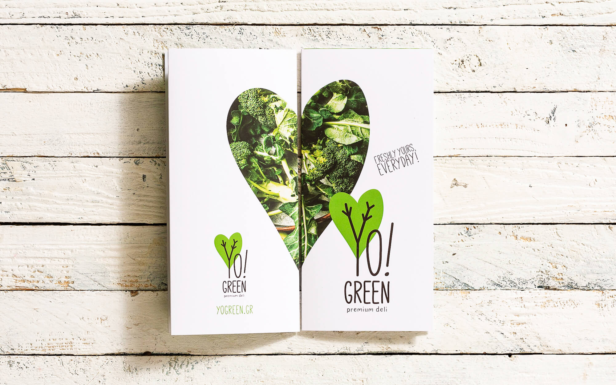
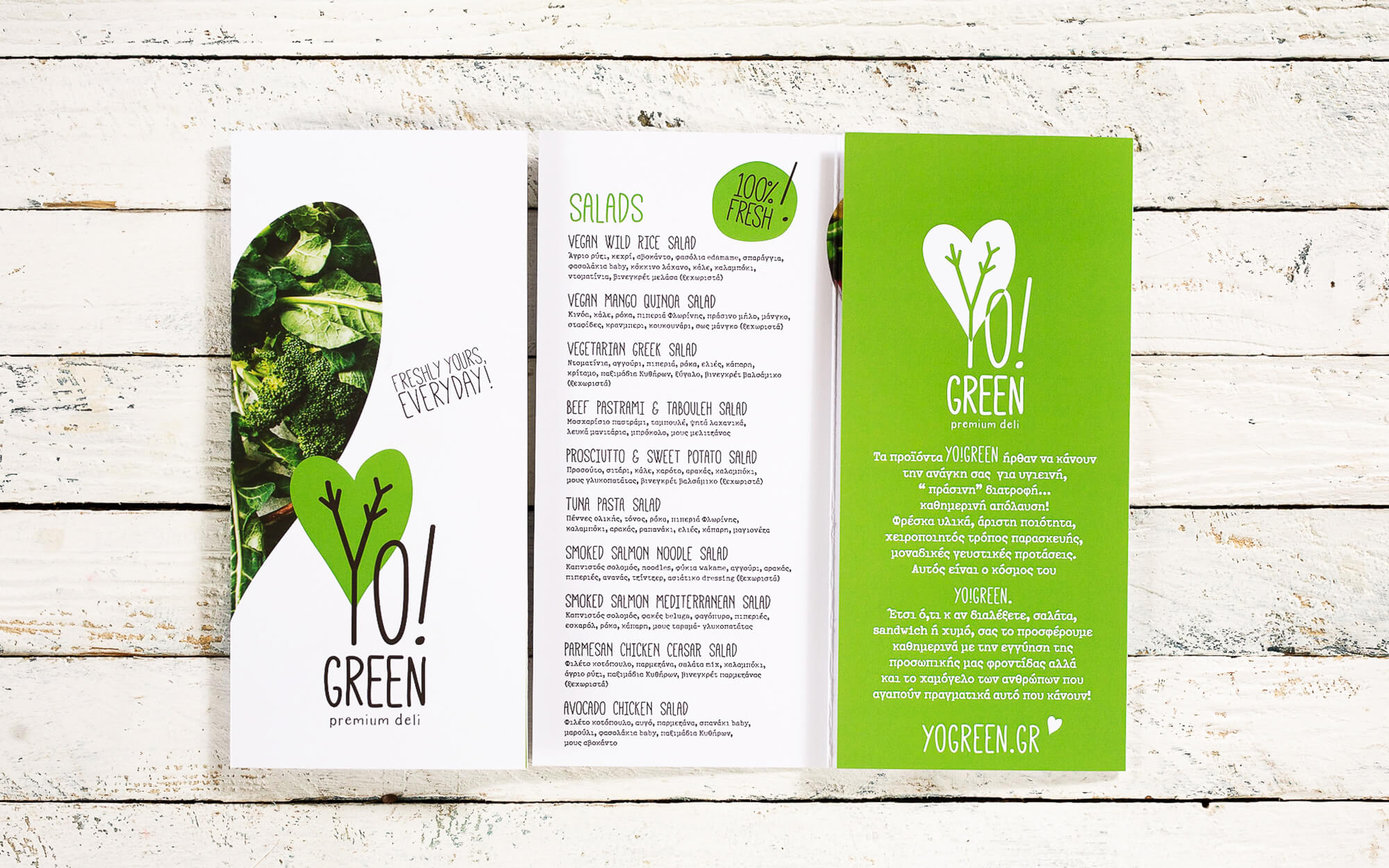
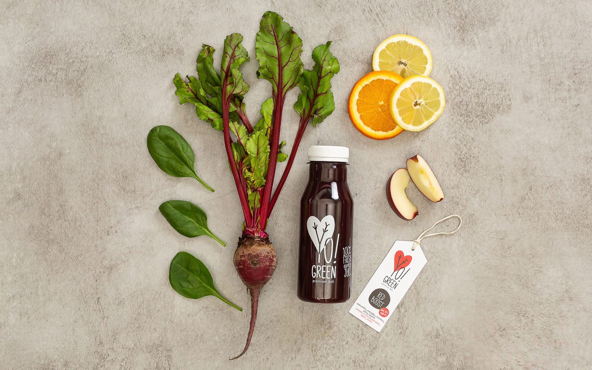
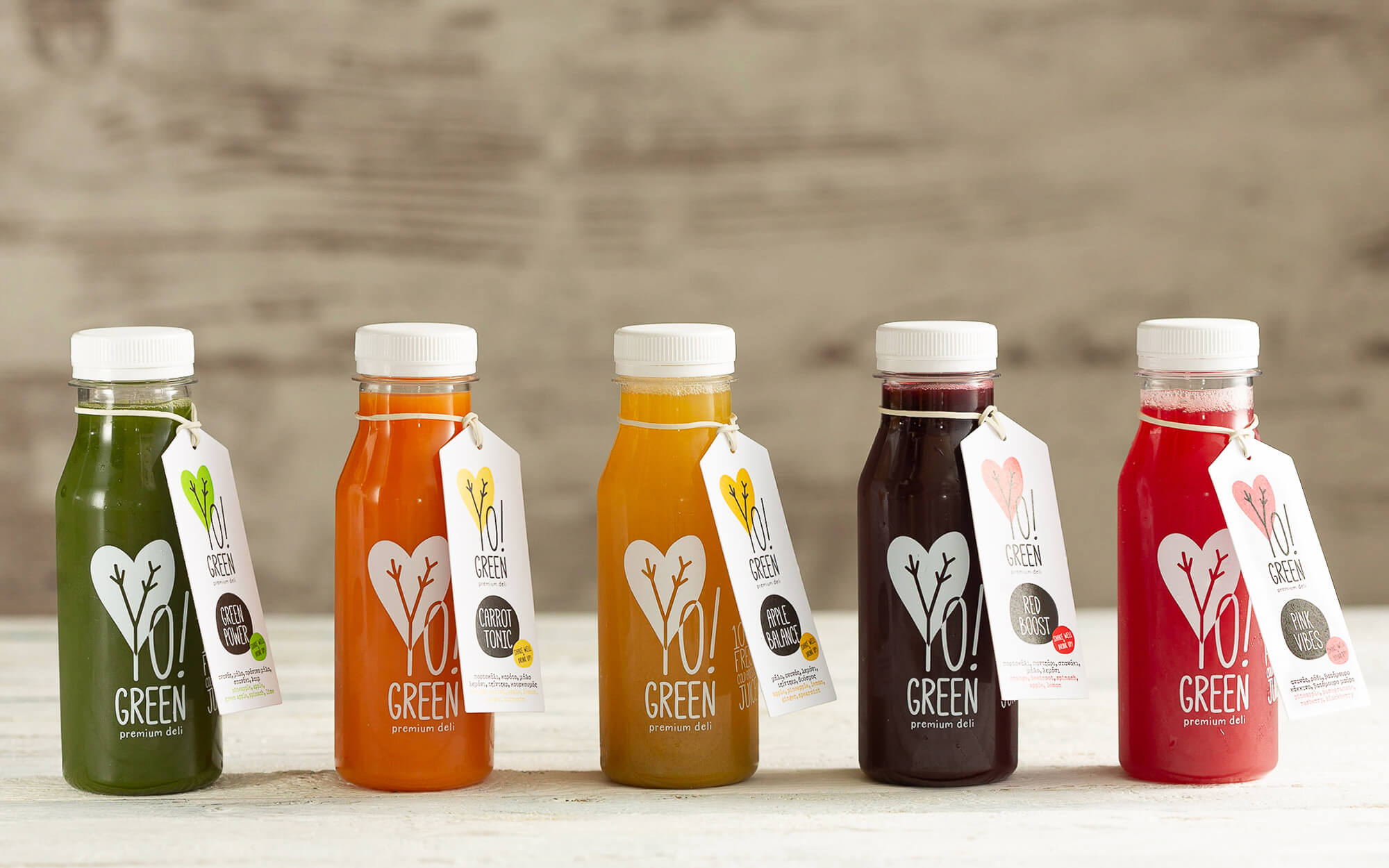
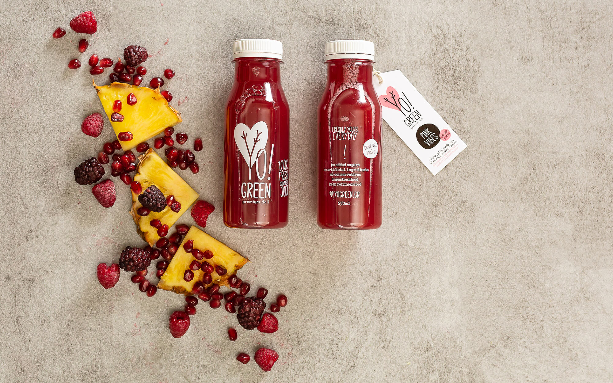
The key color could not be anything else but green, and that was a given. From that point and on, a lot of thought was driven to the conceptualization and design of logo itself. The ‘Y’ in the word ‘Yo’ serves as the trunk and the branches of a tree, whose foliage is shaped as a heart – a green heart. Healthy goodness served. This is one way of reading into it – the other, more subtle yet powerful enough is to see the branches as two arms stretched up in the air, suggesting joie de vivre and emotional uplift.
SERVICES
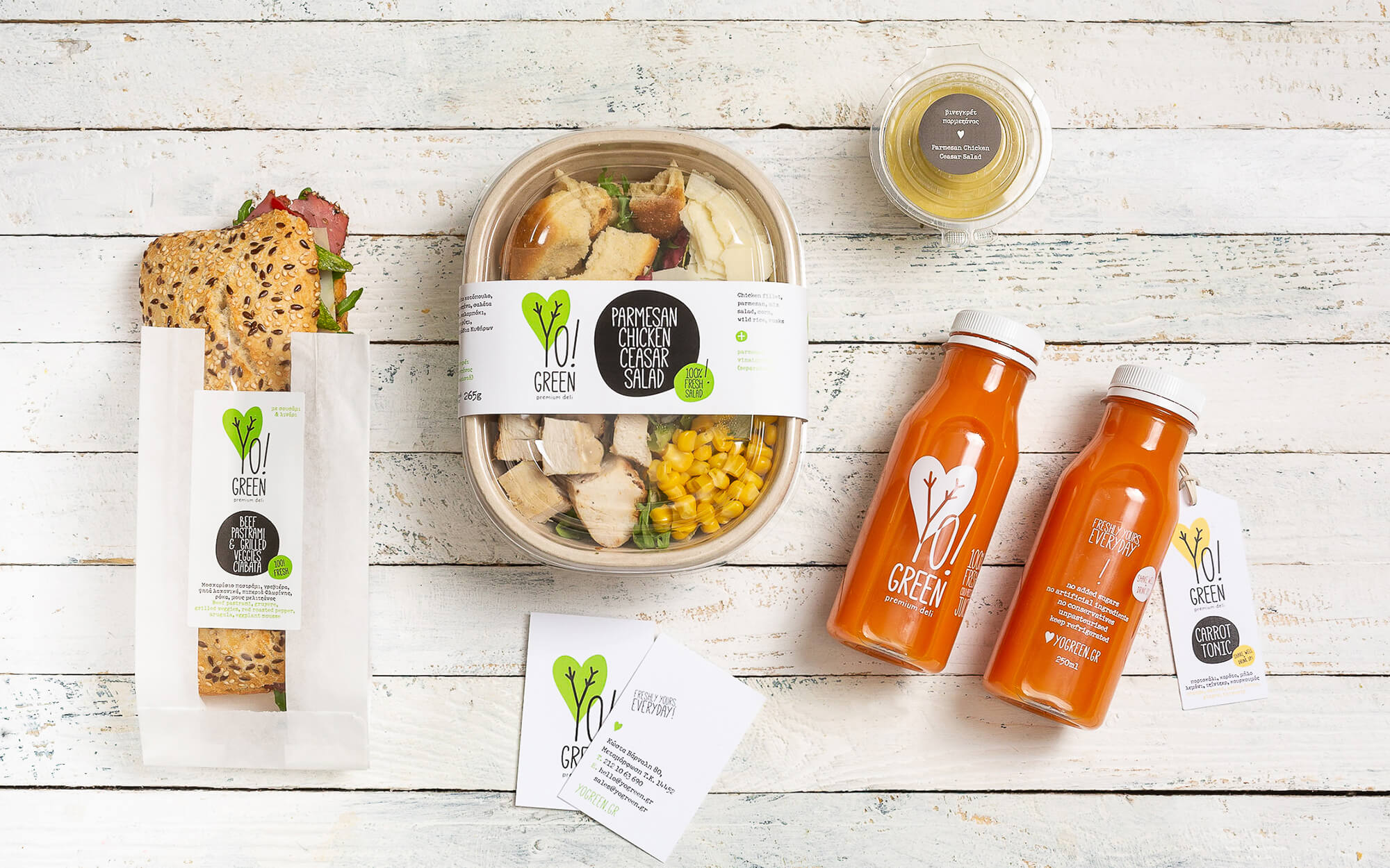
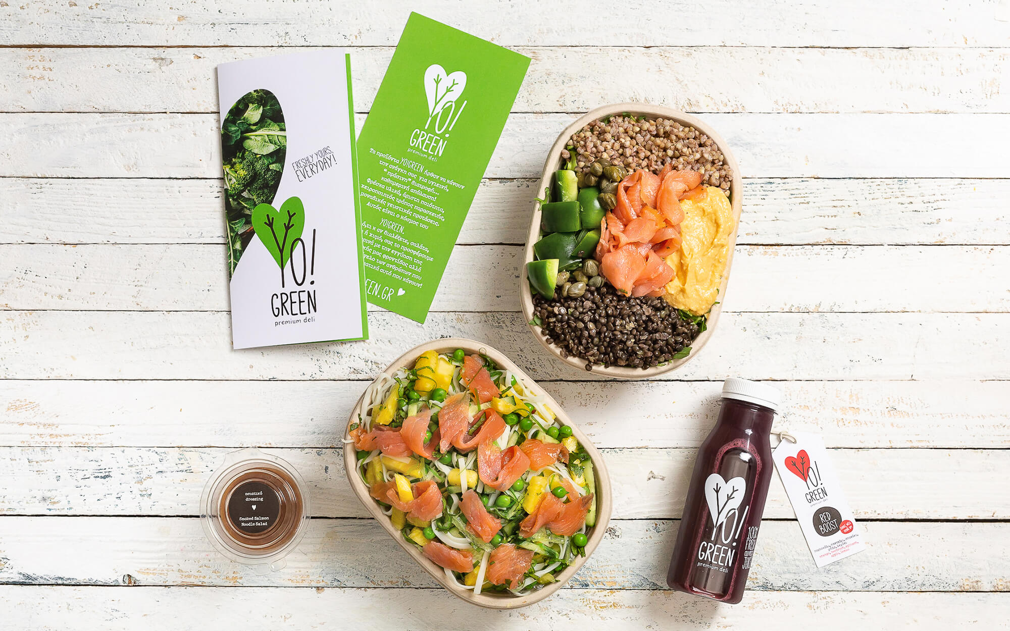
Branding, Logo Design, Visual Identity, Packaging
Brand Name & tagline: Nikos Vlachogiannis
Concept & Design: Sophia Georgopoulou
Text Editor: Konstantinos Kontinos
Photography: George Pavlakos

