A Delicious burst of Colors & Flavors!
BRIEF
The booming of Greek food and cuisine has not left the UK market untouched. Greek Deli is one of the companies capitalizing on this by importing the best Greece has to offer in terms of food items and propositions. Supplying businesses such as wholesalers, retailers, the food service, restaurants and delis but also individuals online, the company wanted a new identity, fresh and vibrant and a cut above from the countless ‘flat’ options already available in the UK market.
TARGET GROUP
UK-based B2B customers with physical operations and stores. Foodies and retail consumers exclusively for the online domain.
CREATIVE CONCEPT
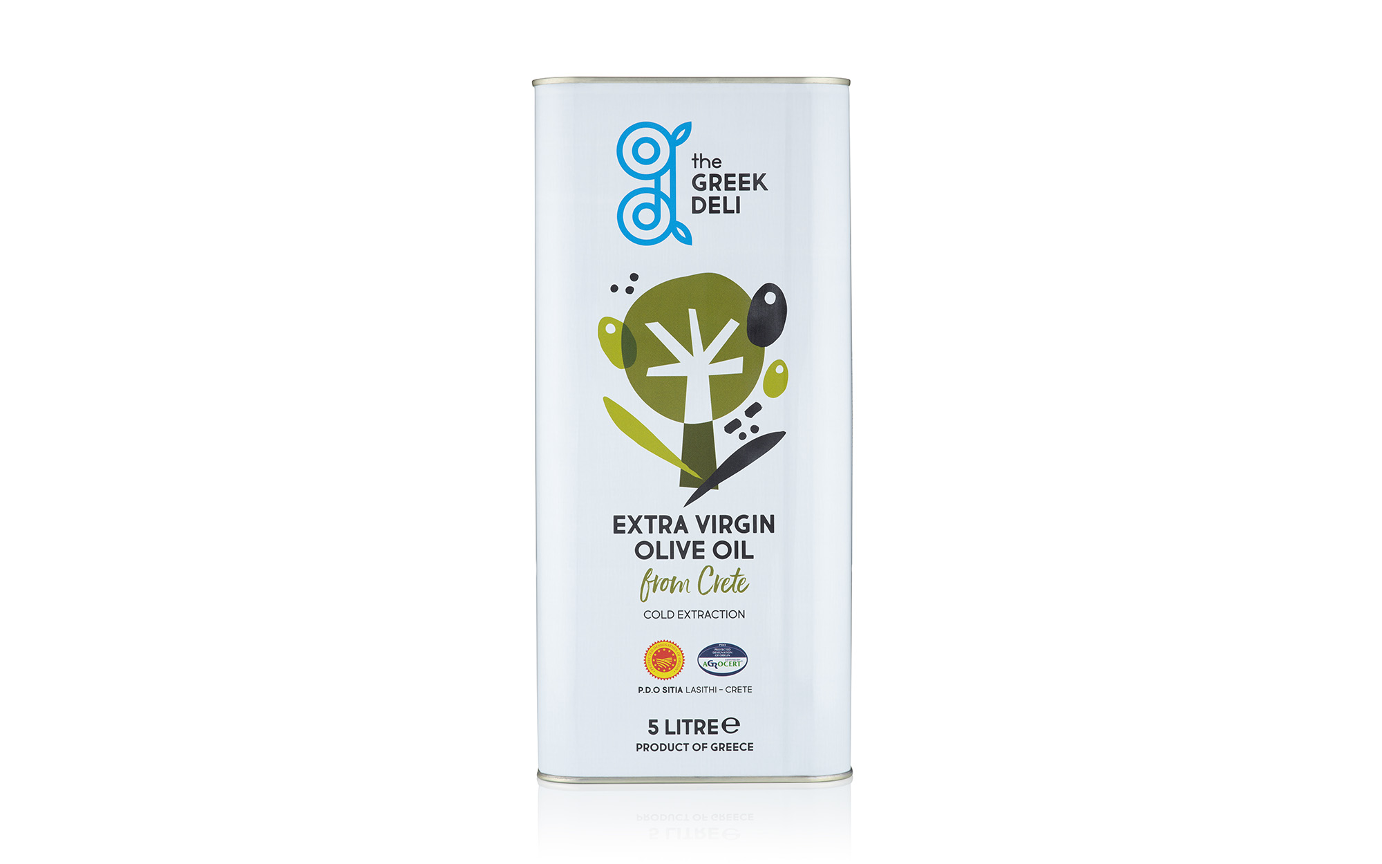
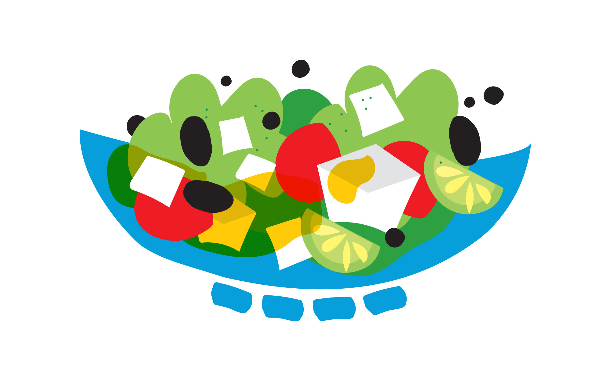
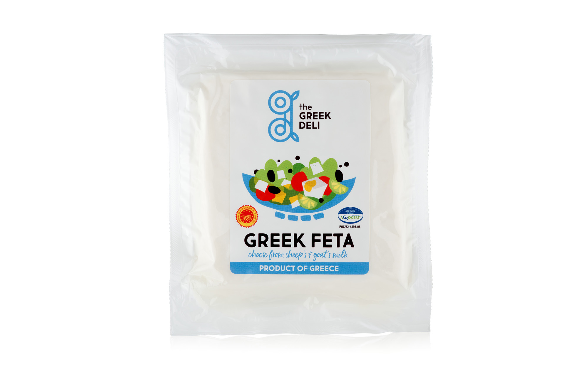
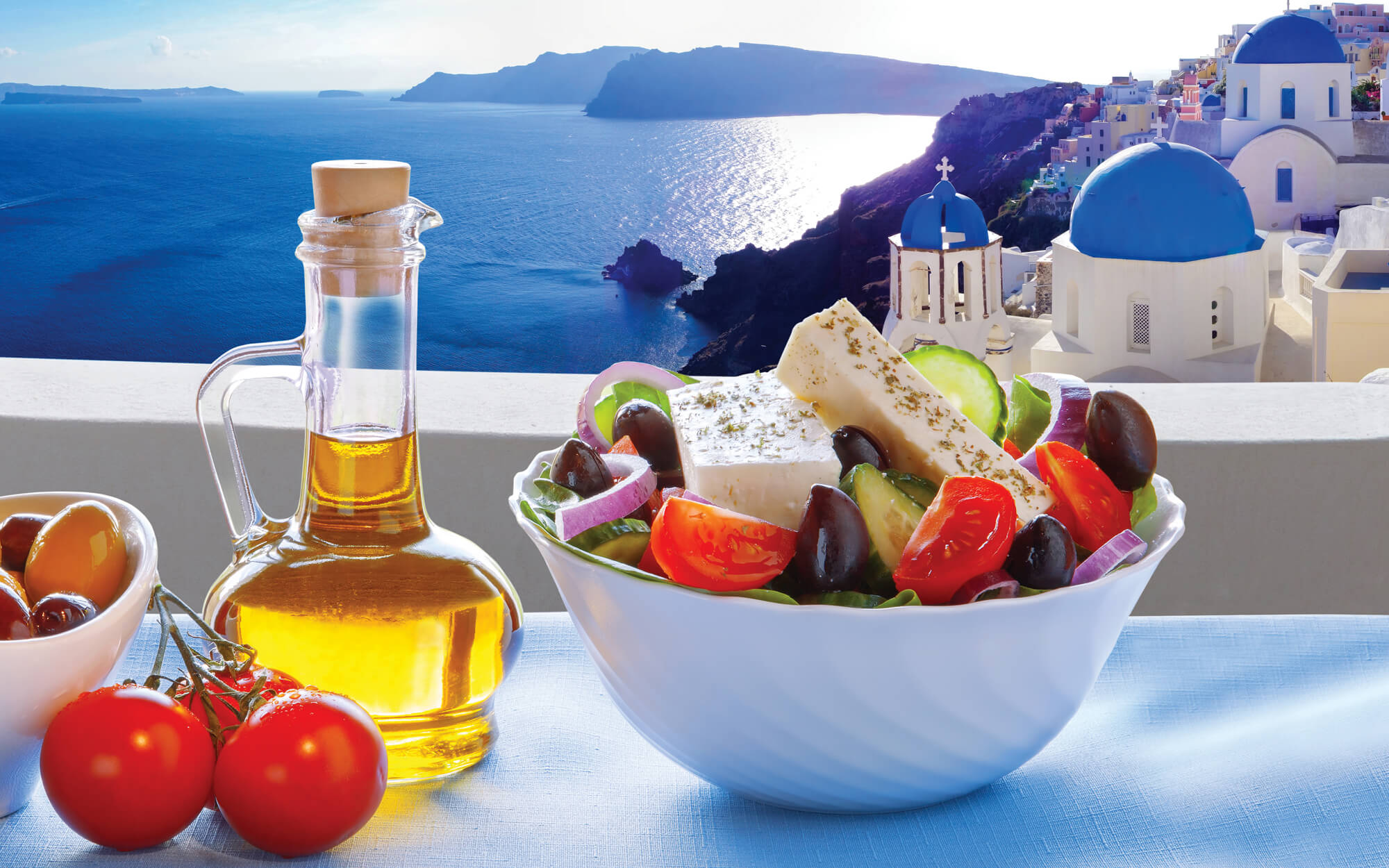
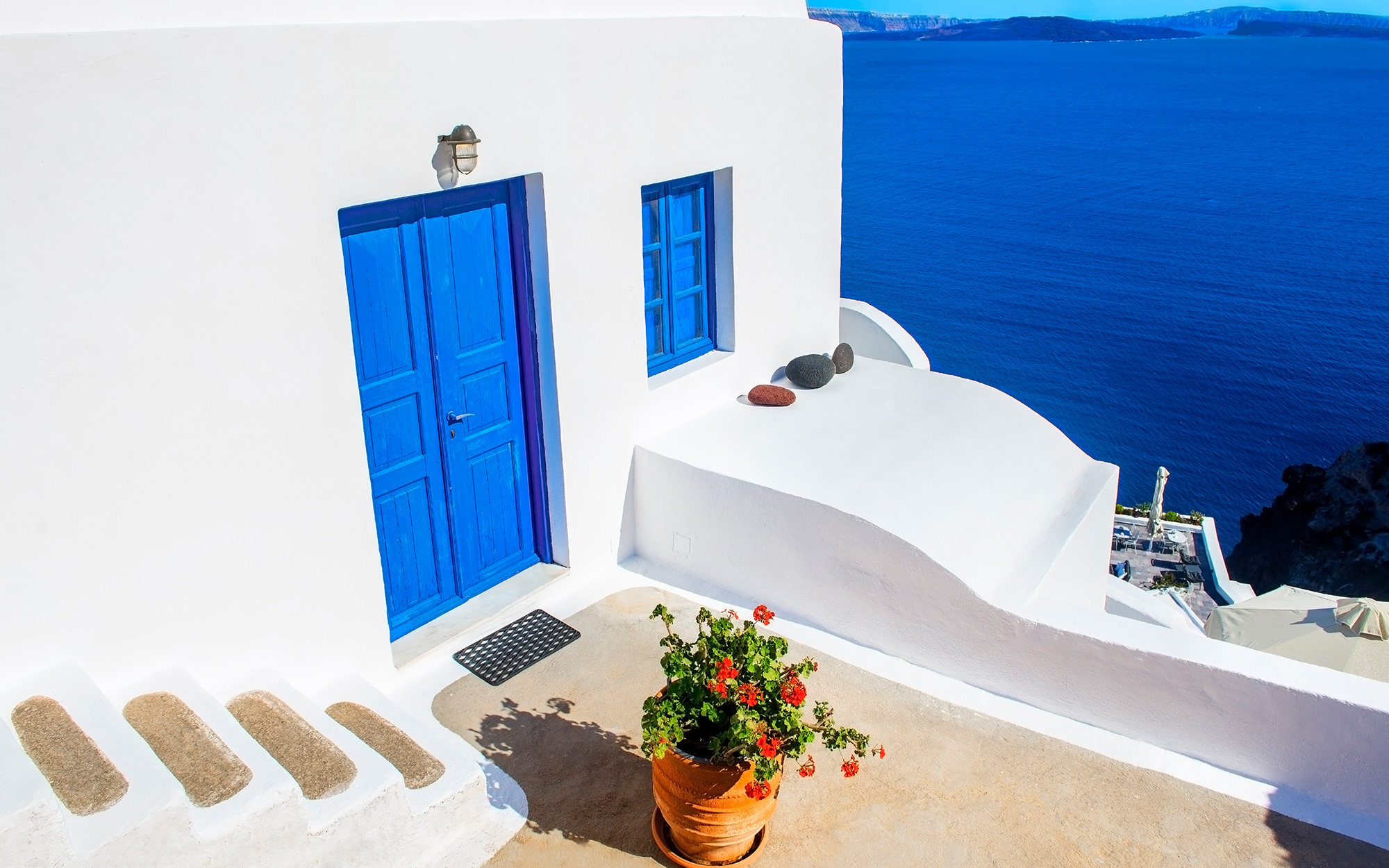
We wanted something that was busting with colors and flavors, something in position to be immediately connected with the idea of Greekness and the explosive feelings evoked when someone comes in contact with truly great Greek food. With folklore avoidance always in mind, we turned for inspiration to the timeless Greek summer and the joy it carries along.
DESIGN APPROACH
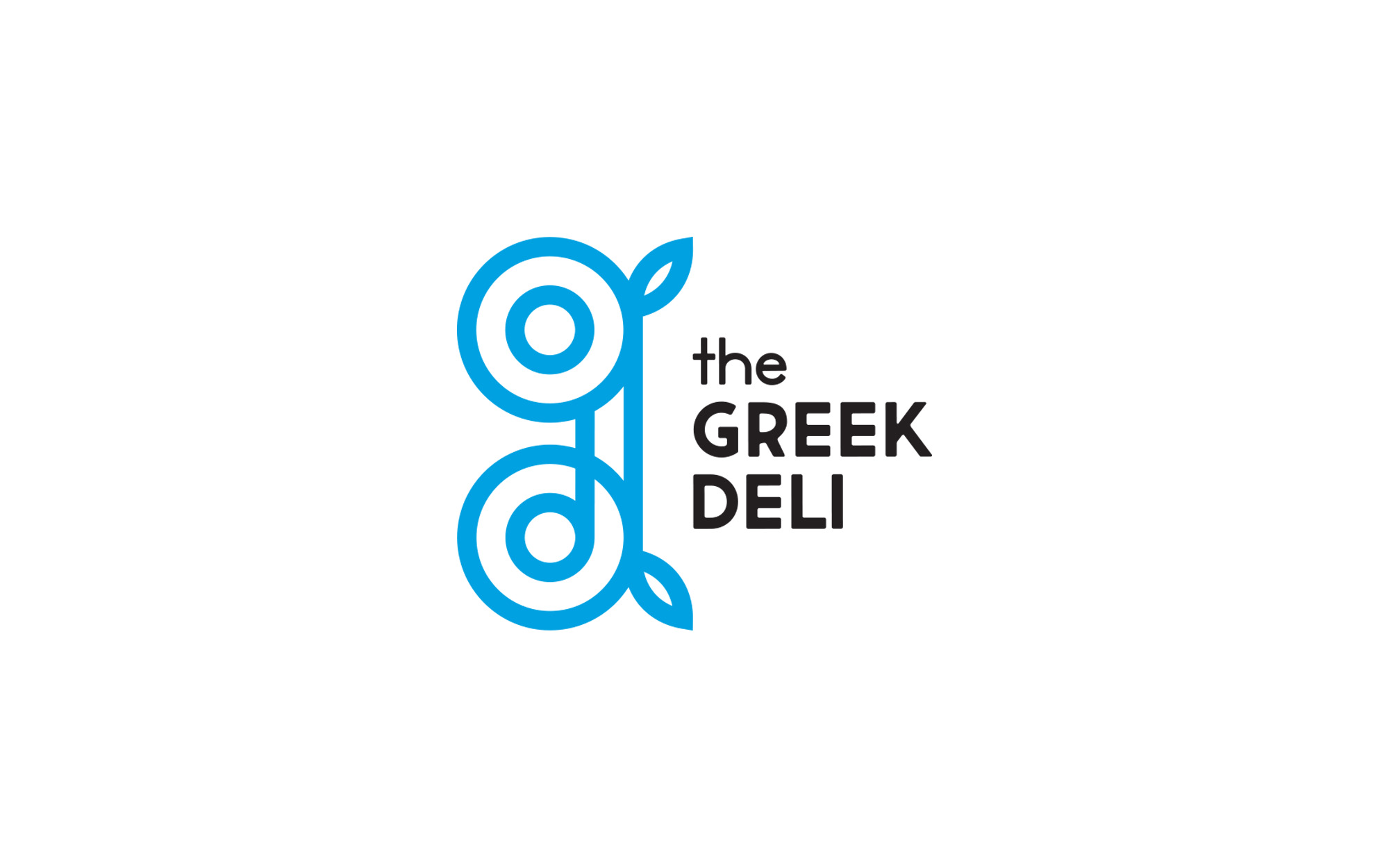
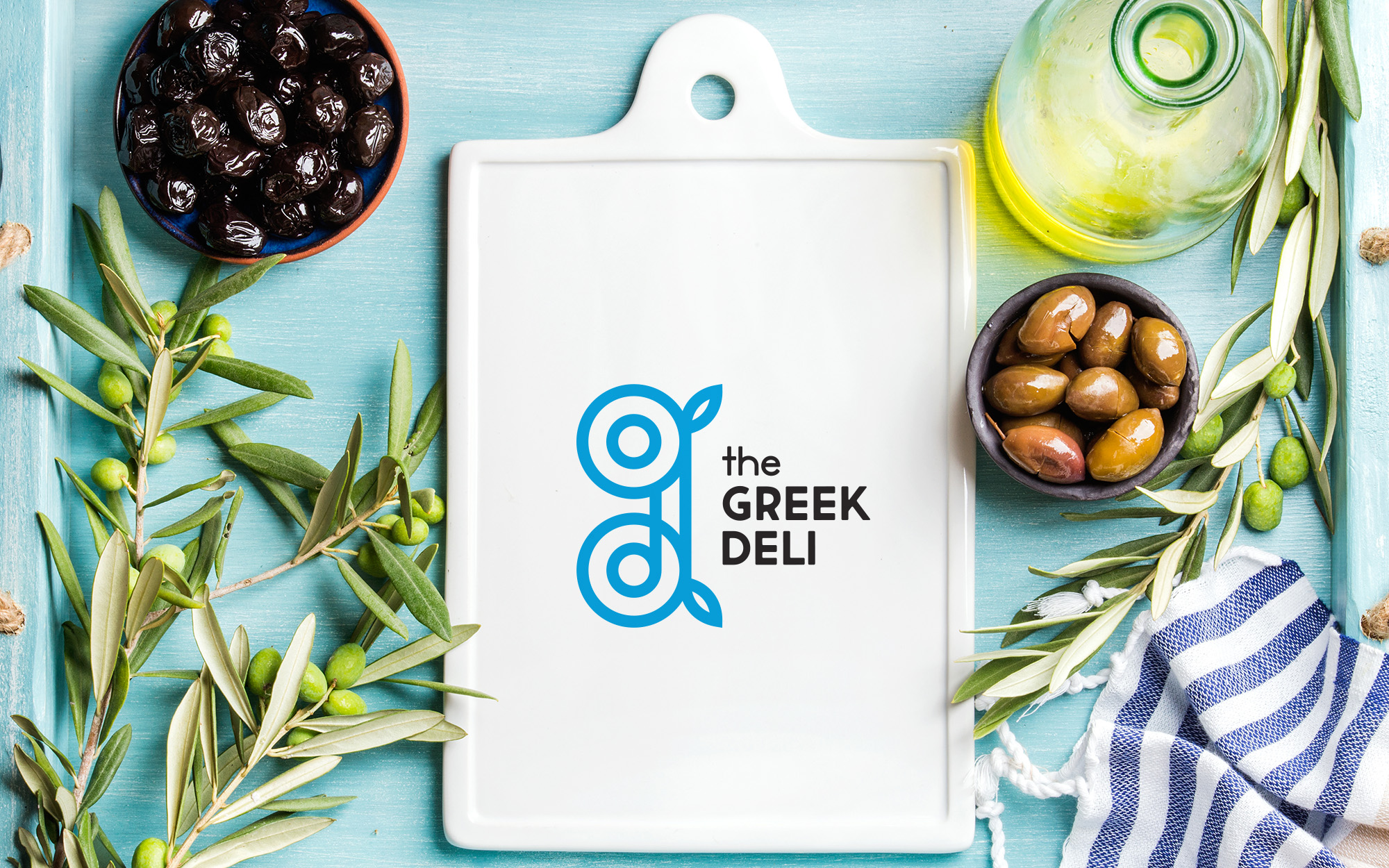
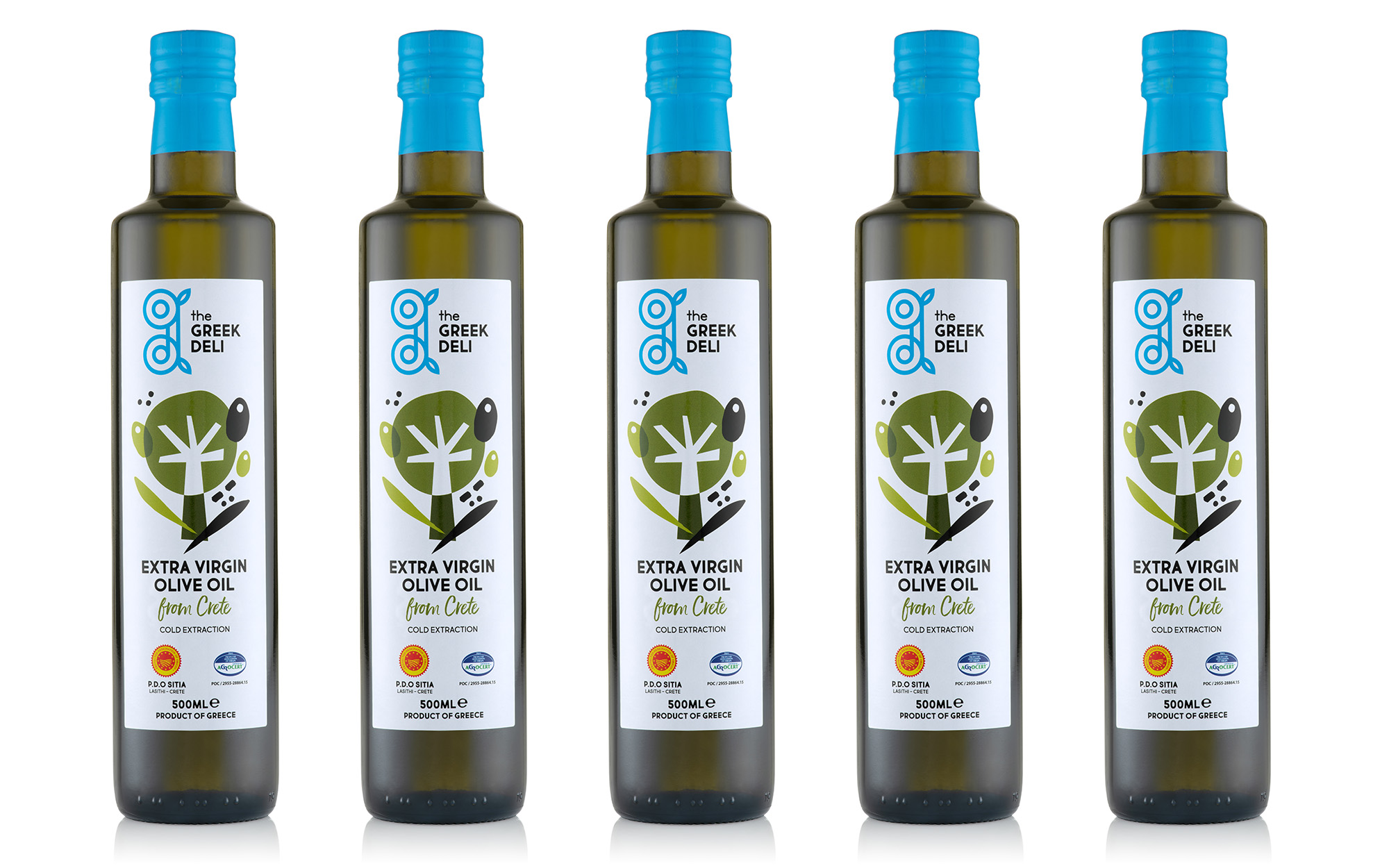
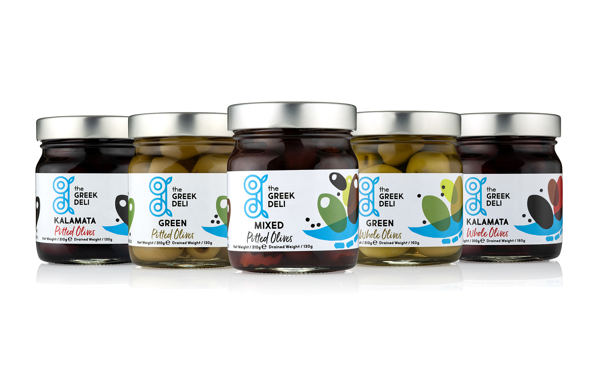
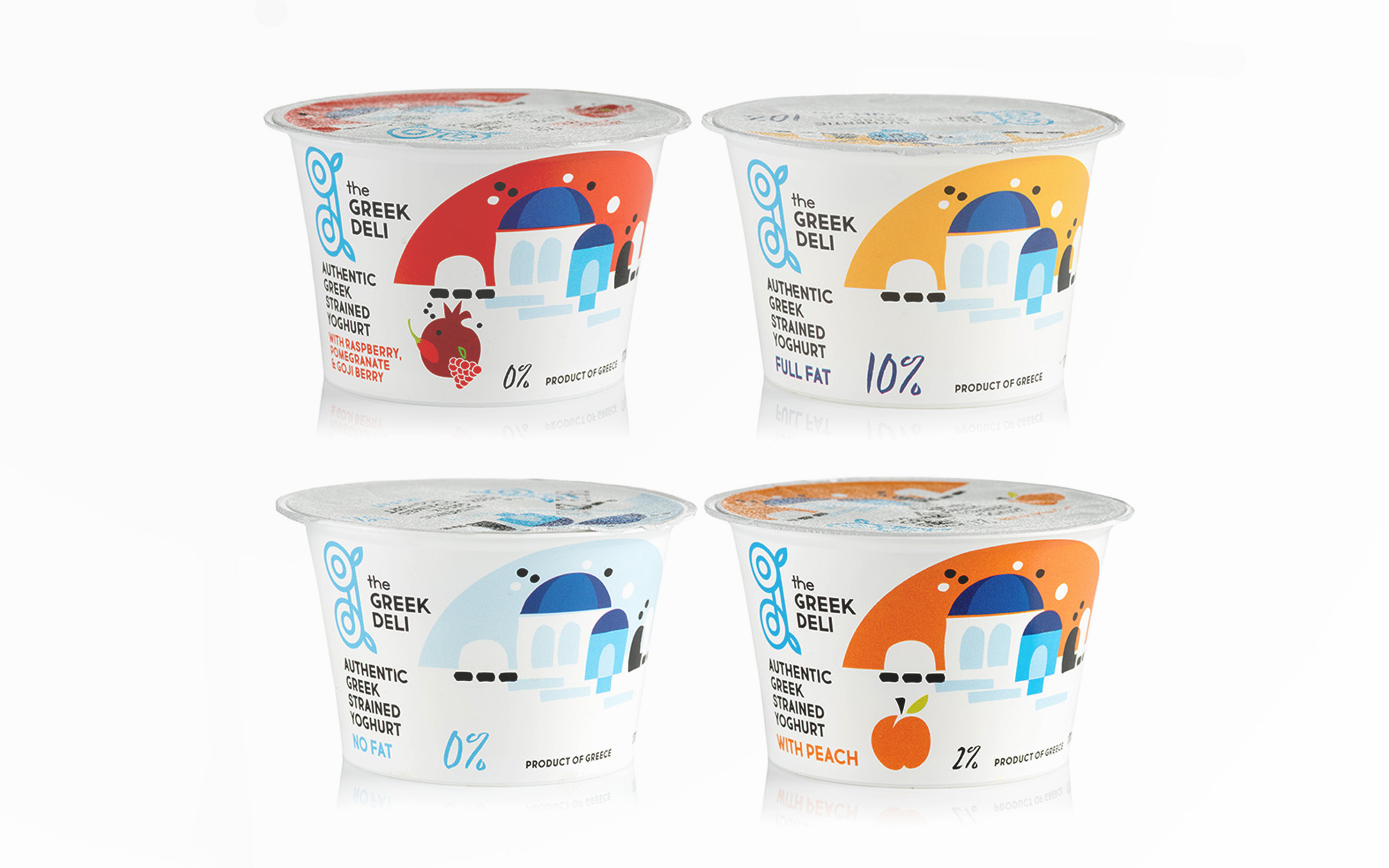
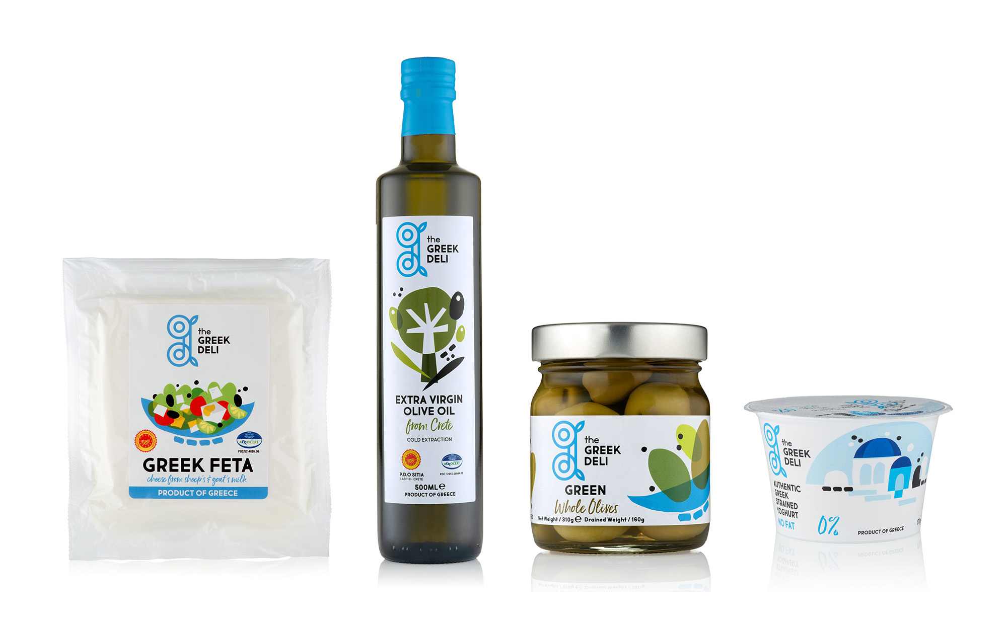
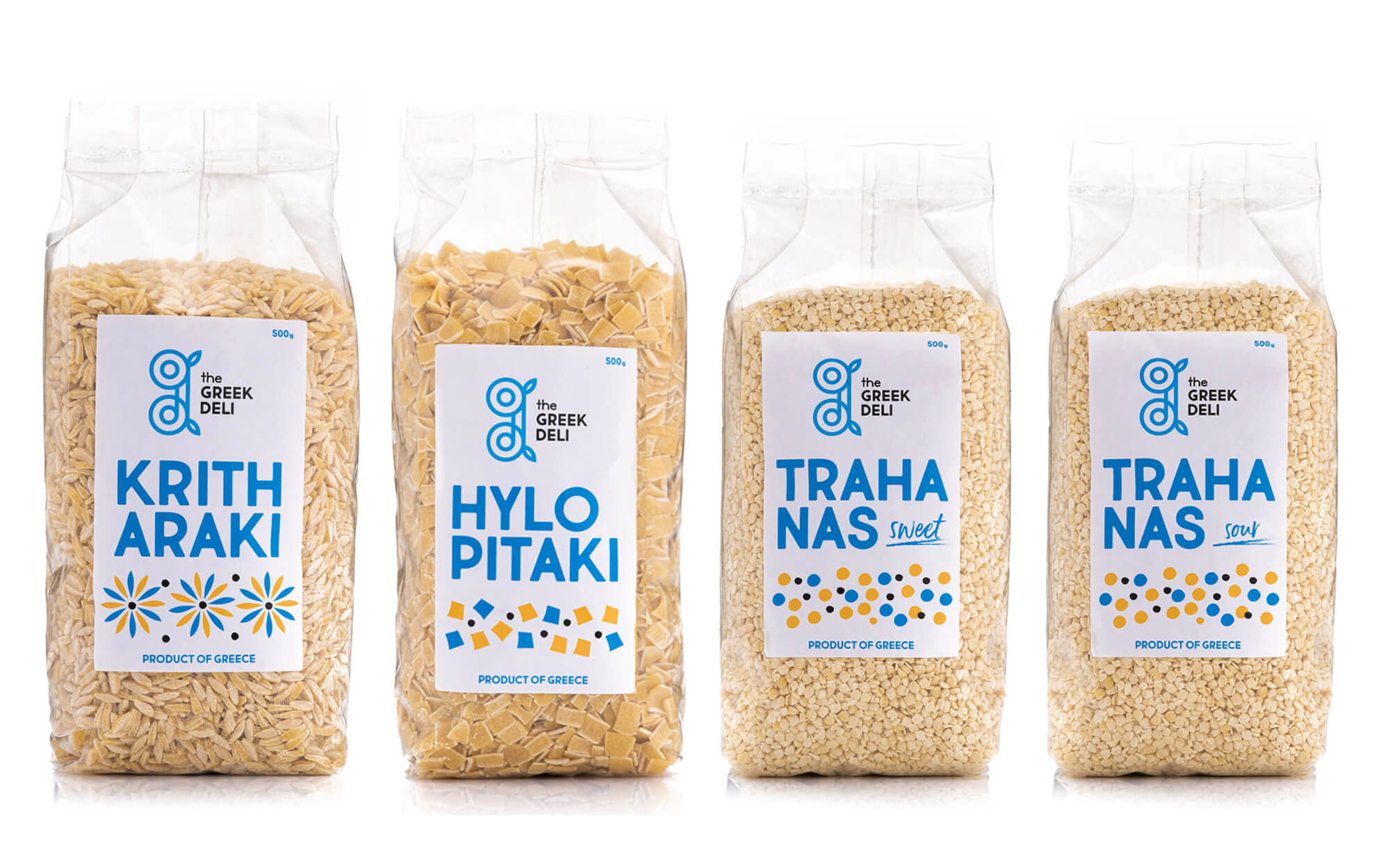
We developed a fresh pictogram to define the logo – basically a monogram incorporating the “G’ and the ‘D’ of the brand’s initials in a shape that is unmistakably Greek without the very much unwelcome cheesiness that comes along in cases like this. Remotely archaic yet contemporary, it could spark the notions of an owl, a Greek column, or a spire perhaps- shapes embedded in the collective consciousness but given in a more abstract manner, without being force-fed to the audience. A good dosage of light blue accompanies all applications, further alluding to the Greek origin, while all original illustrations that accompany different product variants employ a riot of basic colors deriving directly from the precious ingredients themselves.
SERVICES
Logo, branding, packaging