Smile baby!
BRIEF
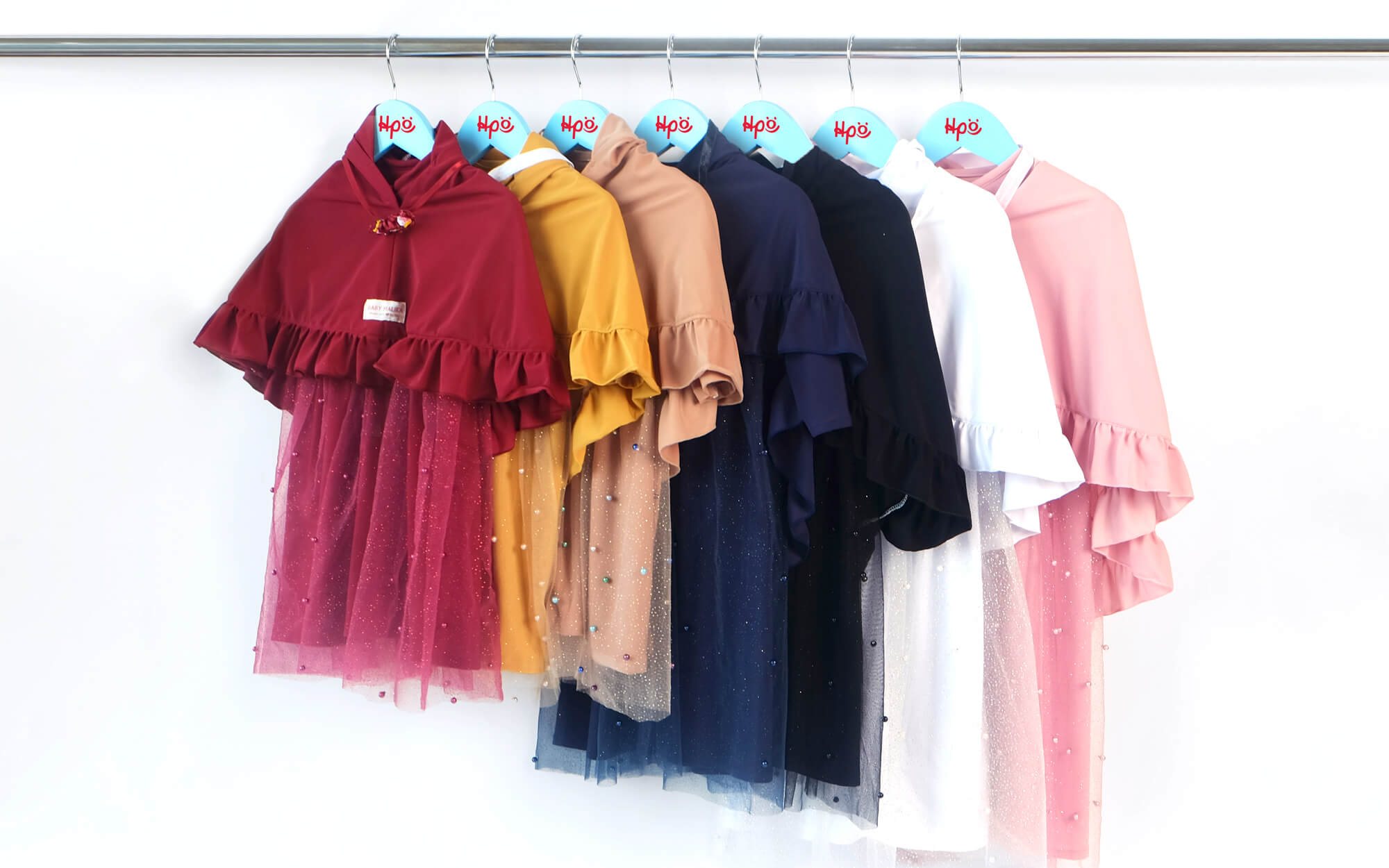
Iro Kids is an established store dealing with kids and baby clothing & accessories, based in Egaleo in the eastern suburbs of Athens. The store represents a wide array of great, well-loved brands and has been recognized for its customer centricity over the years. As customer demands evolve and as competition is getting tougher and more advanced, it was decided that it was a good time to re-approach the store’s identity – especially in light of its expanding online business where every little impression counts.
TARGET GROUP
Parents of infants and children of ages up to 12 and expecting mothers in Athens but also across Greece (through the online store that covers the whole country).
CREATIVE CONCEPT
Our creative drive had to respect the need to combine continuity with freshness. It was decided to build on a basis of already recognizable elements while reinforcing the element of joy that is naturally linked with anything related to babies and children.
DESIGN APPROACH
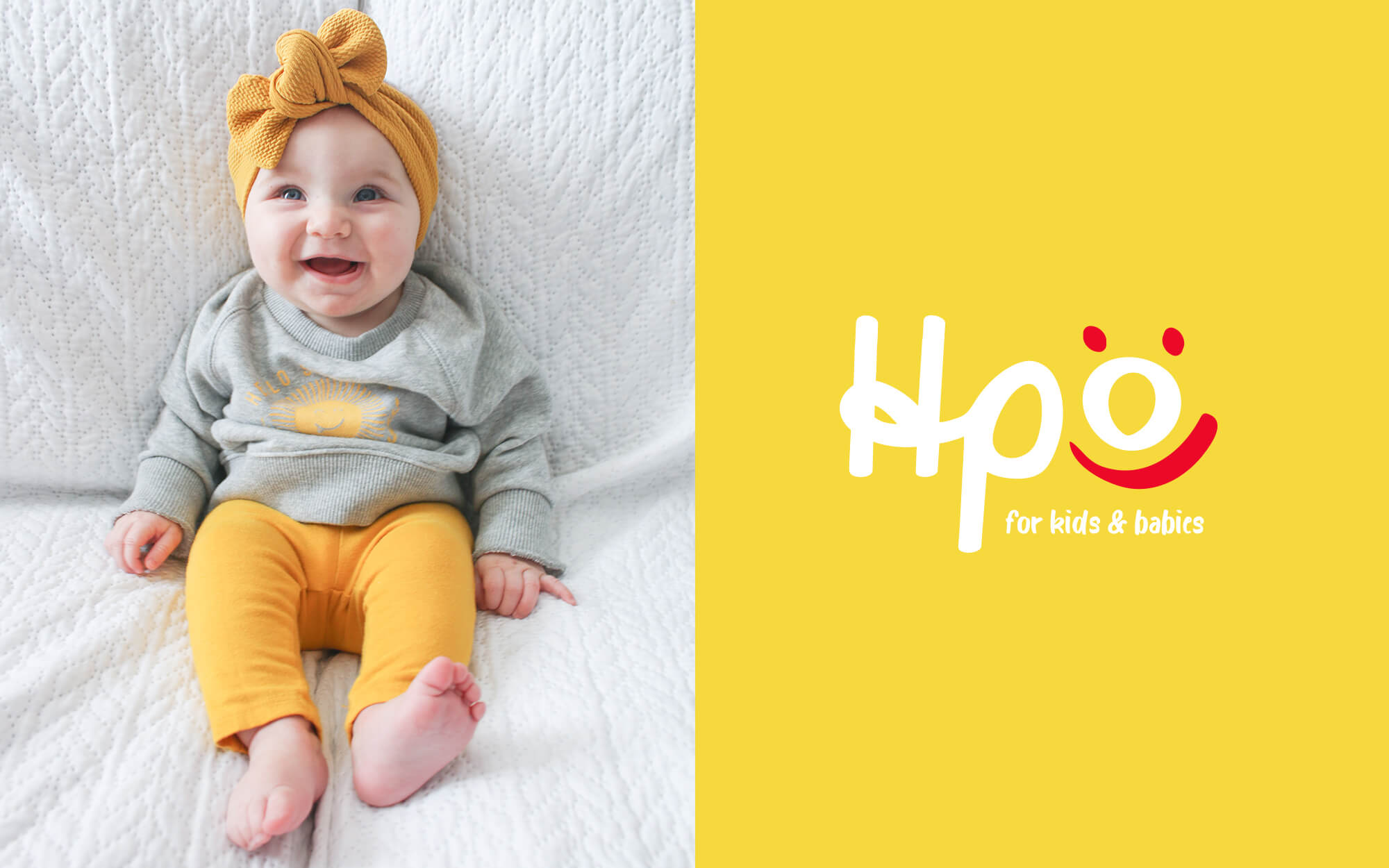
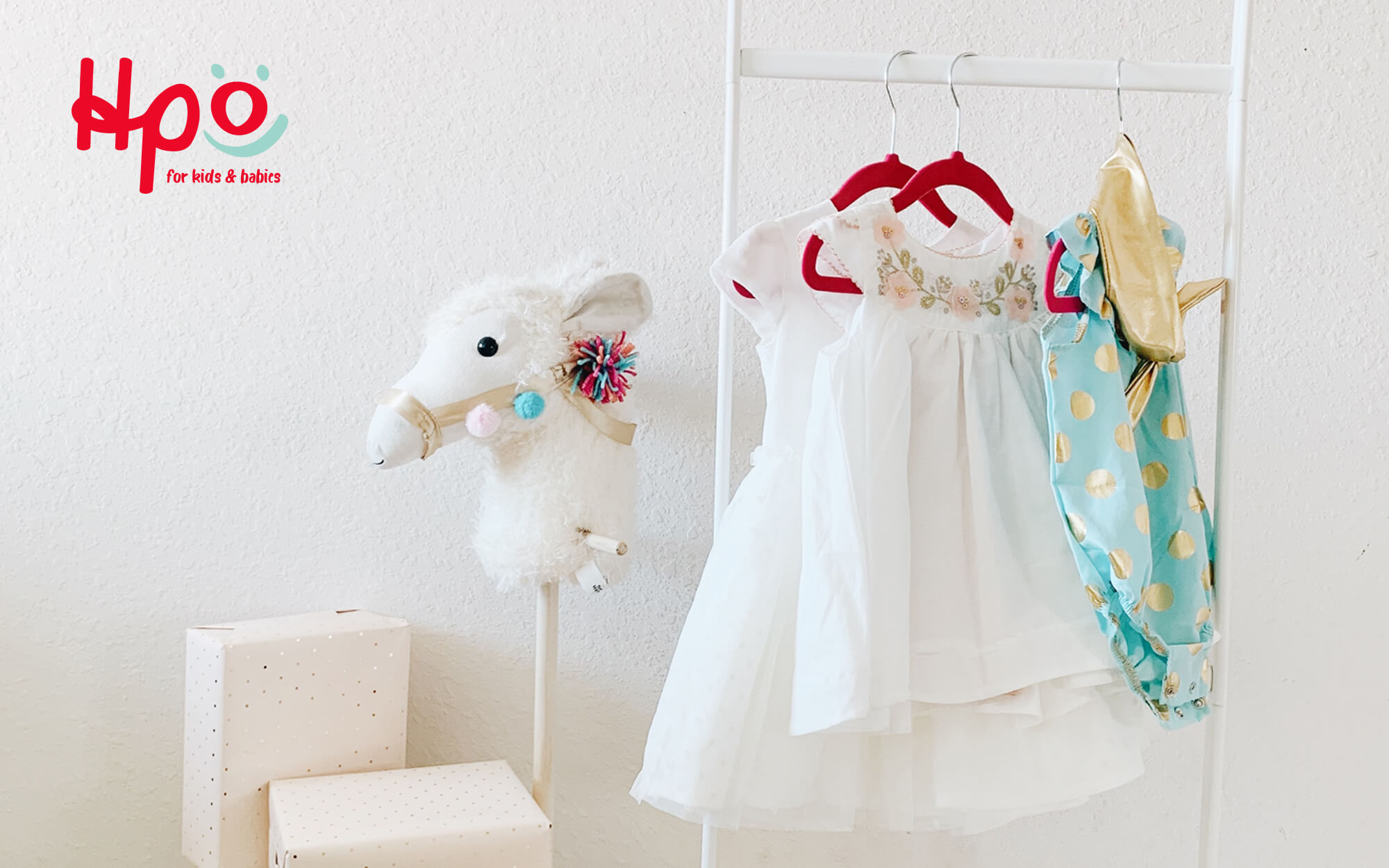
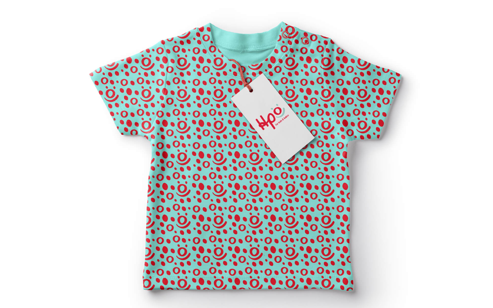
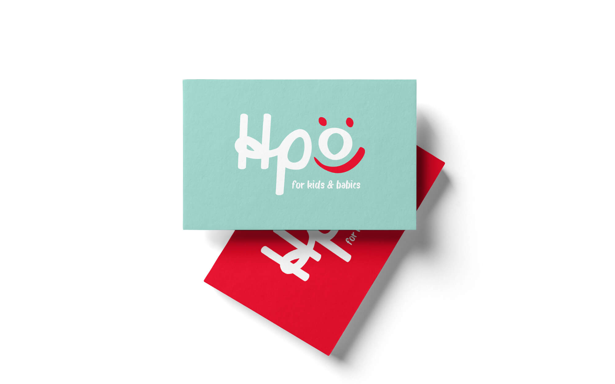
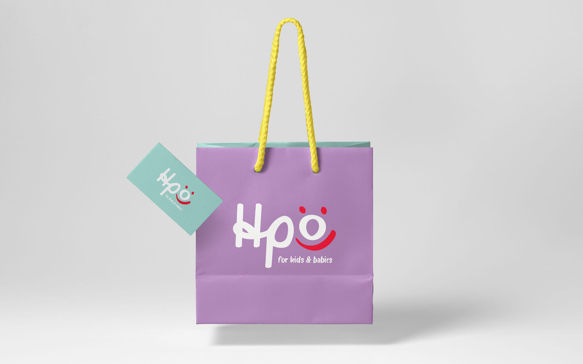
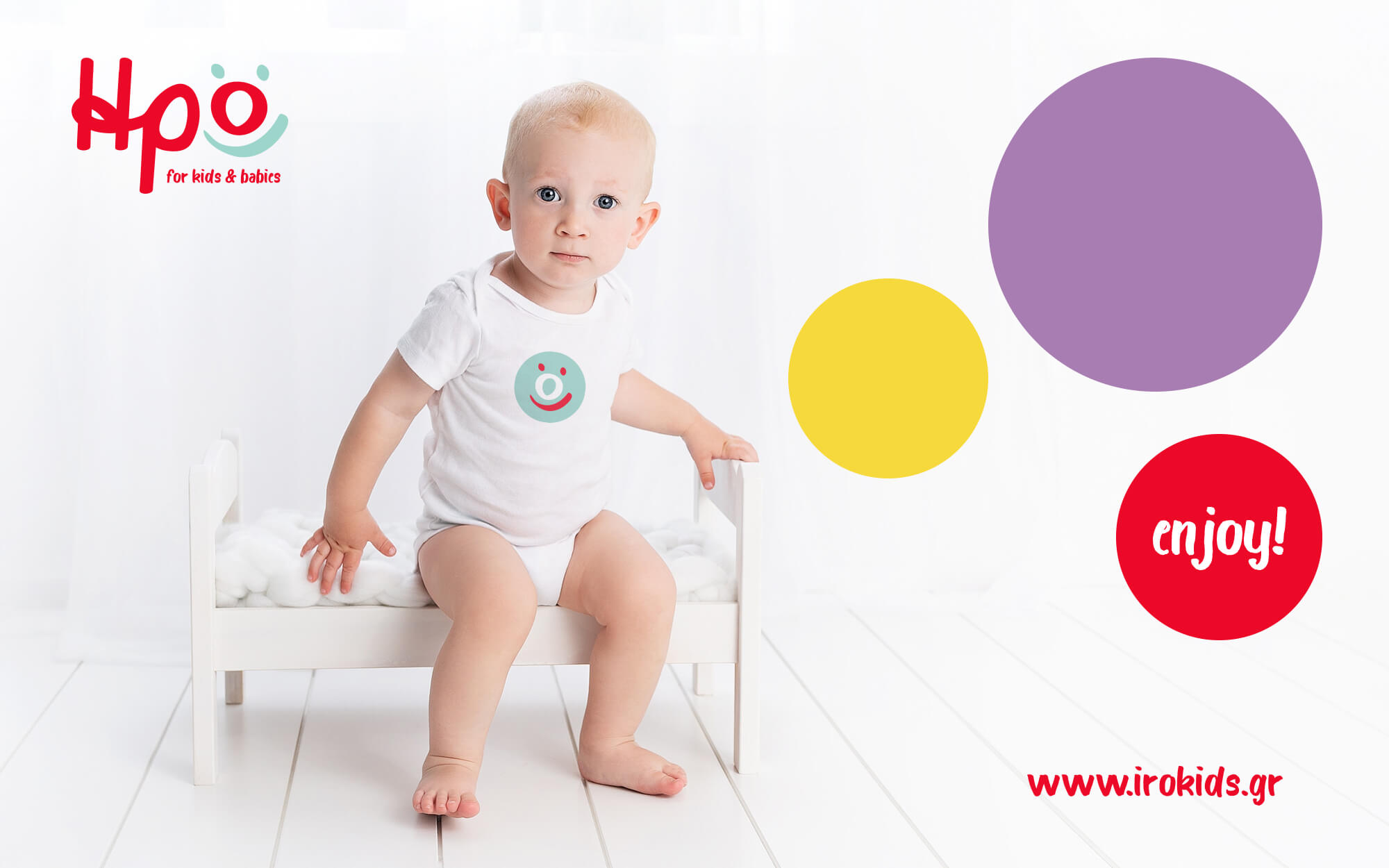
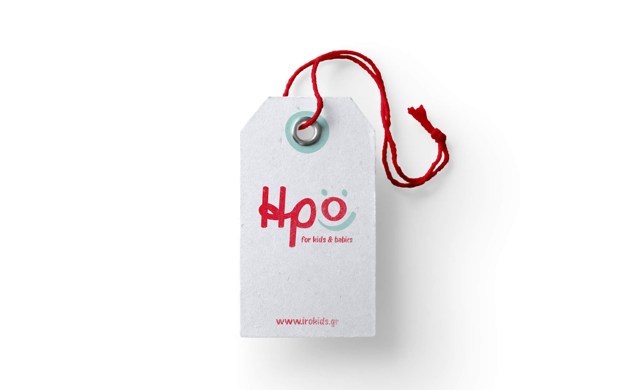
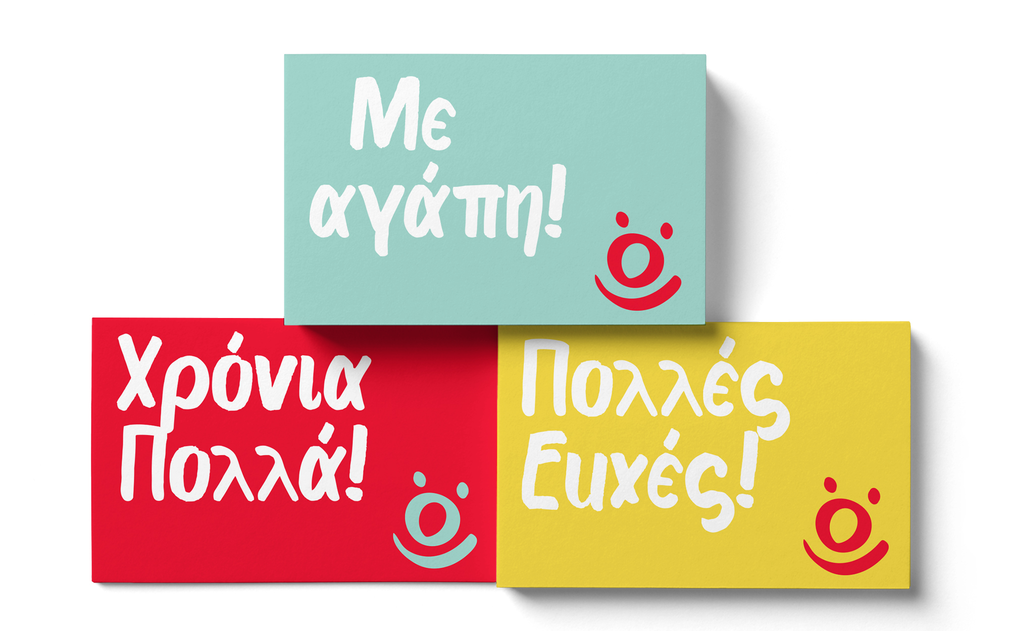
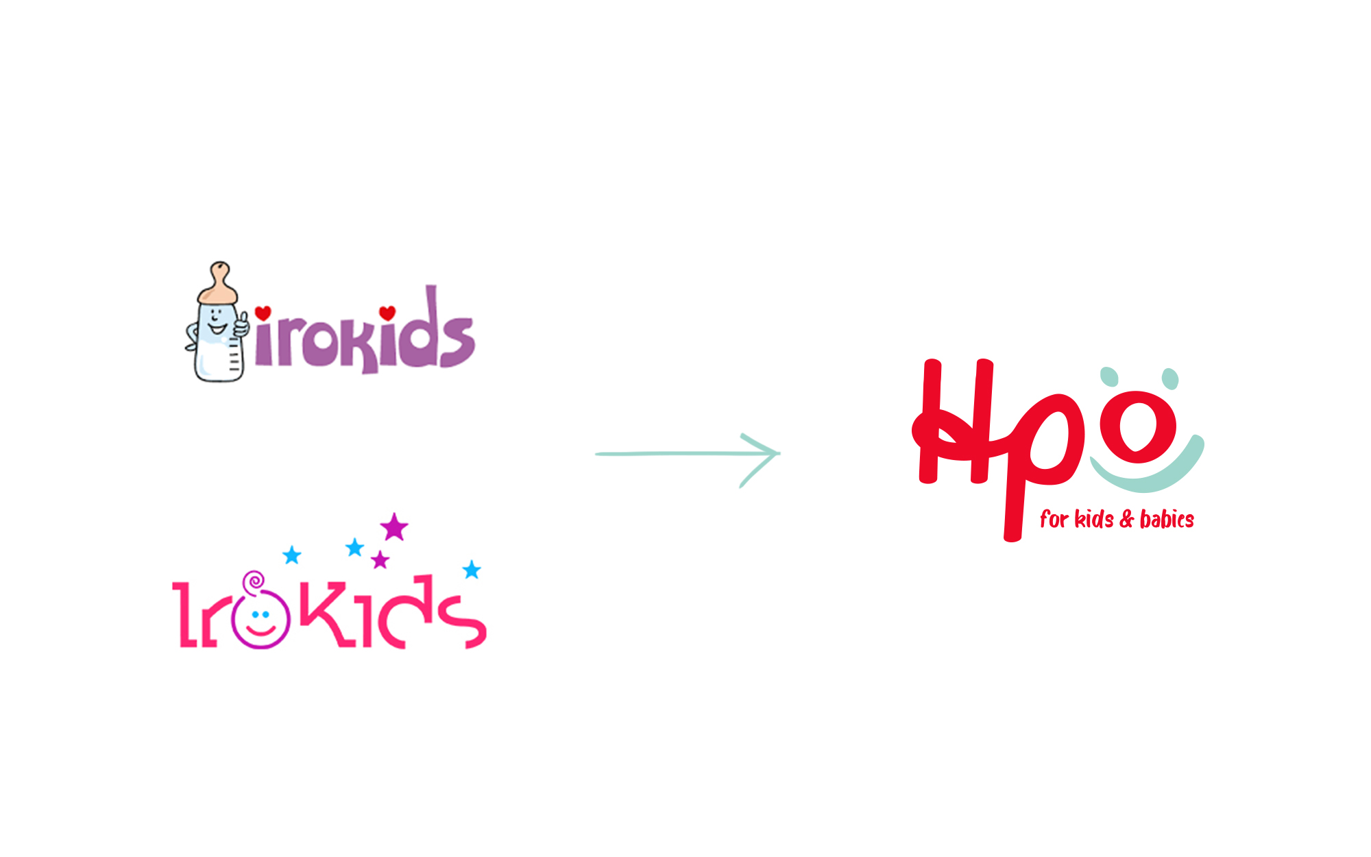
The first field where change was applied was the letter Omega that is part of the word ‘ΗΡΩ’ in Greek. The line that underpins the letter is transformed into a smile, highlighted by the different color that is always employed vs. the rest of the letters. In the same color as the line, two small dots were placed over the letter – reminiscent of the intonation mark in Greek but also creating a visual takeout that looks like eyes, thus completing the image of a smiling face. The identity was sealed with the proposition of four fun, lively colors as part of the color palette and the development of a series of applications for commercial, operational and communicational usage.
SERVICES
Rebranding, Logo, Visual Identity
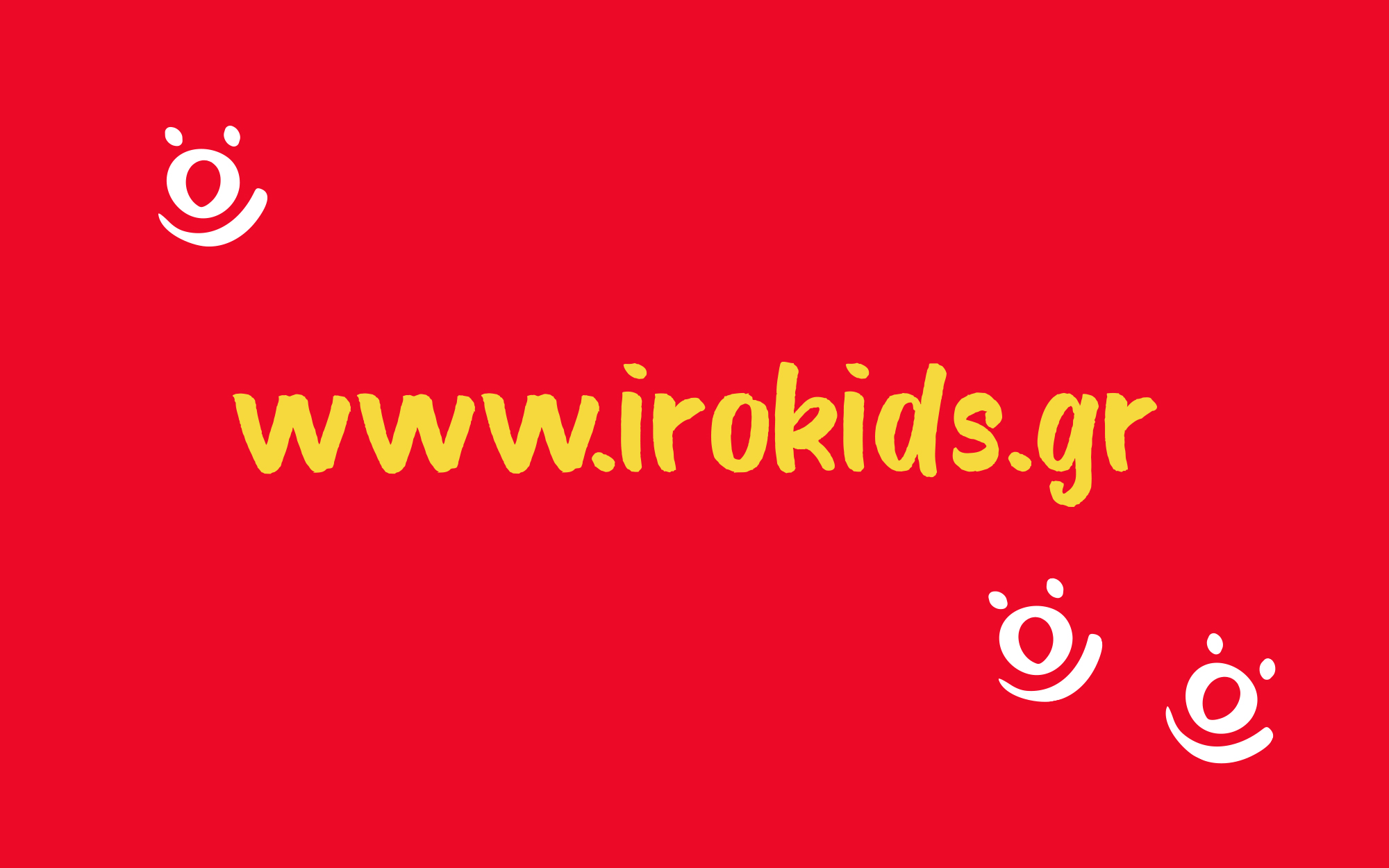
www.irokids.gr


Concept & Design: Sophia Georgopoulou
Copy: Konstantinos Kontinos