The shape of a…sweet brand!
A PROJECT DESIGNED FOR BOTROS ADWORKS (Mary Botros)
BRIEF
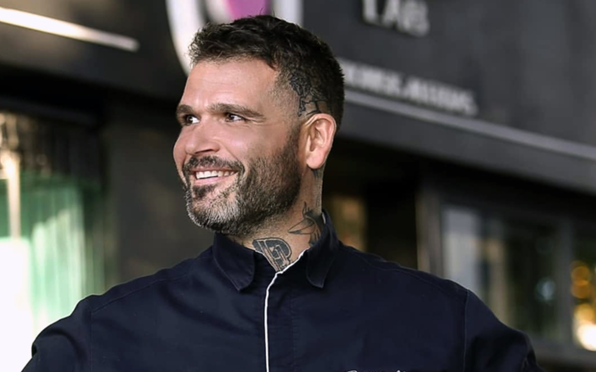
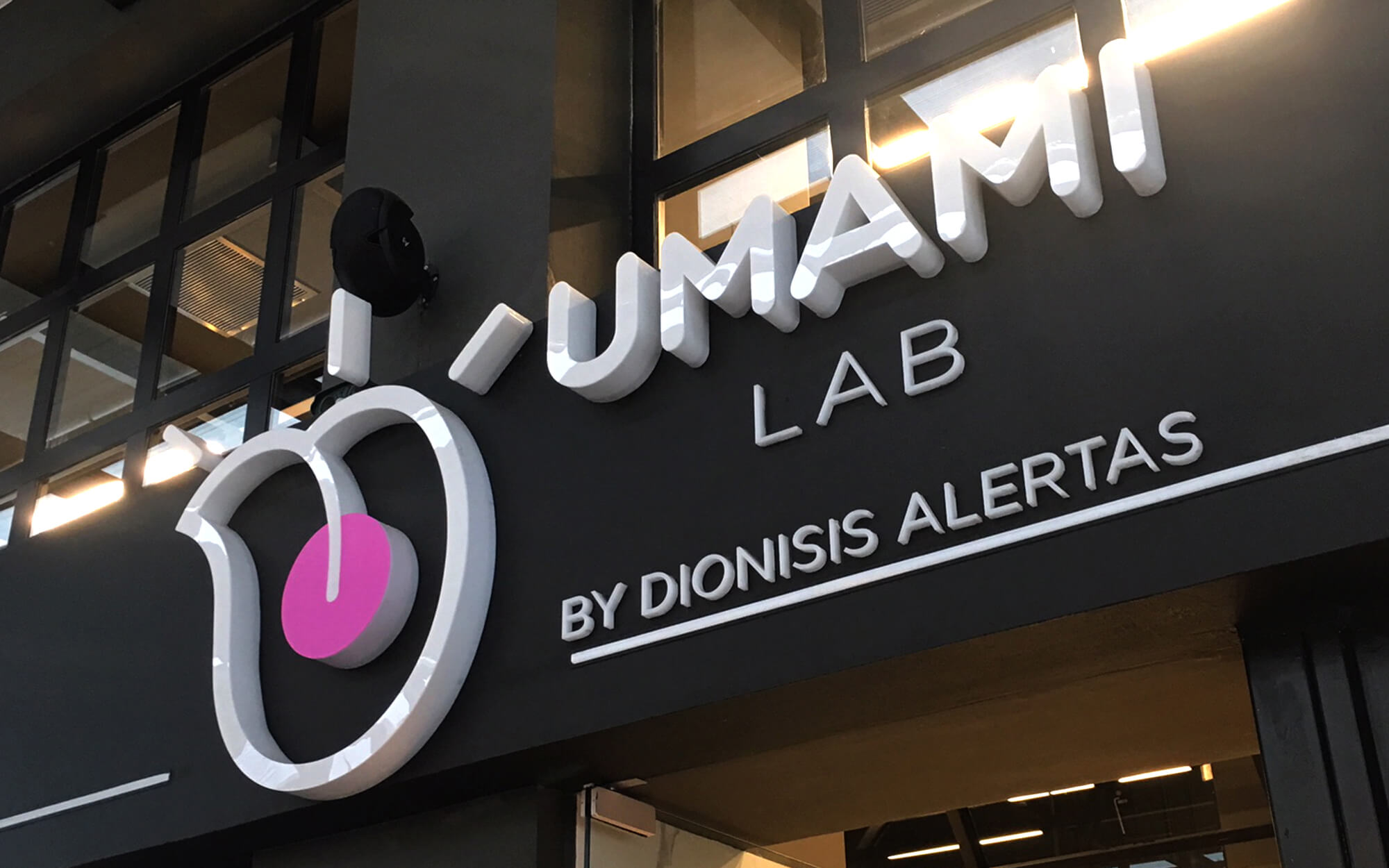
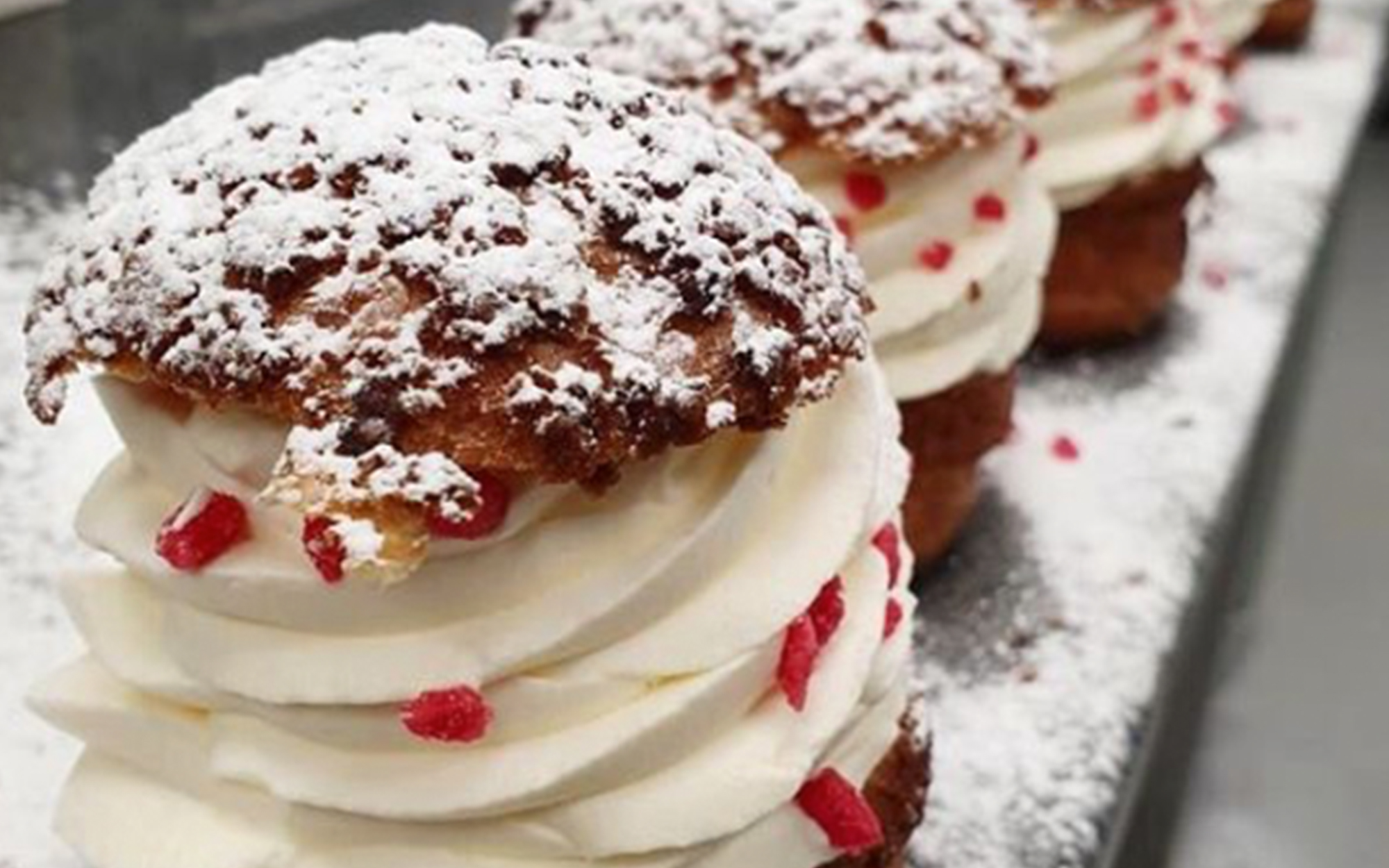
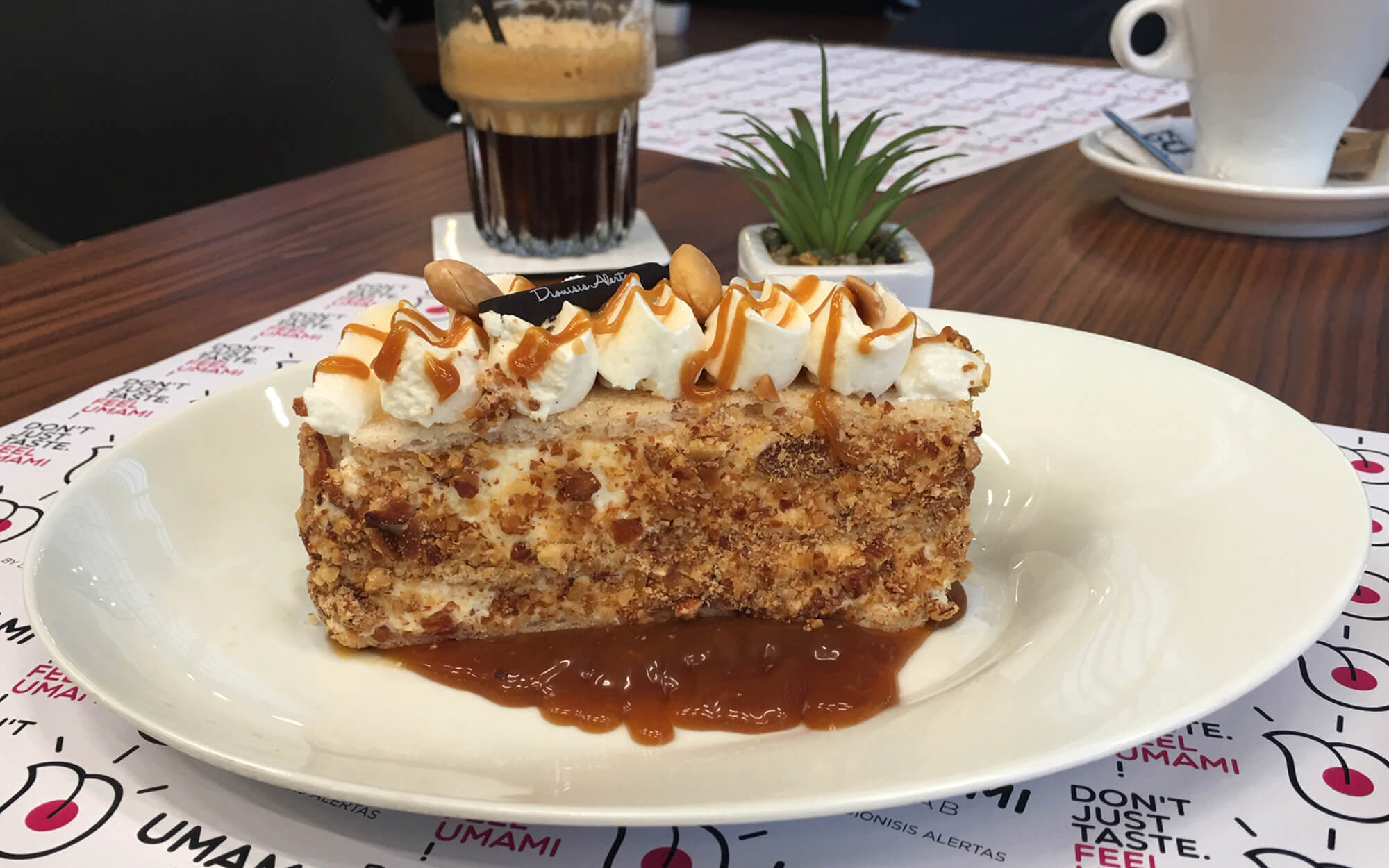
When you have established a remarkable 15-year career as a top Greek Chef Pâtissier, the inevitable direction is upward. Dionisis Alertas is renowned for his unique and distinct creations, integrating learnings from tradition with contemporary inspiration, in ways that seduce even the most fastidious of palates. Dionisis owns an enviable track record of collaborations with award winning restaurants: Spondi, Gaspar, Balthasar and has gained invaluable insight working alongside the esteemed global pastry master, Gilles Marchal. 2019 was the year Dionisis decided to apply his talents and channel his passion in to his own personal business creation. Umami Lab was born: An All-Day spot in the Northern suburbs of Athens that combines high quality pastry, coffee and food creations. Undoubtedly ingredients for a successful brand – where all we had to do was express them in the best possible way.
TARGET GROUP
Trend and nutrition-conscious selective urbanites who seek and value truly flavorful experiences.
CREATIVE CONCEPT
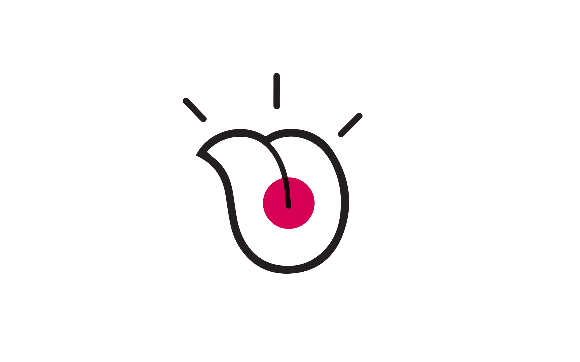
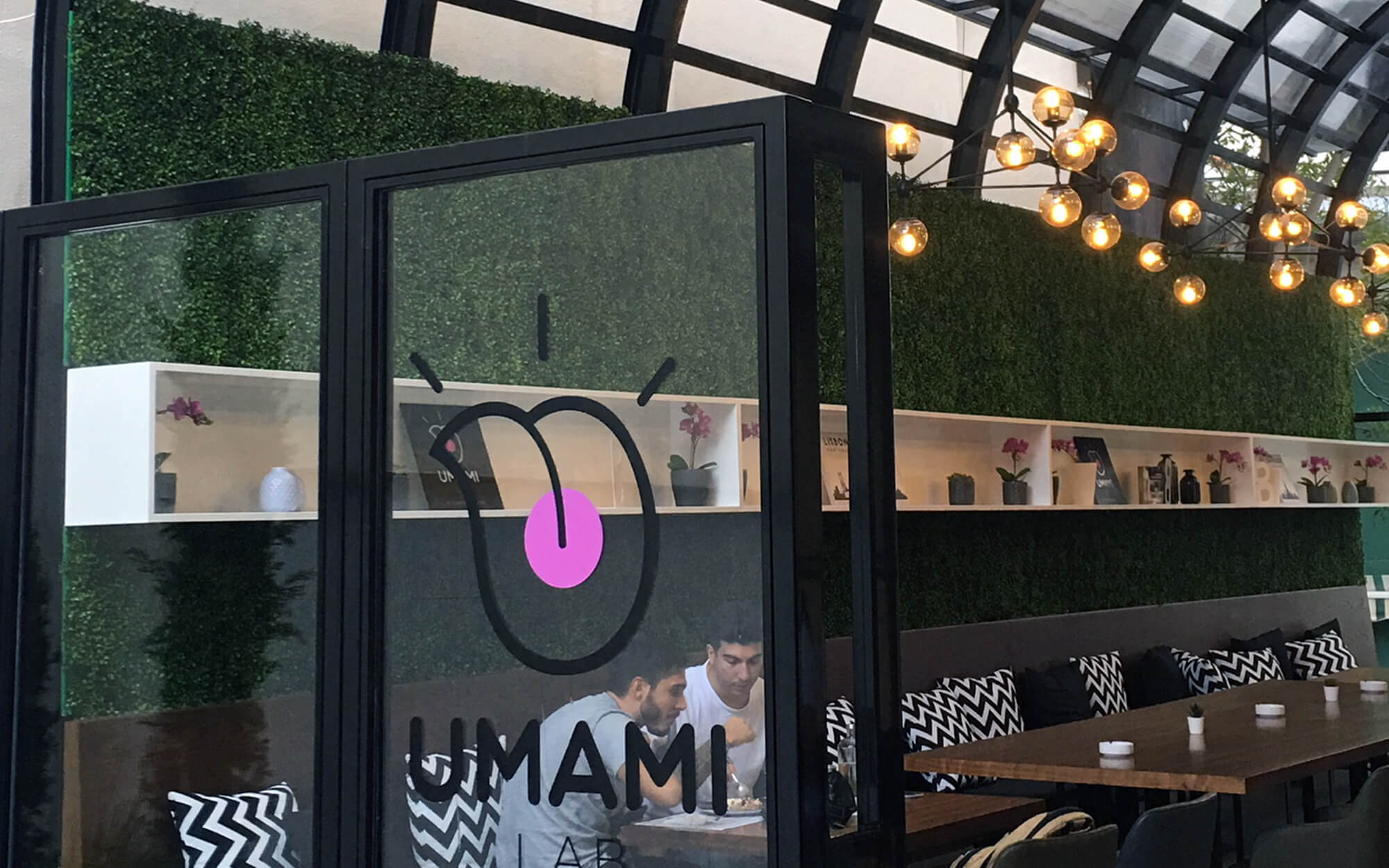
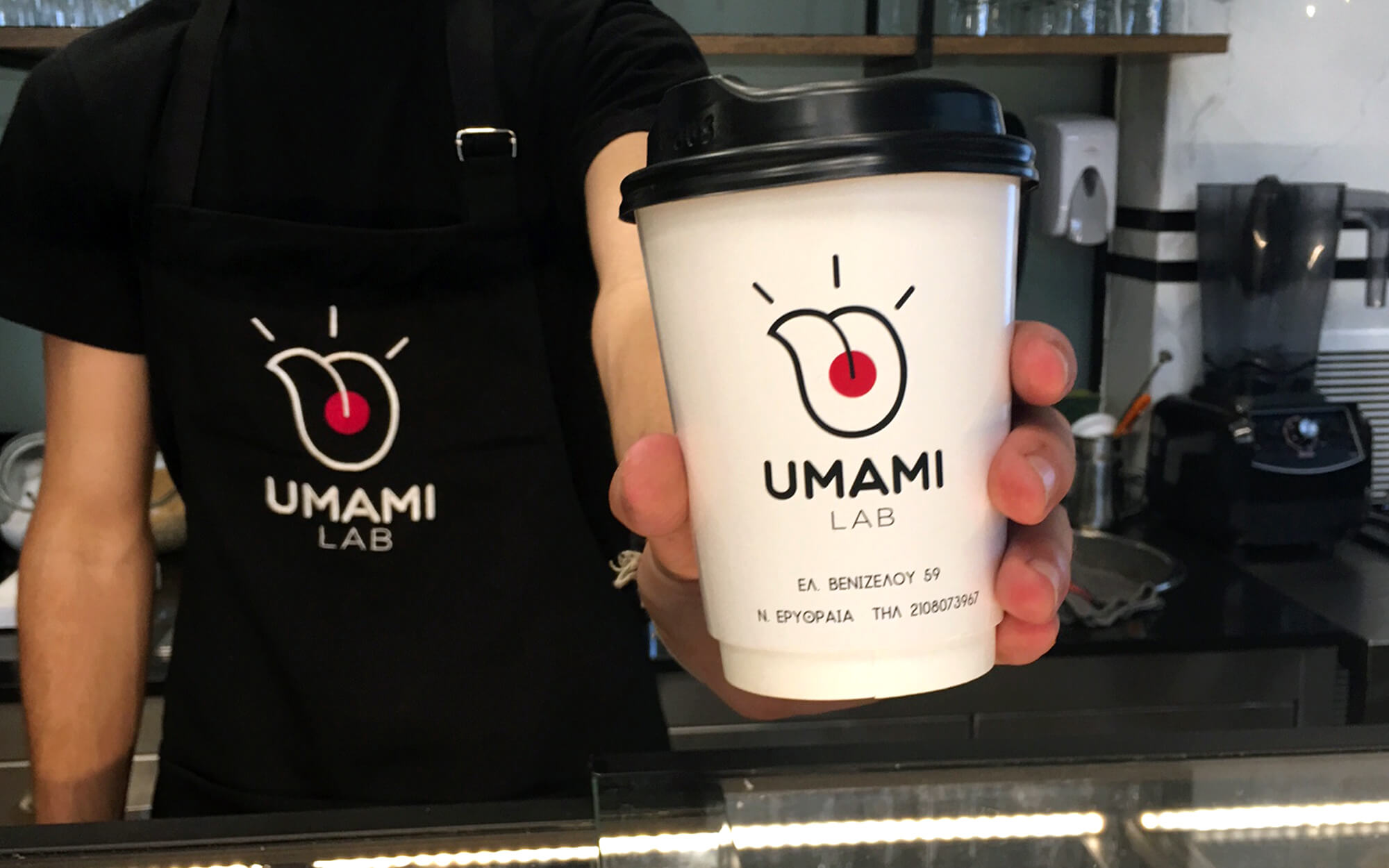
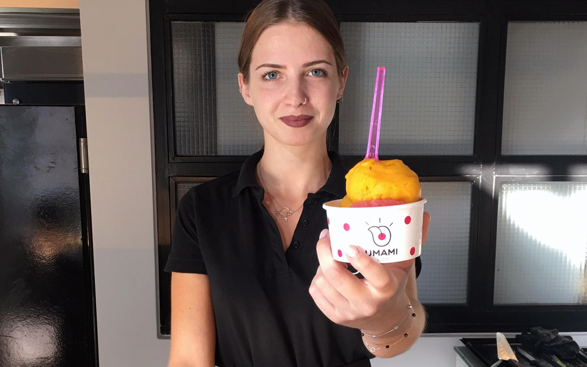
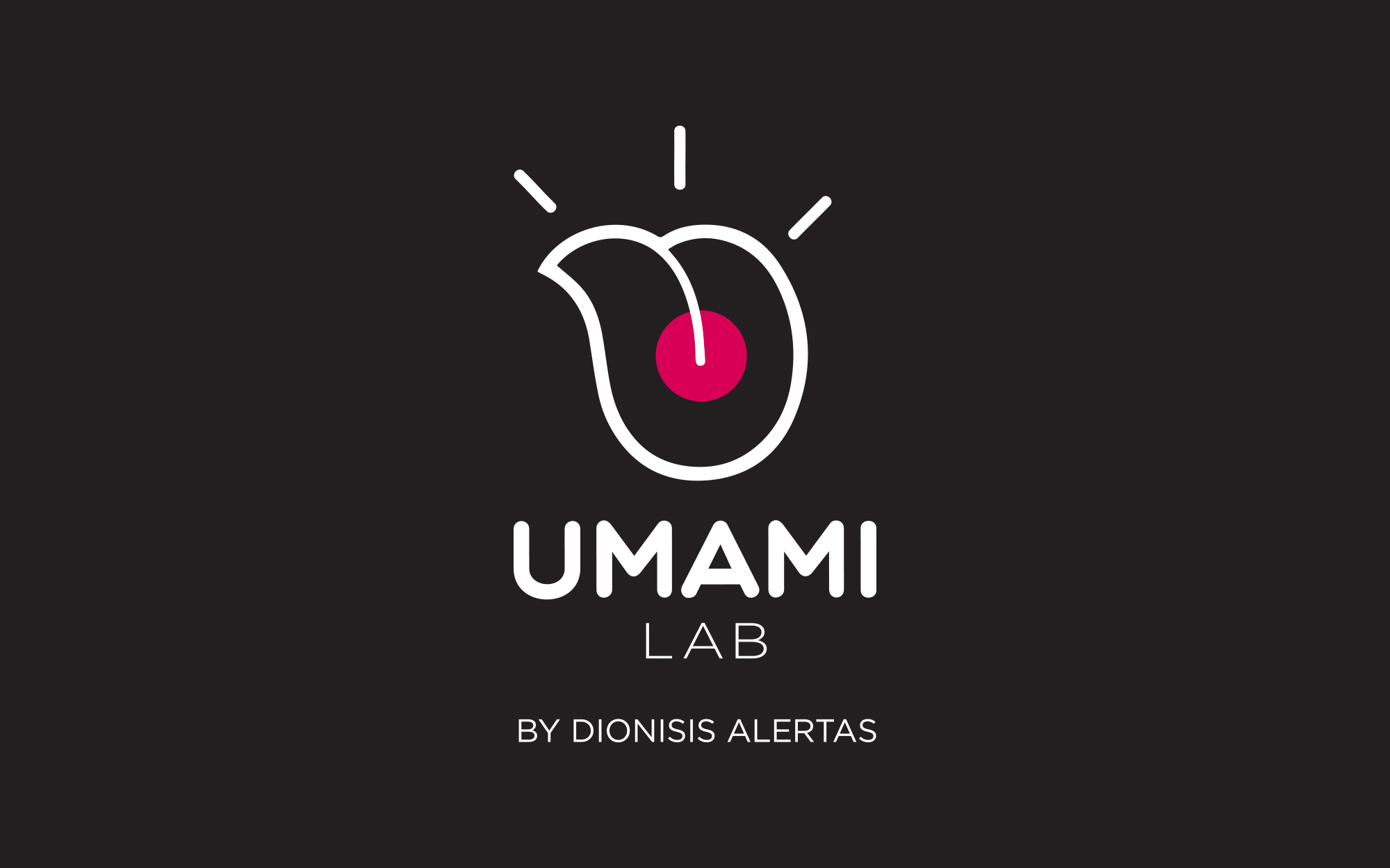
In an effort to bring the brand to life, we needed something that would essentially relate to the name of the spot itself – but also successfully convey the excitement, fun and unique flavors Chef Alertas creations exude as well as his ‘rock’ personality. Appreciation of taste starts with taste receptors on the tongue, which in turn inspired us to springboard from the Umami flavor receptors, located at the center, and initiate a cascade of sensations.
DESIGN APPROACH
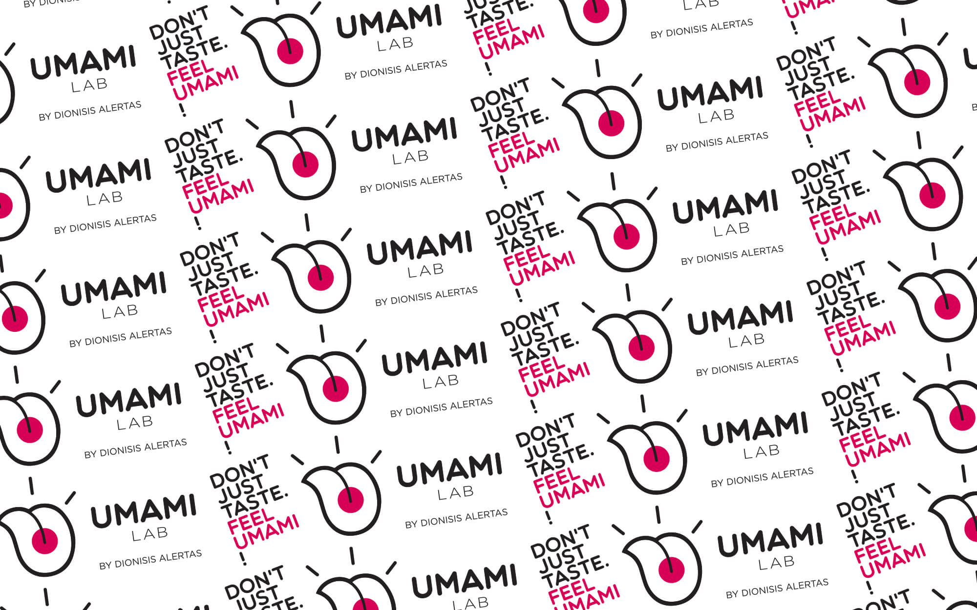
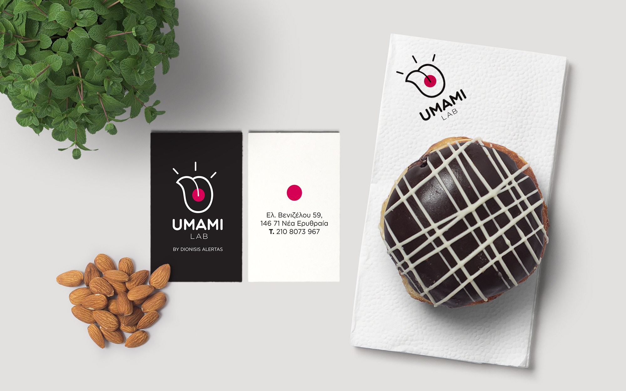
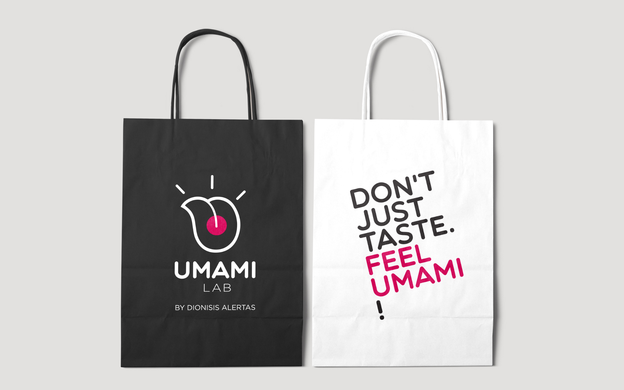
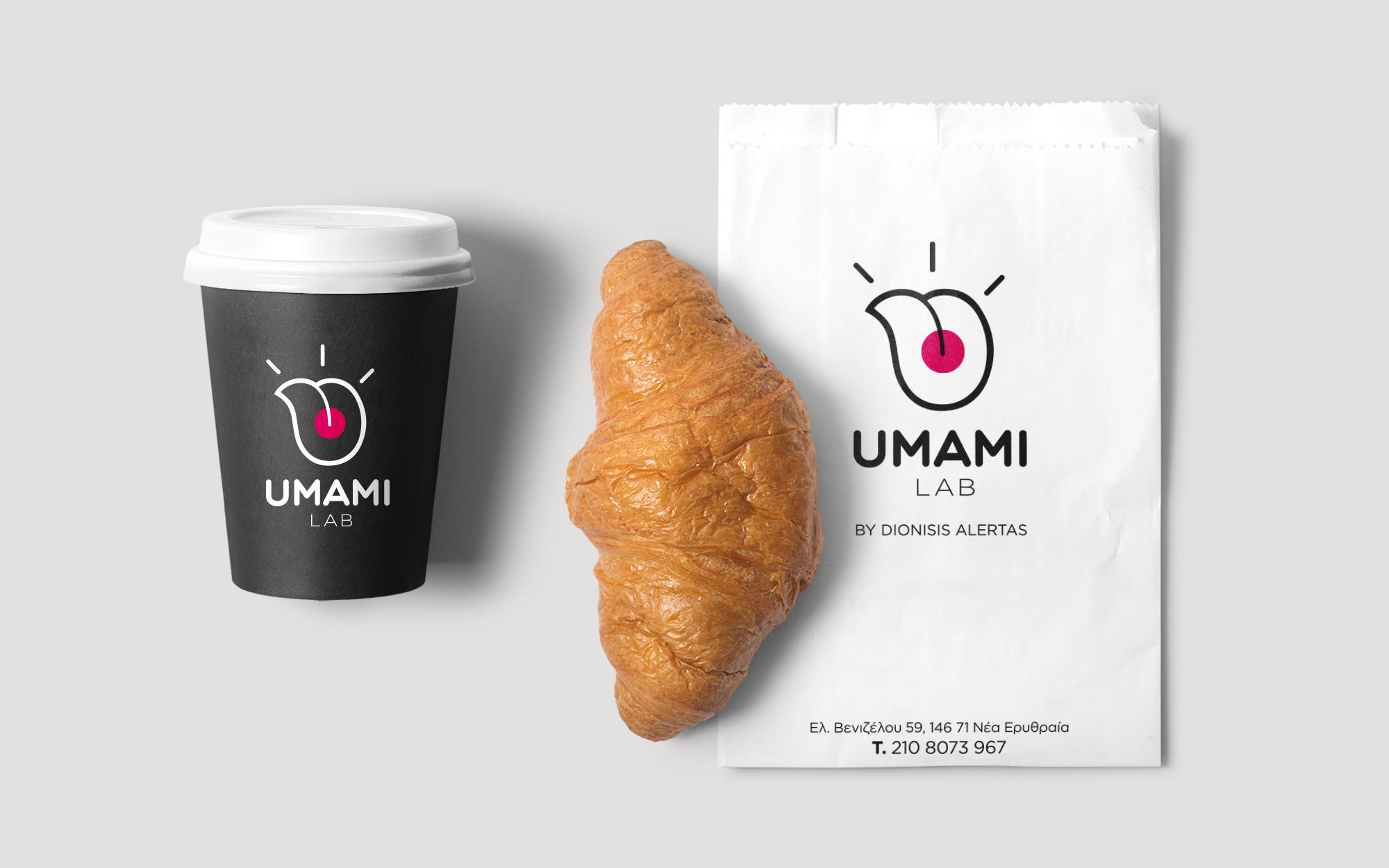
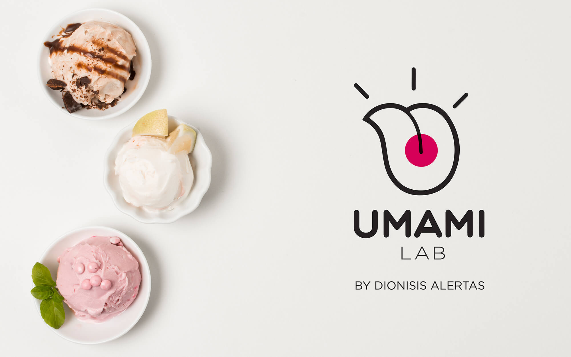
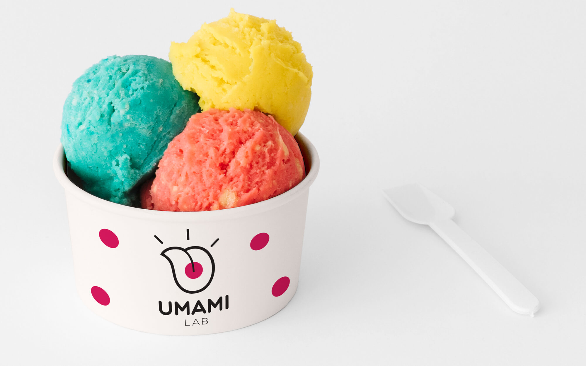
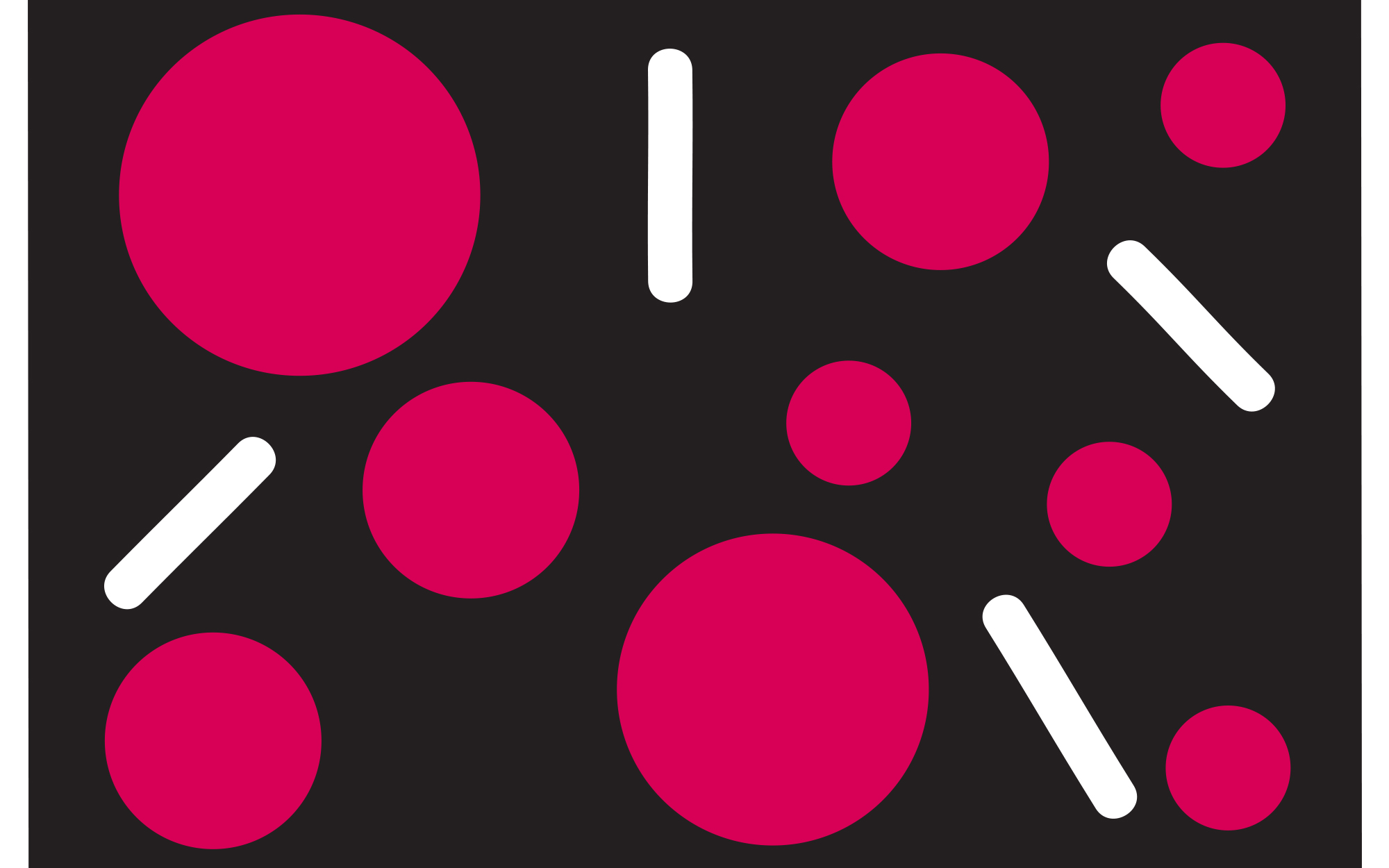
Ιn the logo we created the shape of a tongue sticking out. This visual element is playful, bold, cheeky and somewhat provocative, much like the creator and his creations. It’s as if the brand sticks out its tongue at convention and the obvious. Right at the center of the tongue, there is a big round pink spot – exactly where the Umami receptors can be found. The pattern of the spot is repeated across all applications of the brand’s identity, cementing its personality. Finally, this shape is complemented by three, somewhat cartoonish, lines, denoting the ‘wow’ effect these creations have on customers. The final identity encapsulates fully the type of experiences and sensations that one should expect from such an idiosyncratic spot and brand.