A brand that did not rest on its laurels
BRIEF
In the past, the great majority of Greek food products exported in the USA catered primarily to the needs of the quite big Greek-American community – but this has changed drastically, as a big part of the population has been exposed to the joys of great Greek food and learned to ask for it. Extra Virgin Foods is a company run by Greek Americans, dedicated to bringing real Greek food to the USA market – a market that has been plagued by many lower quality options posing as Greek, yet they are nothing but. The company wanted to create a new consumer-facing brand that would encompass all its products. What was needed was clear: Unmistakably Greek, exuding quality and promising a great experience full of flavors.
TARGET GROUP
Mass-scale American super market audience
CREATIVE CONCEPT
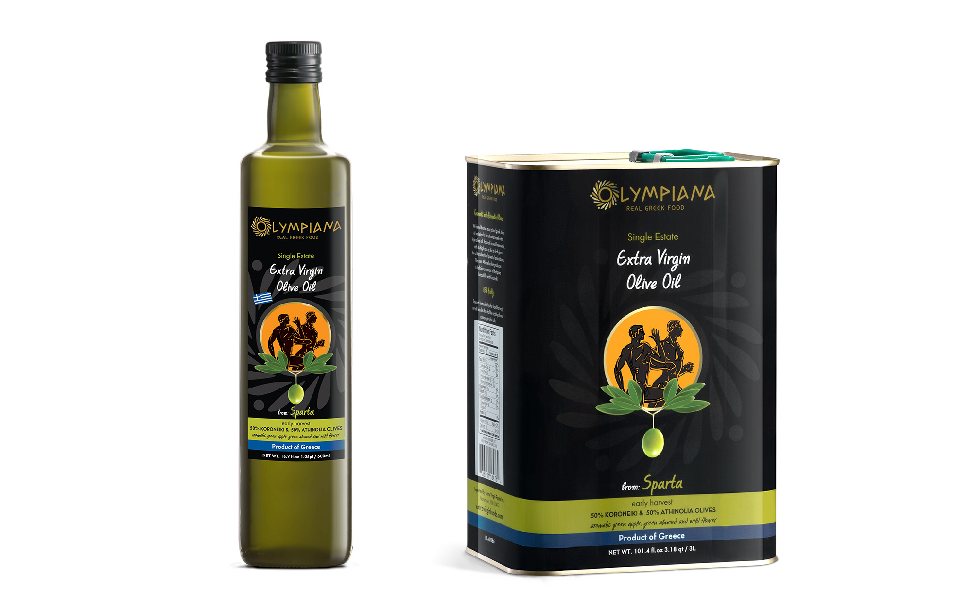
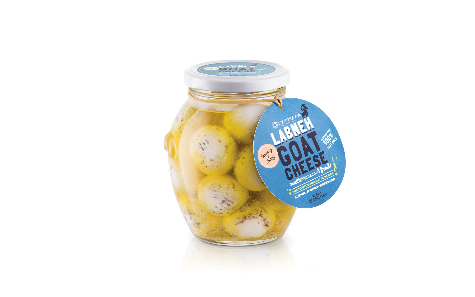
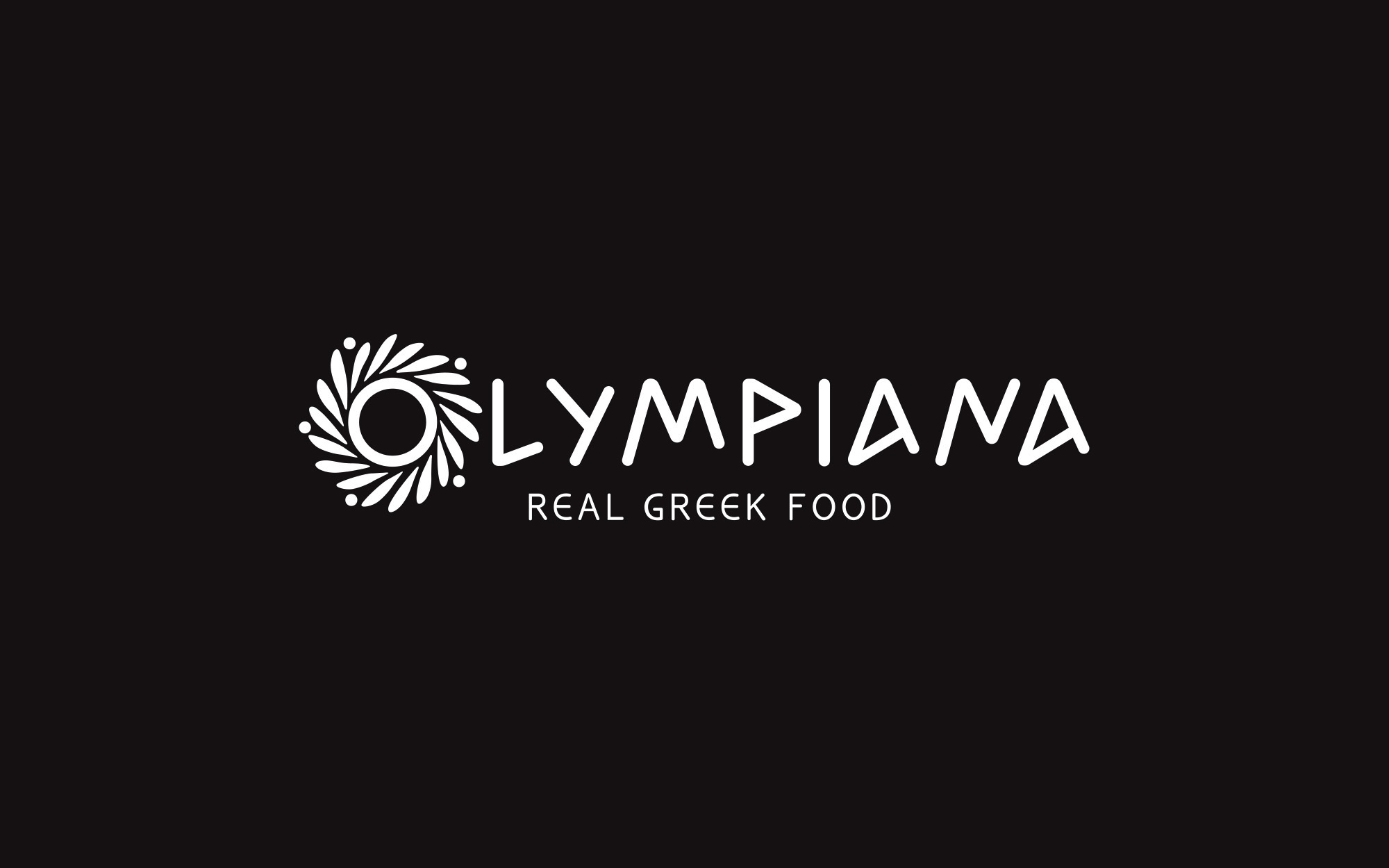
In this case there was no room for going wild, design-wise without this meaning that the solution was easy. The need for iconography that was obviously Greek was a given, yet we should avoid like the plague references to things that were already done to death and most probably connected with imitations of lower quality. The decision was made to use the name ‘Olympiana’ and the shape of the eternal olive wreath as a point of departure.
DESIGN APPROACH
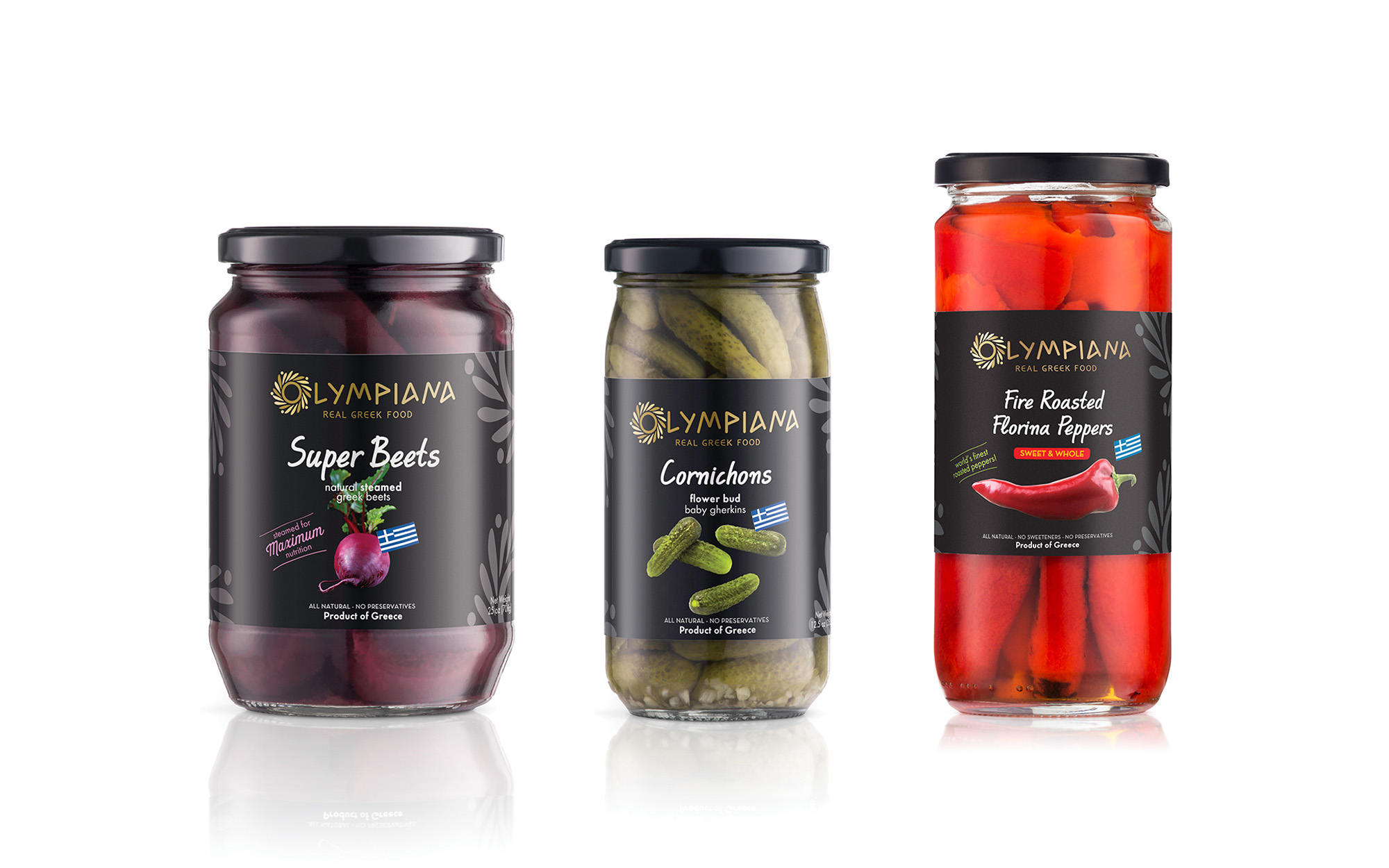
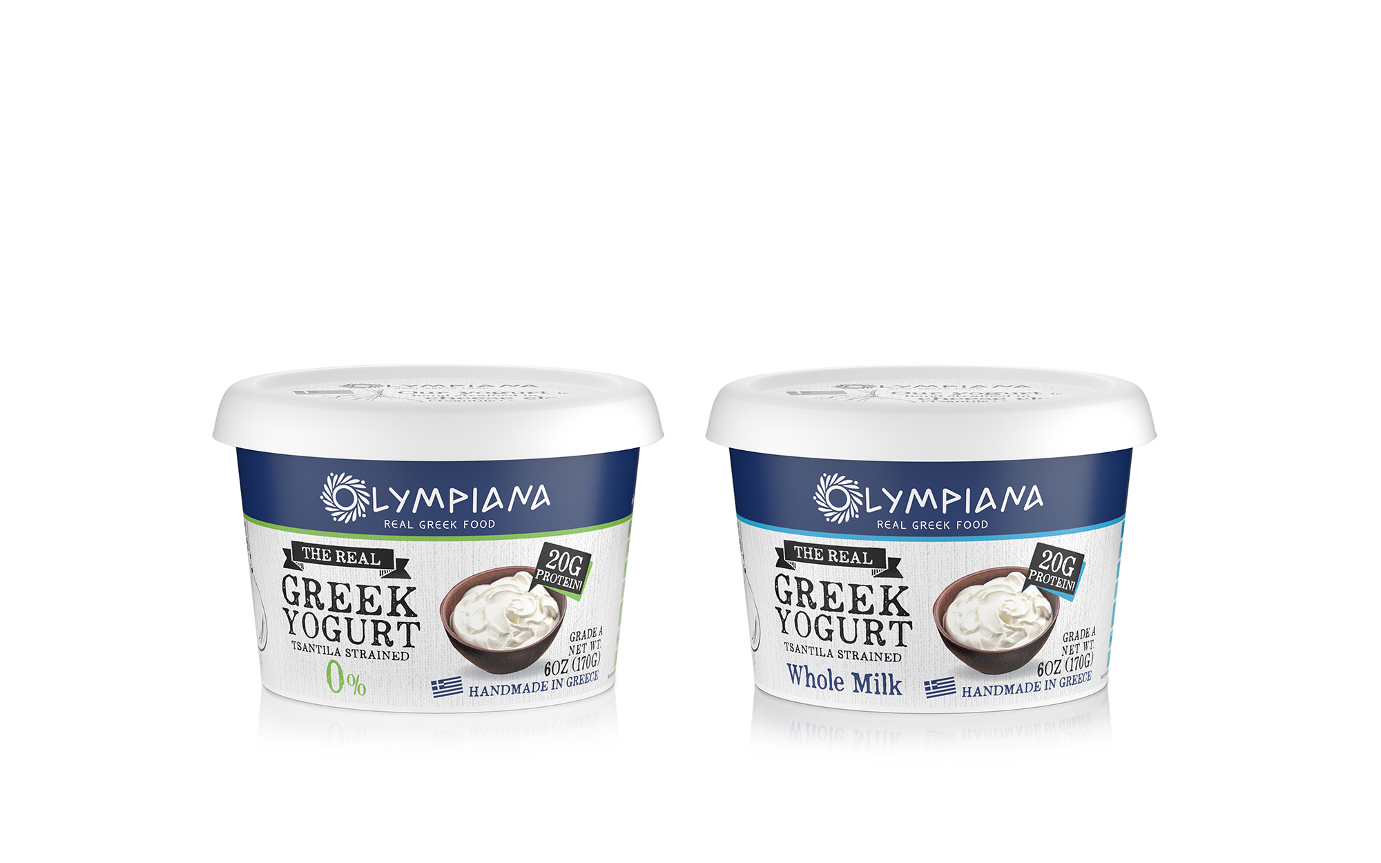
The key visual element is thus an archetypical olive wreath, with minimalistic olive leaves and olives intertwined around a circle – a circle that constitutes the initial ‘O’ of the brand name. The typeface used for the brand name alludes to ancient Greek script, of the angular type usually applied on hard surfaces such amphorae – but rounded up sufficiently to feel super-comfortable in modern times. The basic design language was applied to different products and product lines, providing an easy-to grasp bridge to the mother brand. This is encapsulated by the repetition of the olive wreath pattern in the background of each variant.
SERVICES
Logo, brand identity, packaging