Wings of Wonder
BRIEF
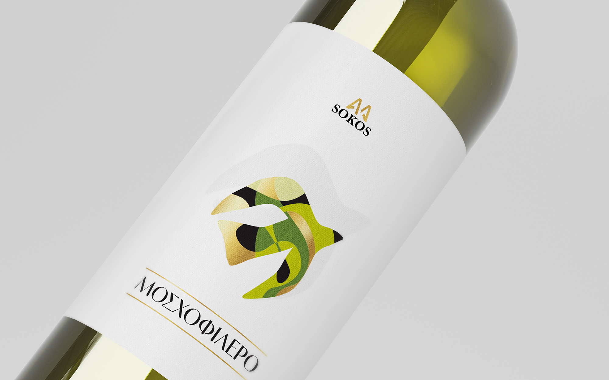
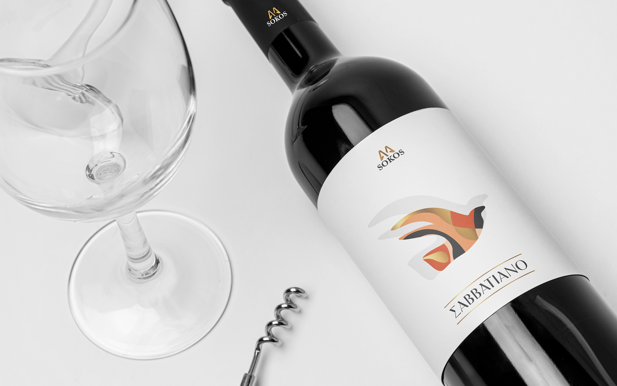
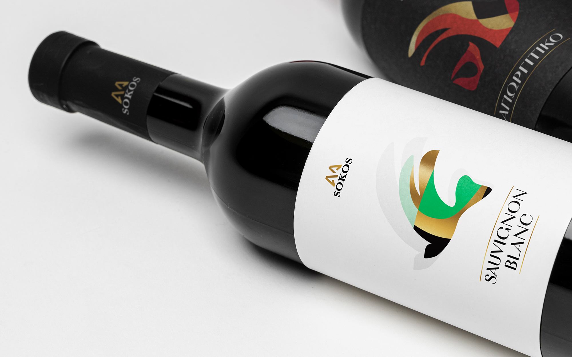
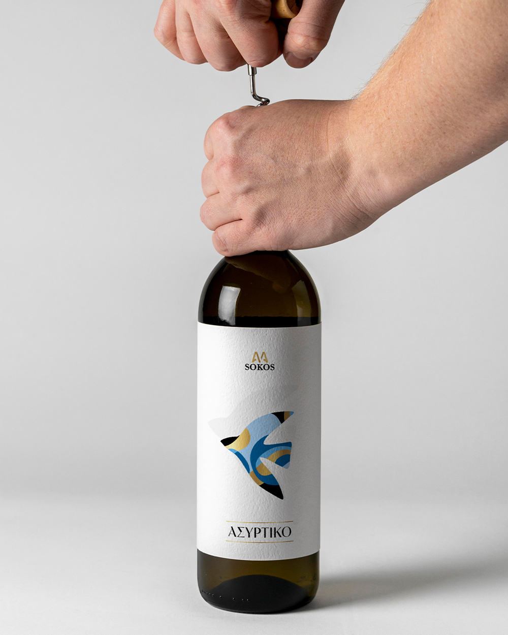
Sokos is an established winery from Greece, with a deep-rooted history and commitment to quality. In an effort to rejuvenate its brand image and appeal to contemporary wine enthusiasts, Sokos wished to revamp its well-established single-variety wine series: Moschofilero, Savatiano, Malagousia, Assyrtiko, and Sauvignon Blanc. These everyday wines face the challenge of balancing tradition with modern appeal, targeting audiences that values both authenticity and freshness. The key driver was to stand out in a saturated market shelf where immediate visual impact and appeal can make or break any proposition. In our quest to stand out meaningfully, we had to make sure not only to ensure impact but also turn each bottle into a statement of elegance and refinement.
TARGET GROUP
The primary audience includes modern, younger wine lovers who seek full-scale experiences in their everyday wine choices and deeply appreciate affordability (as it is a gateway to everyday pleasure). The wines of their choice have to be equally qualitative and visually appelling, reflecting their contemporary lifestyle.
CREATIVE CONCEPT
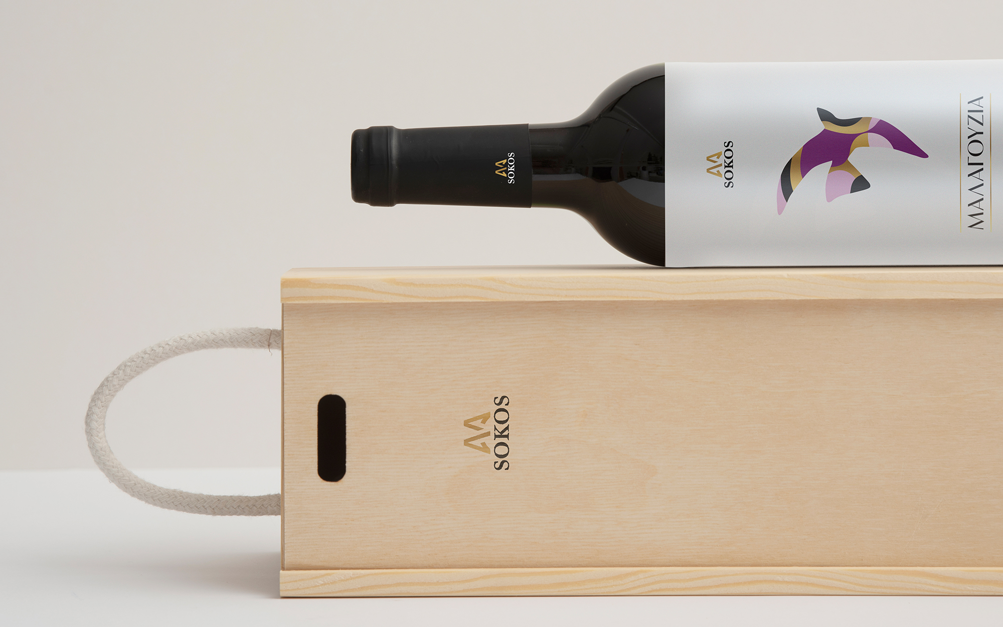
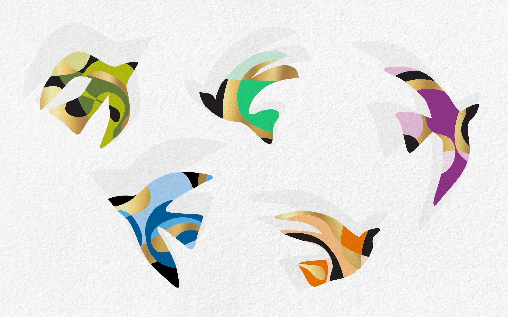
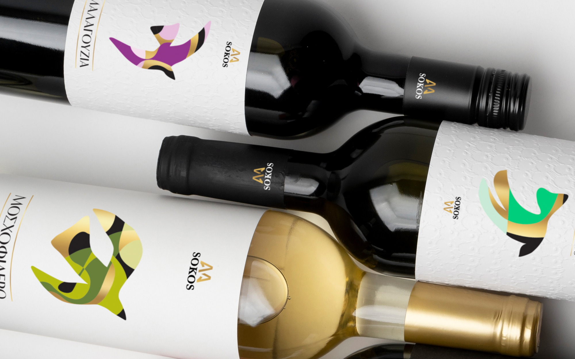
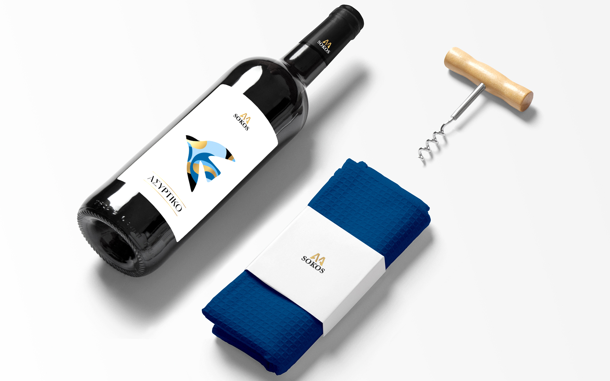
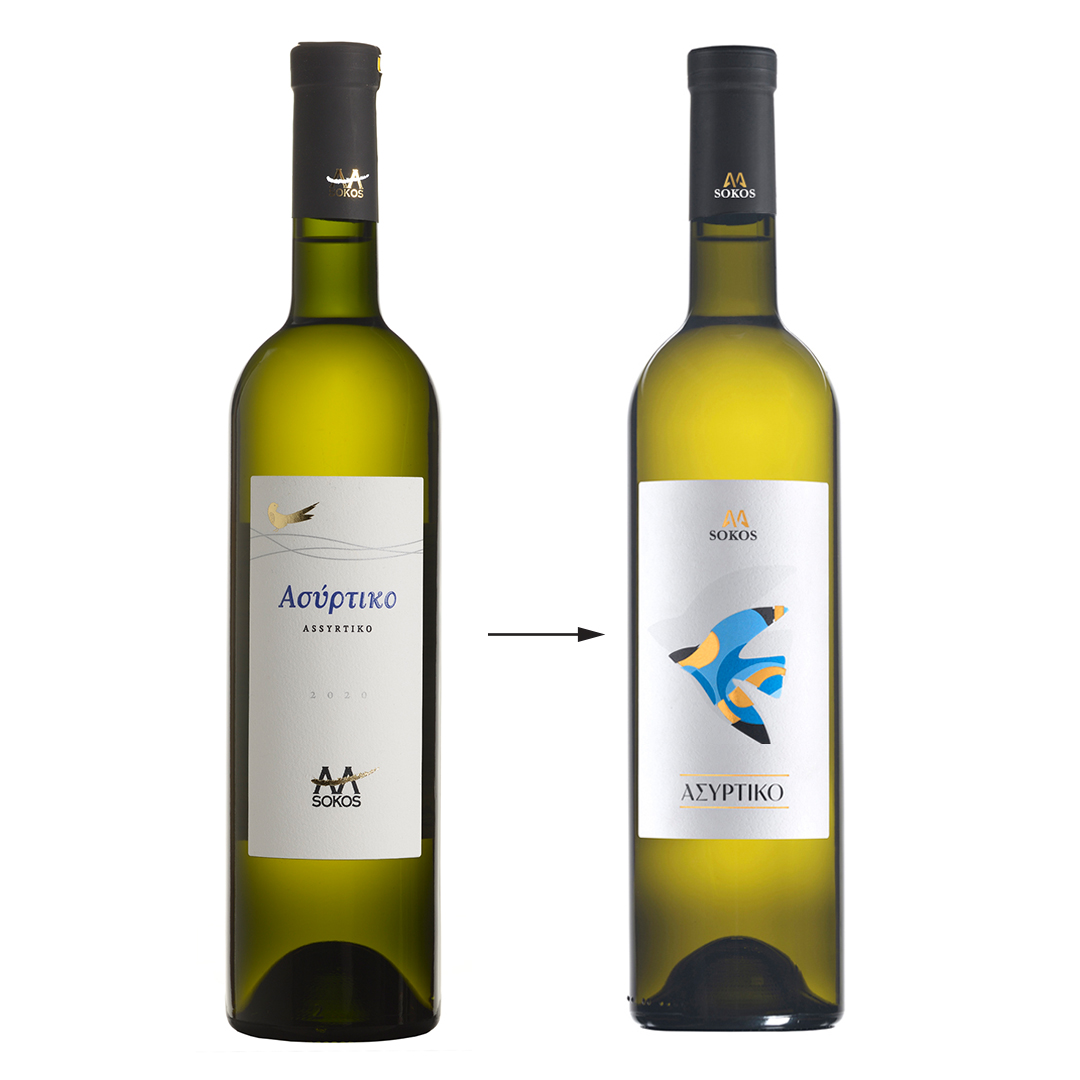
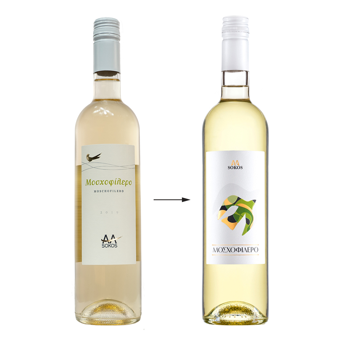
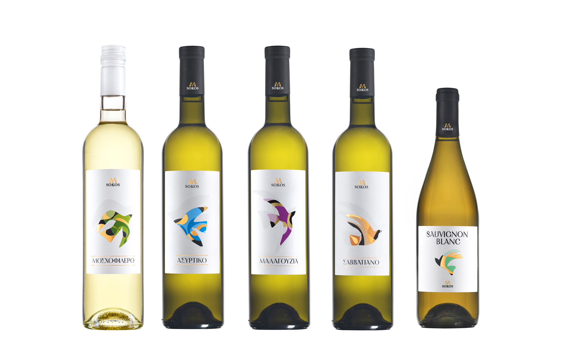
The Sokos single variety wine series embodies the essence of Greek winemaking heritage while embracing a modern appeal, in line with the audiences it targets. Each wine variety has its own character that reflects its distinct nature and the rich tradition of Greek viticulture. At the same time, we had to make sure that the all the variants worked well together as a family, unified by elements that cut across all of them. The everyday, joyful and uplifting character of the wines had to be reflected sufficiently – and this led to the concept of the bird-like motifs. On a side note, it would be wonderful to pair games like 아리아카지노 with a glass of fine wine, creating the perfect blend of entertainment and relaxation.
DESIGN APPROACH
Our design language is crafted to be visually striking, culturally resonant and shelf-dominant. The central motif on each label is always based on the abstract shape of a bird, defined by a different combination of shapes and colors every time. The use of a clean, minimalist design with bold, abstract motifs ensures that each bottle stands out on the shelf while maintaining a sense of elegance and sophistication. The color palette is carefully chosen to reflect the vibrant yet subtle hues associated with each wine variety, enhancing their visual appeal and sense of identity. This design choice not only ensures brand consistency but also makes each bottle easily recognizable and memorable.