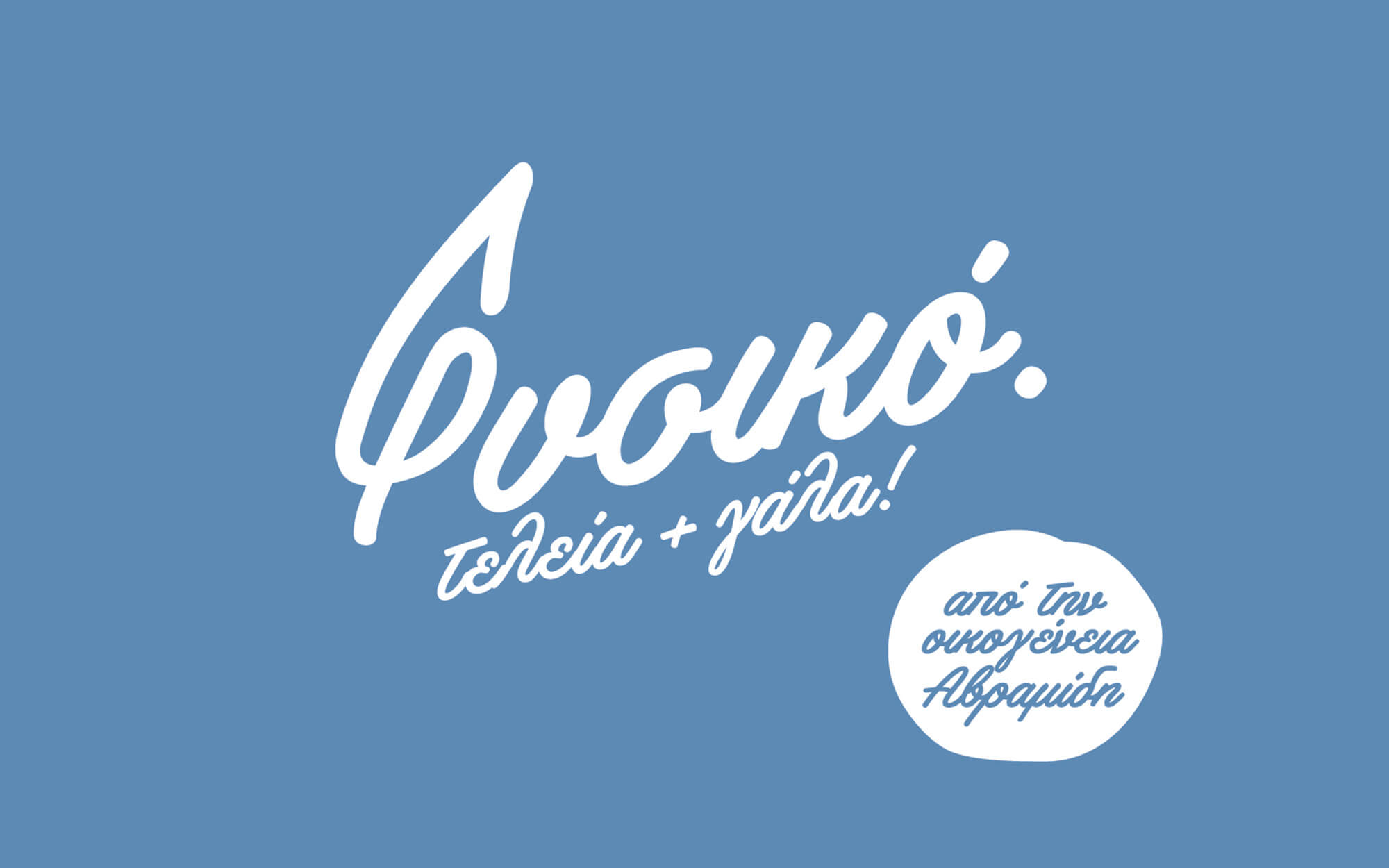
As natural as it gets. Period.
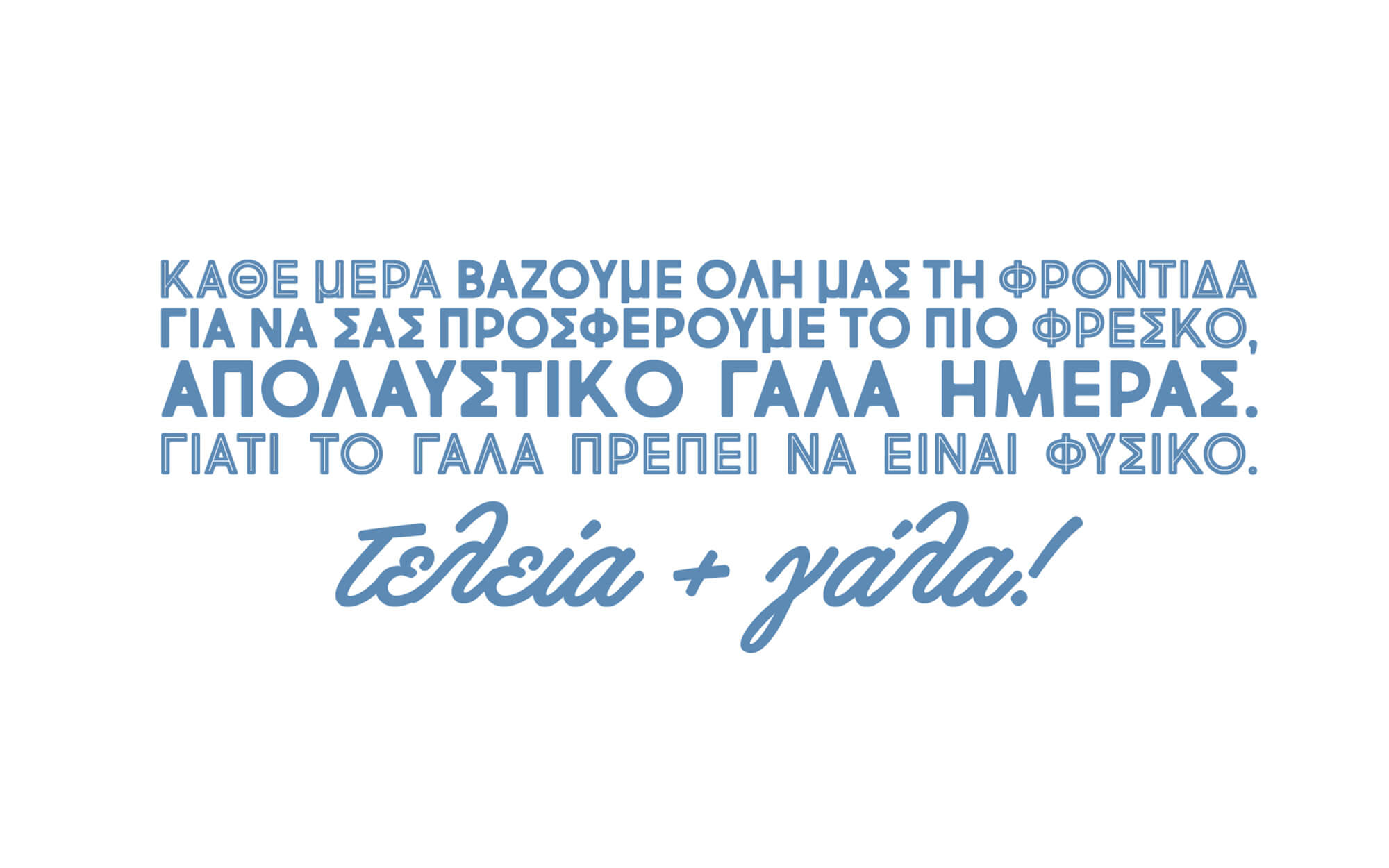
Φυσικό. Τελεία + γάλα! (Natural Milk. Period!)
BRIEF
Needs and priorities in food and beverage are evolving. As more and more people are in search of the authentic and the original, the timing is just great for smaller-scale dairy producers to come to the limelight, share their own story and shine. Avramides’ Family is one of these companies. With a long history in milk production that goes back decades and an experience that spans across dairy categories, they wanted to make sure that their main milk line stood the best chances in this new, evolving market. And redesigning the line’s identity was a good way to start.
But before that, they needed a name to make a statement and carry the right messages across to the target audience. The main focus was to highlight the brand’s absolute commitment to quality and naturalness, a commitment that is so powerful so as to end all debates. In order to do that, we decided to create a statement instead of a conventional brand name and that was the phrase “Natural Milk. Period’.
TARGET GROUP
Broader audience – Greek consumers of packaged milk seeking the natural and the authentic
CREATIVE CONCEPT
Closeness to nature as well as total focus on quality were central to what the brand was all about and had to be expressed visually in ways that were directly accessible to a relatively mass audience. This led us to seek well-recognized visual codes that were referring to the past (which is idealized in the minds of Greeks when it comes to food), in combination with clear-cut references to freshness and naturalness.
DESIGN APPROACH
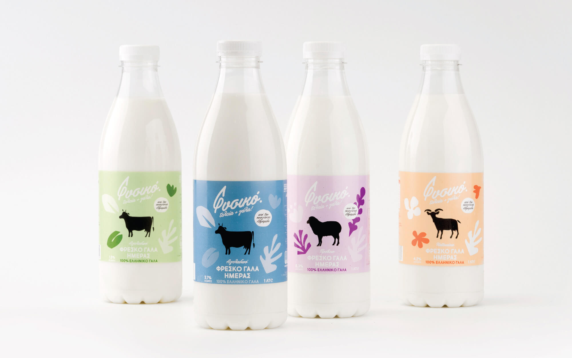
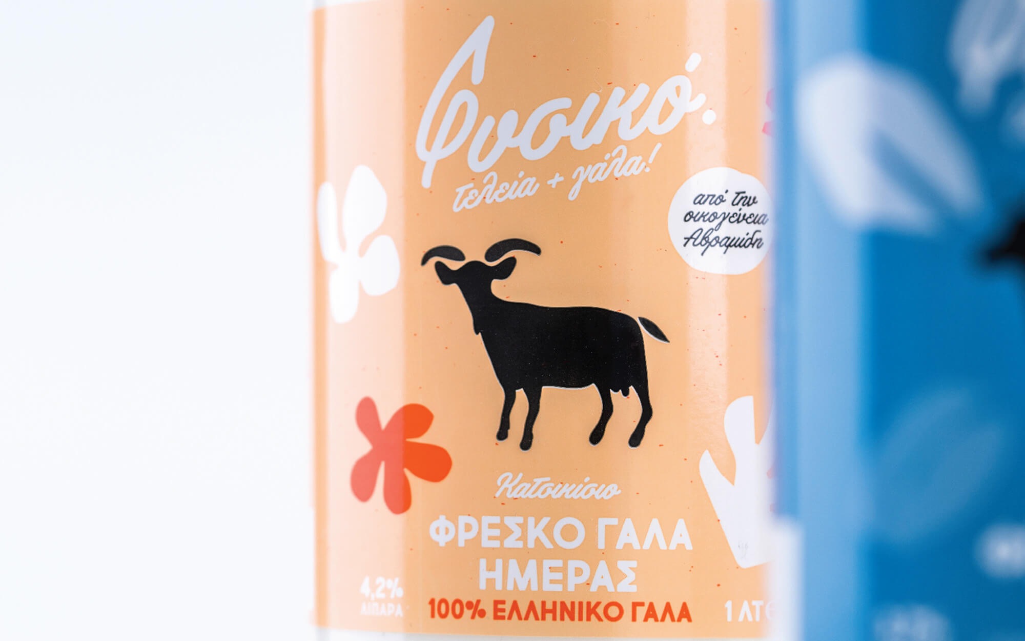
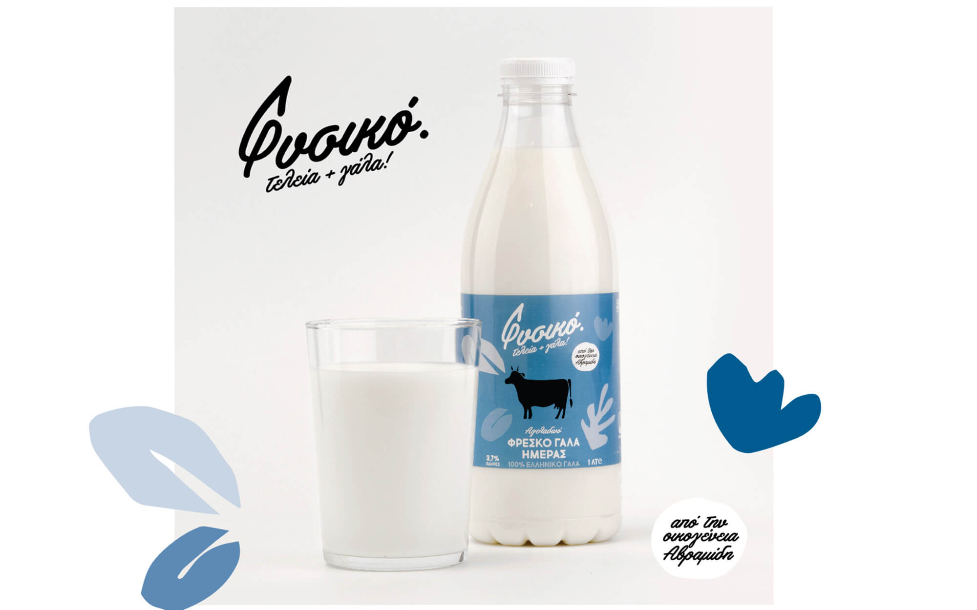
For the logo we developed a vintage script-like typeface that is reminiscent of mid-20th century branding and communication. On the top of that, we added a twist of nature in the mix by transforming the Greek equivalent of the initial letter “F” into the shape of a leaf in order to visualize the freshness of the milk and to emphasize the historical ties of the Avramides Family.
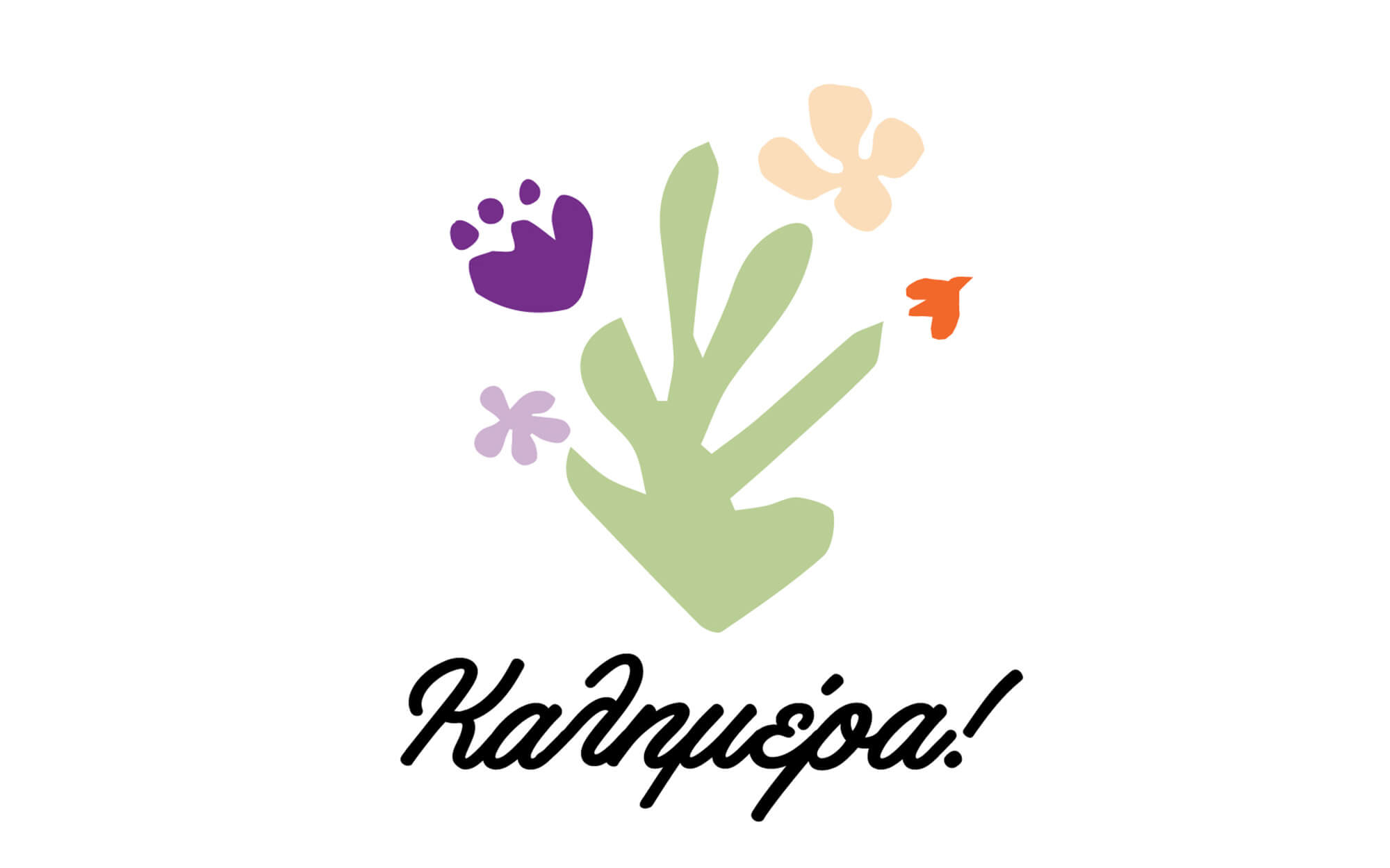
For the packaging itself, our inspiration came from Henri Matisse’s famous cut-outs in terms of shape and composition – as we decided to give a light and fresh approach to the whole result. Color-wise the choice of blue, green, orange and purple shadesaimed to intensify the impression of a fresh, cool product.
SERVICES
Brand name, logo, visual identity, packaging

Naming and Text: Nikos Vlachogiannis
Concept & Design: Sophia Georgopoulou
Photography: Ampoo
Text editor: Konstantinos Kontinos