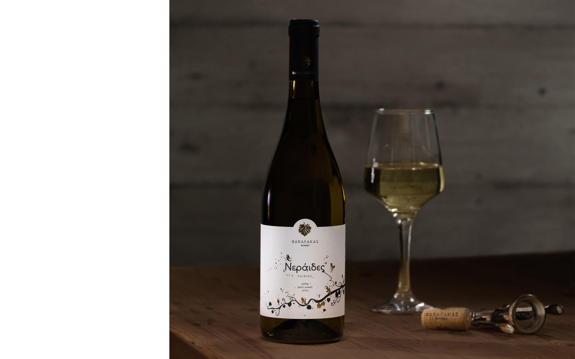
A little bit of magic for a new wine label
BRIEF
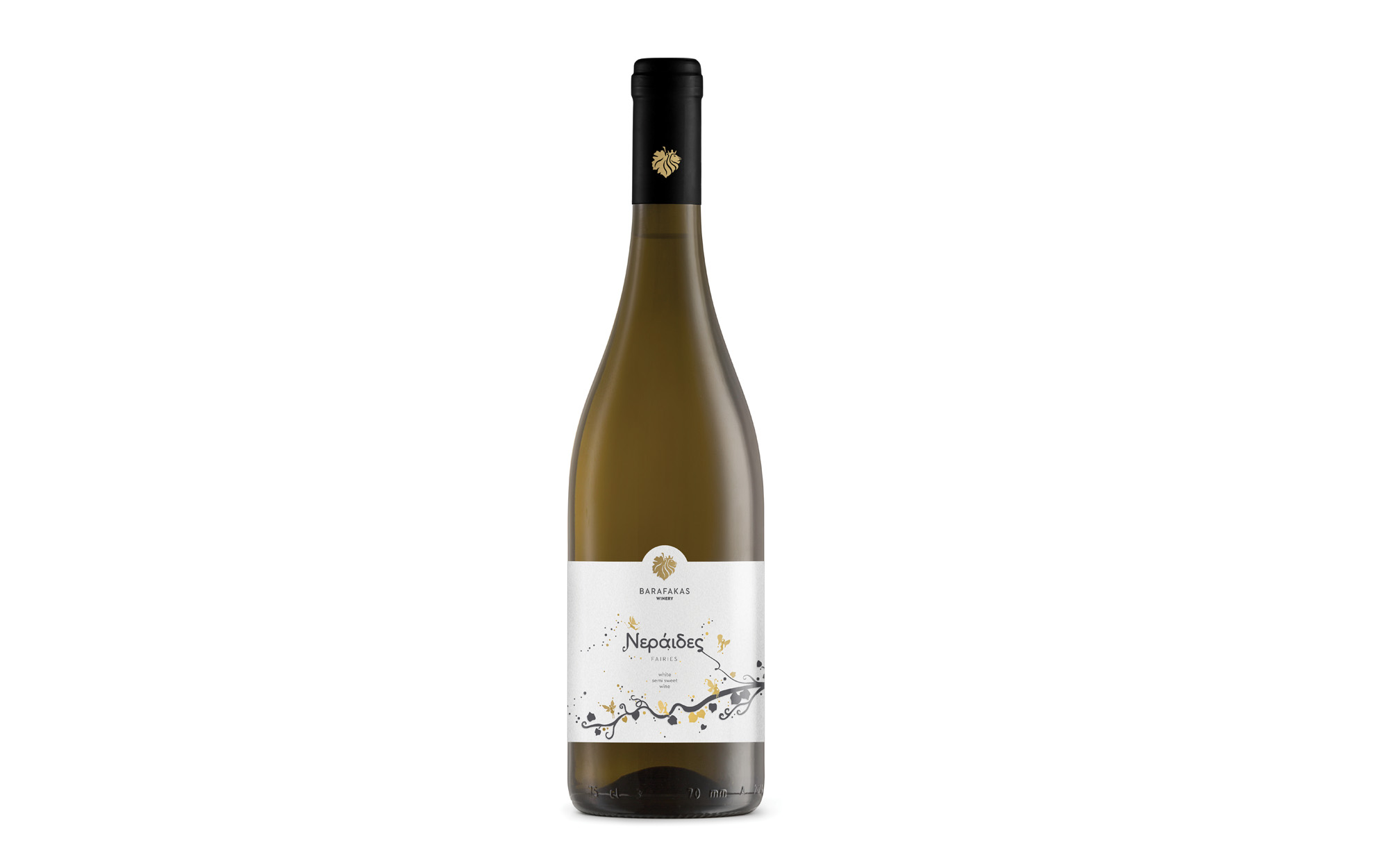
When it comes to wine, corporate identity is one thing, but specific labels is another. Having already worked on the new corporate identity for Barafakas Winery, a more specialized project came on the radar coming from the same people – who, most evidently were pleased enough the first time! This time it was a new wine label that was in need for some good push forward. The name of the wine was ‘Neirades’, broadly translating as ‘fairies’.
This is a semi-sweet, lightly sparking white wine based on the renowned Greek varieties of Assyrtiko, Moschofilero and Malagouzia. Having a fresh, playful and uplifting character, the wine itself already hinted at the kind of identity it would be most comfortable with. And we were bound to respect that.
TARGET GROUP
Greek wine lovers as well as foreign visitors, especially a younger generation
CREATIVE CONCEPT
We wanted to come up with something as playful and cheerful as the stuff in the bottle itself. The name of the wine also pointed to the same direction, as fairies can bring a bit of magic and transform things and moments. So we were after mirth, joy and a bit of mischief in the mix but with a hint of affordable everyday luxury.
DESIGN APPROACH
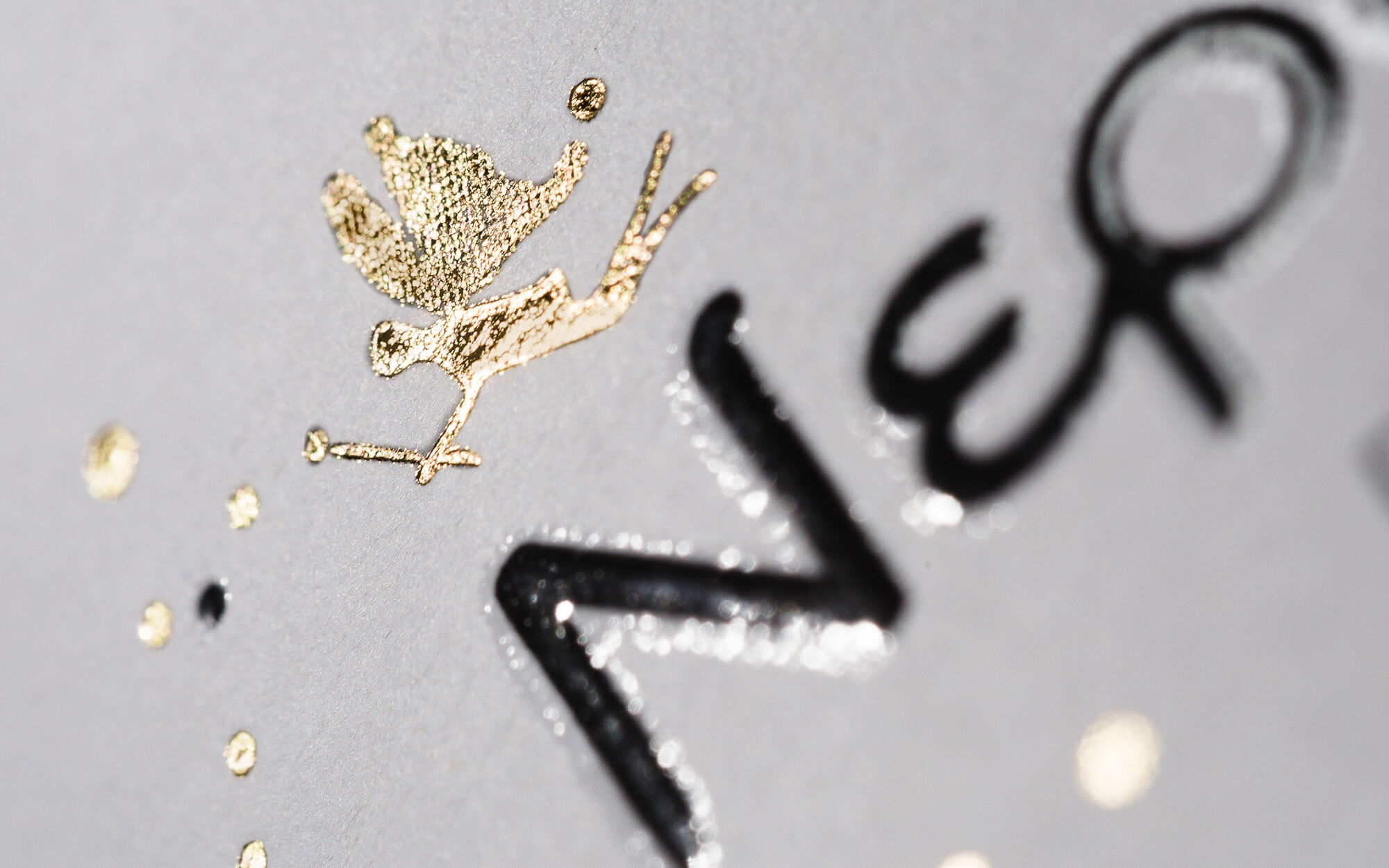
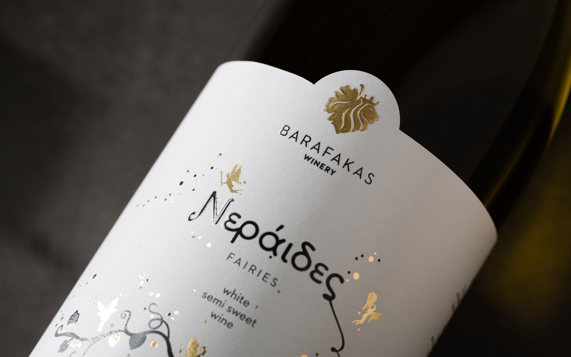
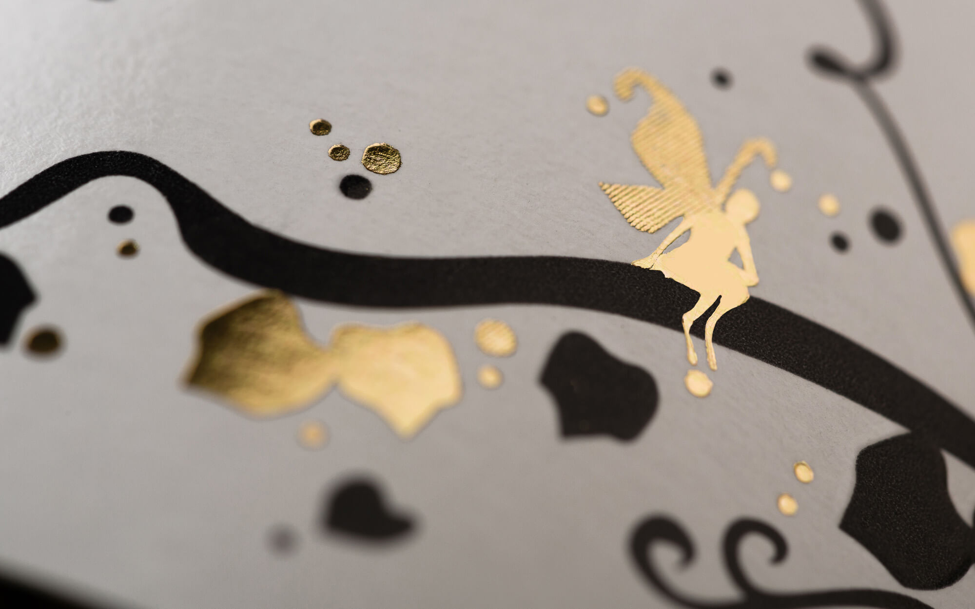
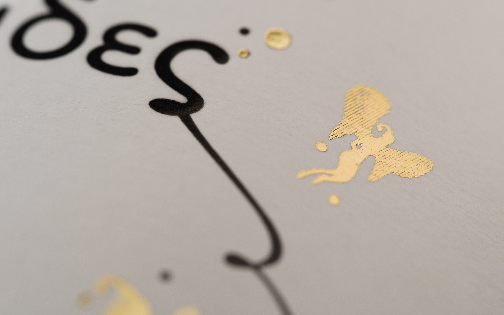
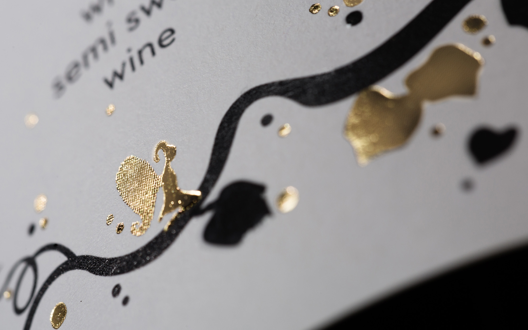
The main and dominant design element is a vine branch that cuts across the label diagonally. But this not an ordinary vibe branch, as it looks as it has been touched by some magic and suddenly came to life. It sprouts eye-catching golden trinkets and bubbles – a direct reference of the bubbly character of the wine itself. And it branches out to get intertwined with the wine name.
But who did this? The culprits of this transformation are very much visible – little golden fairies who have spread their magical mischief onto the label, turning it into a celebration of the senses and a promise of good times.
SERVICES
Label design, visual identity
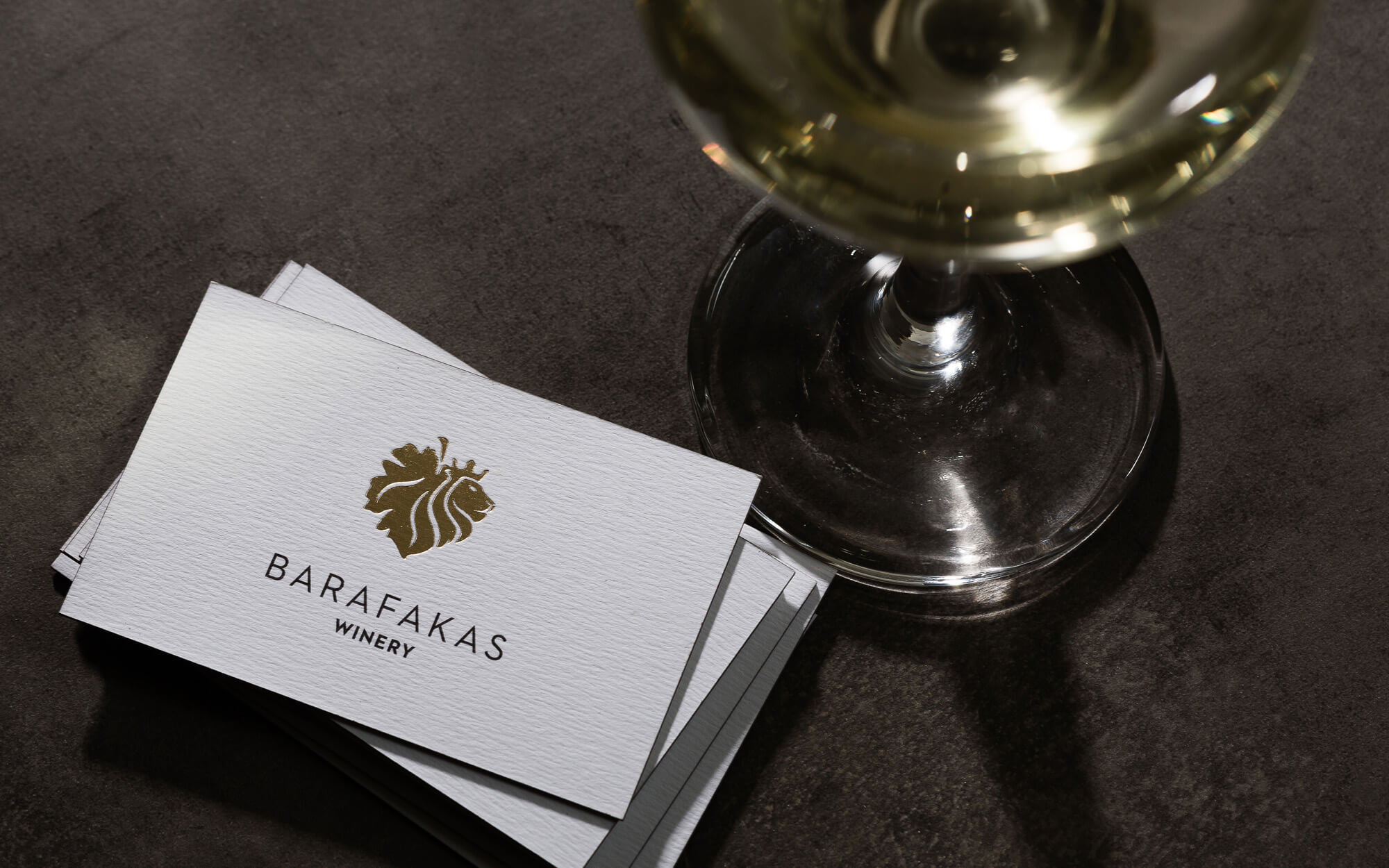
Concept and Design: Sophia Georgopoulou
Photography: George Pavlakos