Kalymnian Sponge Experts since 1956
BRIEF
For countless generations, natural sponges have been the leading choice of people and an integral part of personal hygiene routines. Pushed aside for some time by lesser and cheaper mass-produced alternatives, during recent years natural sponges have witnessed a resurgence that they totally worth. The prime source of sponges worldwide was and still is the Greek island of Kalymnos in the southwest Aegean Sea. In fact, the very economy of the island has been traditionally based on sponge collection by divers operating all over the Mediterranean basin.
Among the top and the oldest producers is the company Kokkinos S.A with a history that dates back to the late 1800’s. Expansion-seeking and export-minded, they have created the brand Kalyspongea, inspired by the name of the Kalymnos Island and the suffix –spongea- that is part of the taxonomic names of many sponge species. The brand was in need of a logo and identity to kick-start its export career.
TARGET GROUP
More mature (preference-wise) consumers in markets outside Greece, with high standards in personal hygiene and an appreciation of products and methods tested by time
CREATIVE CONCEPT
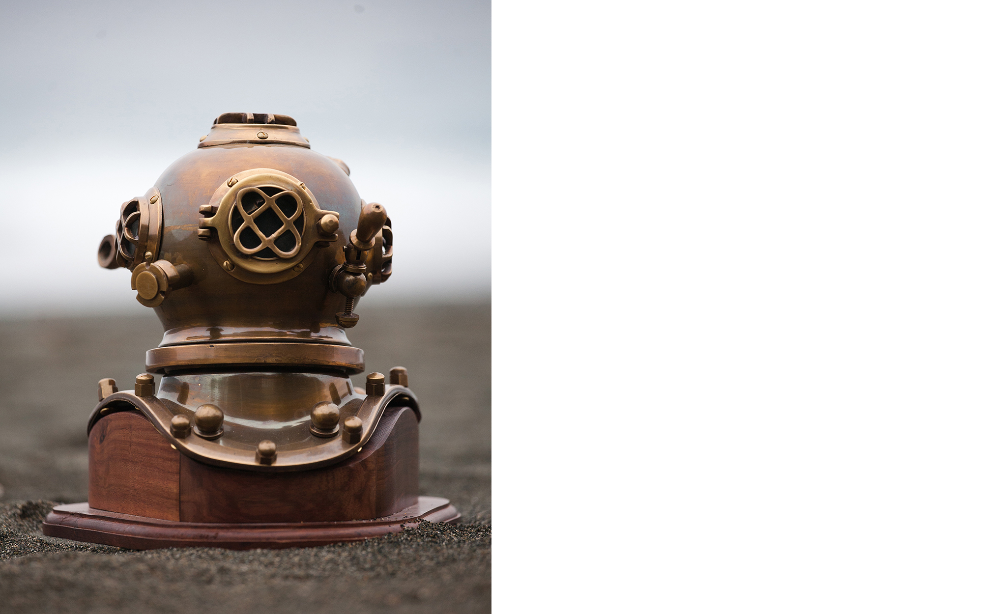
Sponge collection is not that different from mining precious metals at the end of the day. For starters, it involves a lot of effort seeking – sponges do not grow everywhere. It also involves hard toil with an element of danger, as the divers’ work is very demanding and many things can go wrong. We decided to make the divers and their work central to what the brand was all about, celebrating what they offer us and reminding people what it takes to end up with a precious sponge in their hands.
DESIGN APPROACH
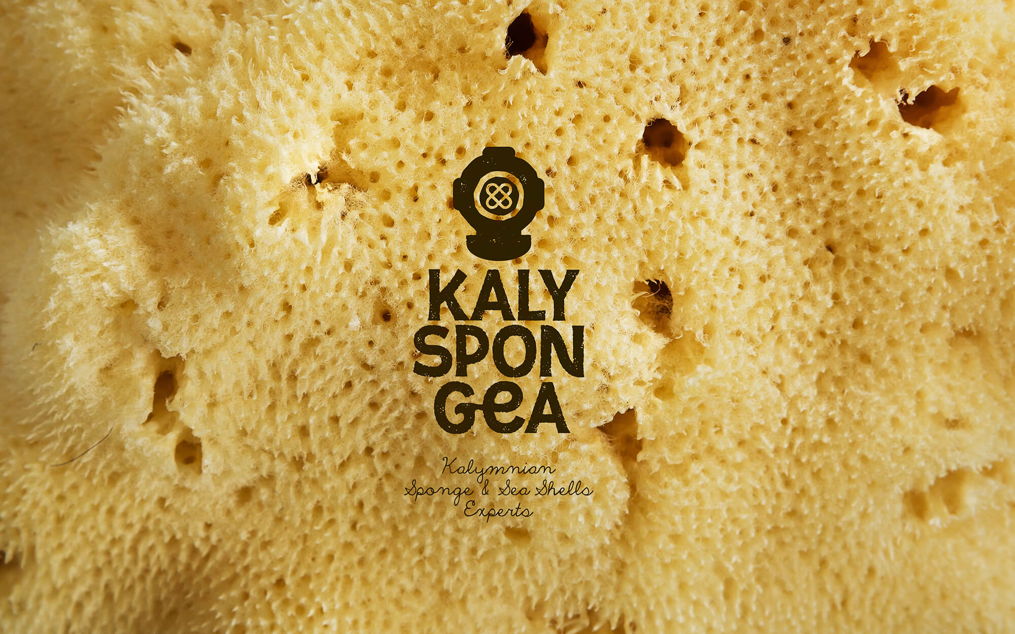
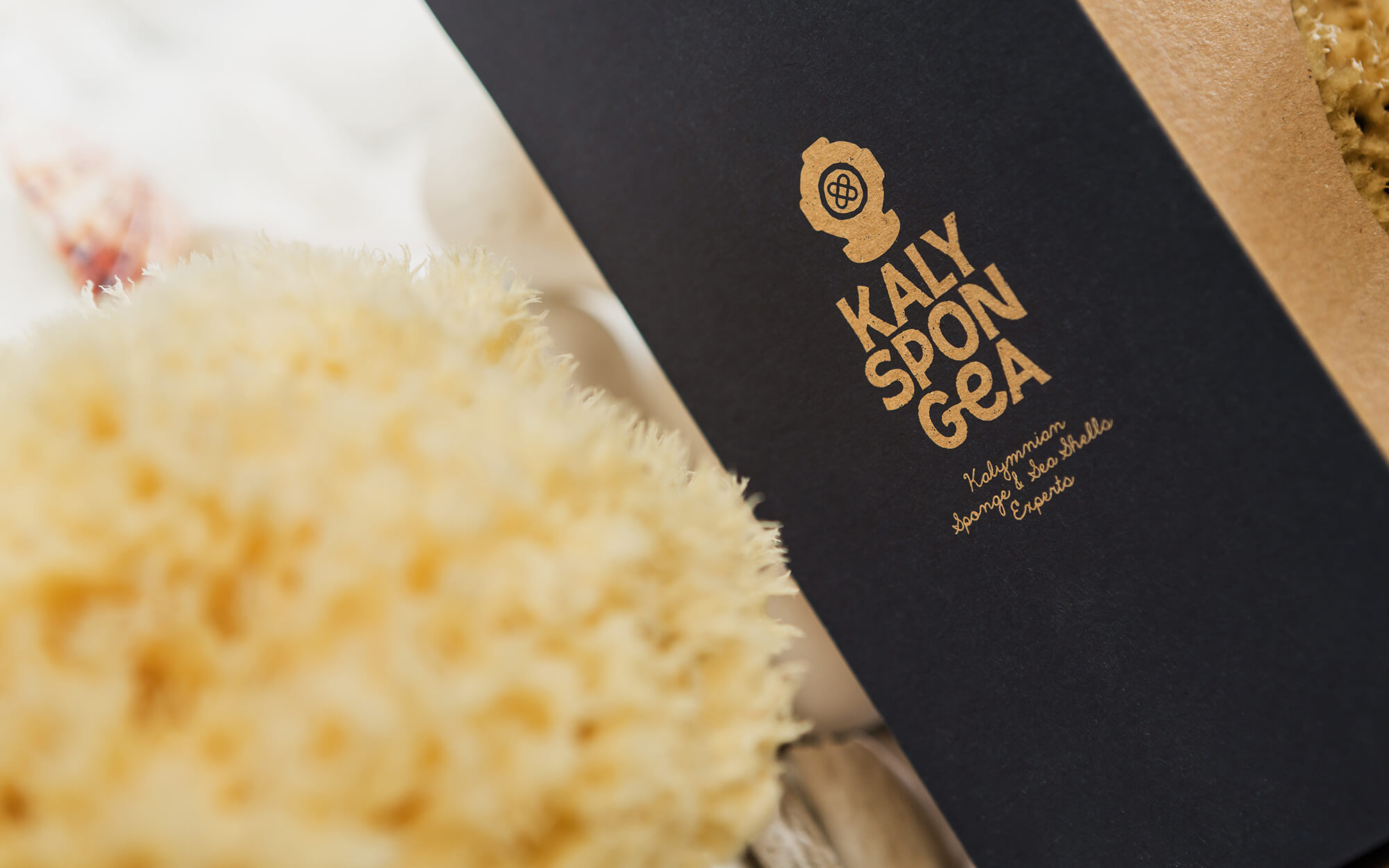
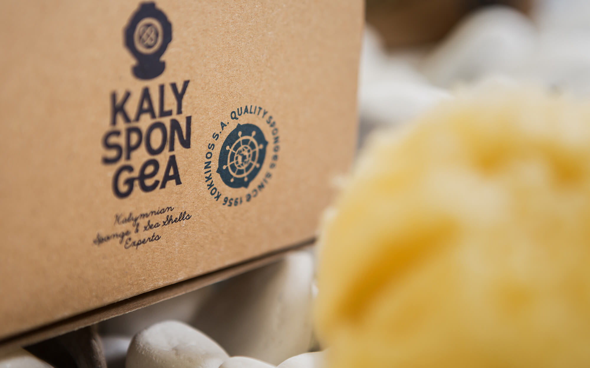
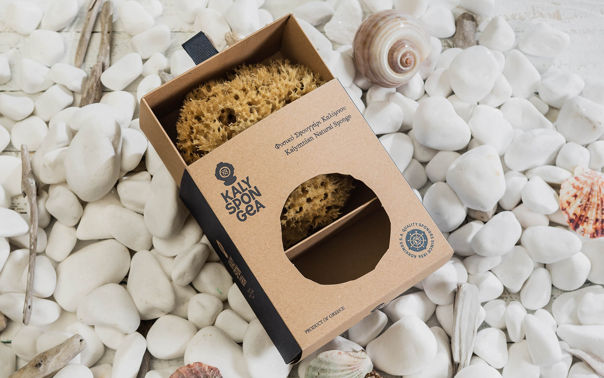
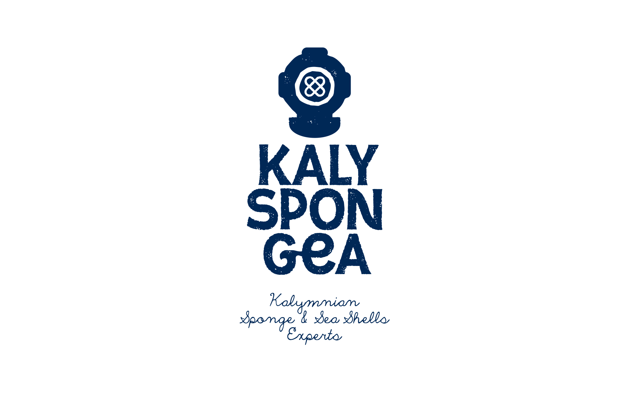
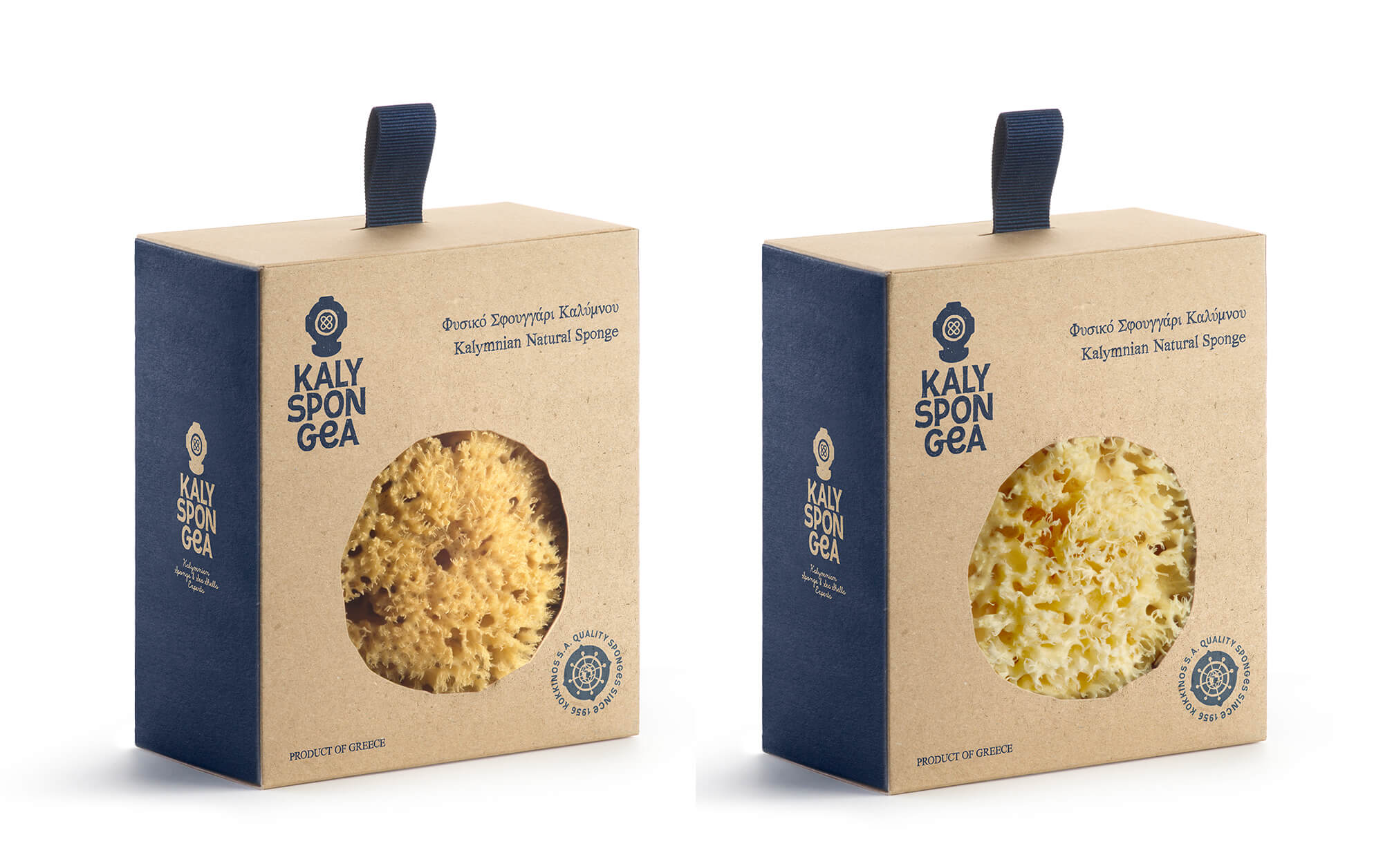
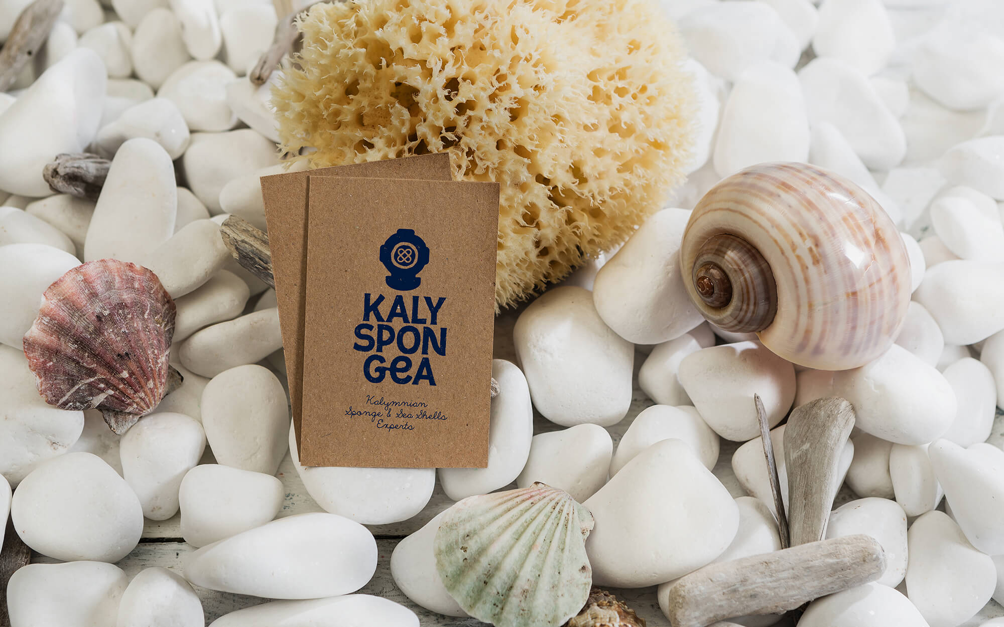
We started with the quintessential symbol of the sponge diver from the days of yore – the old, classic bronze diving suit with a cage-like visor that everybody recognizes. The logo thus draws direct inspiration from old diving suits and encompasses a subtractive depiction of a sponge.
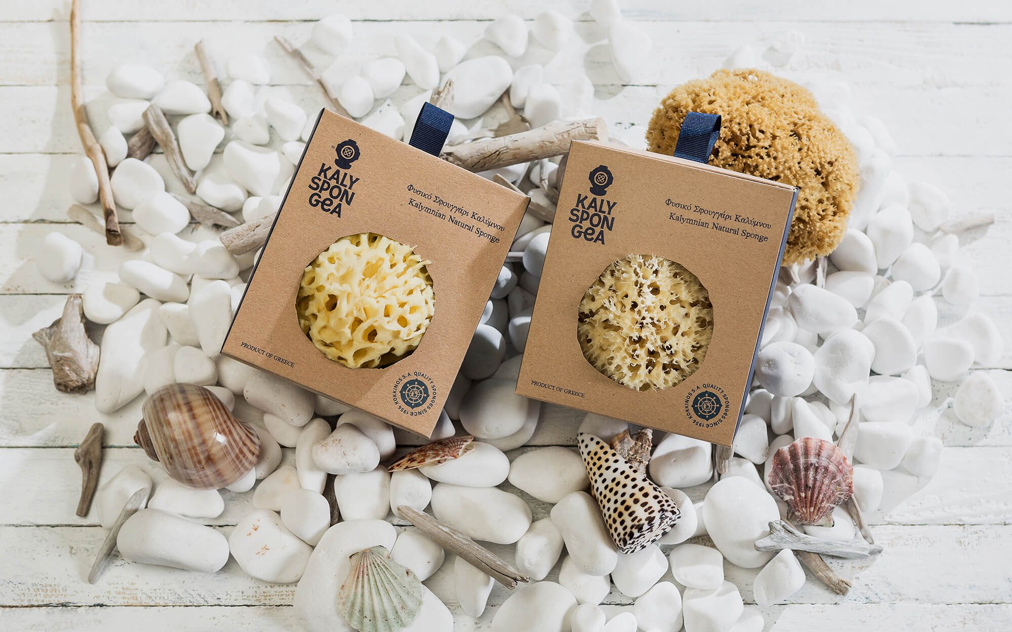
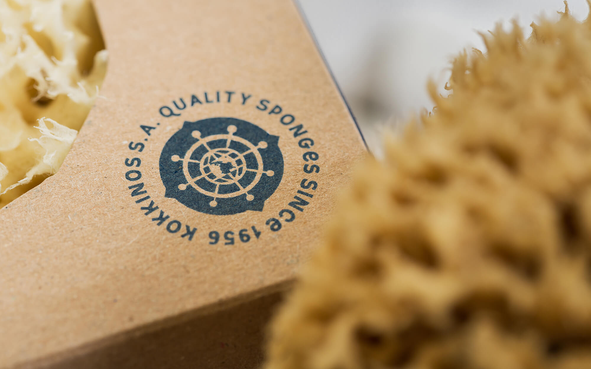
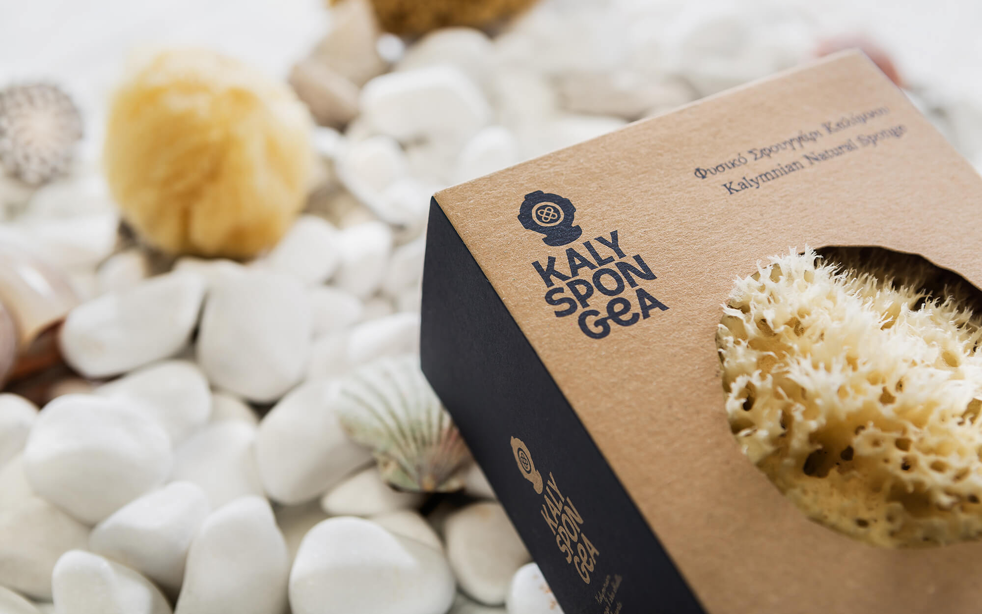
The color palette employed added to the desired take-aways. The dark blue color was deliberately chosen as a reminder of the depths of the sea the sponge divers work at, while also hinting indirectly to the products’ Greekness. The package itself is manufactured from recycled paper in earthy tones, in order to highlight the naturalness of the product. Finally, the quality seal design (in the shape of old ship steering wheel) further reassures the consumer in relation the quality of the brand, while adding an extra reference to the gift-providing Sea.
SERVICES
Logo, brand identity, packaging