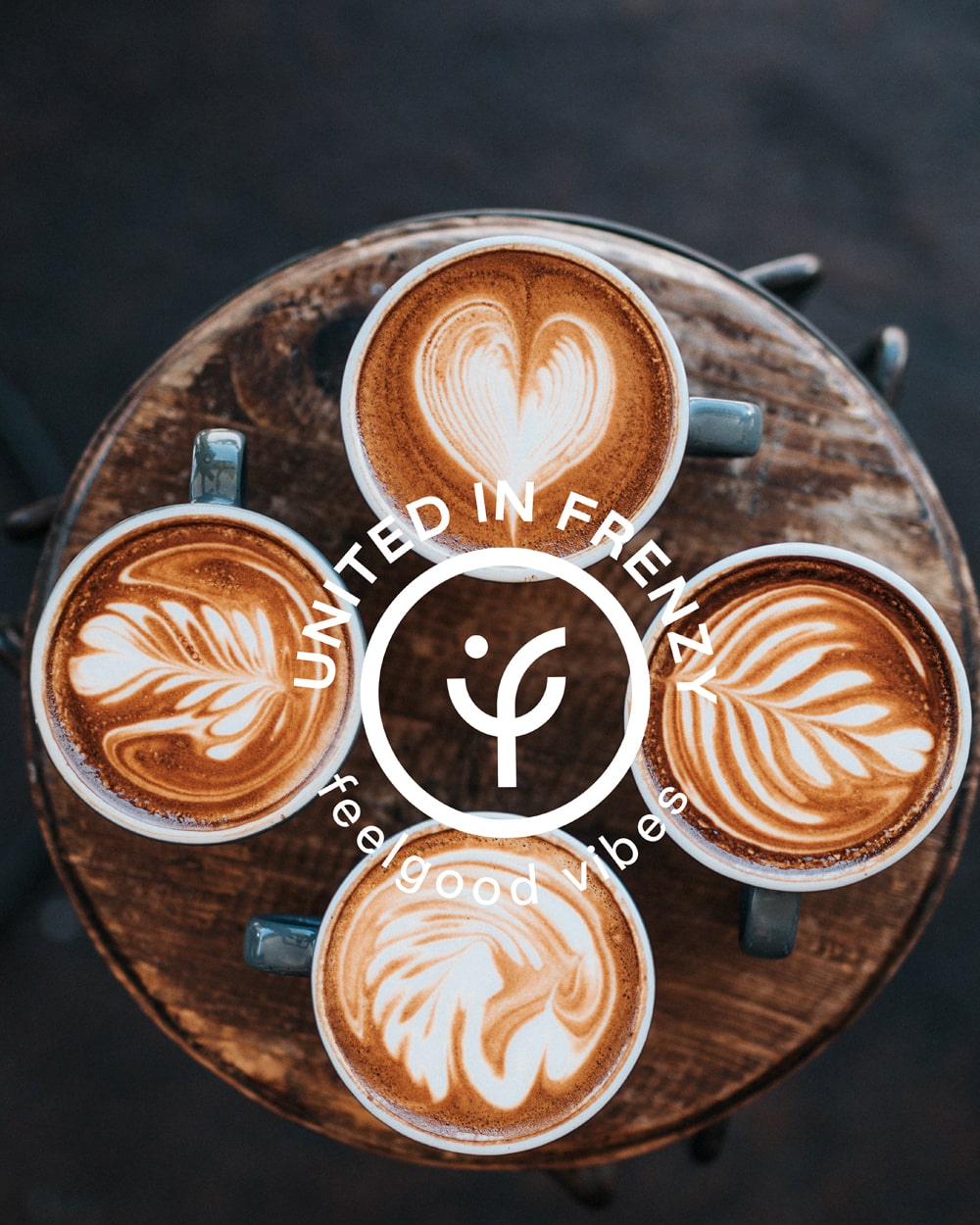
feel good vibes!
BRIEF
Coffee culture was always strong in Greece. In the recent years though it has received an extra boost as stand-alone cafés as well as franchise chains grew in numbers as well complexity of offering. Standing out among a sea of competitors is not easy. This is especially the case in the Glyfada suburb of Athens where cafes can be found in every corner, but also where the bar has been set particularly high. The owners of Frenzy, a new café in the area, were totally aware of the business landscape. This is why they needed an identity that not only stands out visually but also is in the position to communicate the passion for great coffee and good life that stands at the core of the brand – epitomised by the motto ‘feelgood coffee’.
TARGET GROUP
Urbanite coffee lovers from every imaginable background who want a boost of good life all through the day. Coffee lovers who would never compromise their experience.
CREATIVE CONCEPT
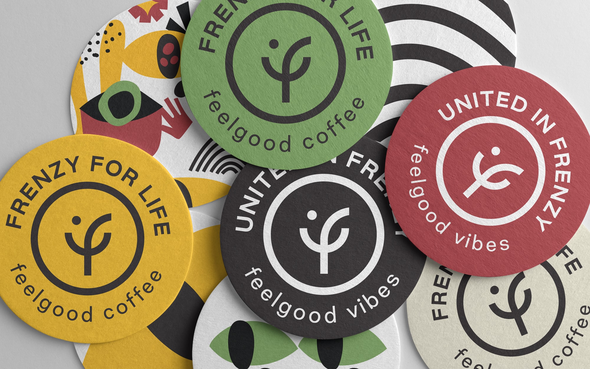
When creating the identity, it was clear that what we wanted was something simple, direct and recognisable. We wanted a characteristic, ownable brand sign. This would provide the basis for alternative branded expressions that convey precisely the philosophy of the place and its owners. The name itself, vibrant, full of energy, passion and a welcome measure of craze, was a good place to start.
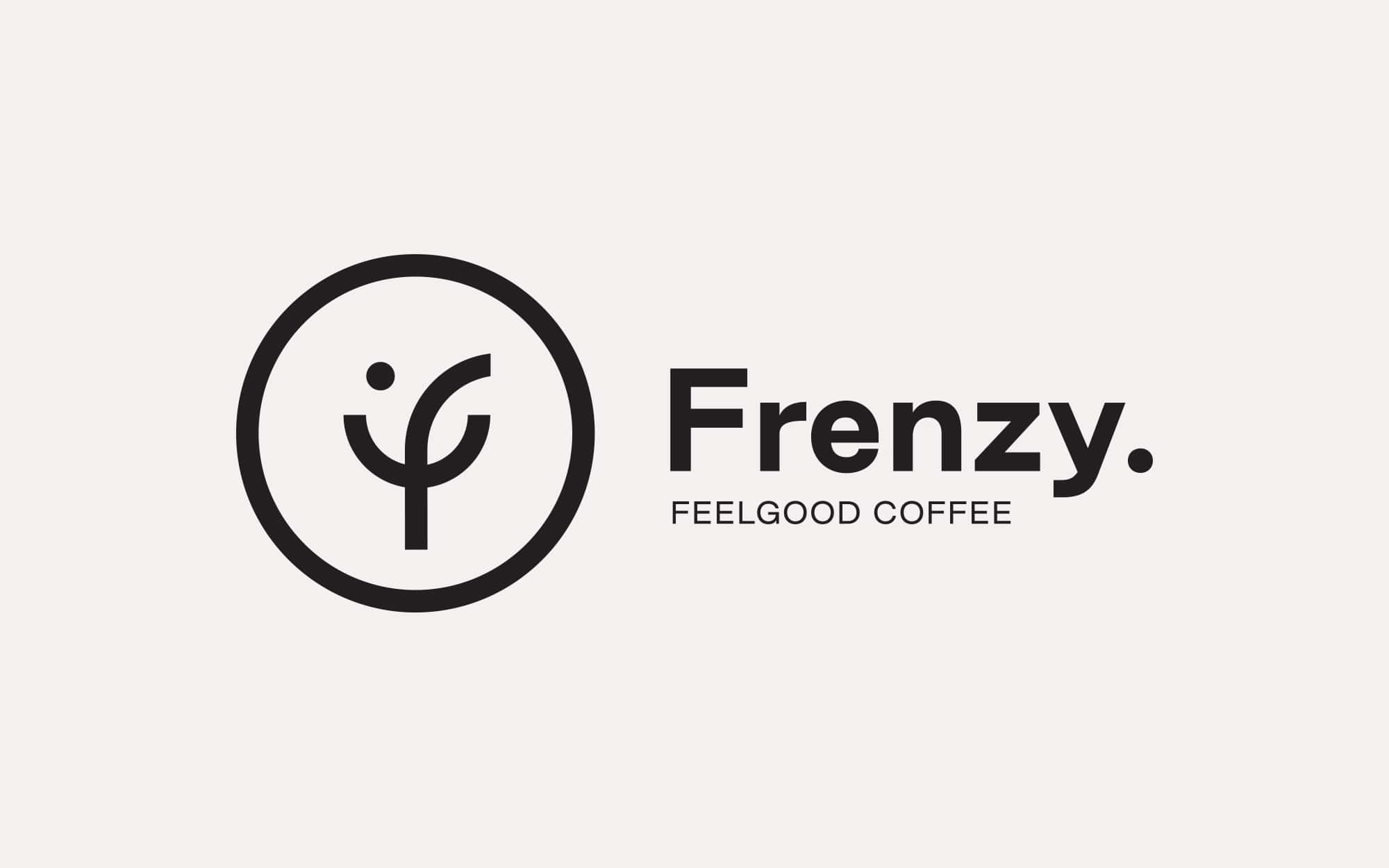
DESIGN APPROACH
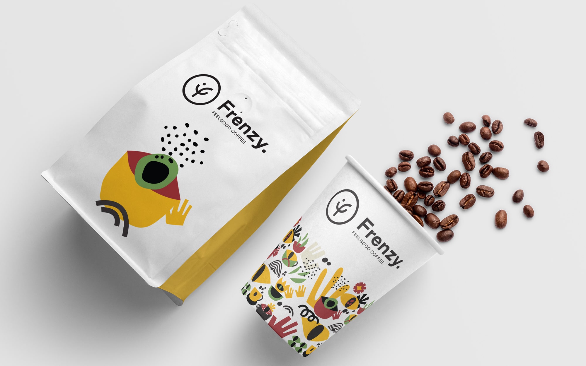
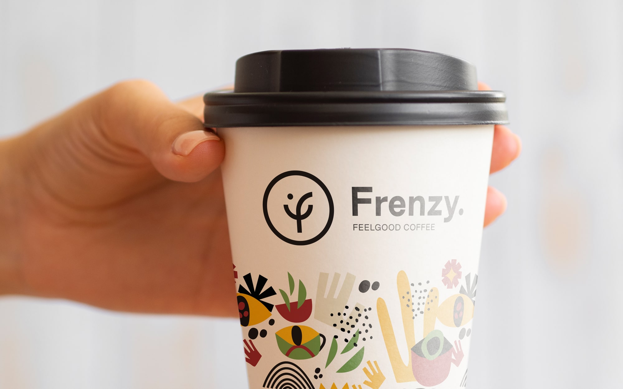
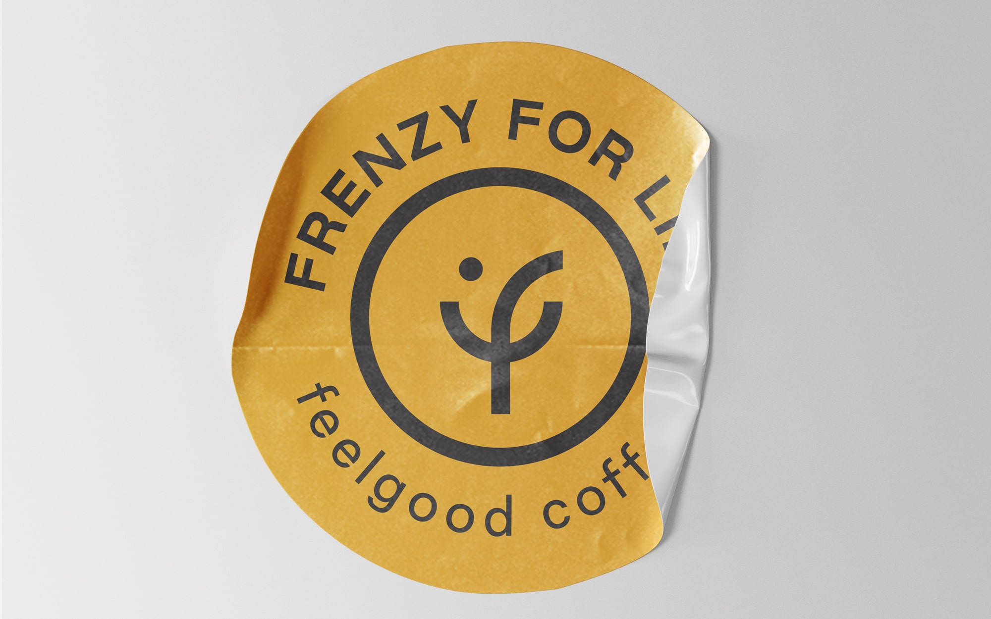
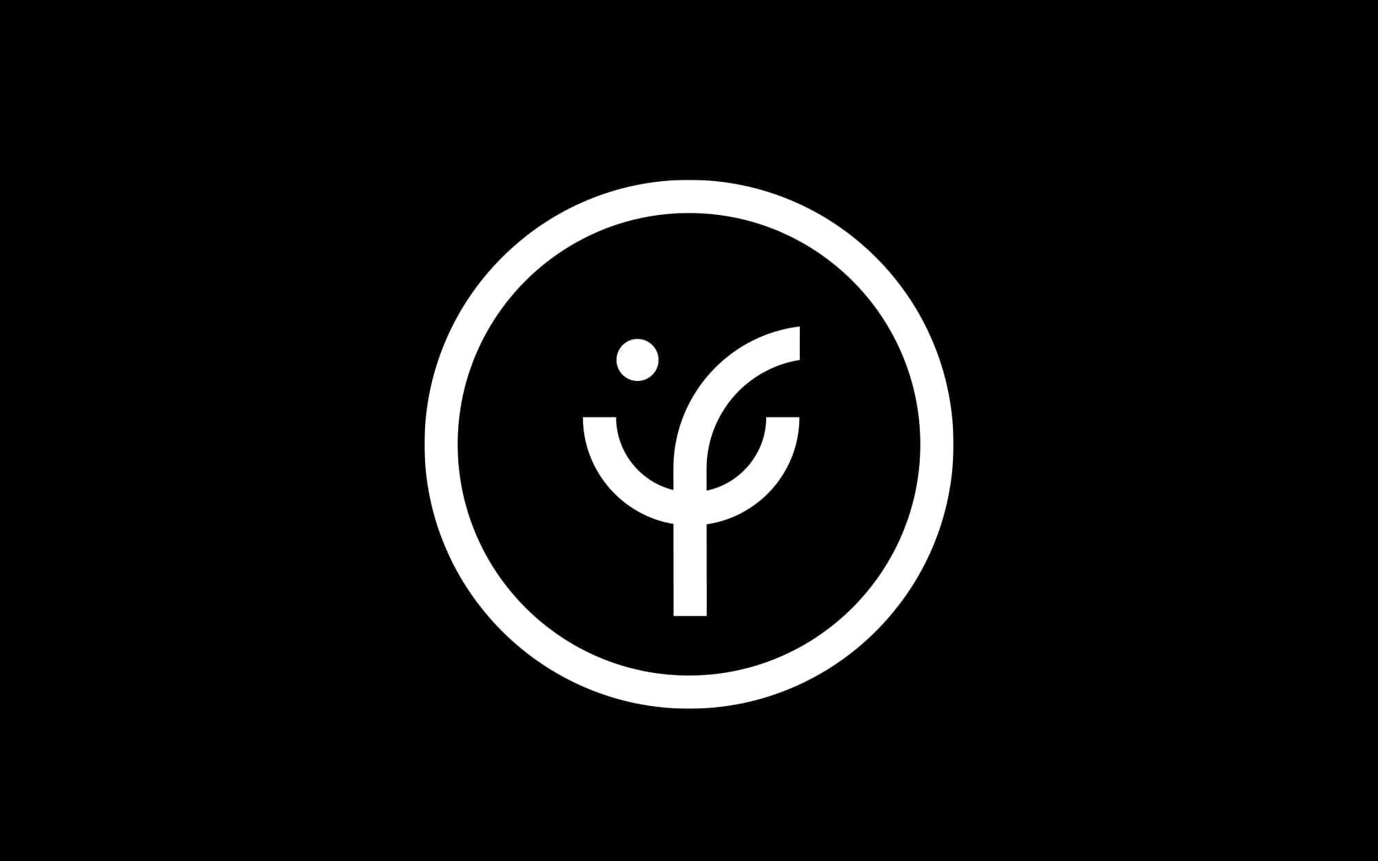
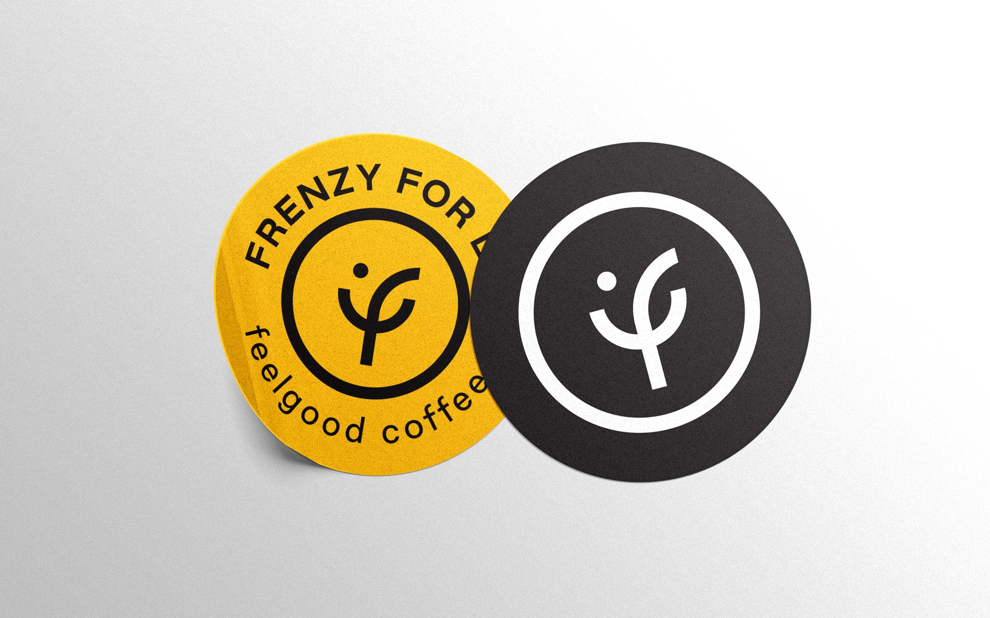
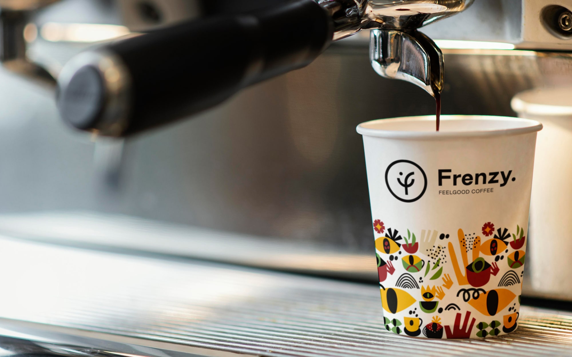
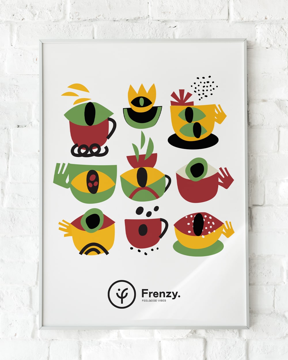
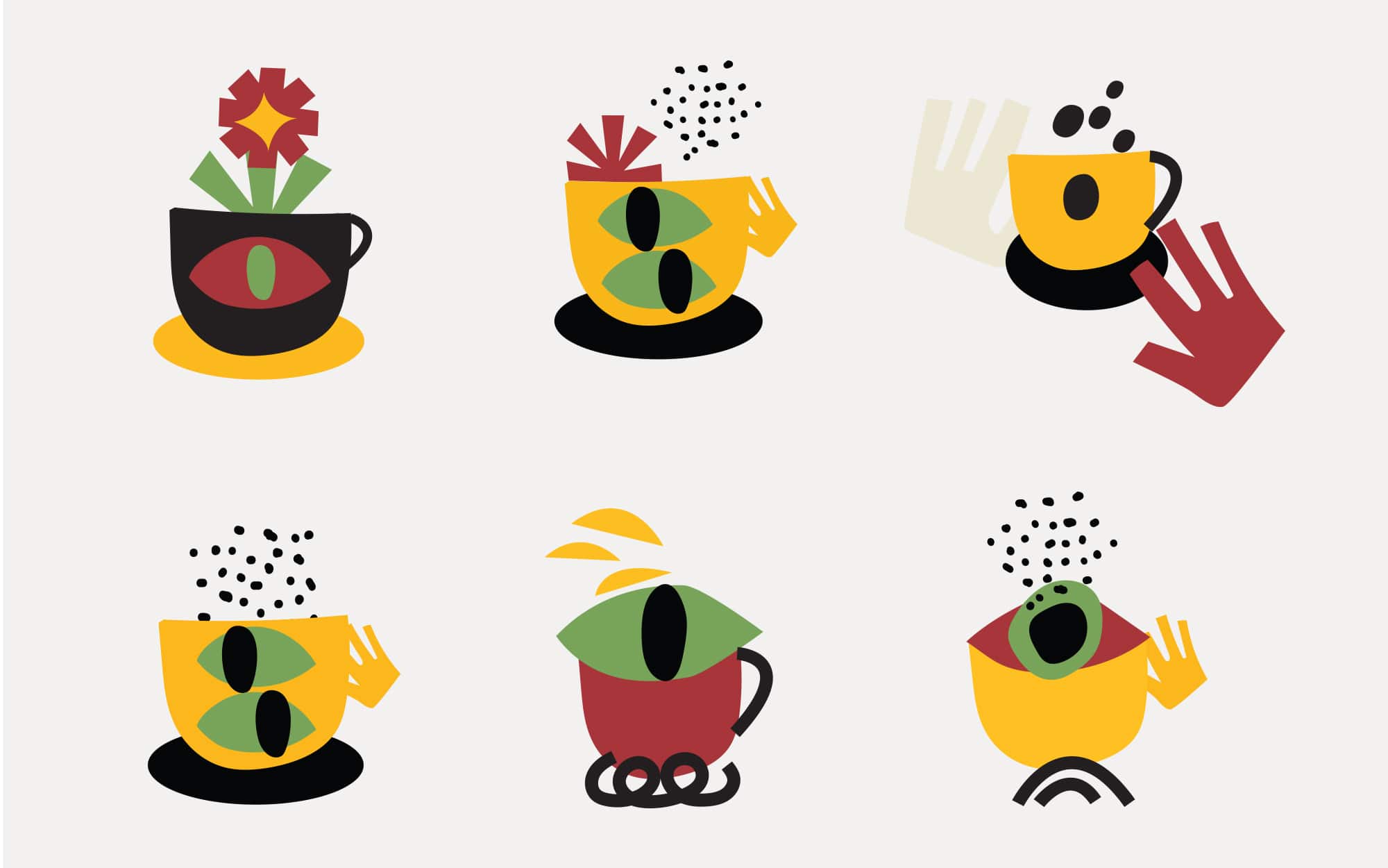
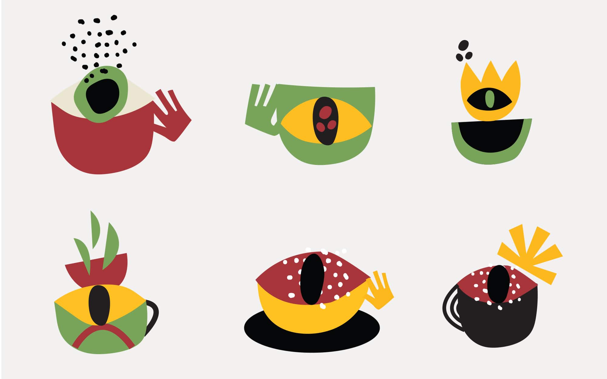
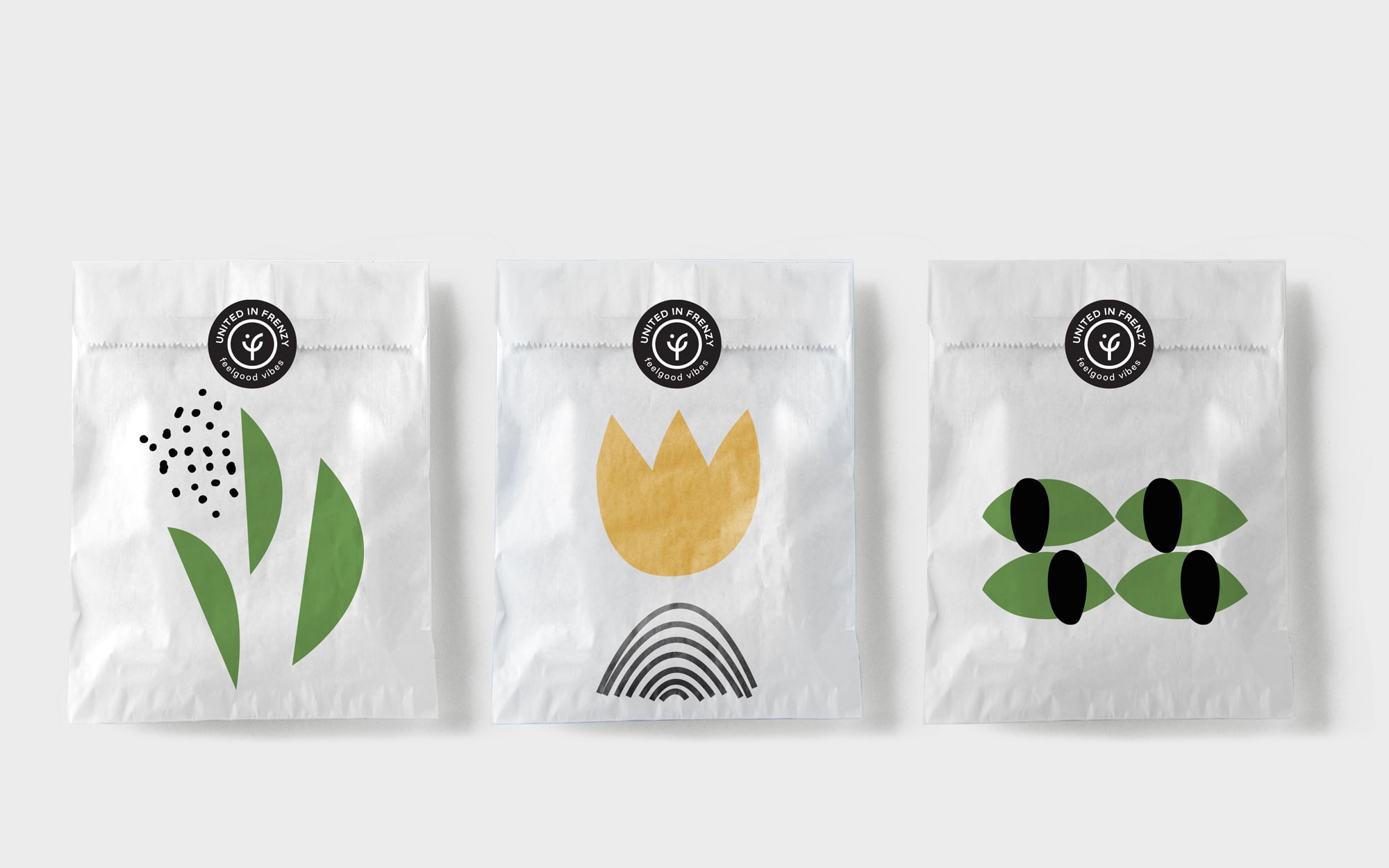
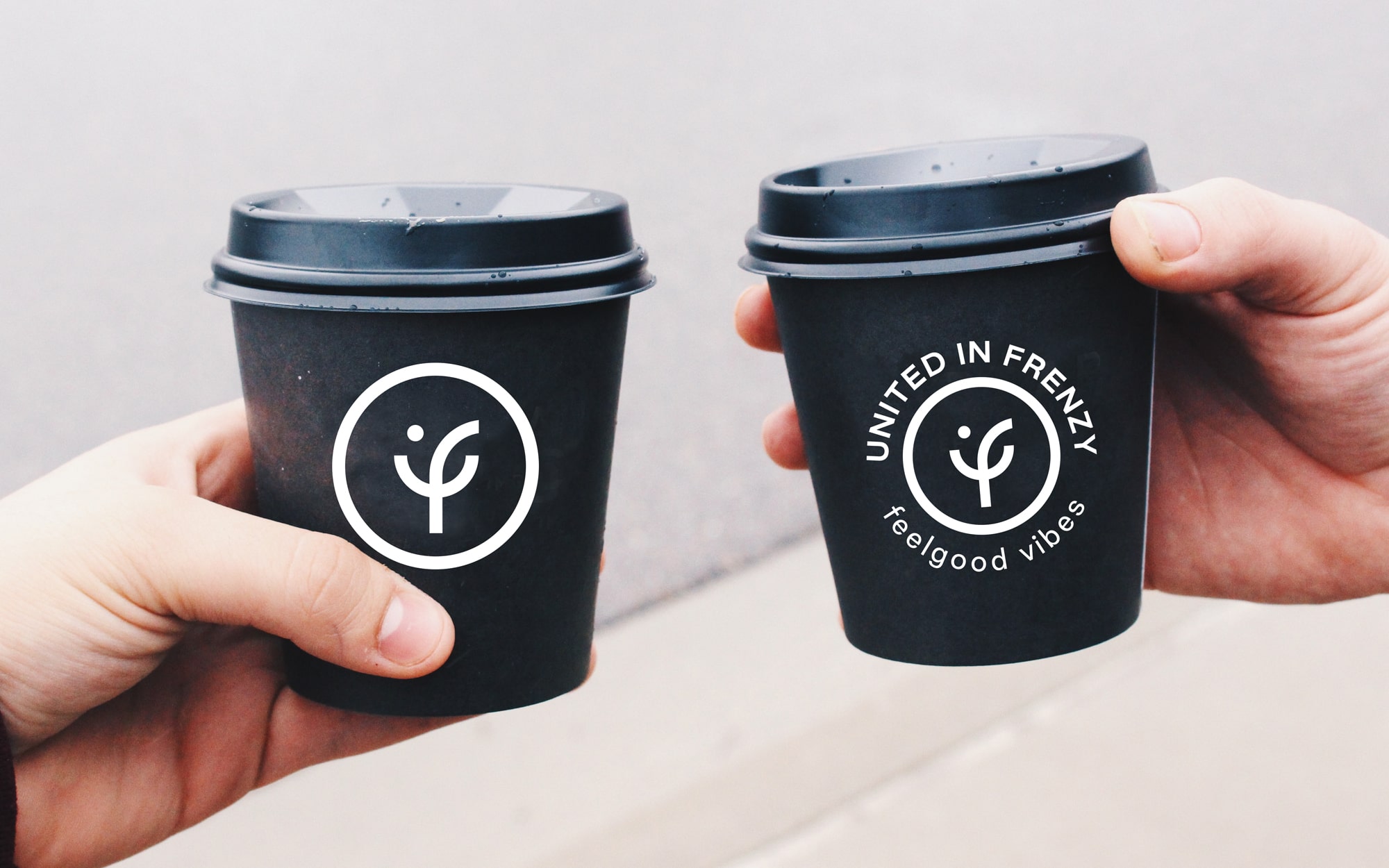
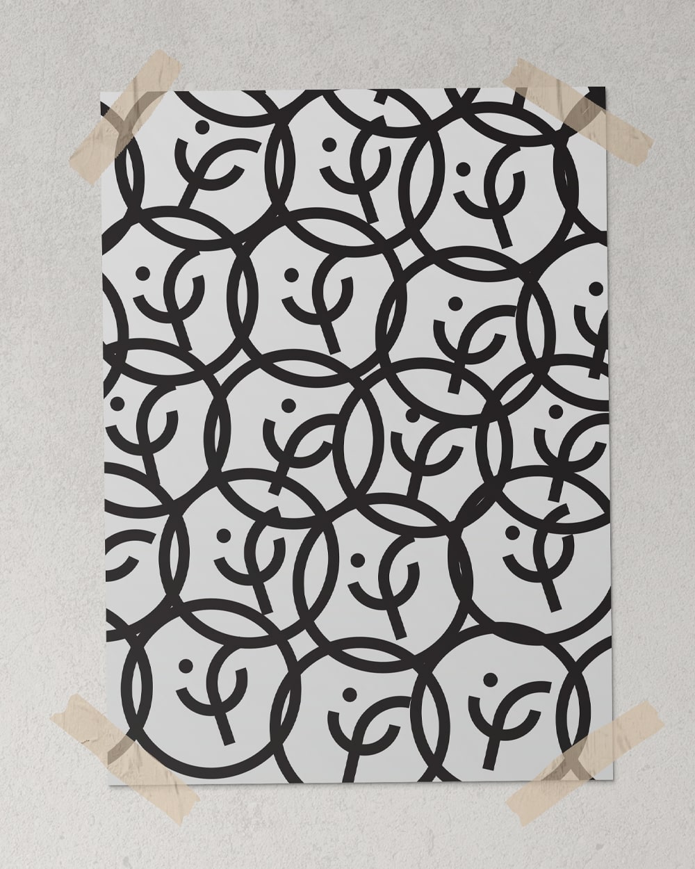
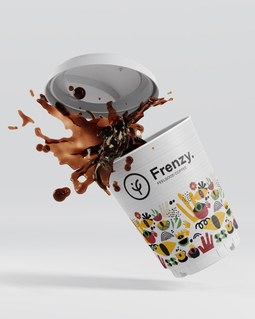
The initial ‘f’ of the brand name provided the inspiration. Combined with a curvy structure and a point on the left top, it created at the same time the impression of a coffee cup, a smile and a growing plant. The color palette used (ochre, black, light green, mellow yellow and scarlet) was drawn from the coffee world itself – the plant, the beans and its packs. All the original artwork created as brand expressions have followed a deliberately primal path, with raw, flat shapes broken down to their basic building blocks – to reflect the primal passion that goes along with the idea of frenzy and the obsession with great coffee. Among the shapes employed the most are those of the eye and the cup in their most minimal execution – to stress the eye-opening effect (laterally but mostly metaphorically) that really good coffee can have and the “get together”-ness.


Brand name, motto & copy: Konstantinos Kontinos