Little BIG pleasures!
BRIEF
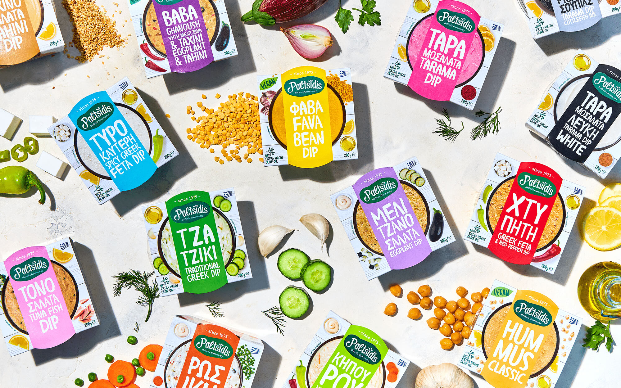
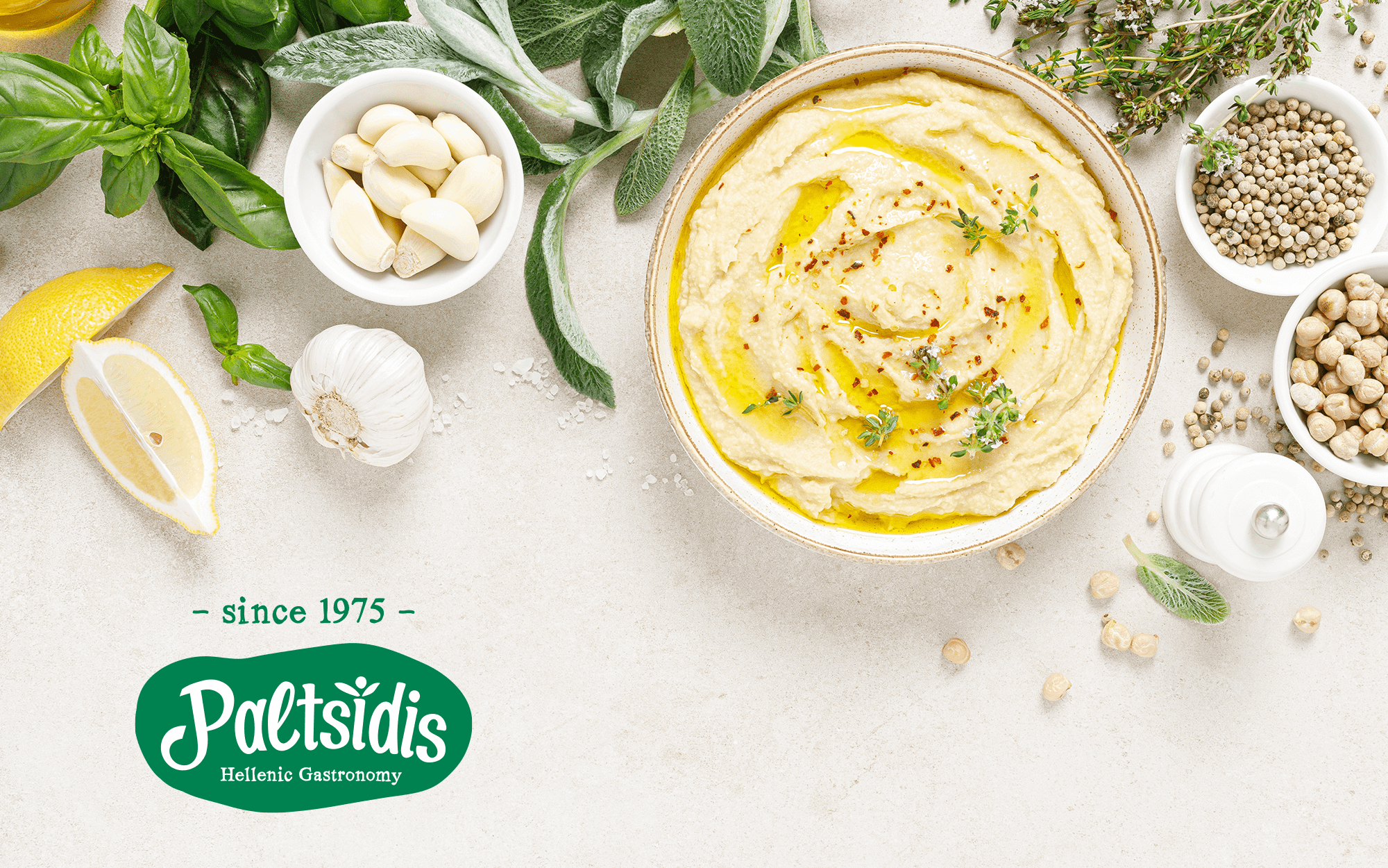
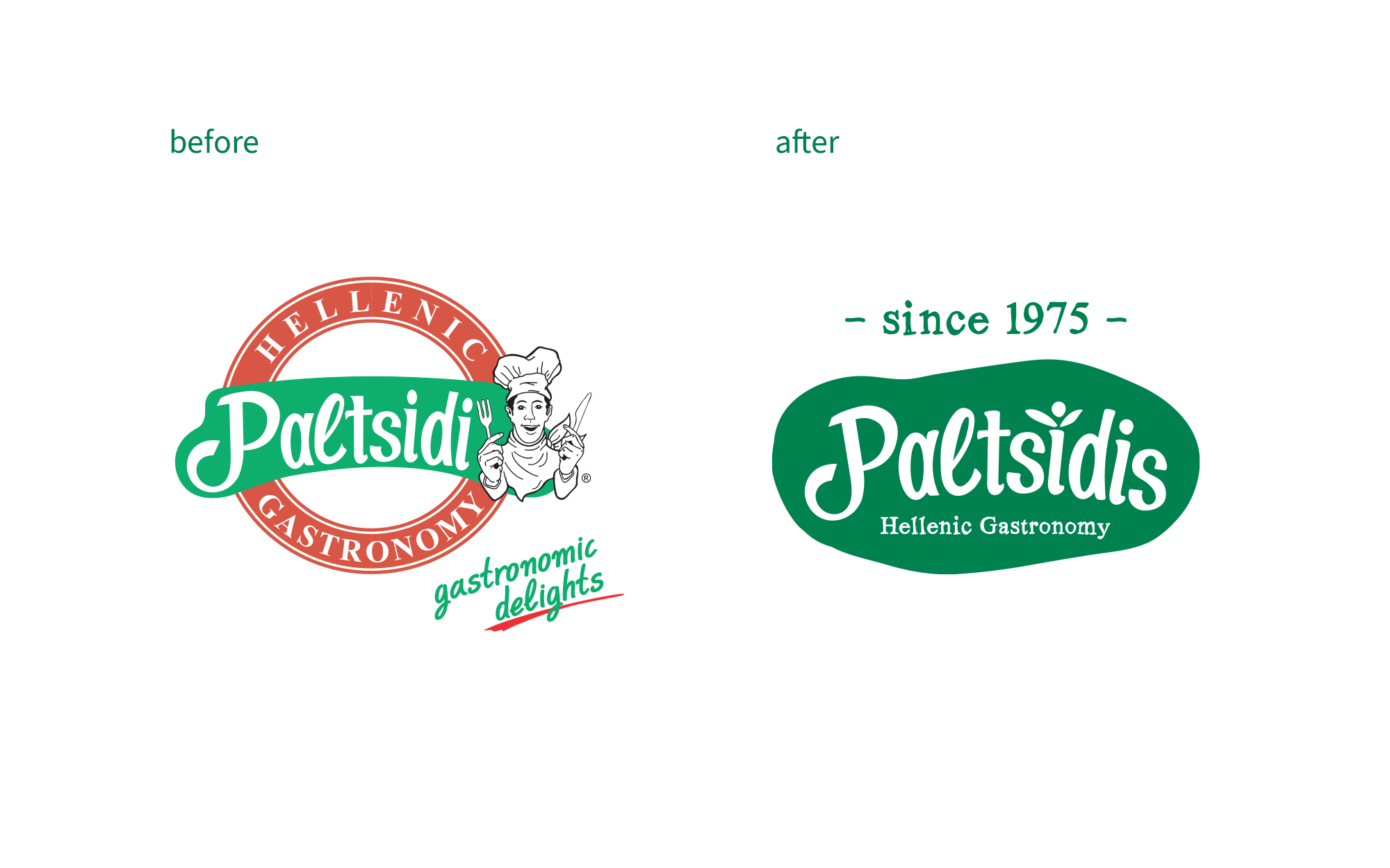
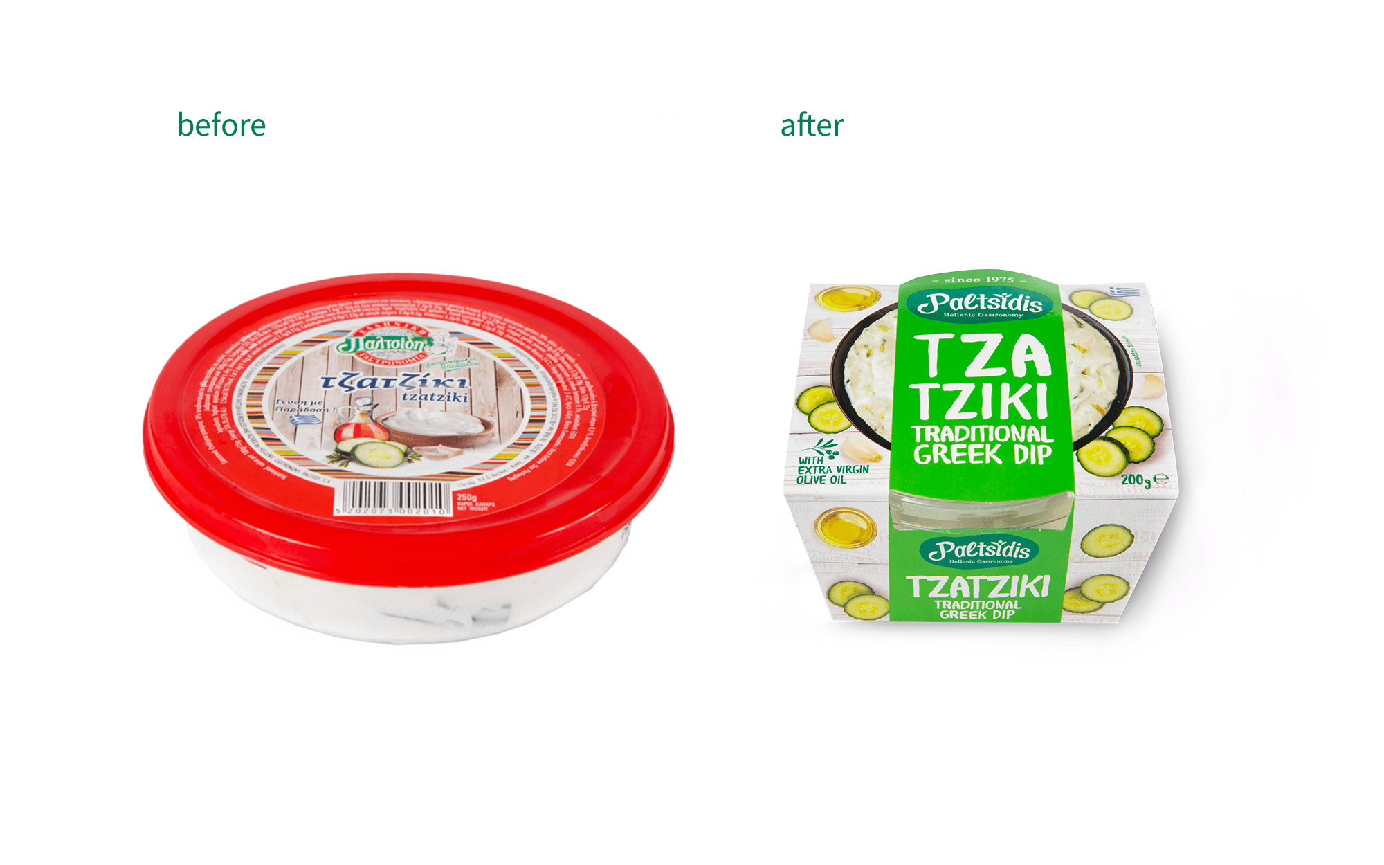
Paltsidis Hellenic Gastronomy S.A. is a food business with a focus on appetisers, dressings and canned products. Their range includes many traditional and well-loved recipes, some of them with a more modern twist. Following a longstanding presence in the market (since 1975) & a renewed export drive, the brand felt that it was time to review its identity. The process started from a totally new logo, refreshing, appetising and inviting but respecting the values and tradition of the company so far. Following the logo, it made perfect sense to move to their core product line, that of salads & dips.
Paltsidis Hellenic Gastronomy S.A. is a food business with a focus on appetisers, dressings and canned products. Their range includes many traditional and well-loved recipes, some of them with a more modern twist. Following a longstanding presence in the market (since 1975) & a renewed export drive, the brand felt that it was time to review its identity. The process started from a totally new logo, refreshing, appetising and inviting but respecting the values and tradition of the company so far. Following the logo, it made perfect sense to move to their core product line, that of salads & dips.
TARGET GROUP
A more mass global audience, people who seek the warmth and reassurance of the familiar – but also want to add some extra spice into their daily eating habits.
A more mass global audience, people who seek the warmth and reassurance of the familiar – but also want to add some extra spice into their daily eating habits.
CREATIVE CONCEPT
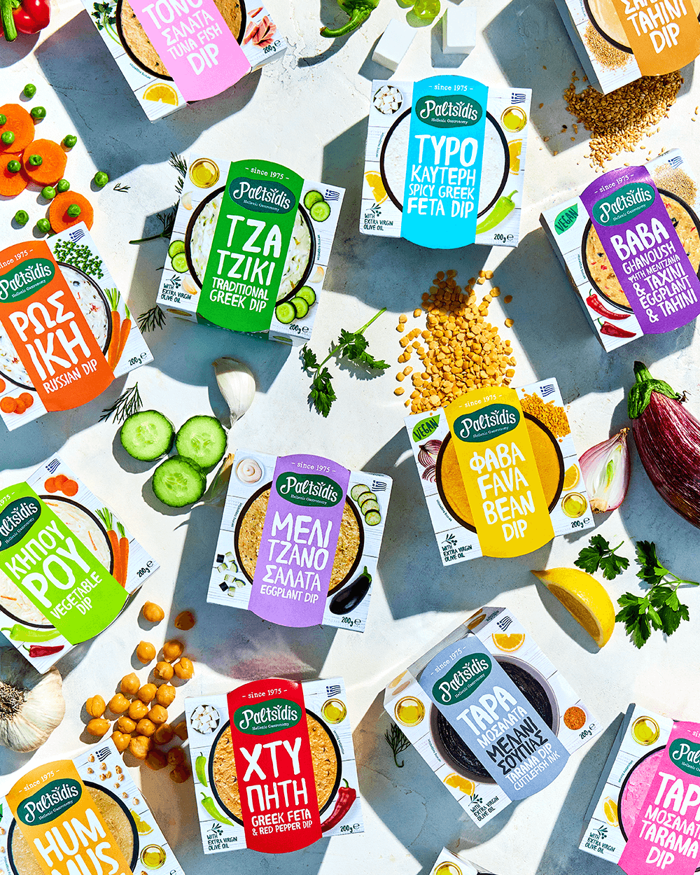
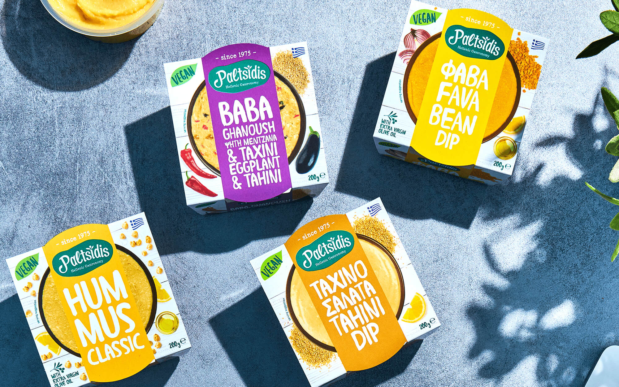
The core values of the brand are deeply rooted in tradition, regardless of the more contemporary turn of some of their recipes. This is an aspect that had to be highlighted, but there was a catch: Many competitors are pushing the traditional angle, using similar design codes and converging identity-wise. We needed to take a different route, suggesting expertise rather than employing obvious traditional references. At the same time, each product had to be differentiated and appealing enough. With an imposing shelf presence and individuality, but in line with a common design directive that brings out joy and boosts appetite.
The core values of the brand are deeply rooted in tradition, regardless of the more contemporary turn of some of their recipes. This is an aspect that had to be highlighted, but there was a catch: Many competitors are pushing the traditional angle, using similar design codes and converging identity-wise. We needed to take a different route, suggesting expertise rather than employing obvious traditional references. At the same time, each product had to be differentiated and appealing enough. With an imposing shelf presence and individuality, but in line with a common design directive that brings out joy and boosts appetite.
DESIGN APPROACH
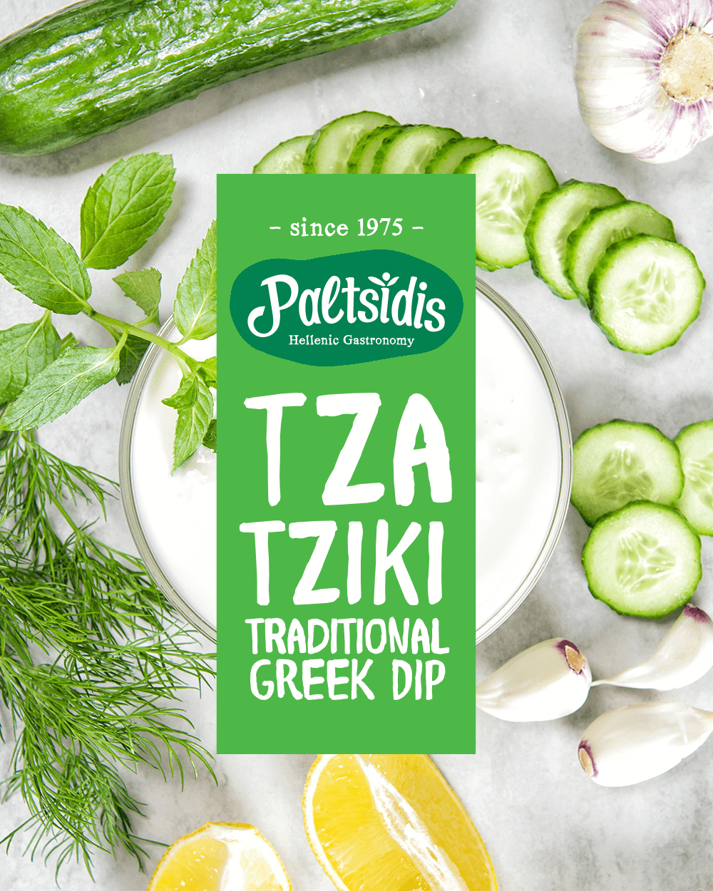
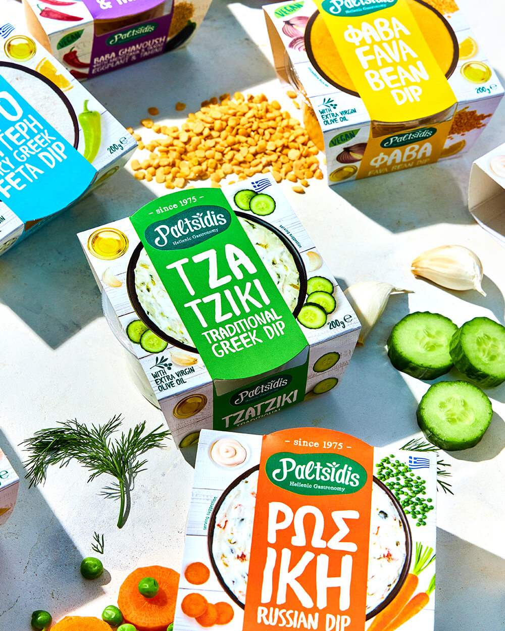
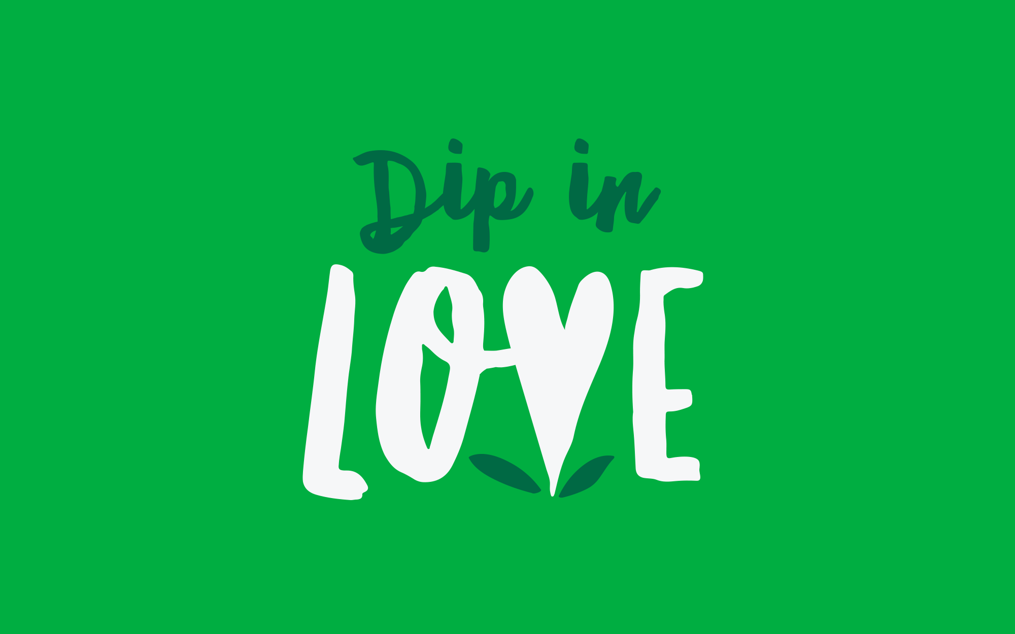
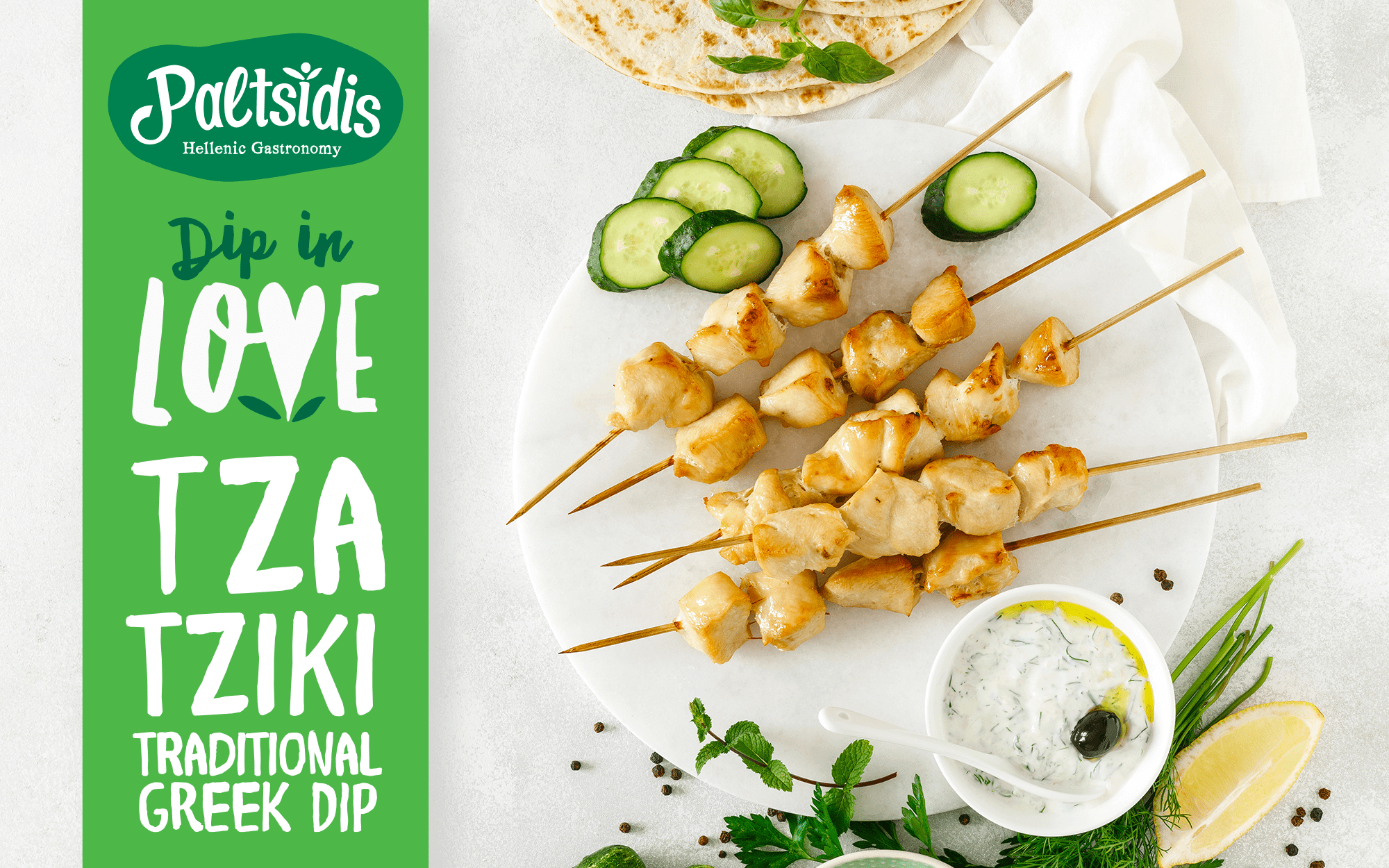
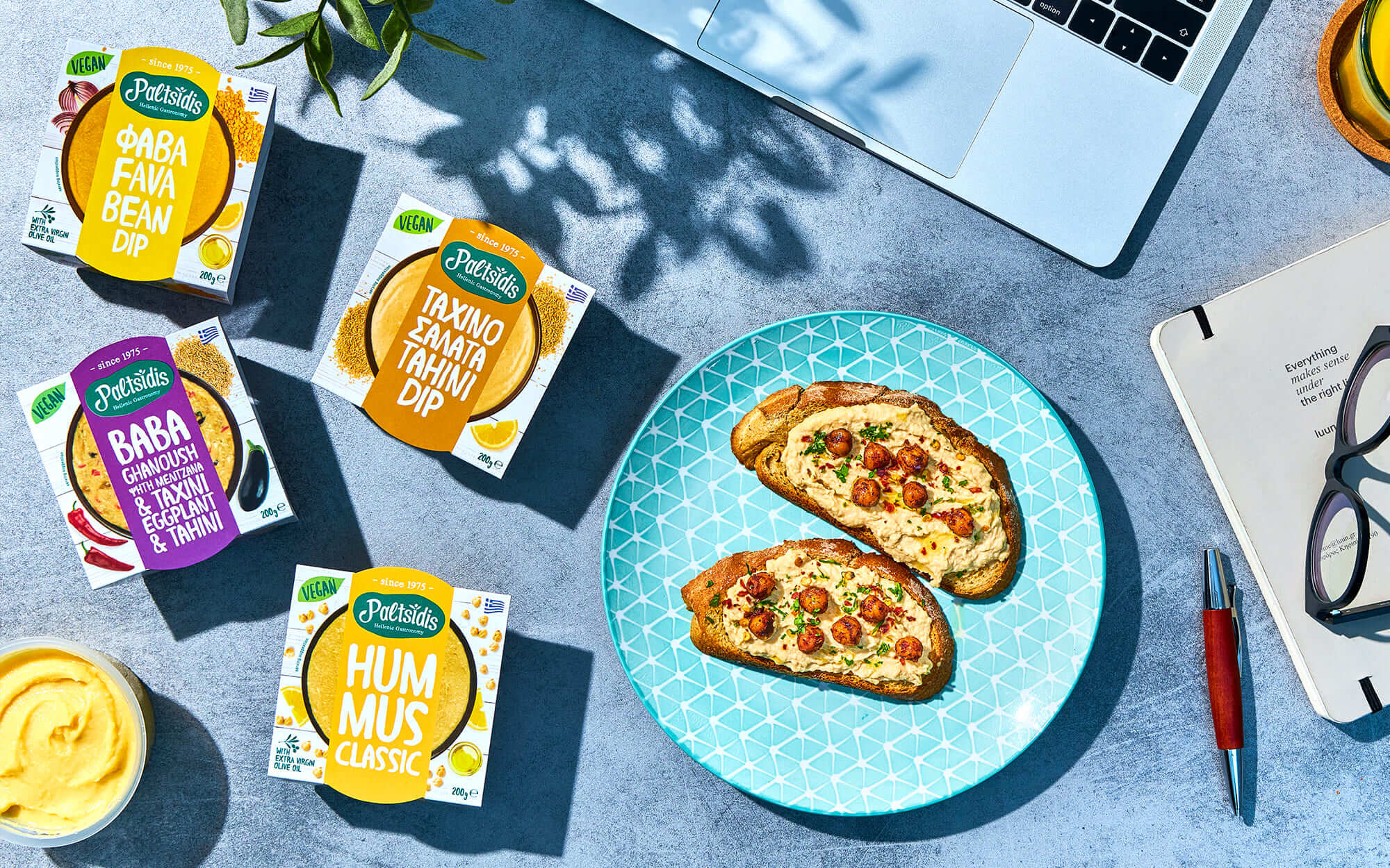
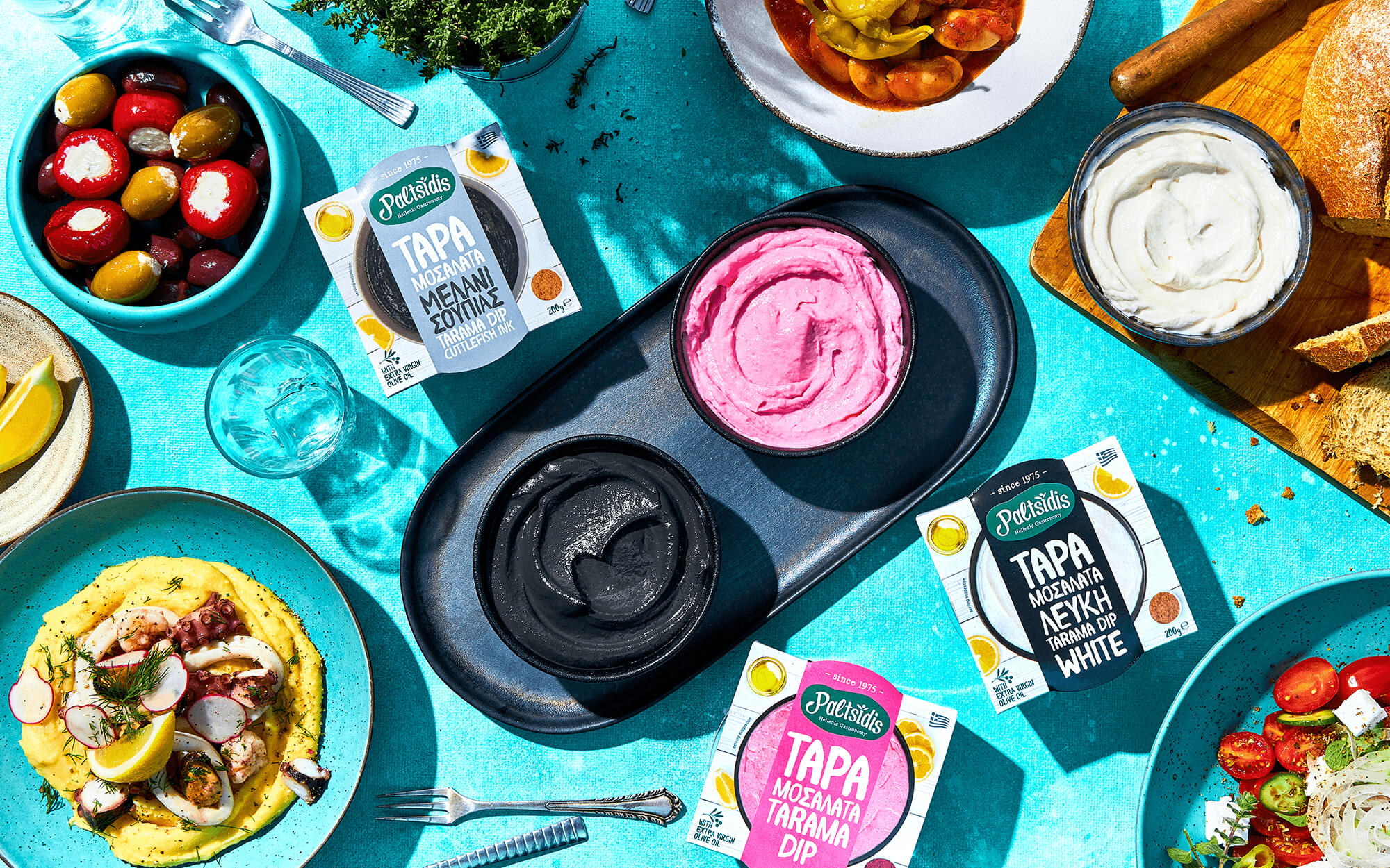
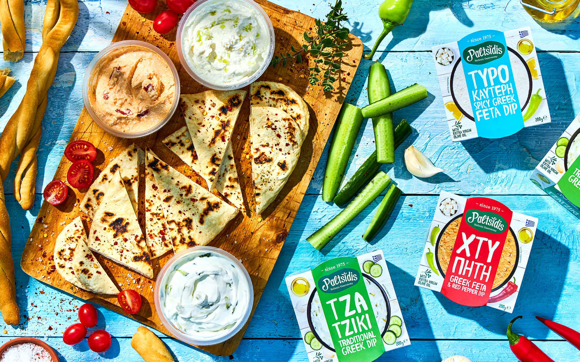
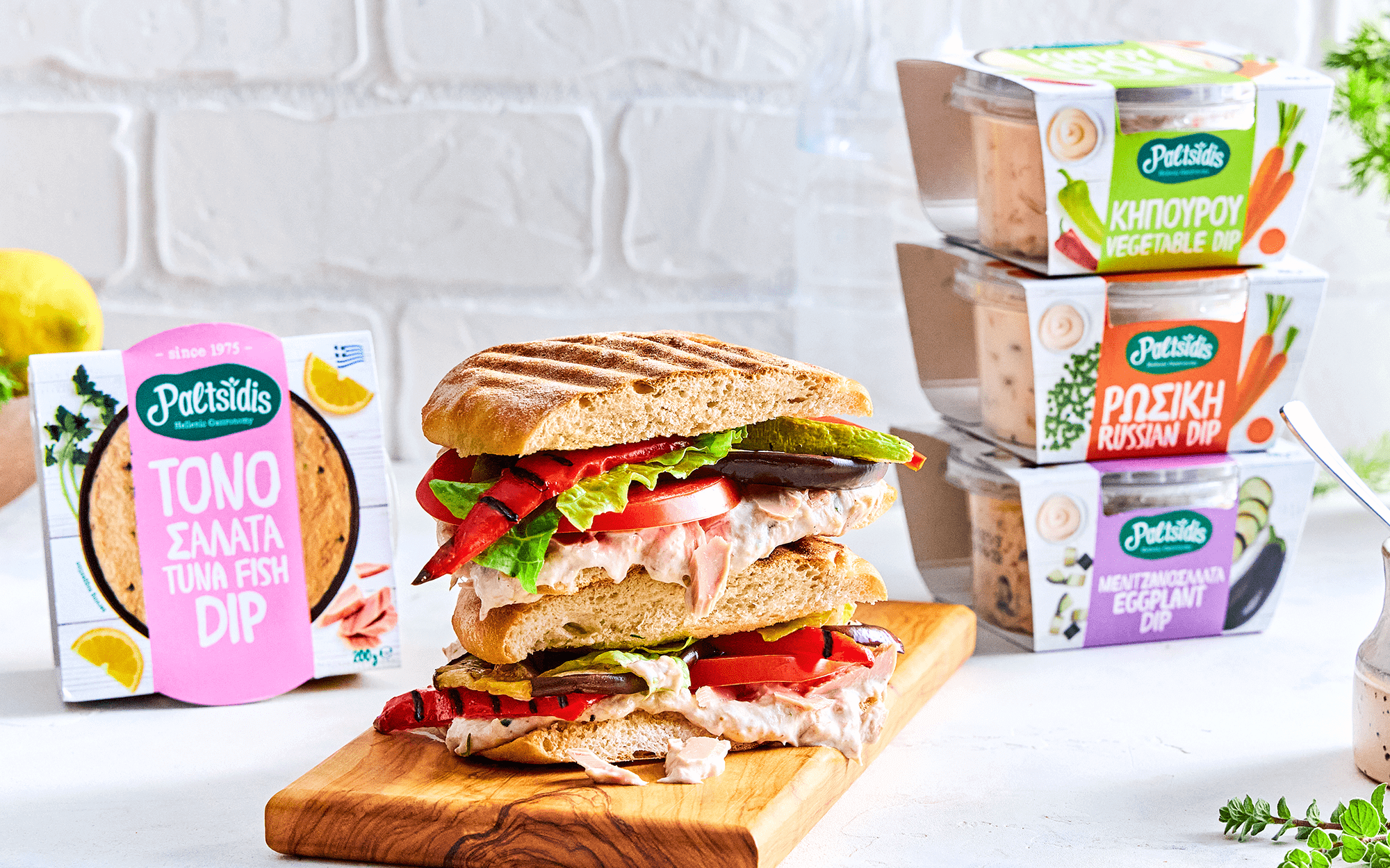
It was decided that the actual content should be depicted rather than just suggested. This, if not addressed with care, can make brands look the same. But in this market it matters to help consumers understand what they get at one glance – and also increase the desirability factor. To balance these needs, a colorful, impactful stripe was laid over the product visual. This stripe uses a color that is unique to each recipe and is inspired by a key ingredient each time. The picture / stripe combo are differentiated at the recipe level. At the same time, the visual architecture, the curvaceous, handmade typeface and the stacking logic of the syllables of each recipe cut across all propositions – thus giving rise to a very characteristic and own-able family look. The brand’s core promise for everyday moments that make you happy was now ready to be supported to the max.
It was decided that the actual content should be depicted rather than just suggested. This, if not addressed with care, can make brands look the same. But in this market it matters to help consumers understand what they get at one glance – and also increase the desirability factor. To balance these needs, a colorful, impactful stripe was laid over the product visual. This stripe uses a color that is unique to each recipe and is inspired by a key ingredient each time. The picture / stripe combo are differentiated at the recipe level. At the same time, the visual architecture, the curvaceous, handmade typeface and the stacking logic of the syllables of each recipe cut across all propositions – thus giving rise to a very characteristic and own-able family look. The brand’s core promise for everyday moments that make you happy was now ready to be supported to the max.
SERVICES
Branding, Logo Design, Packaging
Branding, Logo Design, Packaging

Photographers: Theodosis Georgiadis, Aris Rammos
Text Editor: Konstantinos Kontinos